Here at Esri, in our ongoing effort to educate and improve the accessibility of remote sensing data and technology, we have added the Sentinel-1 Explorer to our growing suite of ArcGIS Living Atlas Imagery Explorer apps. Bringing together the ready-to-use Sentinel-1 RTC imagery from Living Atlas, and core capabilities via the ArcGIS Maps SDK for JavaScript, Sentinel-1 Explorer aims to help democratize SAR imagery for Earth science and observation.
Background
Decades of satellite observations and astronaut photographs show that clouds dominate space-based views of Earth. One study based on nearly a decade of satellite data estimated that about 67 percent of Earth’s surface is typically covered by clouds. More…
For many spaceborne imaging platforms, clouds can present a significant challenge when it comes to capturing information for mapping and analysis of Earth’s surface. What if we could leverage an imaging technology that allowed us to see through clouds? And, what if we could make that imagery readily accessible to a very broad audience?
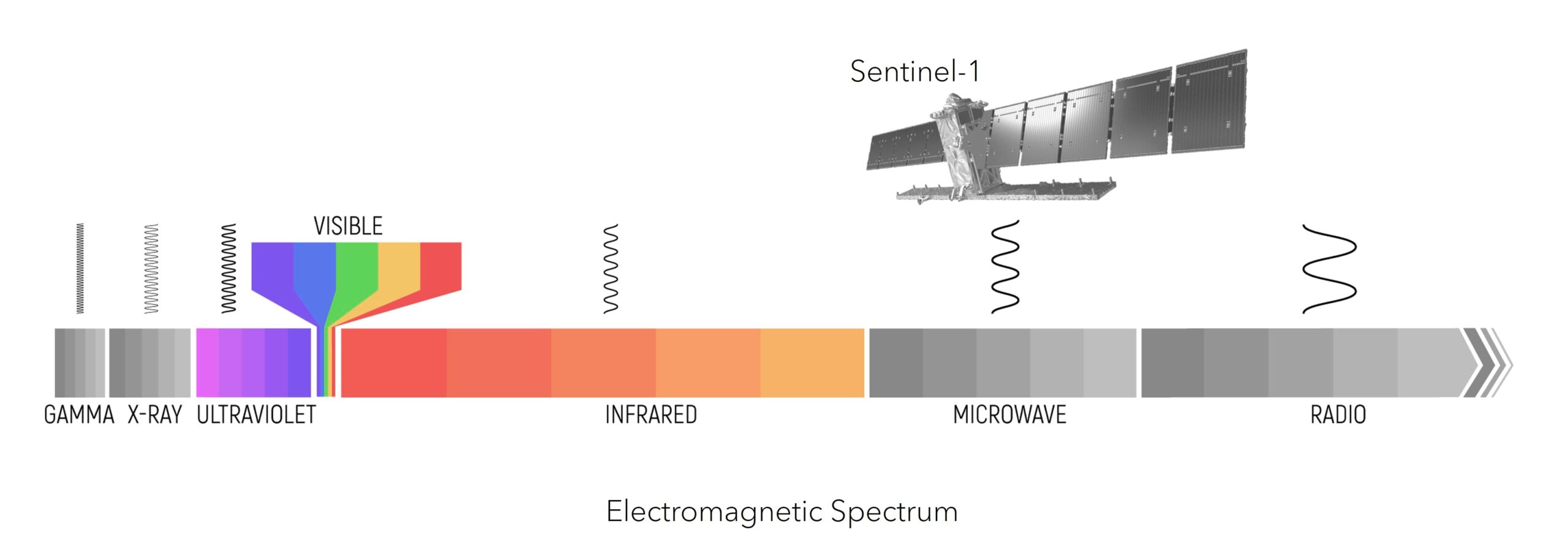
Synthetic Aperture Radar (SAR) sensors use microwaves to survey the Earth’s surface and is capable of collecting data both day and night and in all weather conditions. While this is an exciting prospect, and the concept may be new for some, SAR is not a novel technology. In fact, it has been leveraged for remote sensing and Earth science applications for decades. However, due to factors including limitations in data availability and inherently complex data processing, historically, SAR has had limited exposure beyond the scientific community.
In 2014, the European Space Agency and the European Commission set out to help increase data availability with the launch of the Copernicus Sentinel-1 mission. Sentinel-1 provides global high spatiotemporal SAR data coverage to everyone, free of charge. Today, with Sentinel-1 Explorer, accessing and analyzing Sentinel-1 imagery is easier than ever.
The rest of this article will provide a brief description, sample use cases, and app links for each mode of Sentinel-1 Explorer. You can bookmark and share this article to serve as a reference guide and tutorial for the app. Enjoy!

Quick Links
Use the links below to jump to sections of interest.
The modes:
- Explore -> Dynamic
- Explore -> Find a Scene
- Swipe
- Animate
- Analyze -> Index Mask
- Analyze -> Temporal Profile
- Analyze -> Change Detection
- Analyze -> Temporal Composite
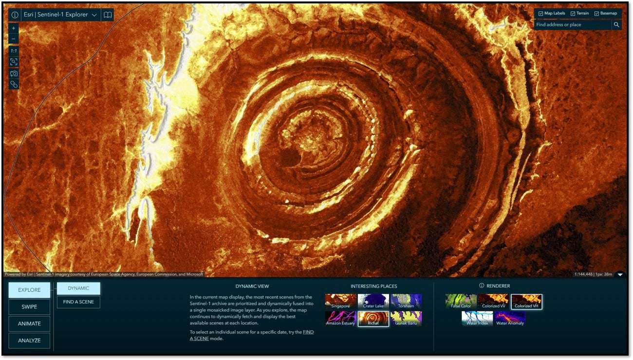
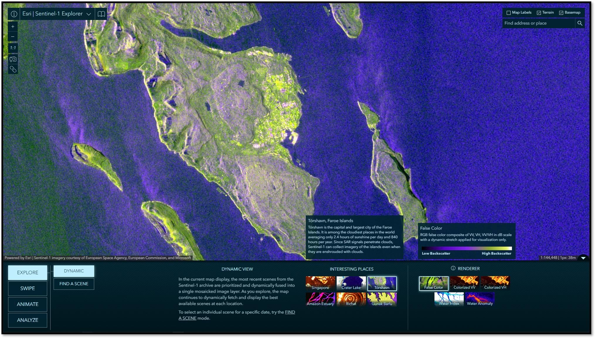
Dynamic
The app opens in Dynamic mode by default. In this mode, the most recent scenes from the Sentinel-1 archive are prioritized and dynamically fused into a single mosaicked image layer. As you pan and zoom, the map continues to dynamically fetch and render the best available scenes. You can select and learn about a variety of interesting locations around the world. You can also select from different renderings of the imagery, highlighting different types of information.
TIP: Just getting started and want more information? Be sure to leverage the information tooltips in each mode. If you are looking for more technical insight into Sentinel-1 SAR imagery, click the open book icon in the app title bar at any time for a Sentinel-1 SAR Quick Reference Guide.
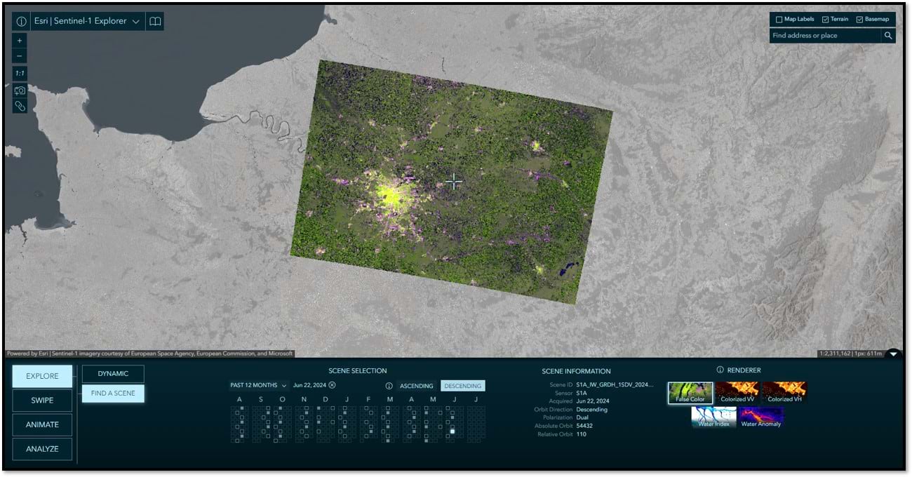
Find A Scene
This mode allows for the selection of individual Sentinel-1 scenes by year, month, and day. By default, the calendar displays the past 12-months of available scenes. Available scenes can also be filtered by orbit direction. The scenes matching your criteria are included in the calendar and those meeting the specified orbit direction are highlighted with a solid fill. Hover over a square for an information tool tip and click on it to load that scene into the map view. Detailed information about the selected scene is provided in the Scene Information panel. As you will see, the find a scene functionally is leveraged throughout the app, simplifying the discovery and selection of individual scenes when and where needed.
Swipe
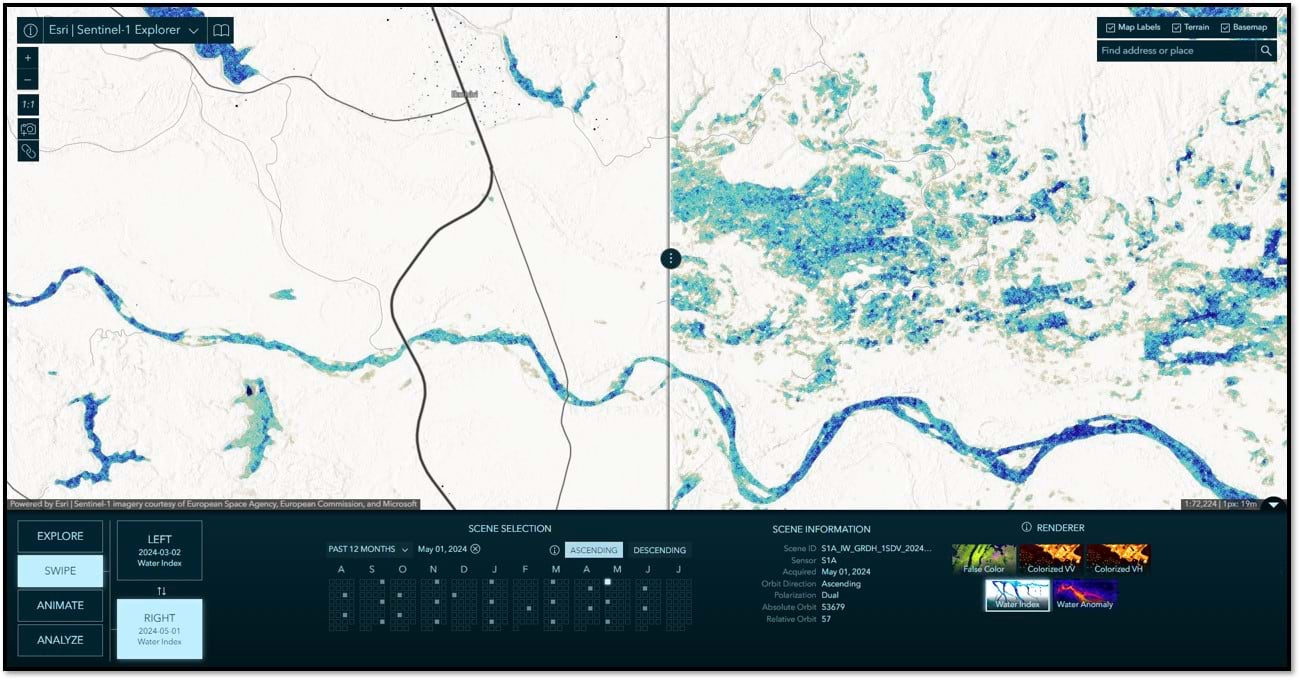
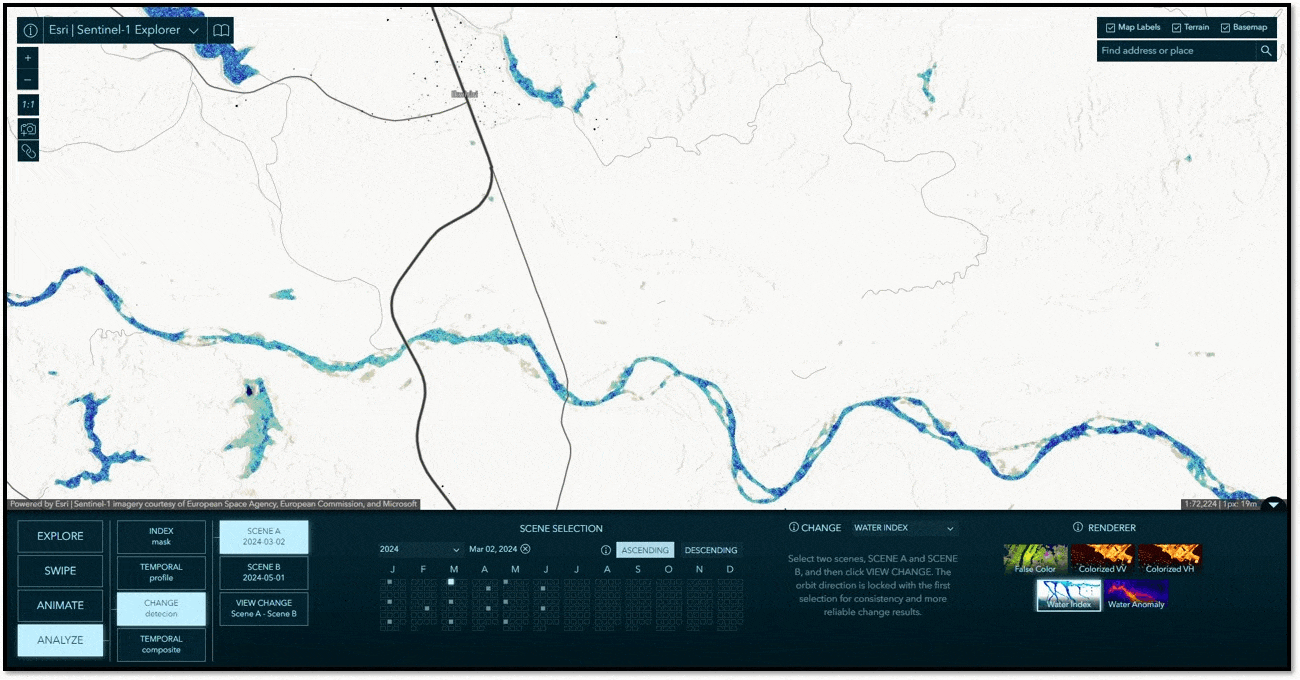
In Swipe mode, you can select two scenes to swipe and visually compare differences between them. It is common to choose between scenes of different dates, but you can also swipe and compare different renderings of the same date, or mix and match. Swipe is a simple yet extremely powerful way to visually detect, explore, and analyze differences and similarities between two images. Below is a before and after comparison in Tanzania where heavy rains throughout April 2024 caused extensive flooding. Leveraging the colorized Water Index, the image on the left shows conditions in March 2, 2024 before the rain set in, while the image on the right is from May 1, 2024 soon after the rain stopped.
Animate
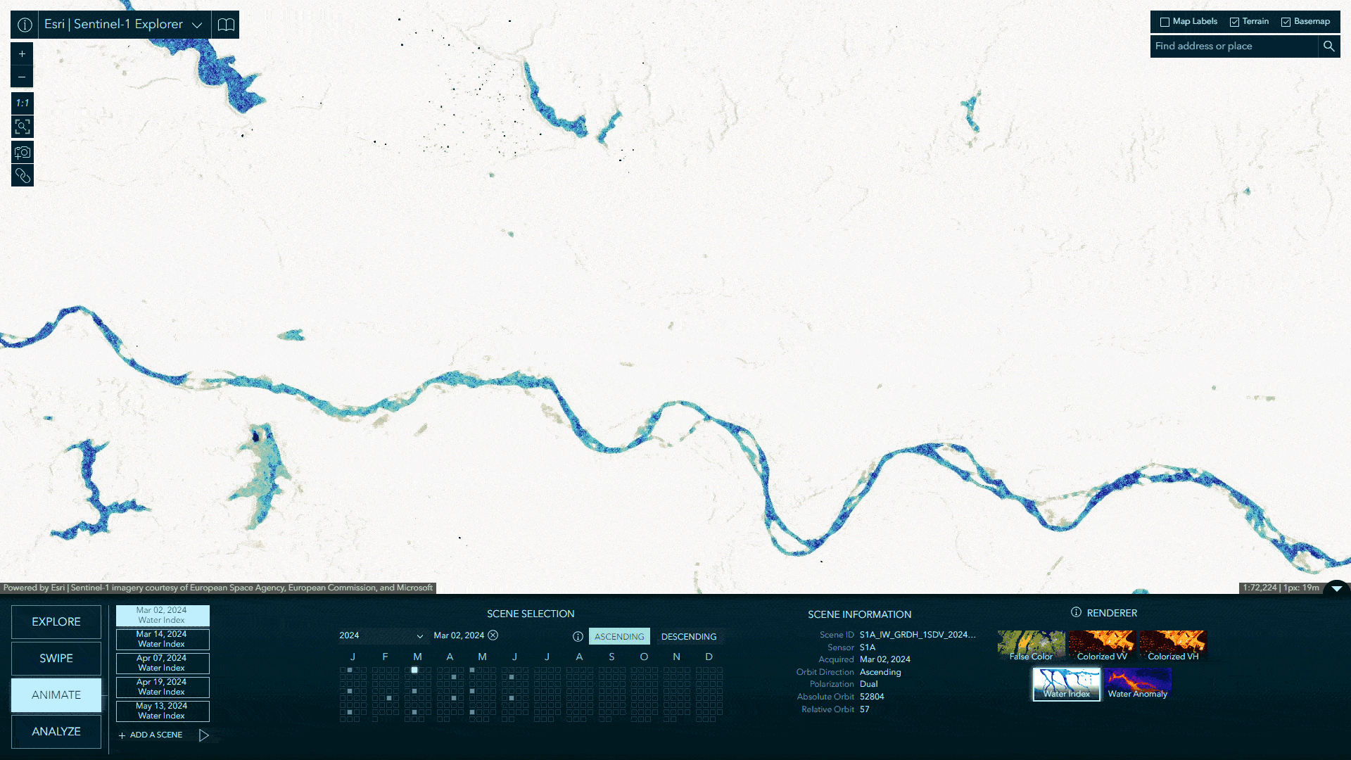
In Animate mode, you can select multiple scenes to create compelling time animations. Click “+ Add a Scene”, select a date, and repeat. When you have gathered your collection of images, click the play button to start the animation. During playback, you can choose your frame rate and optionally export your animation to an MP4 with the layout of your choosing. The animation below was constructed in just a few minutes using the Tanzania flooding example we demonstrated in Swipe mode. Clicking the link below will open the app actively animating the chosen scenes, showing some fluctuation as flooding begins in March, with flood water peaking throughout April into May, and then receding into June.
Index Mask
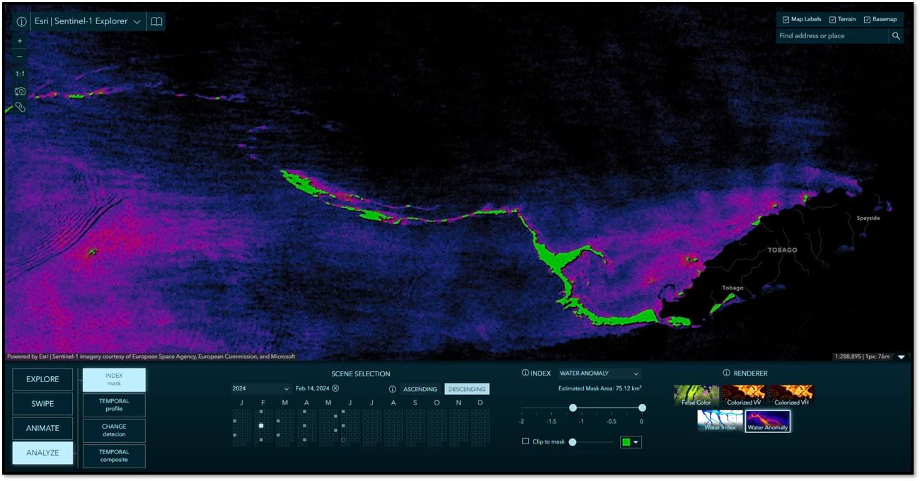
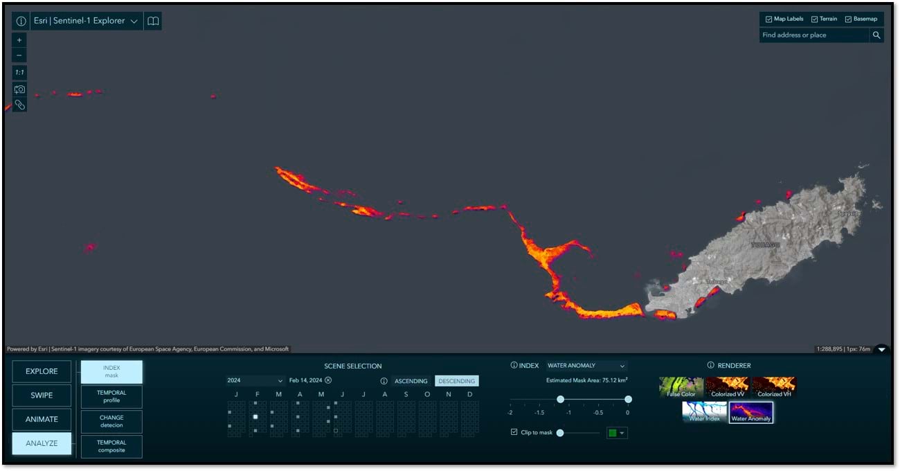
In this mode you can use calculated indices to delineate and measure estimated surface area of things like water and water anomalies (including oil slicks), ships and built-up areas. As you move the slider, a mask is dynamically rendered on screen indicating the areas meeting the specified thresholds. Alternatively, the mask can be used to clip the image and only show the pixels covered by the mask. The examples below are leveraging the Water Anomaly index to indicate the extents of an oil spill that occurred when a barge capsized off the coast of the Island of Tobago on February 7, 2024. The selected image is from one week later on February 14, 2024 and shows how the oil extended out into the Caribbean Sea. The first example below shows the mask on top of the Water Anomaly colorized renderer. The second shows the Water Anomaly renderer clipped to the mask and displayed on the basemap.
Temporal Profile
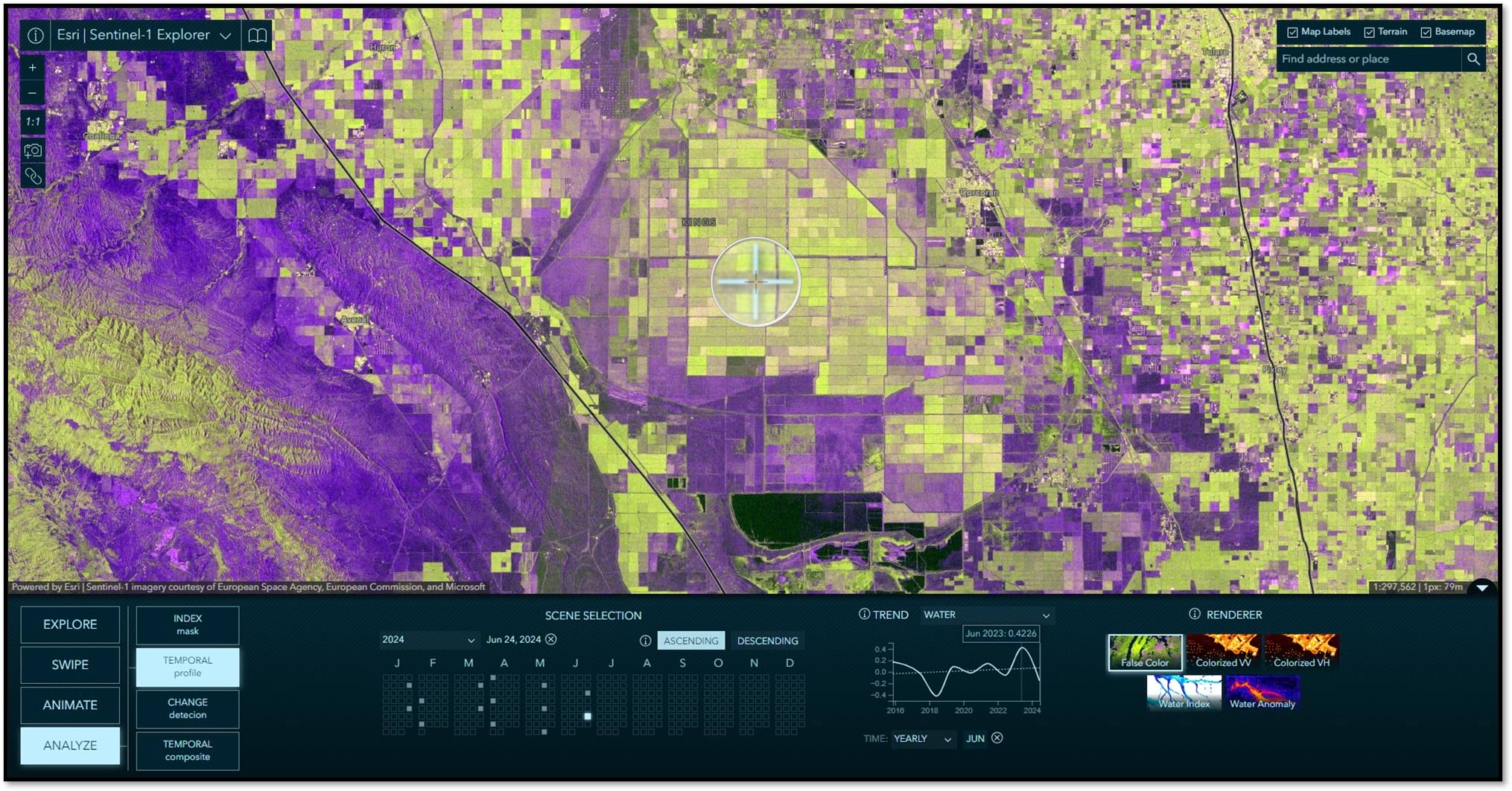
Using the temporal profile tool you can detect categorical trends over time, including water and water anomaly. When Yearly is selected, you can specify the target month you would like to be sampled year over year. This option is best for identifying long term patterns and trends. When Monthly is selected, you specify the target year and all 12-months within that year will be sampled. The monthly option is useful for seeing seasonal patterns and fluctuations throughout the year. In the example below, a point was selected in the Tulare Lake Basin in Central California, USA. This area flooded in the spring/summer of 2023 and this is evident in the peak of water in the annual profile. To get started, all you have to do is click on the map.
Change Detection
In this mode, you are able to select two images and calculate the difference between them. You can create change images based on Water and Water Anomaly indices. You can also create a Log Difference image showing all changes in backscatter between the selected images. The example below calculates the difference in Water between the same two images we previously used in Swipe mode to visualize flooding in Tanzania. Using the slider, we can display only the areas where flooding occurred.
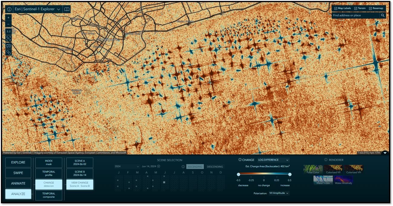
This Change Detection example leverages the Log Difference option to show all changes in backscatter between two images over the Port of Singapore. The Red shows us where ships were on June 2, 2024 (where backscatter has decreased) and Blue where ships were on June 14, 2024 (where backscatter has increased). NOTE: Ships tend to show very strong backscatter returns due to an effect known as double bounce. These strong signal returns can flood the sensor resulting in the “star” effects you see, also known as “lobes”.
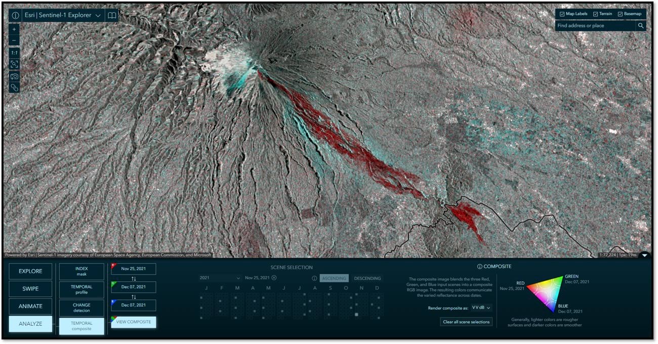
Temporal Composite
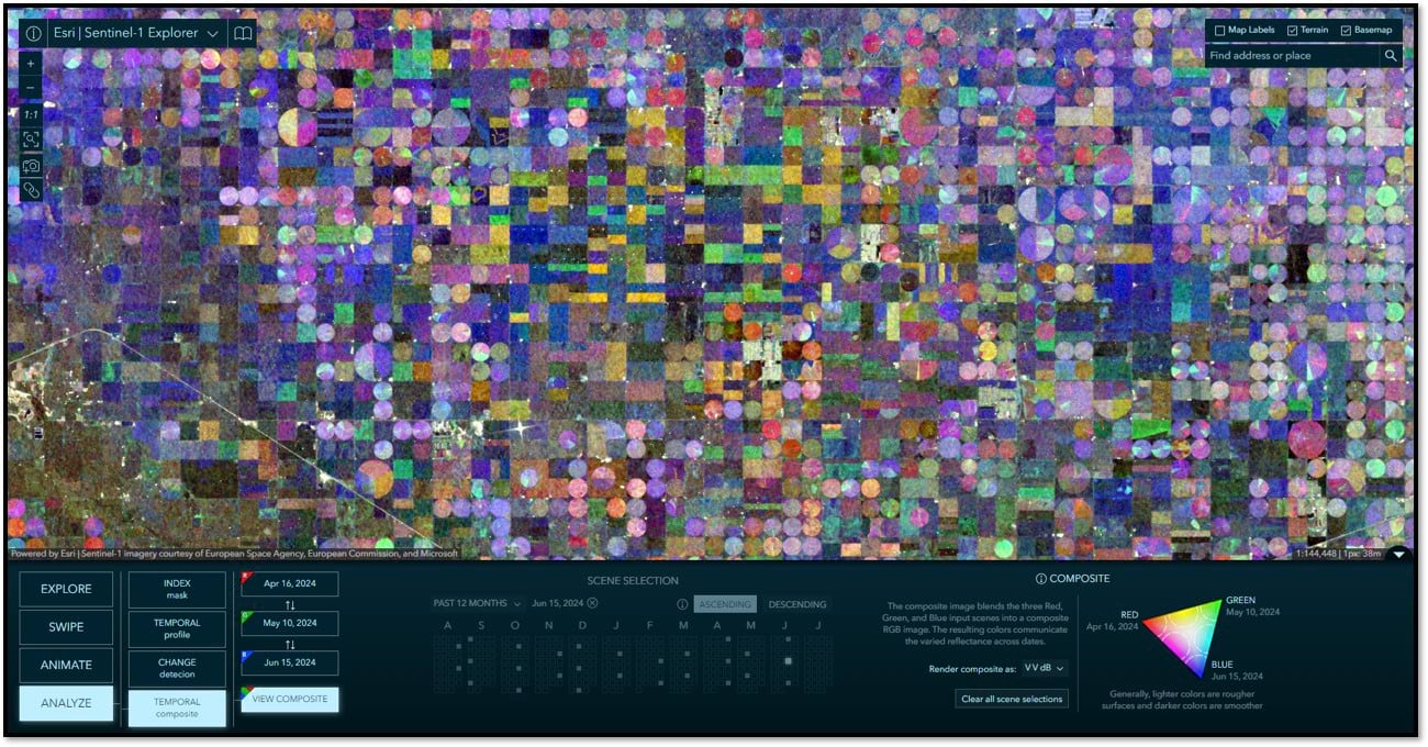
In this mode you can view changes over time for up to three selected images at once. Each selected image is used as an individual band in a dynamically generated three band RGB composite image. Color variations in the resulting composite image represent changes in the land cover over time. For example, areas with high backscatter in the scene used as the red band will have a stronger red hue in the composite image. Areas with high backscatter in the red scene and the blue scene, and low backscatter in the green scene, will appear purple. And so on. Areas with more consistent backscatter, meaning little to no change over time, will appear as shades of gray. Hover over differ regions on the color chart to get tips for interpreting the temporal composite image. The first example below shows an agricultural application of the temporal composite showing agricultural related changes in Kansas, USA throughout the 2024 spring growing season. The composite provides indicators of change related to growth patterns, crop types, soil moisture and more.
This temporal composite example shows pyroclastic flows and lahars in Eastern Java, Indonesia from the Mt. Semeru eruption in December 2021.
More Info
A suite of imagery explorer apps
Sentinel-1 Explorer joins Landsat Explorer and Sentinel-2 Land Cover Explorer in our growing suite of Imagery Explorer apps. See related articles and user guides.
Sharing the code
In the interest of sharing and innovation, all of the source code for these Living Atlas Imagery Explorer apps is available for anyone to access on GitHub.
Many thanks to the team!
App development: Jinnan Zhang
UX/UI and cartographic design: John Nelson
Sentinel-1 image service development: Samira Daneshgar and Vijay Pawar
Systems engineering: Sreekumar Sreenath
Credit: Sentinel-1 Satellite Graphic Courtesy ESA


Article Discussion: