Welcome to Week 6 of ArcGIS Hub’s Civic Analytics Notebook series. In the last notebook, we worked with building permits data to see if zoning plays a role in building permits being revoked. We used a supervised machine learning technique to assess if a few factors can classify a building permit successfully as revoked or not. We then explored to see if zoning played a role too, for instance, due to an incorrectly approved permit based on zoning errors. You can also see the other analyses from this series here.
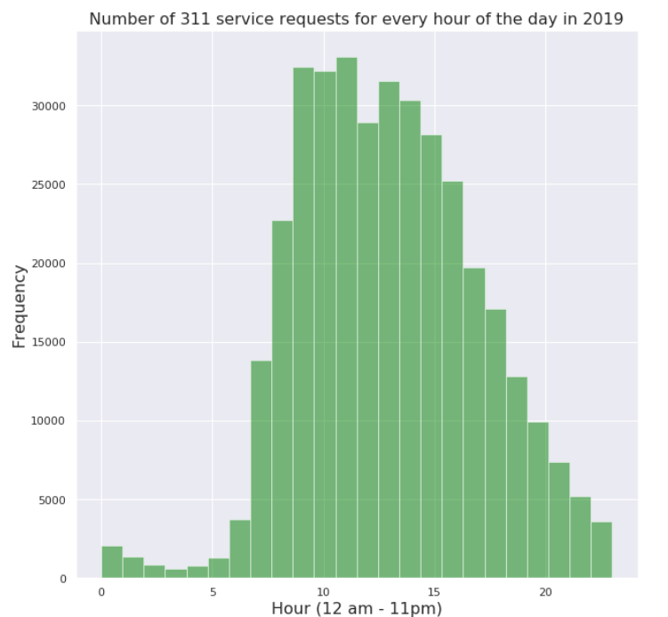
This week we explore how charting libraries in Python can help us visualize temporal and spatial patterns to get a quick snapshot of our city. For this, we look at the crime data in Washington, DC as well as 311 service requests from the year 2019 in two separate notebooks. We start by extracting the month, hour and day of the week for each record from the timestamp field. We plot these on histograms to observe a quick visual of which months/hours/days have most number of recorded criminal incidents and 311 calls. This helps us identify the time periods of high and low activity.

We then take a look at spatial patterns by plotting small multiple charts using the matplotlib Python library. Small multiples was introduced by Edward Tufte as a visual series of similar charts. He described it as –
“Illustrations of postage-stamp size are indexed by category or a label, sequenced over time like the frames of a movie, or ordered by a quantitative variable not used in the single image itself.”
We create these small multiple charts for criminal incidents based on the SHIFT of the day they were reported in, i.e. day, evening or midnight. We then proceed to create these charts for offense type, to get a sense of density and spread of these incidents based on offense type.
For 311 calls, we plot small multiple horizontal bar charts to summarize the most frequent category of requests for each Ward (administrative boundary) of Washington, DC along with a chart of small multiple maps for the agency most calls are routed to. Using these small multiple charts and maps we can compare how spatial patterns differ within the city, to understand sub-spatial nuances better.

We conclude with a statistical analysis that evaluates if number of crimes (or 311 calls) reported in each census tract of a neighborhood, correlate with the population of those census tracts. The steps followed are:
- Enrich the most recent census tracts layer for Washington, DC with recent population data.
- Join the neighborhoods layer to this data spatially (based on location of the two), in order to get the appropriate neighborhood(s) that each census tract falls within.
- Compute a Pearson correlation coefficient for the number of crimes (or 311 calls) reported and population for each census tract of a neighborhood.
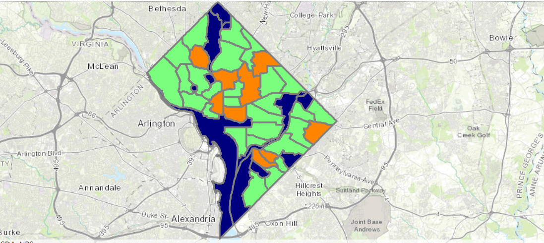
This process is repeated for each neighborhood in the city and we observe a positive relation in many neighborhoods (neighborhoods in green, in the map). A correlation does not imply that one influences the other, it simply suggests that they exhibit more-or-less similar changes. In these notebooks we are testing for a phenomenon (crime, 31 calls) in a region and the population in that region to see if the number of incidents is proportionate to the the number of people, without drawing causal conclusions.

I invite you to test these notebooks for local civic data from your city. The temporal and spatial charts can be generated for any dataset of your choice such as street collisions, restaurant inspections, parking violation, to name a few. We would love to hear of your experiences with this notebook in our Geonet discussion thread.
I look forward to connecting with you on your findings and feedback!
Links to notebooks –
- Temporal, Spatial and Statistical patterns in civic (crime) data
- Temporal, Spatial and Statistical patterns in civic (311 service requests) data
Click here to learn more about Week 7 of Civic Analytics with Hub.

Hello @Hussein Nasser, will this work against ArcGIS Enterprise 11.3 ?
Hello, if you set the triggering fields with Pro 3.4 on a class then published it to an 11.3, the service will start (we don’t upgrade the class) but won’t take advantage of the triggering fields feature, ie updates will trigger on all fields. This is because 11.3 doesn’t know how to read the new property.
To actually take advantage of the feature you need to be in 11.4/3.4 if your planning to use services.
OK thank you
Can you set a rule NOT to be triggered when loading a bunch of data into the FC with the Attribute Rules set – if the fields already have data in them?
Yes by disabling the rule. Because loading data is actually inserting features, which trigger insert based attribute rules. Disabling the rule or removing the insert trigger won’t trigger the rules on insert.
If the attribute rules are set on an egdb, will an update be required to that in addition to Pro and Enterprise?