ArcGIS StoryMaps is one year old!
We’ve truly enjoyed kicking storytelling with maps into high gear in 2020, and we’re not done yet. ArcGIS StoryMaps has just been updated with more new nuggets of storytelling goodness. Here’s a rundown…
- ArcGIS StoryMaps now available on ArcGIS Enterprise
- New navigation options and more for collections
- Create a story with a quick-start template
- Embed a story in your website
- Add attribution to images and videos
- More basemap flexibility for guided tour
- Transparent panel styles in sidecar
- Map designer enhancements
- Compare two images with swipe
- And more…
ArcGIS Enterprise
ArcGIS Enterprise 10.8.1 is now available, and ArcGIS StoryMaps is included! We’re very excited to make the latest and greatest map-enabled storytelling tools available to our enterprise customers.
See this blog for more information.
Collections
New navigation options
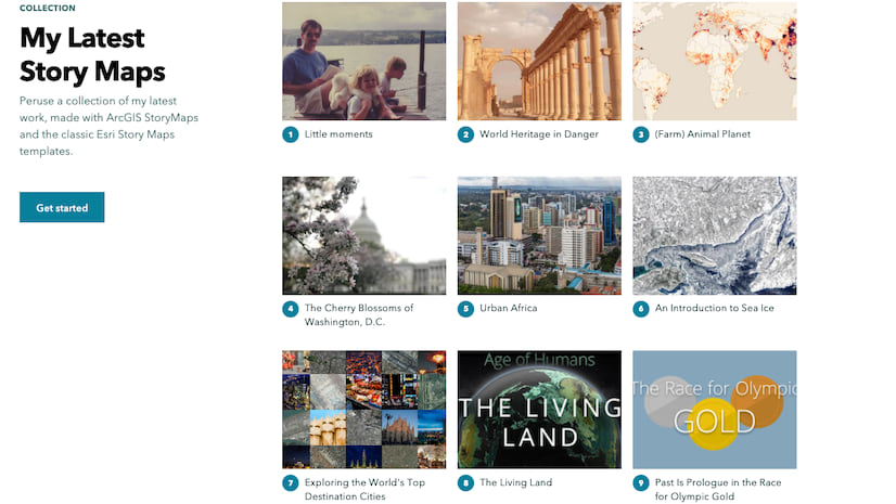
One of the most popular requests we’ve been getting for ArcGIS StoryMaps has been to bring back the beloved tabbed and bulleted layouts from the classic Story Map Series template. We hinted at this a few months ago, and today we’re pleased to unveil two new navigation options for collections that mimic these classic storytelling experiences.
Just open the design panel in the collection builder, select the navigation option you want, and preview your collection. The new tabbed and bulleted navigation options are available in addition to the previous compact option. Don’t forget to re-publish if you’re updating an existing collection.
You can easily add lots of different things to a collection: stories, all sorts of ArcGIS apps, PDFs, and images. Haven’t made a collection yet? Here’s an article with everything you need to know to get started.
More collections enhancements
You can now add a logo to a collection from the Design panel, and when you publish you’ll see a new mosaic thumbnail is automatically generated to make your collection look its best when you share it with the world on social media.
You’re now able to add up to 60 items to your collection (the previous limit was 30). So you can use a collection to bind together an entire year’s worth of weekly newsletters (like we’re doing with our Weekly Waypoint series), and large classes/workshops can use collections to assemble students’ projects.
Quick-start templates
Do you ever find yourself wanting to create a simple story that feels like a classic tour or journal? Well now you can! The new quick-start templates let you create a story with just a sidecar or just a guided tour already added to your story.
Embed a story
You’ve always been able to embed stories in your website or blog, but now it’s easy to grab some embed code for a story. If you’ve published your story publicly, you (and your readers) will see an option in the header menu to Embed this story. This will provide you with a code snippet that can be used to embed your story.
There are options to hide or show the header, and they work by adding URL parameters to your story link. The URL parameters work even if your story isn’t embedded, so if you want to remove the cover for a story that you are using for a presentation you can do that with these parameters.
Add attribution to media
You want to always give credit where credit is due when you use media items created by others in your story. Now, it’s easier to add information about image and video sources.
For inline media, the caption is available for adding source info. But when you place an image or video on your story cover or in a media panel of a guided tour, sidecar, or slideshow, you can now go to its properties and add attribution information. Select text you’ve added to the Attribution field to format it or include a link.
Guided tour
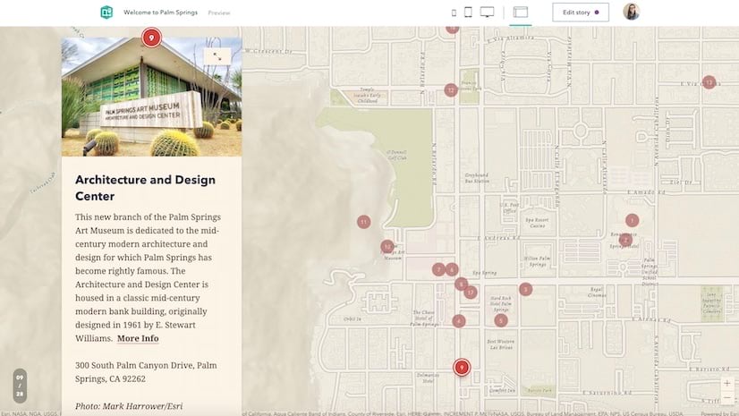
Many of you have requested the ability to use your own basemap in guided tour. Others have requested the ability to add additional layers to a tour to provide more context around your tour places. We figured it would be most efficient to just make both groups of people happy with one new feature.
You can now pick you own web map to use in a guided tour. This will bring in the basemap group (base and reference layers) as well as any other layers in the map. Scale dependent visibility will work as expected on the web map layers, but note that pop-ups are disabled to keep the tour experience clean for your readers.
This new way to configure the guided tour map also opens up the ability to select from the wide assortment of basemaps available in Living Atlas. Note: only web maps in the web mercator projection are supported at this time.
In other guided tour news, the media carousel has received an upgrade so your readers can more easily browse through images and videos when a place has multiple pieces of media attached to it.
If you haven’t made a guided tour, this article has what you need to get started building your own tours.
Transparent panel styles in sidecar
Since it was introduced back in April, we’ve seen a lot of stories that put sidecar’s floating panel layout to good use. Now, there are new styling options that remove the panel background and use light or dark text.
Just a word of caution: These options should not be used over busy backgrounds. They are best used with media that have large, consistently colored areas so your audience doesn’t have trouble reading your story. On small screens, the panel backgrounds are always shown, even when these new styles are active.
Need some ideas on how to best use sidecar? We’ve got you covered. Just skim this article.
Map designer enhancements
There have been a few upgrades to make the mapping experience in the story builder more helpful and more flexible. First, the map designer now reflects layer scale dependency. Layers that are not visible at the current scale are shown dimmed and in italic type face. A tooltip on the visibility icon is also shown to bring attention to this.
Also, you can now specify any color you like for your express map features or guided tour places. Just click the color chip next to the express map layer in the map designer—or in the guided tour map settings—and enter your own hex color code.
Also note that the Edit in ArcGIS button now opens your maps in Map Viewer Beta rather than the classic map viewer. This will help you take advantage of the latest ArcGIS web mapping features.
Swipe…with images
The new swipe block is still in beta (learn more about it in this article), but it’s now possible to create a swipe not only with maps, but also with images. Please try out this new beta feature and let us know what you think by dropping us a note on our GeoNet community.
To create a swipe with images, just add a swipe block and click Add an image. It’s pretty self-explanatory from there. For the best experience, use images of the same size or aspect ratio.
And much more…
- Color formatting is now possible for headings and subheadings
- Accessibility enhancements including improved keyboard navigation and screen reader support
- Added support for WAV audio files
- Background audio stability improvements
- Reduced issues when viewing stories with many embeds on iOS devices
Banner photo by Vernon Raineil Cenzon on Unsplash


Thanks for the new shiny ones – however it looks like the update has broken the “custom map scale” settings for the Guided Tour. Starting July 1st, the Guided Tour starts with the “whole world” map scale, even if a custom scale is set for the first slide. Subsequent slides still use the custom scale set for them, so looks like it’s the first slide issue only. Just double checked with https://storymaps.arcgis.com/stories/d6a1f5ebe5864a4c9fa997781bae7b44 and some more – could you guys please give it a glance? Thanks!
Thanks Owen Evans for the new capabilies in ArcGIS StoryMaps. I’d like to know if is it possible to insert the URL of my StoryMap (New Generation) in Experience Builder? I’ve tried embed the URL but the display says “It’s not possible”, anotherwise, I could embed the URL of my classic story map.