This post comes courtesy of cartographer Jonah Adkins, from Newport News, Virginia. Jonah is a GIS alchemist, routinely crafting beautiful and insightful work, and sharing his process.
…
Vector tiles in Azimuthal Equal Area?? NO WAY!
Way
I’ve been learning all the new patterns in ArcGIS Pro since it’s early beta days. Like many of you, I’ve been using ArcMap for years (since 8.0!) and was skeptical about making the switch to ArcGIS Pro. I can tell you now after about 2 years of use, it’s my go-to for cartographic creations. I’ve used Pro for several projects, putting it through the carto-wringer doing forced 3d perspective on a 2d page with the Rainfall Cubes map, and creating a Legend of Zelda inspired basemap called Breath of the World. For my latest project, I was going Back to School.
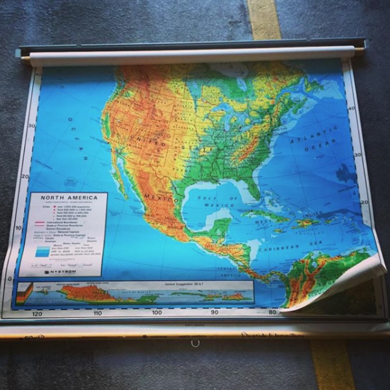
A few years ago, while I was at a state GIS conference, I used some free time to peruse the shops in Downtown Charlottesville, Virginia. I came across a vintage store and absolutely fell in love with an old Nystrom classroom pull down map hung up on the wall. I instantly purchased it, then I did what any normal cartographer would do – re make it!
Fast-forward to this past month. I was eager to generate some non-Mercator vector tiles using Pro. My Back to School pulldown map was the perfect inspiration to try this out on because of its Azimuthal Equal Area Projection of a North America-centric view, and of course its retro sweetness.
Resources
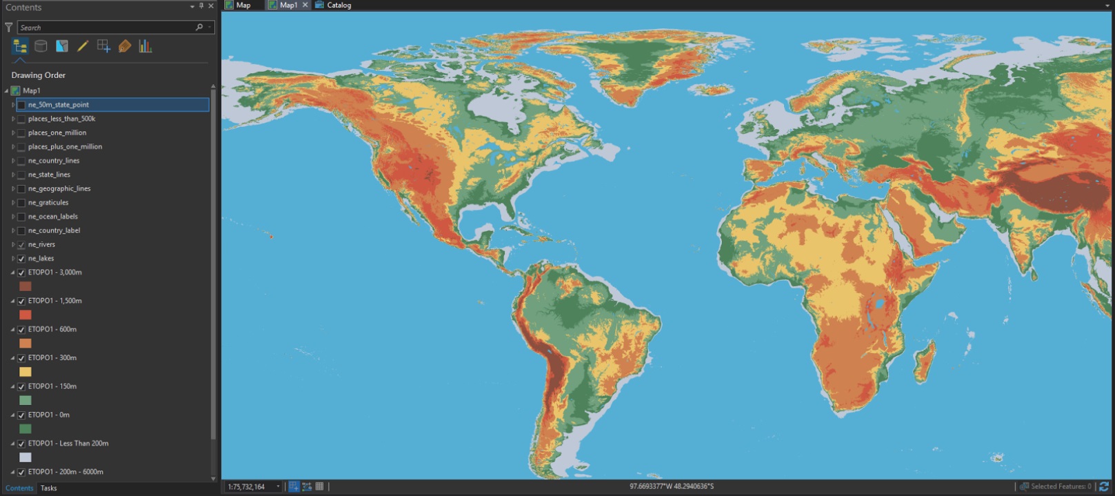
For my digital re-creation, I used two main datasets: Natural Earth data and a polygonized version of ETOPO 1 raster data.
Styling
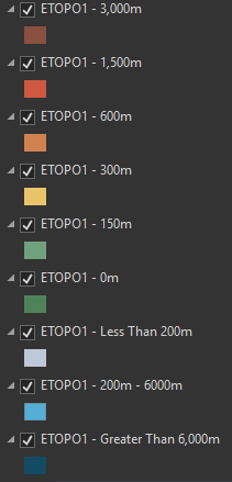
With ArcGIS Pro open, the data was added and styled using the pull down map as my style guide. I took a high-resolution picture that I brought into my Mac and used the color-dropper tool to help derive those beautiful color combinations of the original. Elevations were grouped according to the original map as well. Below are the hex values used:
#8C503C — Greater than 3,000m
#D25A3C — 1,500m
#D2824B — 600m
#ECC465 — 300m
#6EA07D — 150m
#4B825A — 0
#BEC8D7 — Less than 200m
#4BAFD7 — Less than 6,000m
#0A4B64 — Greater than 6,000m
With those settings and colors applied you can feel the dry gum under the desk and smell the chalk dust. It’s gorgeous…and we could just call it day there. But why?
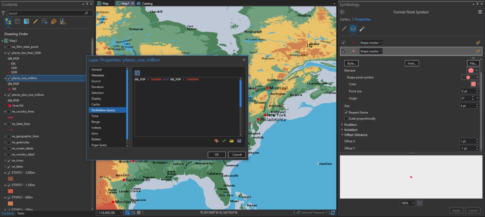
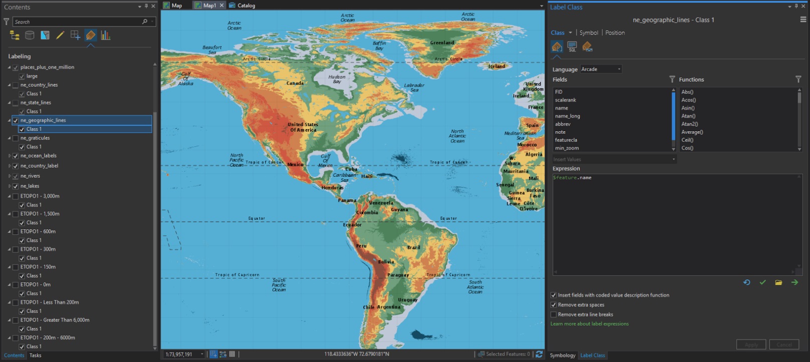
Some reference would be nice. The original map uses simple red symbols (circles, squares, and triangles) to denote population hierarchy with labels to the left or right of the symbol. The Natural Earth Populated Places (ne_50m_populated_places) layer contains points with population numbers attributed that we can use to replicate the map’s style. I added a pink (1, -1) offset shadow to make them pop just a bit in my version.
Along with some State and Country labels the map uses semi-transparent lines to show boundaries. These are default dashed lines with a thick background according to boundary type. I use a creamier red (#F03250) for these.
Probably one of my favorite features is the use of geographic lines and graticules – it’s a rare occasion to put the Tropic of Capricorn on a map these days. I used ne_50m_geographic_lines and ne_50m_graticules_10, both from the Natural Earth 50m Physical dataset.
Projection
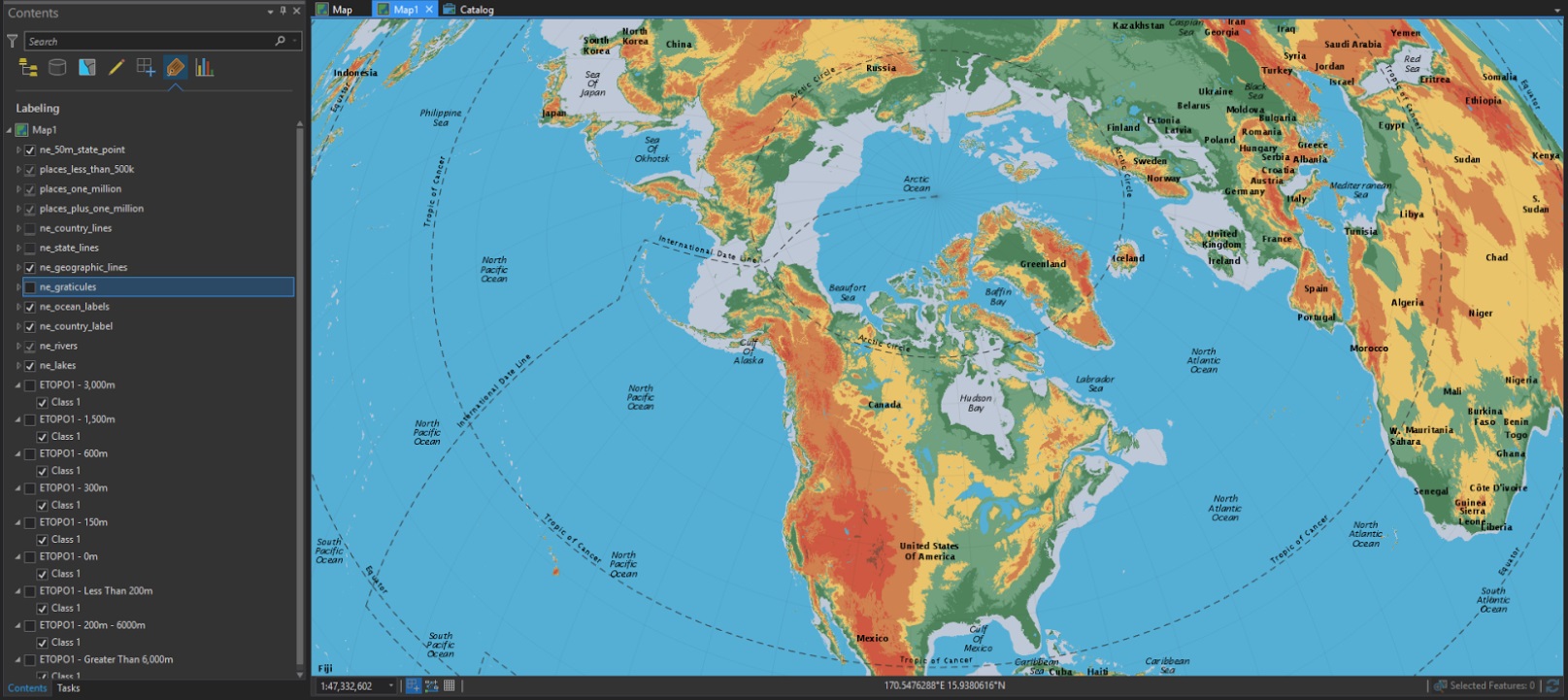
With the labeling properties buttoned up, we’re ready to get the full effect of this pull-down map style: changing the projection!
We’re going to edit the projection properties just a bit, to center the projection over North America. In the map properties, coordinate system, and select North Pole Lambert Azimuthal Equal Area: 102017, then right click the projection and choose “copy and modify”. More on this sort of thing here. All that’s changed here is the Central Meridian (-96) and Latitude of Origin (40).
It’s too gorgeous to keep to ourselves; we want to share this with the world…
Tile Index
We could make some raster tiles, but why do that when vector tiles can snap into existence on demand, on the client-side? So let’s bake some vector tiles!
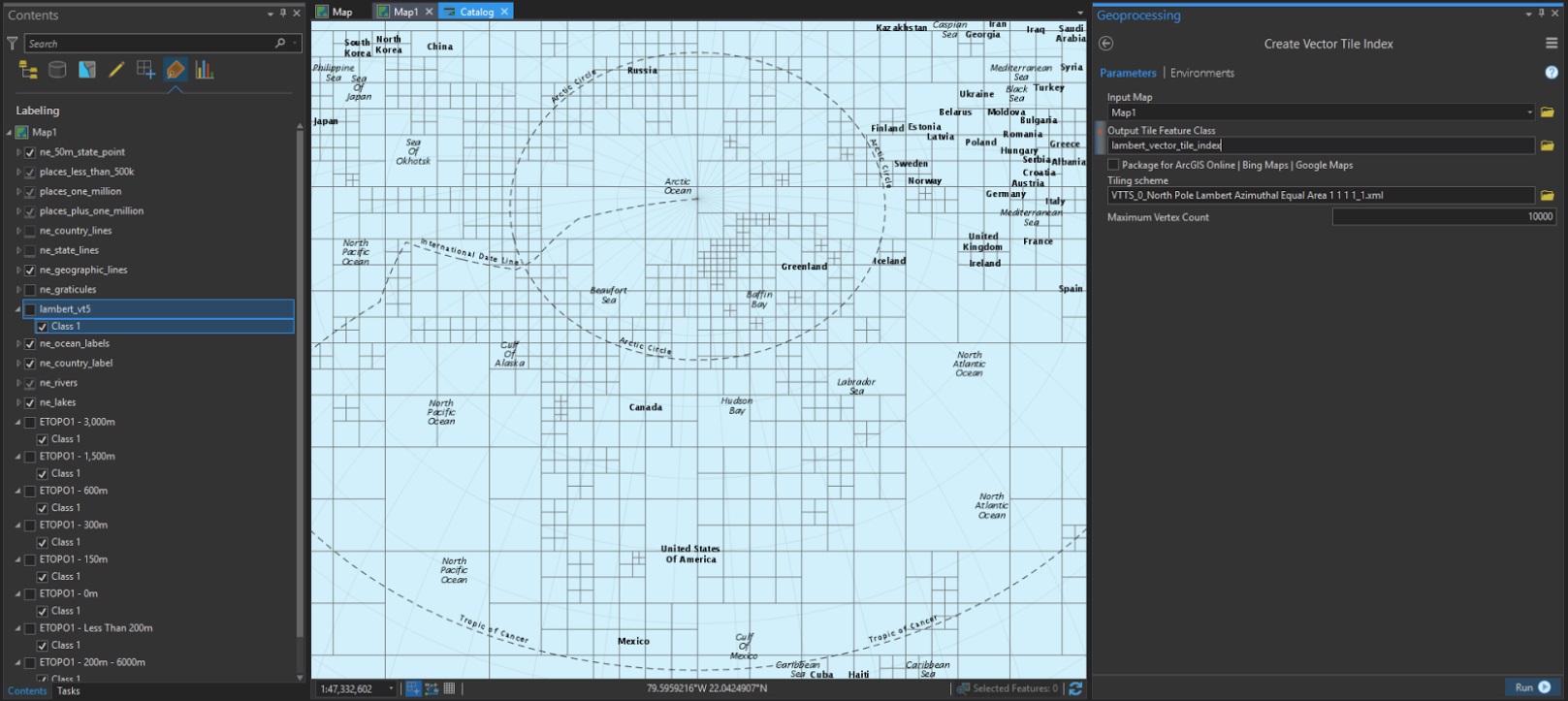
First, we need to create a vector tile index—this will look at our data, and chop it up appropriately for each zoom (Geoprocessing > Create Vector Tile Index) so tiles are created efficiently and quickly. The mesh actually looks pretty cool.
The important thing to note here is to un-check the “Package for ArcGIS Online”. This will ensure we create tiles in our lovely custom azimuthal coordinate system, rather than in typical web Mercator.
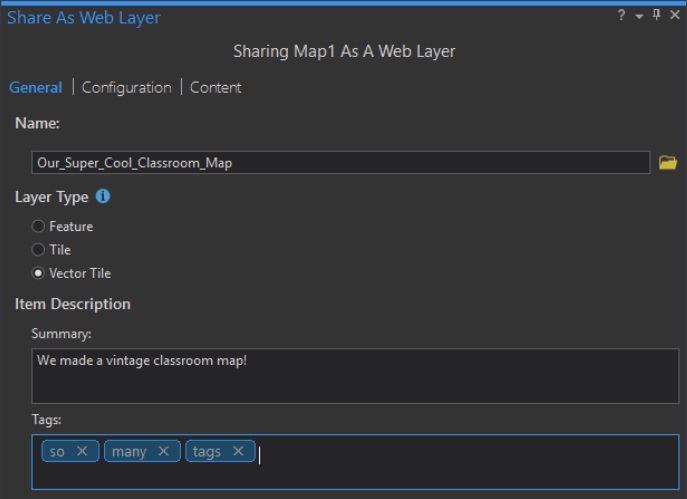
And that’s it—we’re ready to share it (Share > Publish Web Layer). Fill out the Name, Summary, and tags, and be sure to check “Vector Tiles” because we are baking tiles and a baker’s gonna bake 🙂
Tile Baking
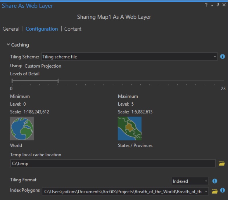
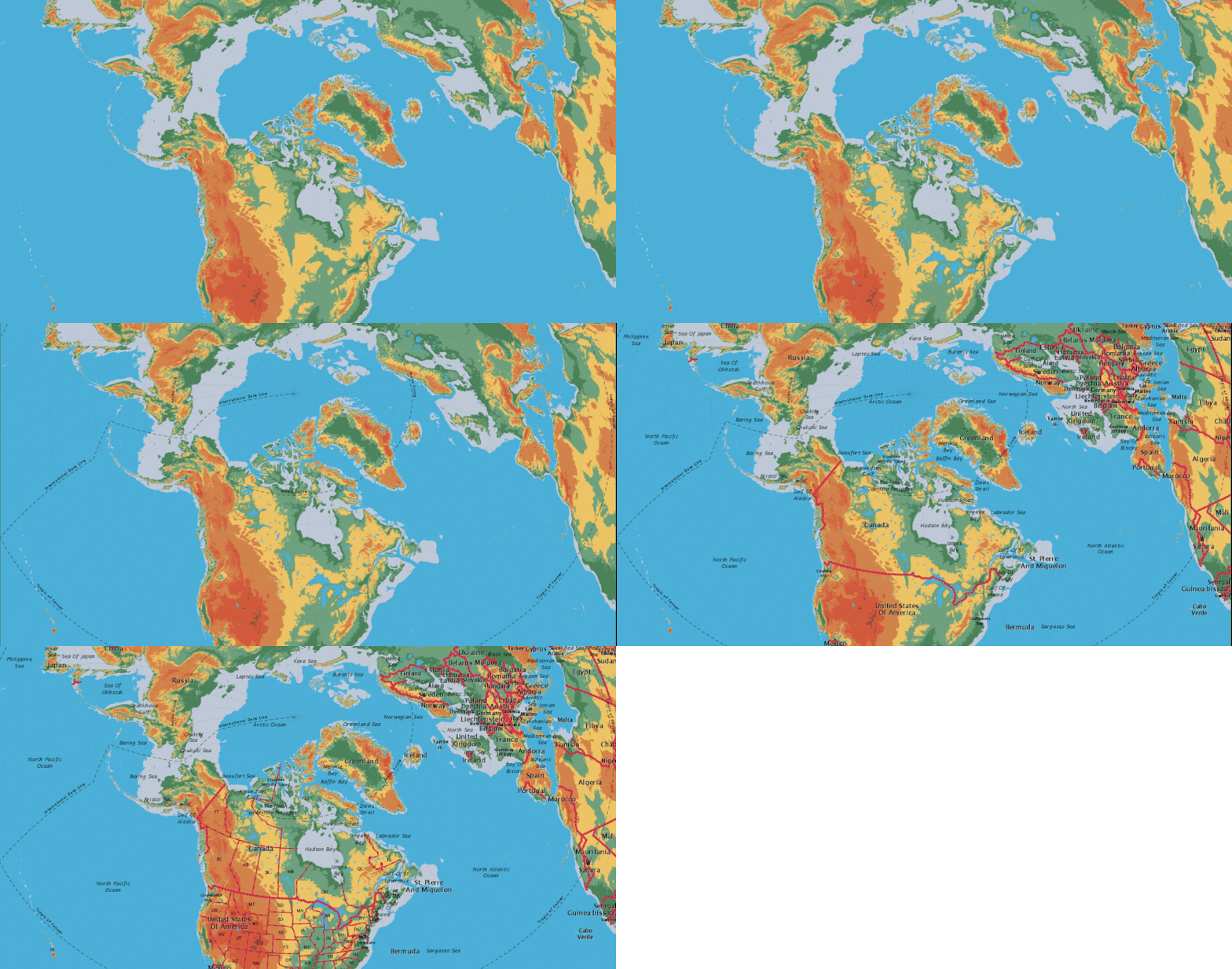
Next, switch to the configuration tab. We want to use the tiling scheme that we generated with the tile index polygons. I’d saved mine locally, so I just pointed the dialog to it. Then adjust the levels of detail to tell it how deeply this tile bake-off digs. I only styled down to zoom level 6, but you can go as low as your styling allows, just be mindful of your output vector tile package size. Vectors are much more efficient than raster tiles, but things can still get big in a hurry. Select the tile index polygons we just created, to inform the tile chopping.
The last step is to analyze the map; as long as we are error free (we are :>) we can publish to ArcGIS Online.
Optional Post-Production
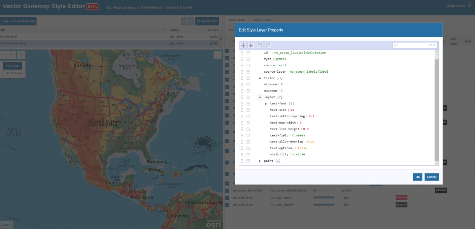
You may want to adjust the label properties of your vector tiles in ArcGIS Online in what I call “Post-Production”. At times there can be wrinkles with advanced label settings. You can easily fix this by creating a copy of your published vector tile style – there’s a great how-to by Deane Kensok on this exact topic. Then you can use a vector tile style editor like Vector Basemap Style Editor to edit your tiles.
To adjust label text-wrapping, select your layer in the right panel of the Vector Basemap Style Editor’s layout section and add the two following properties:
-
text-max-width: 5
-
text-line-height: 0.9
You may want to play with those settings a bit, depending on your font sizes. Refer to the full vector tile style specification for further information—specifically for any symbol or text setting.
And now we’re really done! I had a lot of fun recreating this nostalgic style—and that was the only reason: FOR FUN!!!!!!!!!!
Check out Back 2 School in all its equal area glory here.
Jonah Adkins
@jonahadkins

Commenting is not enabled for this article.