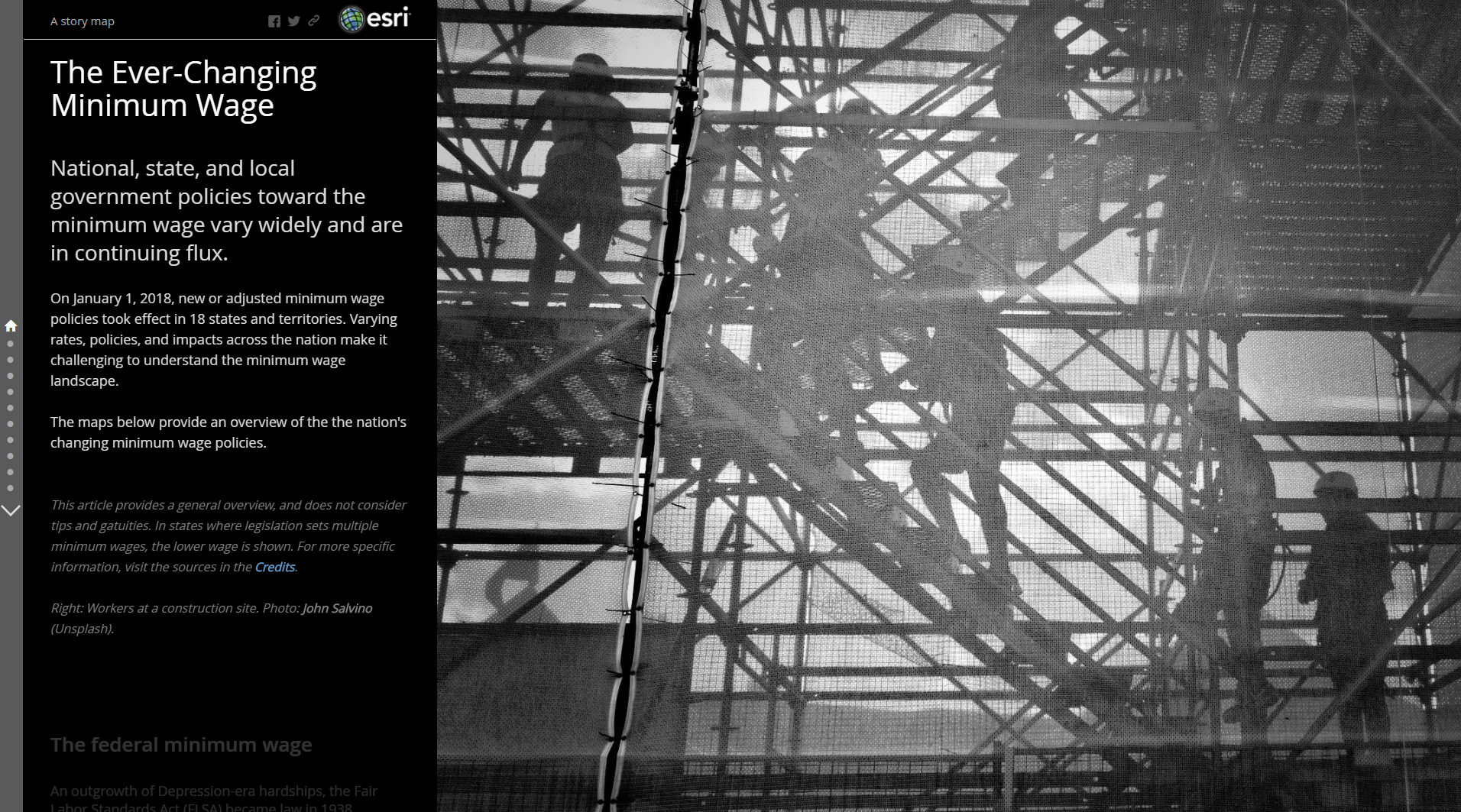
Policy talk around minimum wages has been cropping up in recent years, particularly at the state and local levels. With 18 states updating their minimum wage policies on January 1st, we decided to dig into the issue and create an explanatory Story Map Journal The Ever-Changing Minimum Wage.
This Map Journal is pretty short and sweet. It’s a good example of a data-driven subject in which the story is primarily explanatory, and leads the reader from the big picture down to the fine details. We provide enough context for casual readers to grasp the subject but encourage the more ambitious ones to explore the data interactively. This is an instance where less is more: If the story were overly long it would quickly become boring.
Look and Feel
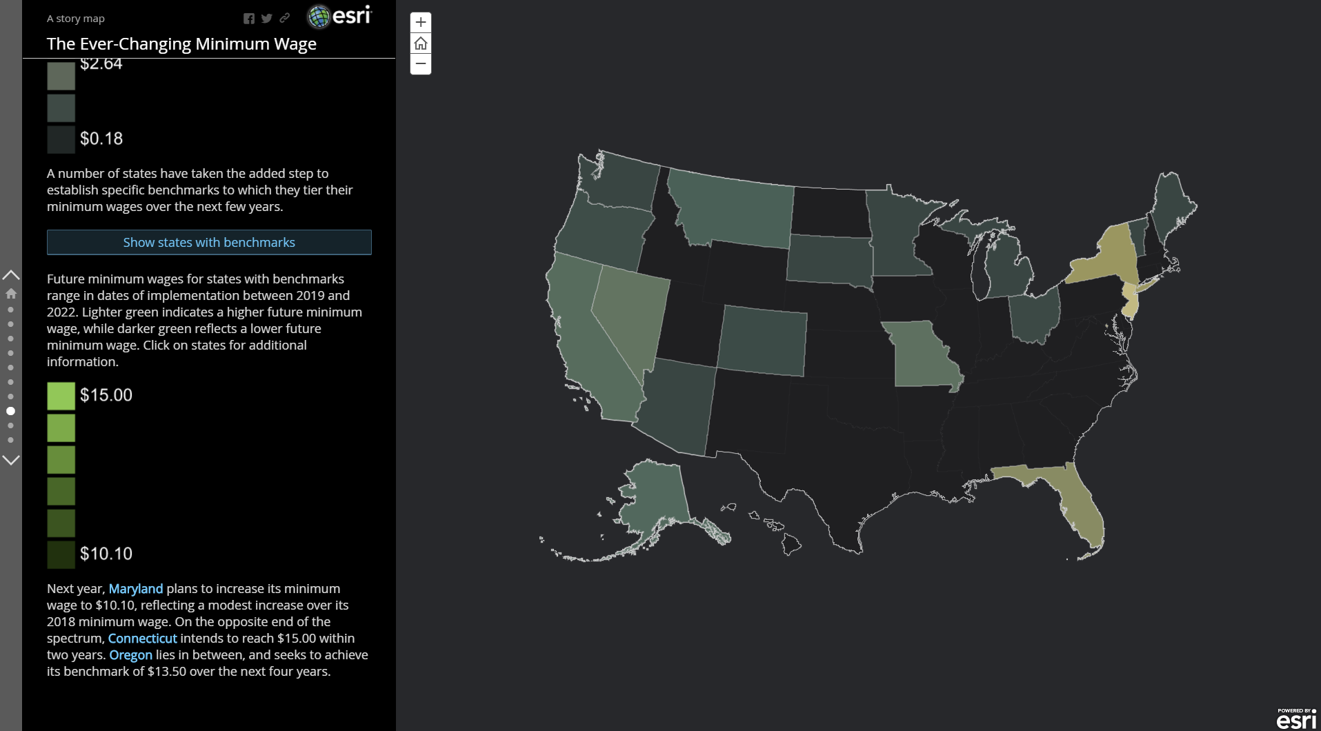
Making the data pop is essential for a data-driven story. Map Journal’s dark theme paired with a dark basemap amounts to a visual style that reinforces the contrast between colors while allowing the data to really stand out.
As much as possible, the predominantly blue and green palette (with some reds and yellows) and dark theme of the maps extend into the text to create a unified visual experience. This is particularly true in the case of custom story action buttons. Custom credits that glow on hover also mimic this style.
Moreover, since this is a national dataset, we took the opportunity to experiment with David Asbury’s composite geographies, a projected basemap of the United States featuring inset maps of Alaska and Hawaii. This enabled us to set a focused map extent, while not demanding that our readers pan and zoom all over the place.
Explaining the Data
With laws varying through time, among states, and between different segments of the economy, minimum wages can get pretty confusing. With this in mind, we intentionally focused on the overarching trends: minimum wages historically, state minimum wages today, the relation of minimum wages to costs of living, minimum wage policies, and local minimum wages.
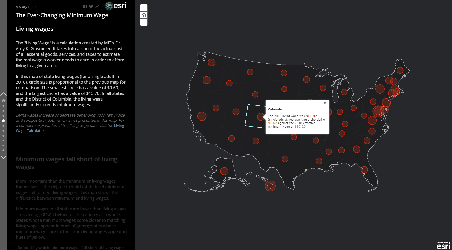
We purposefully left out some of the smallest details of minimum wages so as to limit the length of the story and not overburden our readers. As an alternative, we configured popups to show essential data and enable interested readers to find more specific information. Importantly, we acknowledged where we have abridged certain points, and supplied inline links for readers to get the full story from authoritative sources such as the Department of Labor or MIT.
The text narrative, meanwhile, directly supports the maps and describes what the reader is seeing. Here we define the symbology and called out a few illustrative cases. Story actions allow readers to view additional data on the same map and encourage interaction. But information in the side panel overall remains brief: We had to balance the desire to describe against the risk of distracting the reader from the very data needing explanation.
Additional Resources
Don’t forget to check out The Ever-Changing Minimum Wage Map Journal
Get the minimum wage data used in this story
Learn how to use the composite geographies basemap (coming soon)
Learn how to customize story action buttons
If you have popups, don’t forget to configure them! And while you’re at it, review 13 ways to make your story maps sing


Commenting is not enabled for this article.