Everything is awesome!
I, as well as you, grew up playing with Lego. And there is no reason that ever has to stop. And just because we make maps, that doesn’t mean some of those maps can’t look like they were assembled out of tiny plastic bricks! Exhibit A:
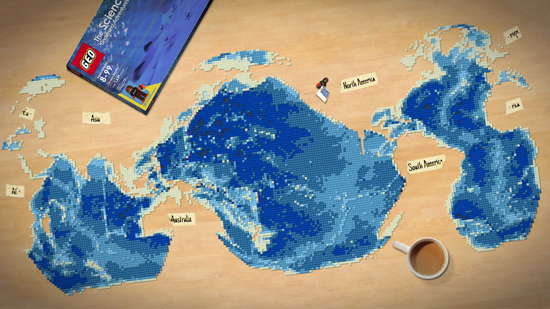
But I made this Lego-looking map via a manual process of tessellation, etc. I was not clever enough to make a dynamic style that would just Lego-up my maps for me. But then I stumbled into using marker symbols to make Larry King Live sorts of dotted background map sorts of things that graphic designers like. And the gears started turning.
Of course I don’t need to convince you of the charm, educational utility, considered minimalism, and pure joy that Lego brings to the world. So why would I need to convince you that making maps in a Lego aesthetic is worth your while?
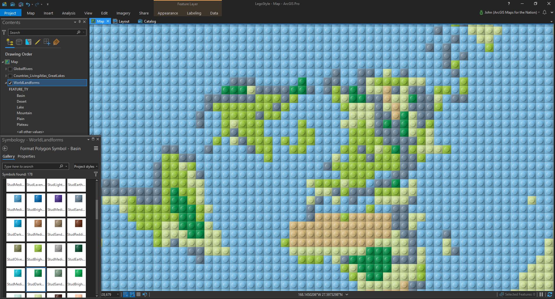
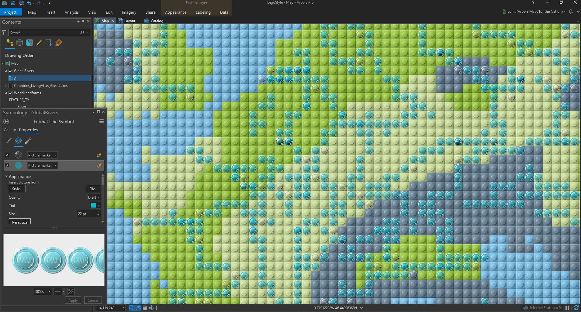
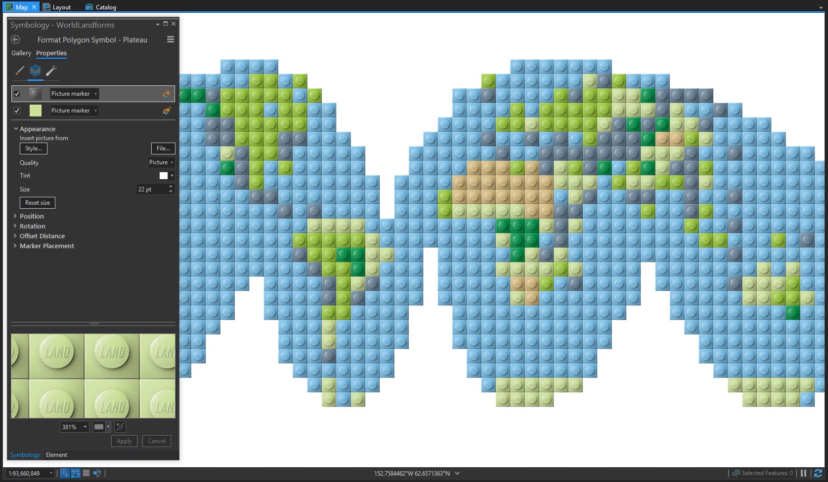
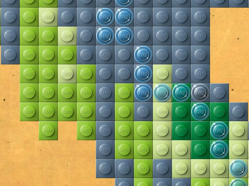
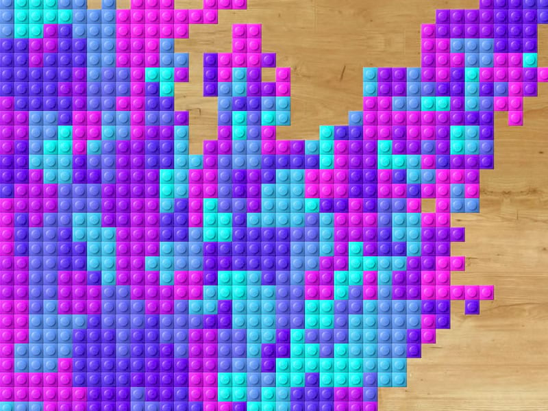
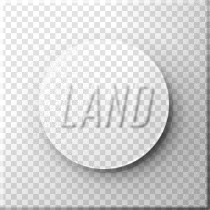
The technique is based mainly on these two sneaky texture overlays I made. They sit atop a dynamically colorable background element so you can use the symbology panel to apply any and all sorts of colors and color ranges to your bricks.

And since you need a nice solid surface to do your building on, I’ve also included some background textures that you can apply to your Layout background, or to this Global Background layer. You can build on a wood table top, Formica, a table cloth, or craft paper, or choose the classic bright green base plate. There is no wrong choice.
Happy assembling! John Nelson
P.S. You are not morally obligated to share images of the cool bricky maps you make with this style, but shoot I sure would love to see them!

Commenting is not enabled for this article.