For some time I’ve been drooling over those 1850s “principle rivers/lakes/mountains/whatevers” comparative diagrams (you know, these things), and wondering how I might be able to make something like that. Then recently I saw this tweet which eventually led me to this article which led me to this data. Pow, this was my chance!
Here is the resulting map, created in ArcGIS Pro, which shows the three rivers that contribute the most plastic waste into the oceans.
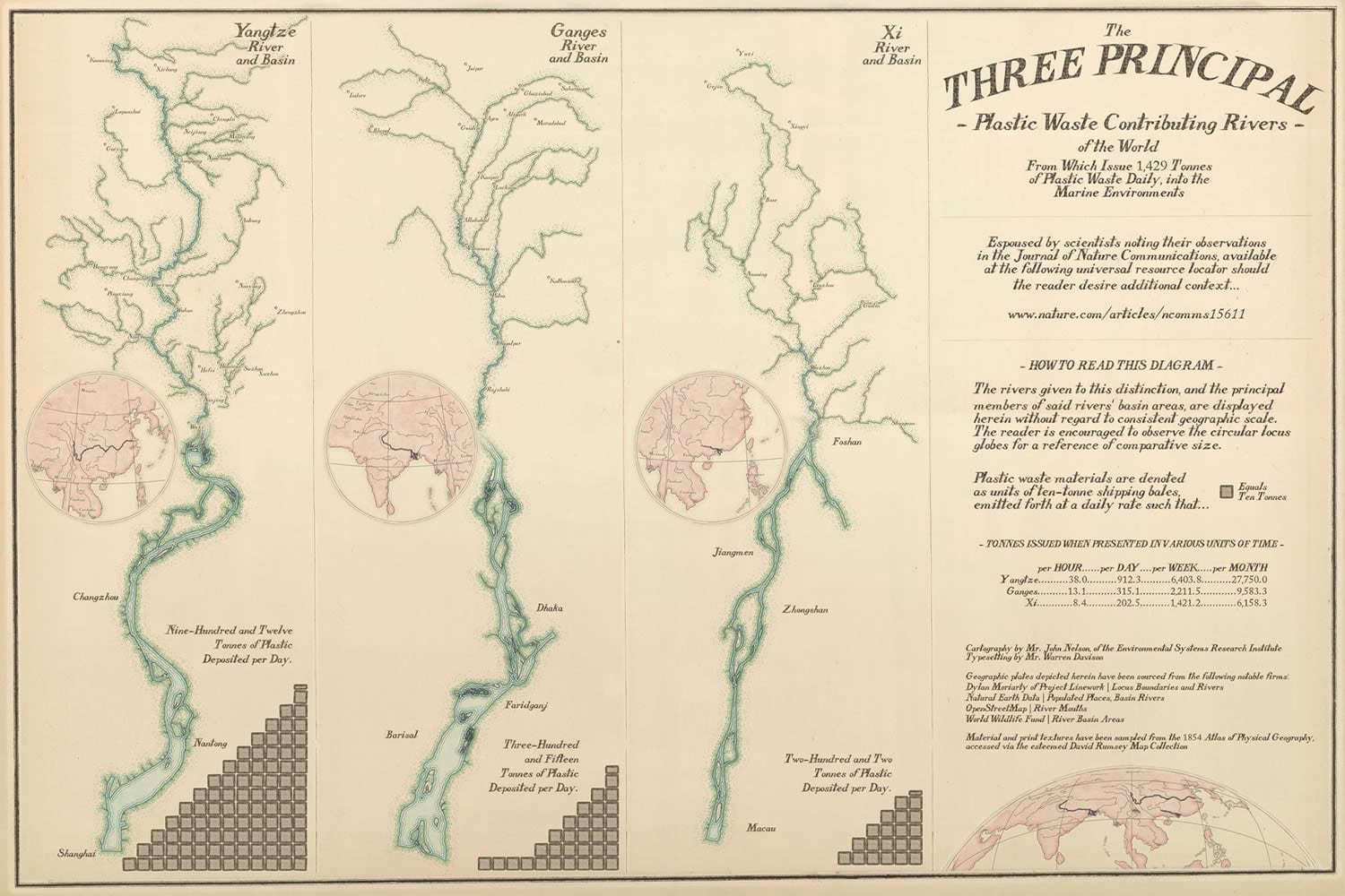
It shows, diagrammatically, the three rivers, their primary tributaries, inset locus maps, and graphical representations of the amount of plastic dumped per day.
Wait, what? ArcGIS Pro? Yes. Here’s how…
Layout Assembly
I was most inspired by this diagram from an 1854 Atlas of Physical Geography, available for your virtual perusal at the outstanding David Rumsey Map Collection. Inspired by, and sampled from! I actually screen-captured a couple of the paper and ink textures for use as map and symbology elements.
Here is an ArcGIS Pro layout with a big blank sheet of vintage Atlas paper (I Photoshopped away all the content so it could serve as a backdrop) inserted into the layout as an image. You can download this image, and other handy textures from the map, here.
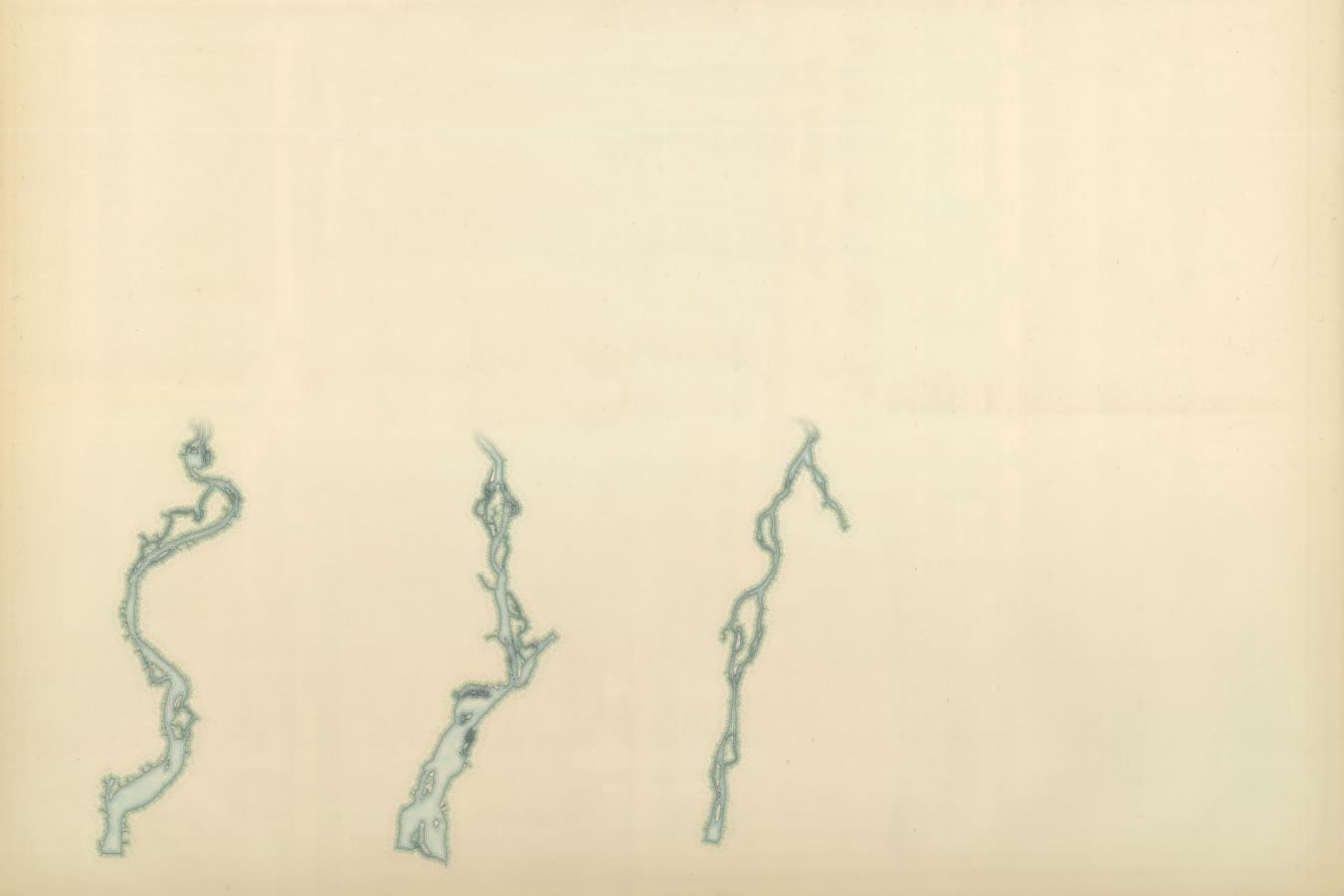
Then I added three map views showing a reasonably zoomed-in look at each of the three river banks near its terminus.
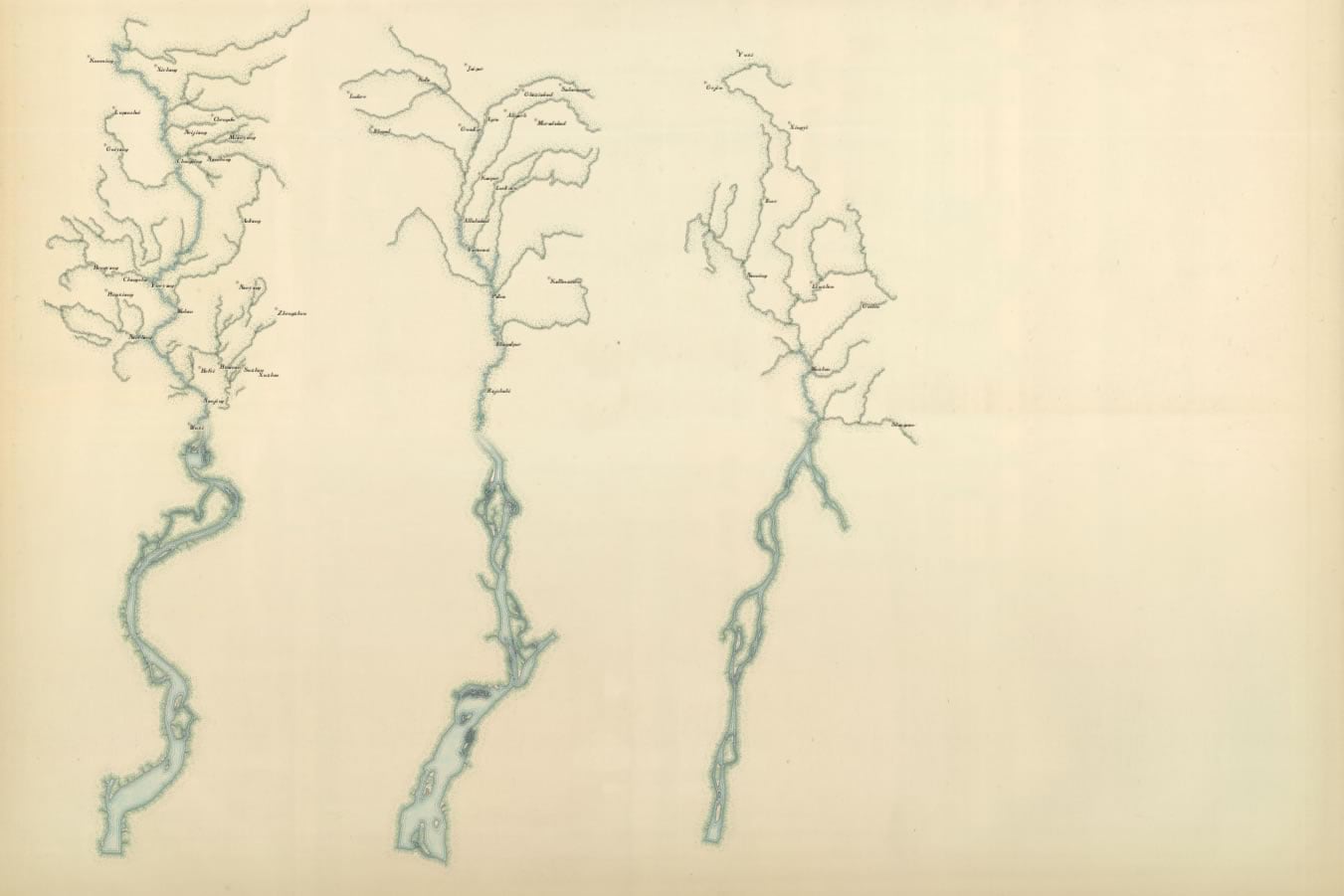
Next I added three more map views, this time showing the basin area of each river with the primary tributaries and large cities situated among them.
To provide some geographic context to these rivers and basins which are relatively stripped of their true scale and orientation, I added in some inset locator maps as circular map views.
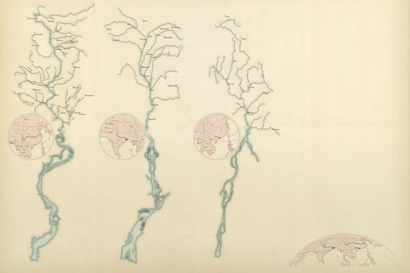
I then added in graphical indicators of pollution quantity, a title, some period-style prose for fun (why was everything so wordy then?), and sources.
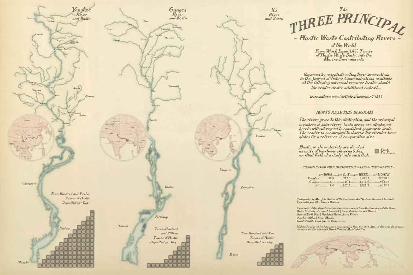
Lastly, the neatlines and divider graphics were added. If you are familiar with my maps, and opinions about maps, then you probably know that I am not a fan of the neatline. But, in this case I think it helps the map conform to the aesthetic of the day. These graphics are available here in this set of map textures I scraped, if you didn’t download it earlier in the post.
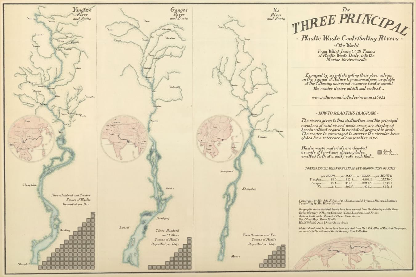
So that’s how the layout assembly went. Ten maps (three river mouths, three basin tributaries, three locator maps, and one overview map), some graphics, and a ton of text. Next I’ll show you about how these component maps were constructed.
River Mouths
The detailed riverbank maps are just dressed up OpenStreetMap layers. I downloaded the “waterway” shapes from https://overpass-turbo.eu/. It’s a pretty great resource. If you’ve ever played much with OpenStreetMap data before, it’s a pretty wasteful exercise in downloading mountains of data, filtering for the bit you need, then tossing the rest out. But with overpass turbo you can just zoom to an area, search by tag for the type of feature you’re interested in, then download it. Mega handy.
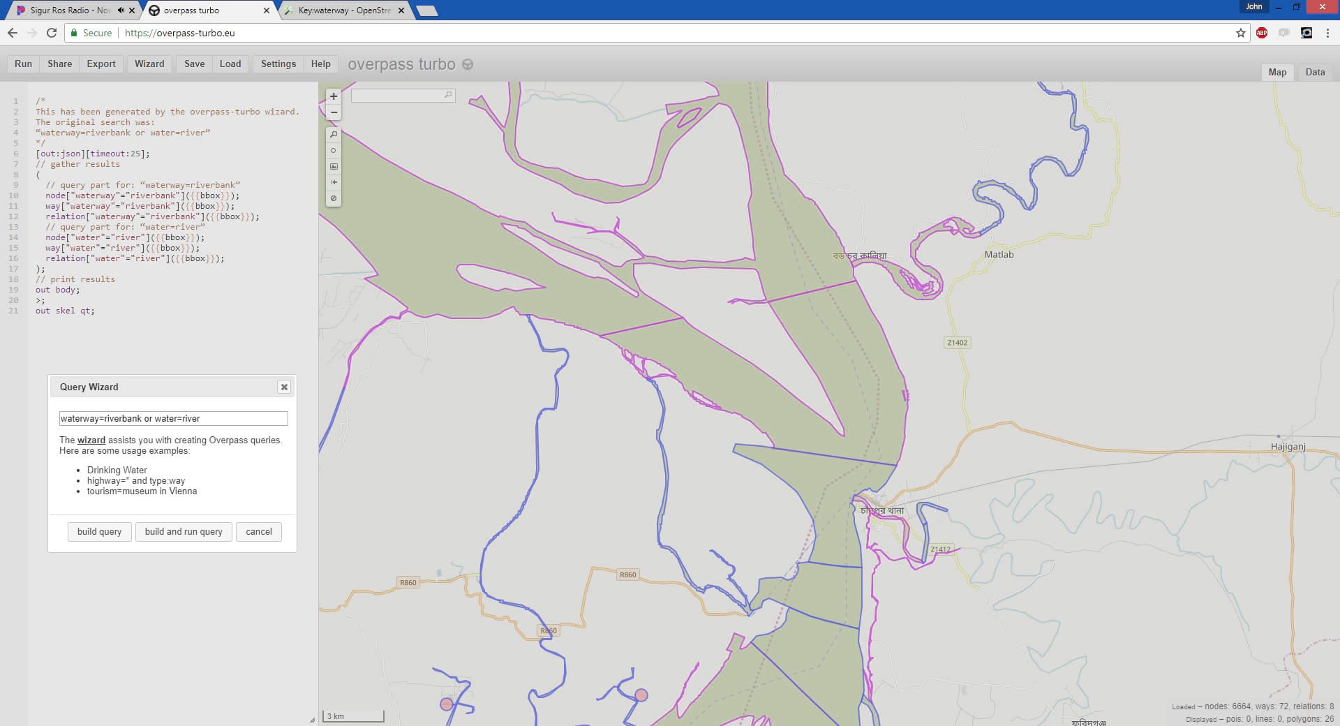
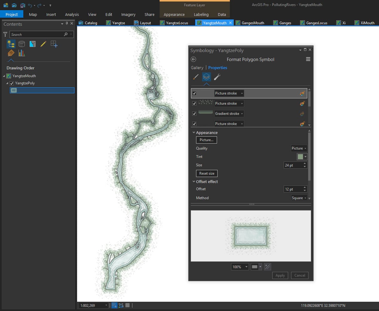
Then I applied a nice stack of picture fills and picture strokes to get the river looking all vintage-print-like. Say, would you like to steal this symbology, and all the symbologies used in this map? Then download this handy style file!
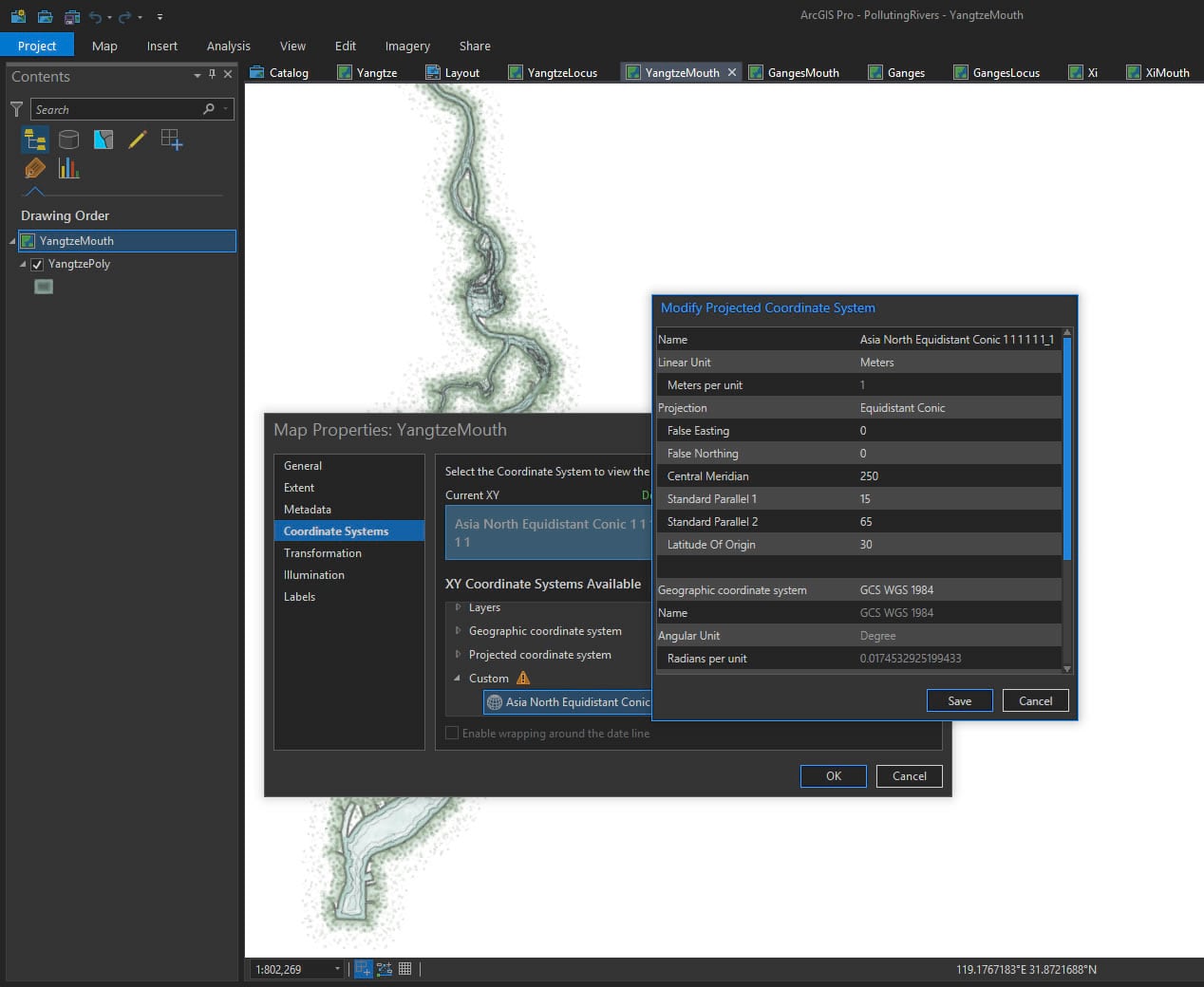
Because I was making a diagram of three rivers all neatly lined up next to each other, their E/W direction posed a bit of a layout challenge. No worries, I just monkeyed with the conic projection’s center longitude until the river stood at attention.
River Basins
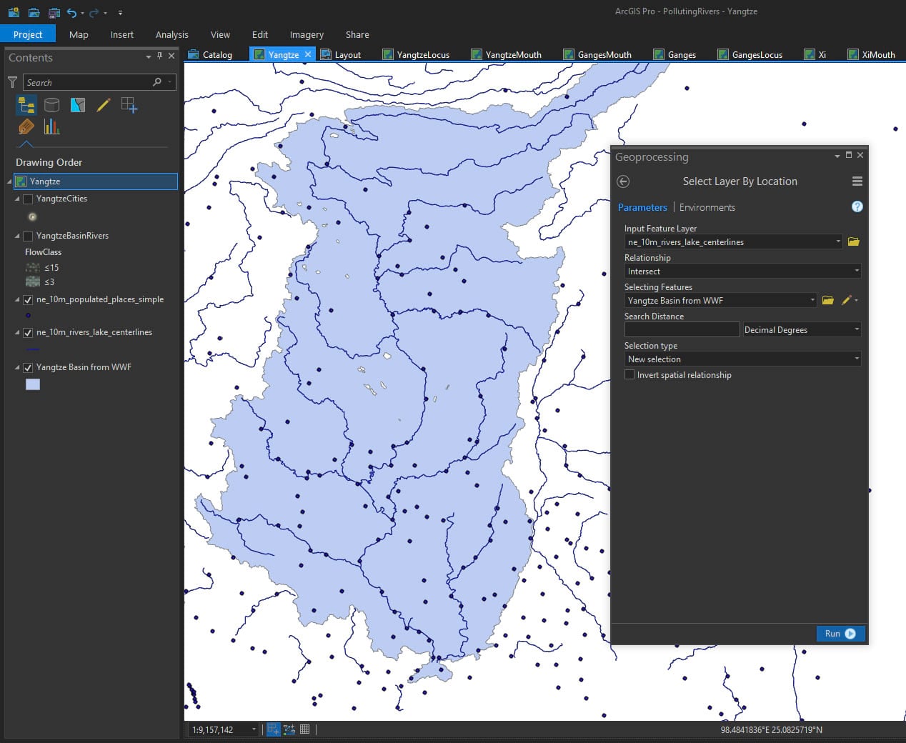
The next set of maps in the layout show the river tributaries, at a much broader scale. I found an exquisite set of global river basins created by the World Wildlife Fund (a mega-huge download of like a half gig or something). I used these basin areas to do a spatial query on rivers and cities from the insanely handy Natural Earth river data, capturing the rivers and cities that feed into the main river system cited in the article.
I did the same projection modification trick as I did with the river mouth map, so it stood up/down rather than sideways. Then I applied some river line symbology (again, feel free to steel this style for your own crafty cartographic adventures) to get these rivers looking suitably mid-19th Century.
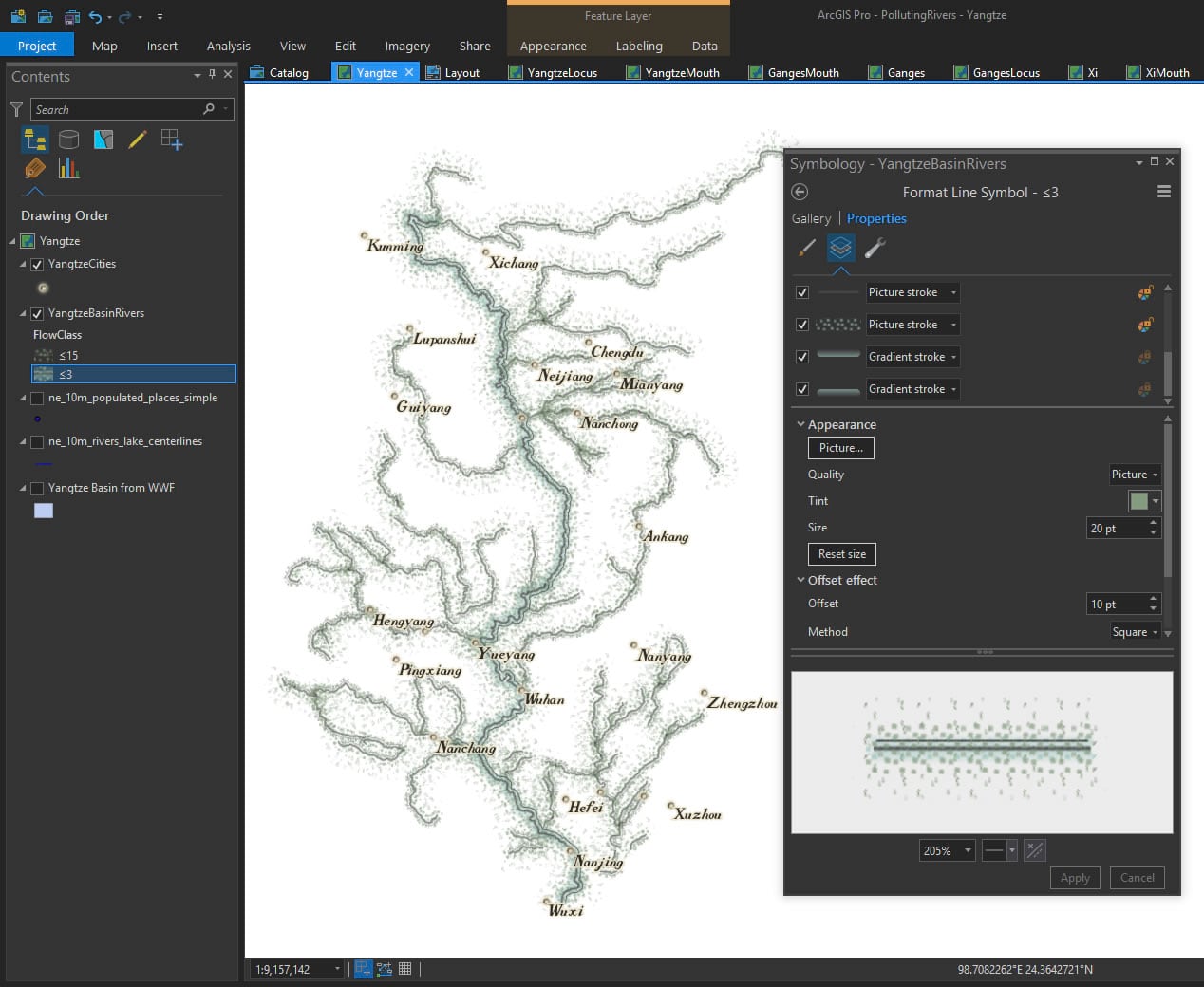
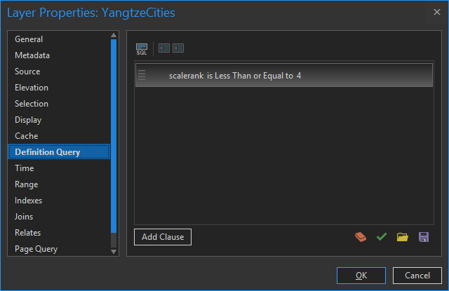
If the suspiciously keen-eyed among your are wondering where some of the cities went, it’s because I used a Definition Query to show only the larger cities. This is a super handy tool and I use it all the time.
Locator Maps
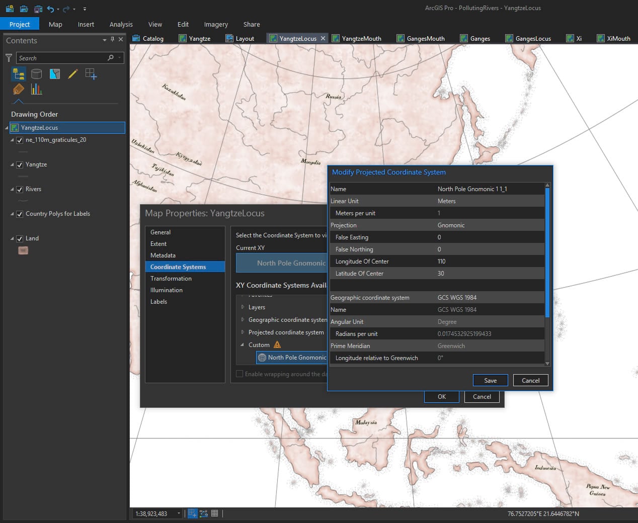
There are three small locator maps and one larger overview map in the layout. The three locator maps were given a gnomonic projection, centered over the river in question, because that seemed to look like how they rolled them back in the day.
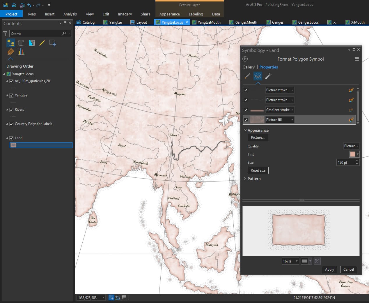
And I gave the geography (coasts drawn by Dylan Moriarty, and available at Project Linework) that trusty old pink tint that they seemed to love so much back in the 1850s. Also available in this style (seriously, just download it already).
Text
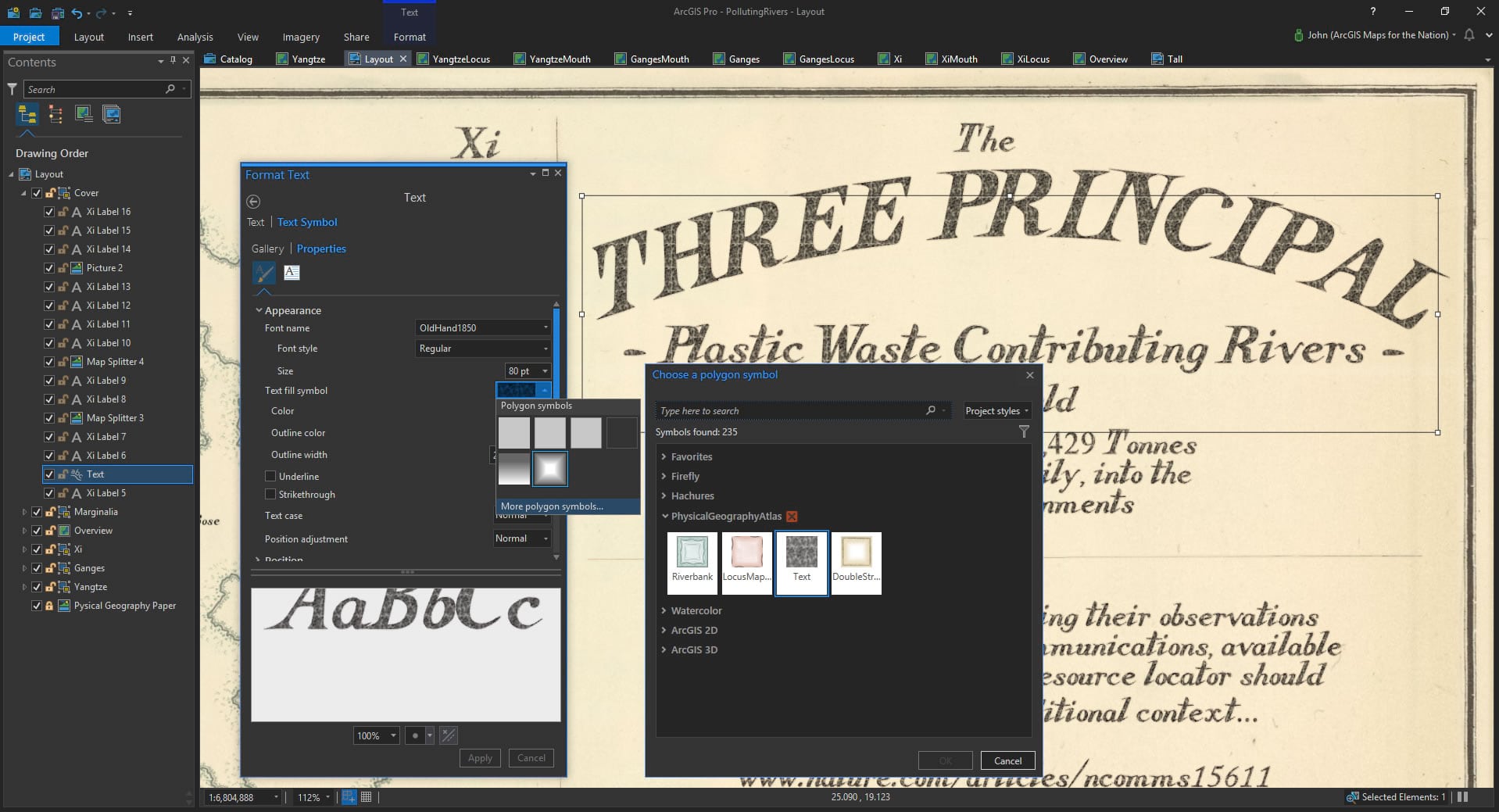
Stop the presses (wink)!! Did you know that you can apply polygon symbology from styles to FONTS? This blows my mind and I wish I’d known about it sooner. Often when I’m making a map that is intended to look real, the perfectly crisp fonts break the illusion of materiality. But not any more! Here is a fantastic font (hand-forged by Warren Davison) with a textured fill and dappled edges. Just like an old inky copper plate print! I’ve added a special Text symbol to the style file (so help me someone is going to download this thing), so you can check it our for yourself.
Why This Look?
I think we can become inoculated to important issues by the constant typical visualizations that they manifest as. A basic grid? That’s cool but doesn’t grab the massive proportion of your brain that is devoted to vision cognition. A single map with rivers shown in a standard projection? Sure, but when you are talking only three rivers, and rivers with a wide range in size, you are looking at a perhaps-forgettable map that has either too much detail or not enough detail.
When my 11yo daughter saw this map on my monitor she said, “oh that’s cool, what’s it about?” This is perhaps the most noble purpose a map can serve. Causing another person engage with a phenomenon. When she asked what the stacks of boxes were I told her that each one represents about the same weight in plastic garbage as five cars, and the whole stack of boxes flows into the oceans each day from just these three rivers. She absorbed it for a moment then her eyes widened and she responded, “wait, each DAY?”
Maps can be conventional looking or weird looking. But the good ones engage and communicate to an audience that might otherwise shrug off a bit of information otherwise presented. Did this map need to look like an 1854 diagram? No. Can maps created with some eccentricity and careful craft reach a new audience with a serious message. Sure!
Happy Throwback Mapping! John


Commenting is not enabled for this article.