Introduction
Finally, we’ve made it to the step of creating the gentrification index score for each census tract in New York City. This score is essentially one number that represents the amount or degree of gentrification that has occurred between 2000 and 2020 in a census tract, and is based on a combination of the five gentrification change indicators that we just prepared.
There are dozens of methods available for creating indices. In the original research paper that this blog is based on, the authors chose to use Principal Components Analysis (PCA) as their method to create the index. In the following section, we will replicate this step. In a later blog in the series, we’ll experiment with some alternative composite index creation methods and compare the different results to PCA.
One thing to keep in mind when creating indices is that the process itself is subjective, and it’s up to you as the analyst/researcher to have a good understanding of the decisions made to develop the index, as well as the consequences of each decision. Check out this Esri technical paper for a more detailed list of best practices for creating composite indices in ArcGIS.
Creating the gentrification index using Principal Components Analysis (PCA)
Broadly speaking, PCA is a technique used to reduce highly dimensional datasets into smaller, uncorrelated dimensions, while attempting to maintain as much of the variation (e.g. information) in the original data as possible. In ArcGIS Pro, we performed PCA using the Dimension Reduction tool.
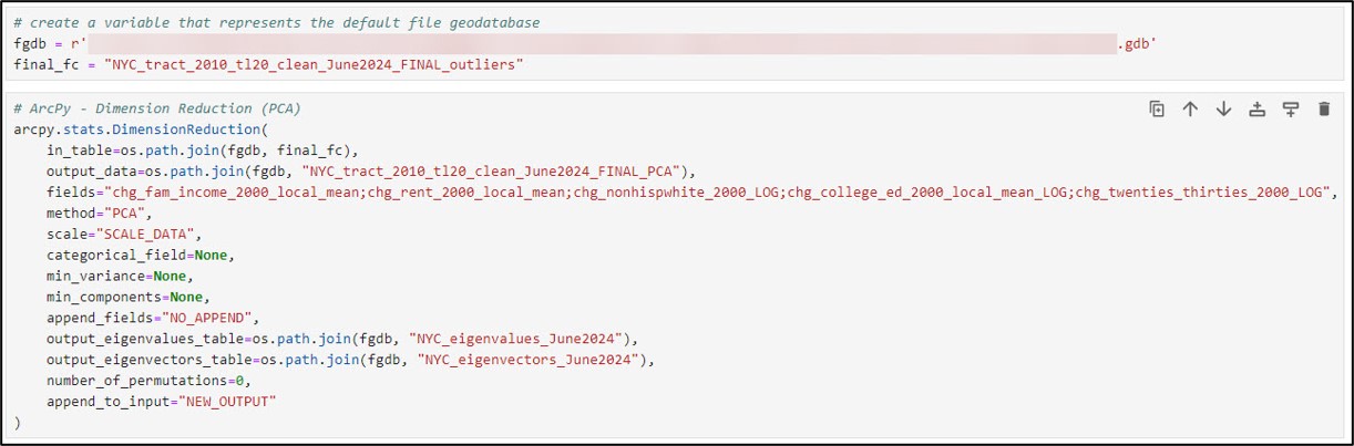
We’ll specify our input and output datasets and choose our five gentrification change indicators for the fields parameter. The scale parameter gives you the option to transform all the input variables to the same scale such that they each contribute equally to the principal components. This was an important step that the authors also took to ensure that one variable (relative change in socio-demographic composition, e.g. change in non-Hispanic white population) did not dominate the contribution to the index score.
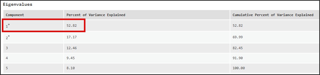
When we look at the PCA results in the notebook, we can see that the first principal component accounted for roughly 53% of the variation in the original five gentrification change indicators.
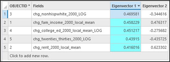
Additionally, the output eigenvectors table showed that each of the five gentrification change indicators had similar loadings (e.g. weights), which also suggests that they contributed equally to the results and that no one indicator was over-represented in the first, or primary component.
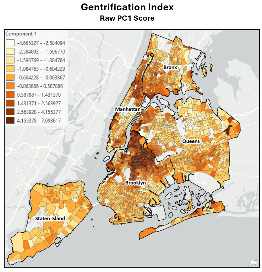
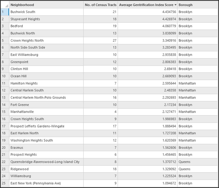
Now we can map the values of the first principal component, which is the final gentrification index score for each census tract.
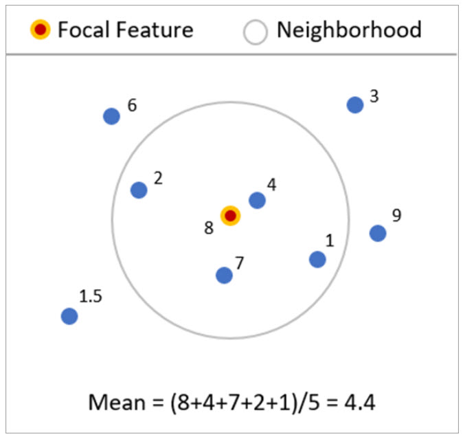
We then performed one more step, using the Neighborhood Summary Statistics tool to spatially smooth the raw PCA values. This tool can be used to calculate local or geographically weighted summary statistics around features based on the values of neighboring features. These statistics can be useful for smoothing values in noisy data, or understanding local variability in data values.
The graphic below shows a simple example. The focal feature in the center of this circle has a value of 8. However, when we calculate its local mean based on its four surrounding neighbors, the center point now has a value of 4.4.
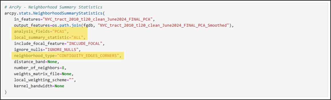
When running the Neighborhood Summary Statistics tool, here are a few of the important parameters:
- analysis_field – “PCA1”, representing the first principal component
- local_summary_statistics – “ALL”, which includes local versions of the mean, median, standard deviation, etc.
- neighborhood_type – “CONTIGUITY_EDGES_CORNERS”. This option will calculate local summary statistics based on polygon features that share an edge or corner with the focal feature.
You can read more about how Neighborhood Summary Statistics works, including all of the parameter options and calculations of the local and geographically weighted statistics.
The map below displays the local mean of the first principal component, which represents a spatially smoothed version of the final gentrification index score of each census tract.
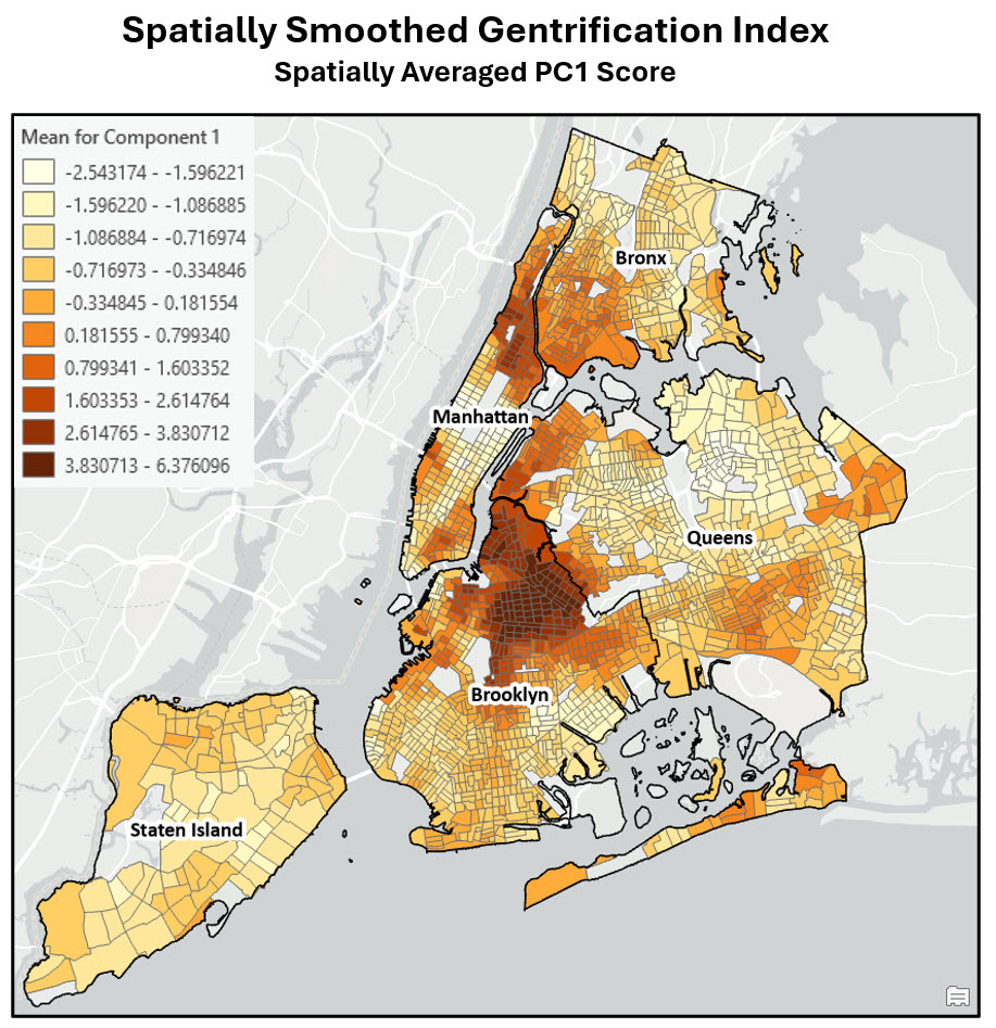
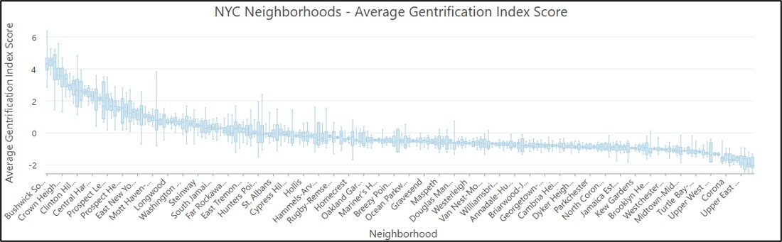
The map below shows the spatially smoothed gentrification index scores for New York City, along with the neighborhood boundaries.
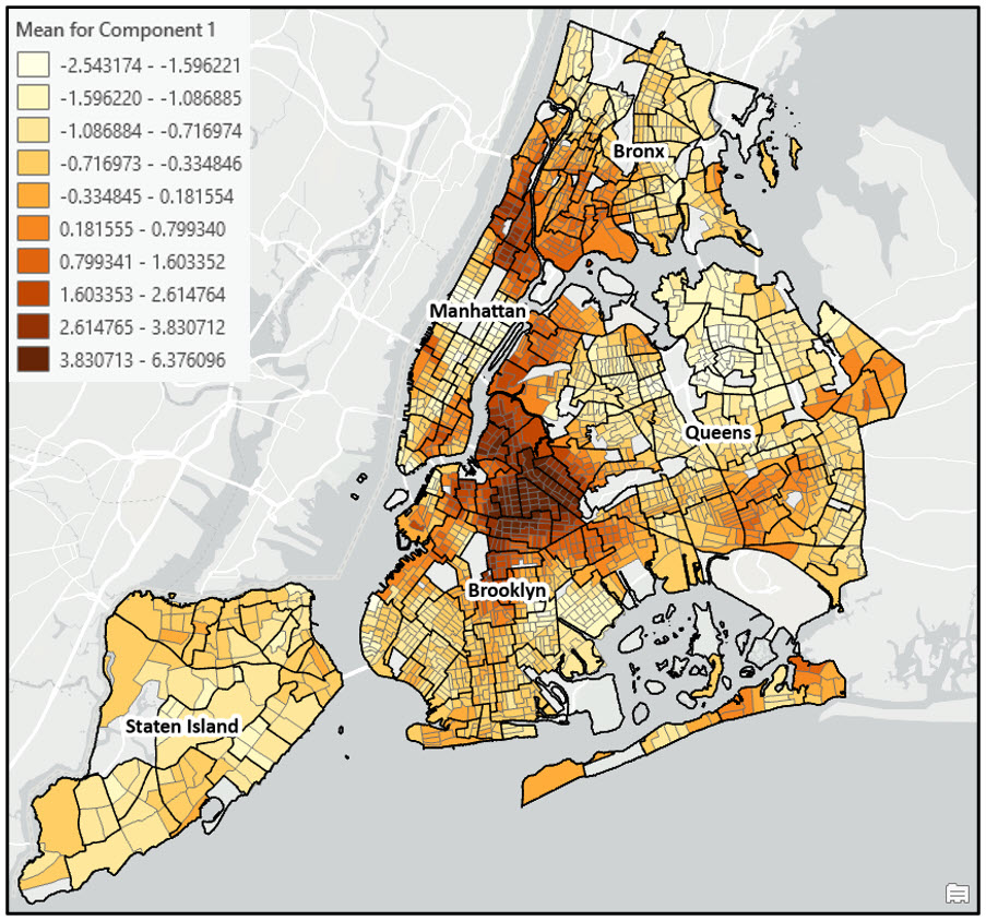
In general, the most gentrifying neighborhoods between 2000 and 2020 occurred in northern Brooklyn, northern Manhattan/Southern Bronx, some parts of western Queens, and Manhattan’s lower east side. These results are closely aligned with the findings in the original research paper, and also reflect the common understanding of the patterns of gentrification in New York City.
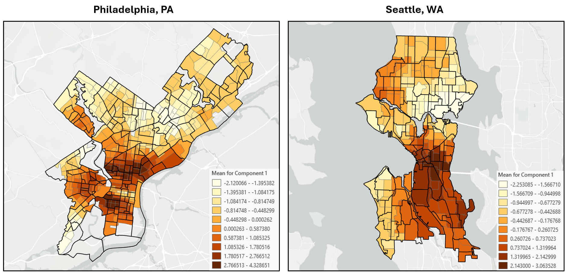
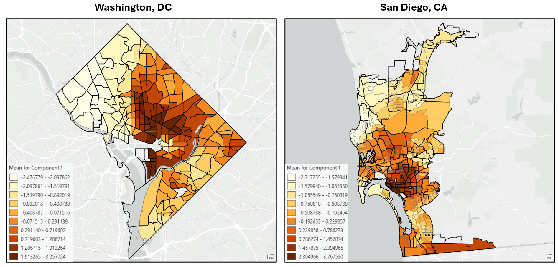
Application of the workflow in other US cities
As a proof of concept, I then applied this same workflow to several other US cities that are known to have experienced gentrification in the past few decades.
This process was made incredibly easy for two reasons:
- Both the NHGIS and ArcGIS Living Atlas data from both 2000 and 2020 were available for all US census tracts. This means that I can run all of the code for data fusion, engineering, and other preparation for any city I want, all I need to do is select or clip out the census tracts from my city of interest.
- The Python code itself is all written in the ArcGIS Pro Notebook. I simply get the census tracts for my city of interest, and plug them into the notebook code. With the exception of a few steps in the workflow where I had to make slightly different decisions based on the characteristics of that city’s data (e.g. which missing values to fill, how to deal with outliers, if I should use a transformation or not), all of the notebook code was the same for each city. This makes Notebooks incredibly valuable for repeatable, sharable workflows and processes.
I ran through the notebook code to replicate the entire workflow for the following cities:
- Philadelphia, PA
- Seattle, WA
- Washington, DC
- San Diego, CA
…and here are the final maps.


Article Discussion: