
My colleague, Bern Szukalski, says it well in his Pop-ups: the essentials blog: “Authoring web maps is easy, although authoring a truly great map requires a bit of additional thought and tradecraft”. Customized pop-ups are one of the key pieces to creating great maps. Planning the layout of your pop-up, including the type of content to use is half the battle. For many, a text element is all that’s needed to build an informative and visually appealing pop-up. You can summarize attributes and key information in a blurb, table, list, or a combination of those. This can be accomplished with the rich text editor in Map Viewer, but often refinement requires working with Hypertext Markup Language (HTML).
HTML is the language used to define the content, structure, and design of web content. Because HTML is such an important tool for creating great content, the development team is always looking to expand ArcGIS Online’s list of supported HTML to make it easier to achieve your design goals. In the November 2024 update, we made some exciting additions, specifically support for flexbox and grid.
What are flexbox and grid CSS?
When talking about the look of web content, Cascading Style Sheet (CSS) is often brought up. Flexbox and grid are both CSS layout systems. They’re essential building blocks for modern web pages because they make it easier to create responsive, flexible, and complex layouts. This makes flexbox and grid a powerful tool for building elaborate pop-ups that work everywhere in the ArcGIS ecosystem. Before diving into how to leverage flexbox and grid in your pop-ups, let’s review each layout system and their key concepts.
Flexbox
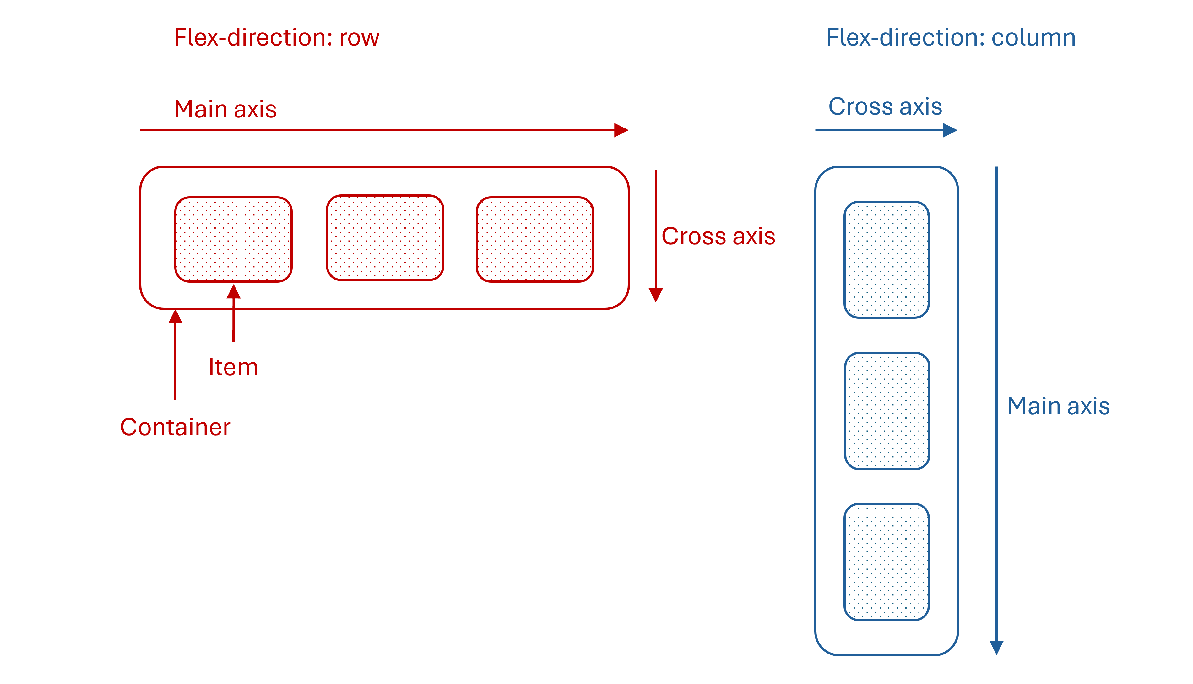
Flexbox is a one-dimensional layout system. By one-dimensional, I mean that you can create either a column or row layout. In the diagram below, you’ll see a container with items inside. A flexbox container is defined by setting the display property to flex. The content within a flex container become flex items. The orientation of the flex items is determined by the flex-direction property, which can either be column or row. An important concept relating to flex direction are axes. There are two axes, a main axis and a cross axis. For example, when the flex direction is set to column, the main axis is vertical, and the cross axis is horizontal. Axes are important to consider when setting the alignment of your content.
Grid
Grid is a two-dimensional layout system that allows you to work with columns and rows together. This makes it easy to create complex but manageable layouts. Grids are made up of a container and items where items act like cells in a table. However, grid layouts should not be confused with tables. Tables are used to display tabular data whereas grid CSS is a system used to design the layout of HTML elements in a container. A container could represent an entire web page.
The grid container is defined by setting the display property to grid. The number and width of columns and rows within the grid are defined using the grid-template-columns and grid-template-rows properties. The property values are a space-separated list with each value defining the width of the respective column/row. The number of values dictates the number of columns/rows.
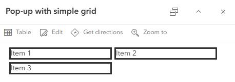
Let’s apply these grid concepts in a simple example. Say you want to build a grid in your pop-up with 2 columns and you have 3 items to include in the grid. In your scenario you want the columns to be 200 pixels wide. The HTML and pop-up would look something like this:
<div style="display: grid; grid-template-columns: 200px 200px; grid-template-rows: auto; gap: 5px;">
	<div style="border-style: solid;">Item 1</div>
	<div style="border-style: solid;">Item 2</div>
	<div style="border-style: solid;">Item 3</div>
</div>
Flexbox vs. grid
At this point you might be wondering when to use flexbox over grid and vice versa. The simplest answer is to use flexbox if you want to create a single dimension layout. These could be things like headers, footers, lists, or to simply arrange multiple items inline. Alternatively, use grid if you want to create complex, grid-like layouts where you have complete control over column and row properties and item placement.
CSS properties
ArcGIS Online supports inline CSS. This means that CSS properties are set in the style attribute of an HTML tag. The following list outlines the CSS properties available for controlling the look of your flexbox and grid layouts.
- Align-items
- Align-self
- Gap
- Grid
- Grid-area
- Grid-auto-columns
- Grid-auto-flow
- Grid-auto-rows
- Grid-column
- Grid-column-end
- Grid-column-start
- Grid-row
- Grid-row-end
- Grid-row-start
- Grid-template
- Grid-template-areas
- Grid-template-columns
- Grid-template-rows
- Justify-content
- Justify-items
- Justify-self
- Margin
- Padding
Practical examples
Your mind is likely buzzing with all the CSS concepts covered. The best way to ground concepts is by applying them to real-world examples. This section shows a variety of ways that flexbox and grid can be used to enhance or build pop-ups.
The flexbox examples build upon the existing pop-up designed for the OpenAQ Recent Conditions in Air Quality PM2.5 layer. The grid examples are two-fold. The first examples are grid layouts that can easily be transferred to your pop-ups. The second utilizes the data-rich iNaturalist Observations layer to build a dynamic, informative, and visually appealing pop-up. For a closer look and to access the code, check out the flexbox example map and the grid example map.
Example 1: Create a footer with flexbox
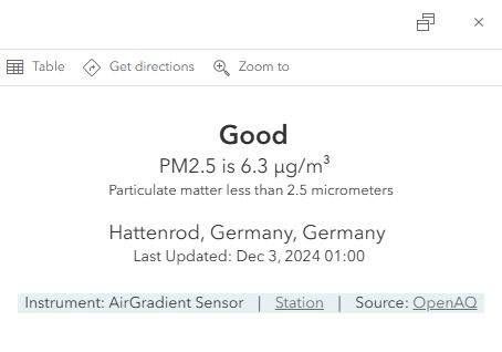
This example demonstrates how simple it is to add a dynamic footer to existing pop-ups. The footer provides key site and source information while keeping the spotlight on the main content.
Example 2: Create a gauge with flexbox
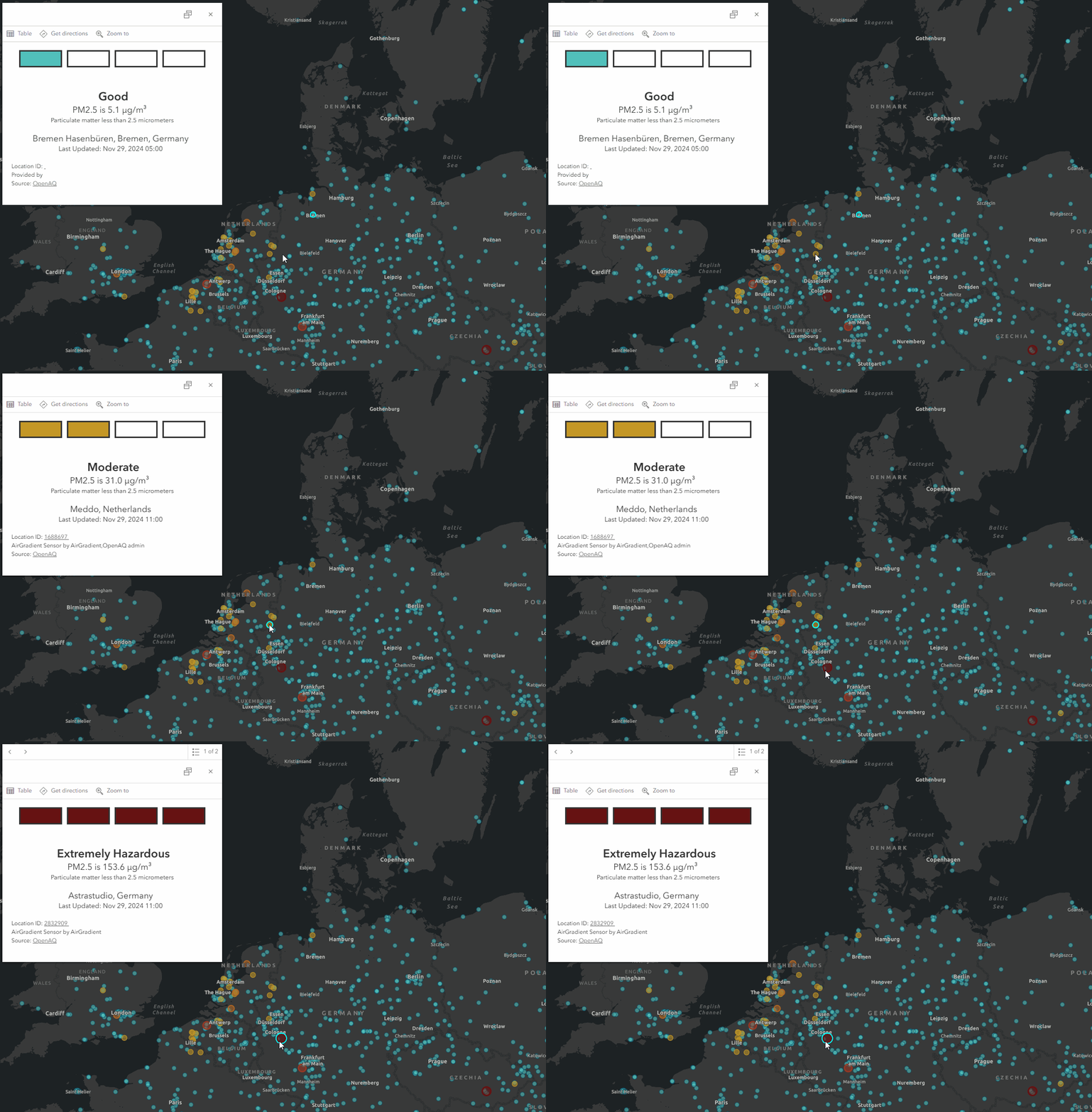
In this example, an air quality gauge is built using flexbox. The gauge reinforces the other pop-up content and the layer style.
Example 3: Reuseable grid layouts
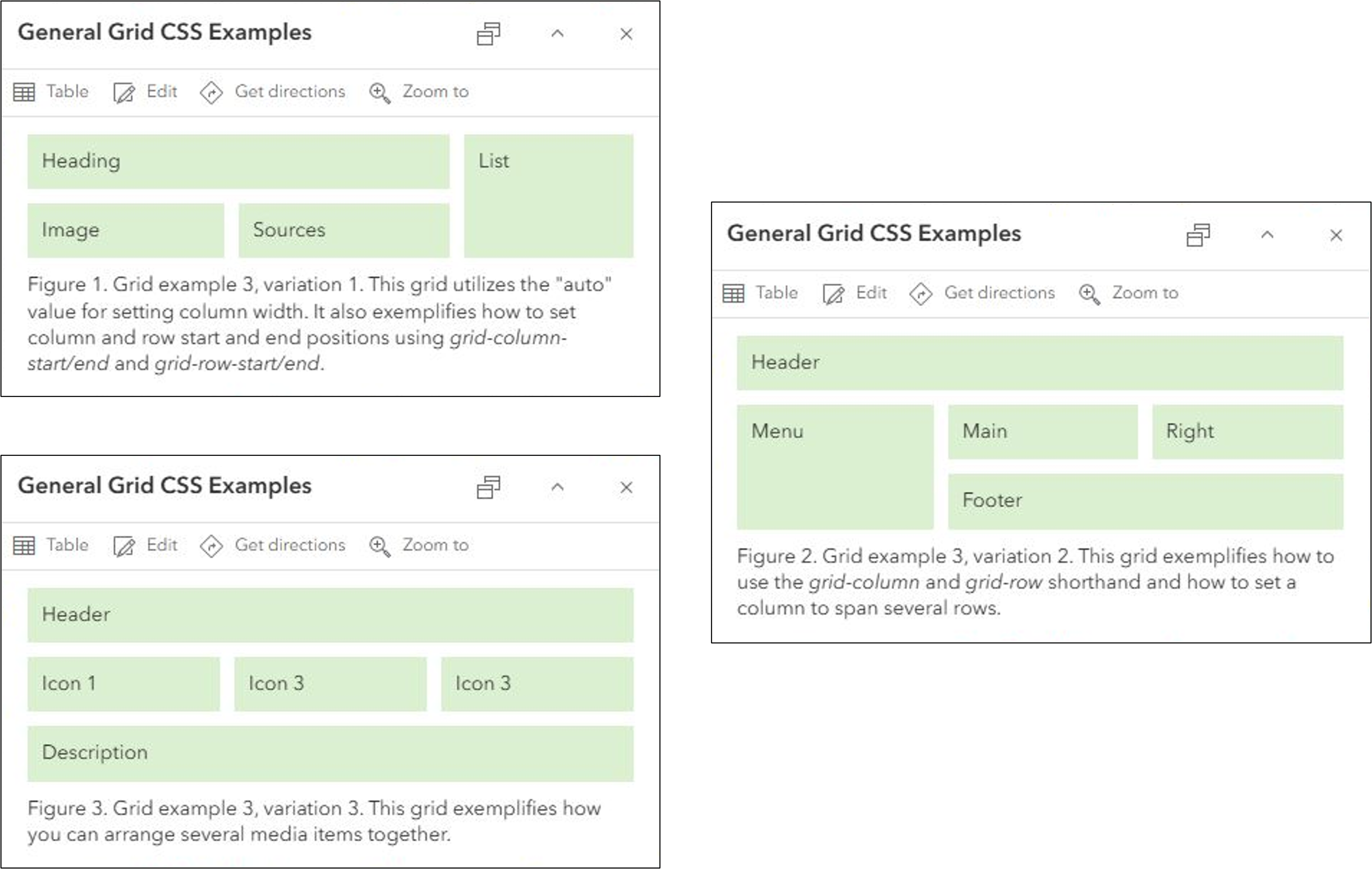
The following images show a variety of grid layouts within the pop-up. Each grid has been constructed in a generic way to help you visualize your content within the layout. The code is also general, to streamline adding it to your maps.
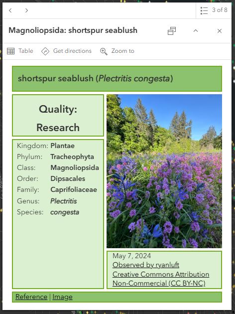
Example 4: Create a grid layout for iNaturalist observations
The final example combines all the grid concepts to build a rich grid layout. This layout exemplifies how you can mix and match different content, like text, tables, images, and links, to build a great pop-up.
You might have noticed that some of the examples use Arcade content elements rather than simple text elements. Arcade content elements allow you to perform logical evaluations, calculate values, format data, and pass those values into your return. This is all done within a single expression. Arcade content elements simplify authoring and maintaining intricate pop-ups. For more information on Arcade content elements, check out Paul’s blog.
Final thoughts
I hope you’re inspired to take your maps to the next level by creating truly great pop-ups with flexbox and grid layouts. The dynamic functionality of flexbox and grid can give you confidence that your pop-ups will shine wherever they’re viewed. In future ArcGIS Online updates, you can look forward to HTML templates that will streamline authoring pop-ups with flexbox and grid.

Article Discussion: