If you make maps you likely see maps in everything, like the shapes of clouds, or a puddle of rainwater. You may even actively search them out as if the use of a map as part of a brand logo immediately signifies a certain superior level of quality. Following on from this principle, if you enjoy a glass of wine you likely fall into one of two categories – those who purchase a bottle based on there being an animal on the label, and those who make their choice based on there being a map on the label. Sidenote – some cartographers even design map labels for wine producers. My friend and colleague Sarah Bell made a beautiful label for La Pelle which you should definitely check out (nice wine too!).
Anyway, I digress, but where am I heading with all this? What’s the point I hear you say? Well – the point is exactly that, or more accurately, a whole load of points. Bear(ing) with me.
I recently received a very pleasant gift from someone who knows I fall squarely into the category of selecting drinks based on there being a map on the bottle. Upon opening the package the bottle was, indeed spectacular with a full wraparound map (cylindrical projection – check), and a logo designed as a north point (which also appeared on the cap – check).
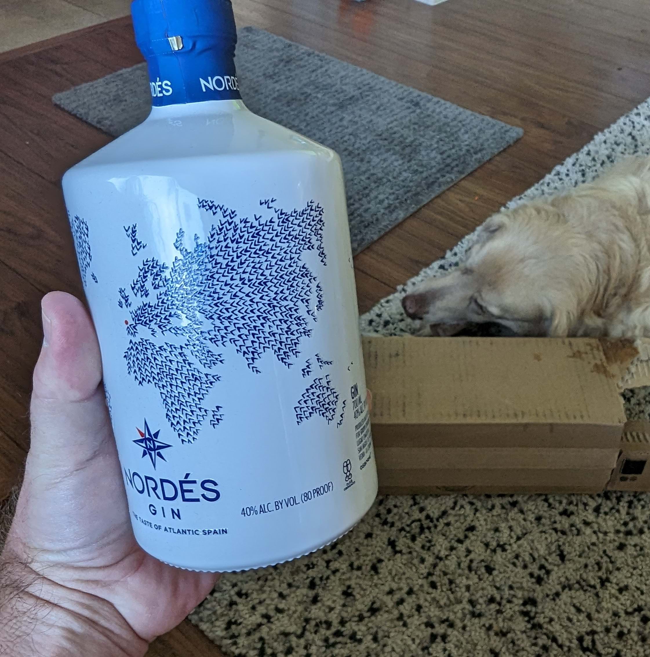
As you can see, Wisley (the dog) was more interested in the box it came in, and set about dismantling it for recycling, but I settled down with a lovely refreshing gin and tonic (Fever Tree if you need to know) and looked a little more closely at the map. It’s a map of the world formed from hundreds of small arrowheads that occupy land. There’s no coastline or other detail. The arrowheads appear hand drawn and each one is slightly embossed. But wait, they all seem to be pointing to a specific place. There’s a red dot in Northern Spain, and it didn’t take long to discover the gin is from Galicia, a region of Spain on the northwest Iberian Peninsula. The use of the map to reference the origin of the drink inside the bottle, and have all points orientated toward that place is a wonderful piece of design. So I poured another drink and thought some more, and my thoughts inevitably turned to wonder how I could recreate this map in ArcGIS Pro.
The basic premise for the map simply requires a whole load of points contained within the land masses of the world. There’s lots of ways to achieve this but I simply used a map of world continents from the Living Atlas, and used the Generate Tessellation tool to create a grid of hexagons, each of which was 50,000sq km which gave a reasonable size for this purpose. The Select Layer by Location tool then enabled me to select only those hexagons that intersected with the original land features, and I exported the selection as a new feature class. Finally, I used the Feature to Point tool to create a feature class of points across the map. Point(s) made!

Now all I needed to do was calculate the angle (bearing) from each of the points on my map to a single destination point. Simple right? Well not so simple as it turns out. Finding the bearing between two points on a map effectively means creating a line between those points and calculating its angle relative to due north (or another constant). That angle measurement can then be joined back to the origin point as a new attribute field and subsequently used to orient the angle of a symbol using the settings in the Vary Symbology by Attribute settings. There’s nearly 3,000 origin points on my map, and it seemed to me a bit pointless to have to go through the creation of additional features. Also, this would need some level of automation.
I happened to be chatting to another friend and colleague Tommy Fauvell about my dilemma, and search for a more streamlined approach, and we discussed various ways we might be able to achieve the desired outcome using Python or Arcade. Given that my coding skills largely began with Commodore Basic, ran through Turbo Pascal, Arc Macro Language and ended up with Avenue he kindly offered to fire up his far more accomplished (and current) coding ability and figure it out. Literally a few hours later Tommy sent me a Python toolbox with a new tool called Angle to Points. Don’t you just love collaborating with experts who have different, and complimentary skillsets to your own? I thanked Tommy profusely. I also owe him a drink or two – and I have an idea about that.
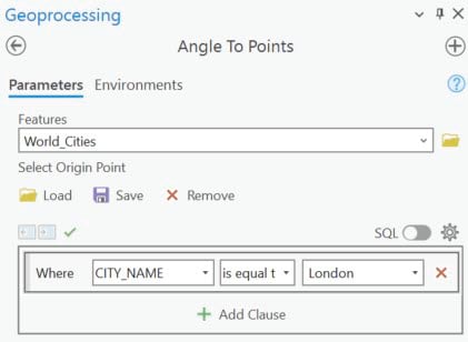
It’s a simple tool. Actually there’s two versions of the tool. Angle to Points requires you to input a feature class that represents all the points in your dataset. You then select a single point from the dataset using an SQL query that will be used to identify the point towards which all other points in the data will have the angle calculated and added to a new field in the attribute table. For instance, if you have a layer of world cities and wanted to make a map with all points pointing towards London you’d complete the tool parameters like this.
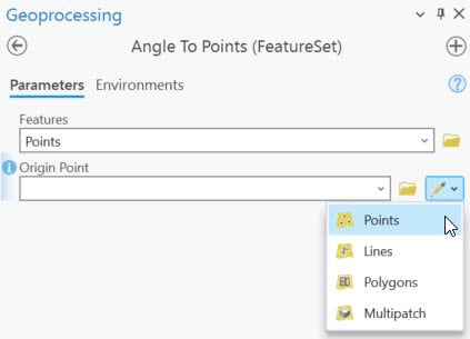
The second version of the tool, Angles to Points (FeatureSet) allows you to add a layer of points and then either select another layer that contains a single point feature, or interactively add a point feature to the map itself. Run the tool and, again a new field is added to the attribute table of the points layer with the angle calculated towards the single point.
This was the simple approach I wanted, so I made my single point Null Island, ran the tool and symbolized the points using arrowheads, with the newly created angle field used to rotate them by attribute. Boom!
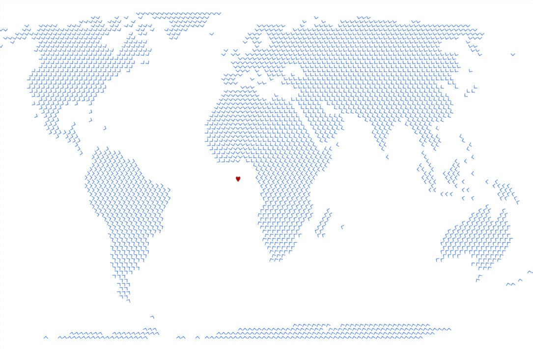
So that’s the map. Except it doesn’t have that certain hand drawn aesthetic. I cracked open my drawing pencils, drew some hand drawn arrow heads, took a picture, created PNG symbols and built a style out of them. Then I used the Match Layer Symbology To A Style tool to do just that. And now the very same map is symbolized using hand drawn arrow heads that mimic the map on a bottle of gin.
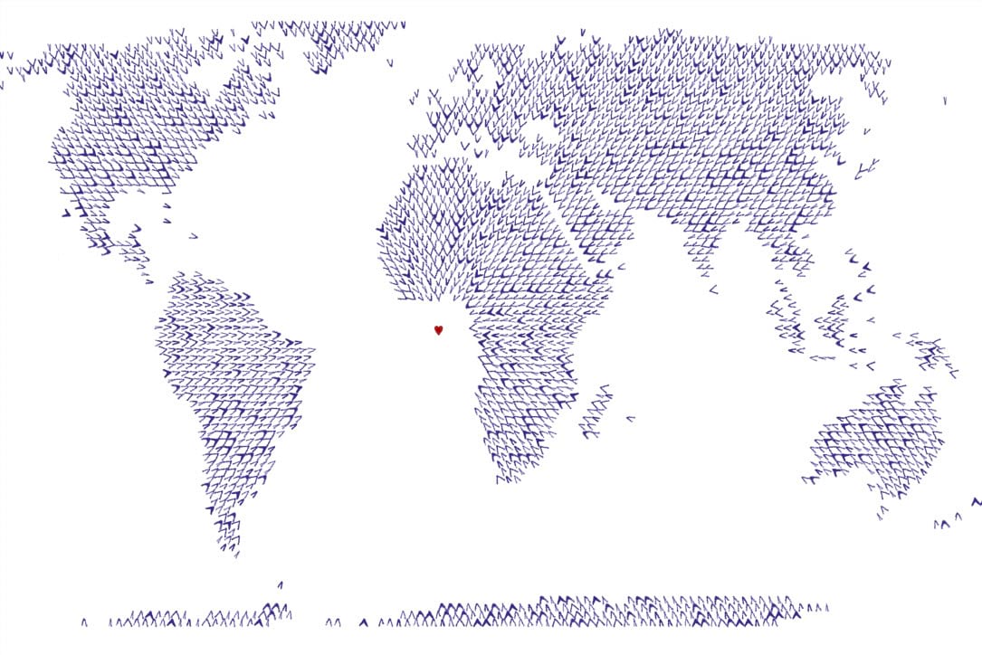
But wait, now the tool exists I wonder what else I can make it do? Let’s see if it honours the projection. Here’s an Orthographic View from Space projection with all points pointing towards that very seasonal of points – the North Pole.
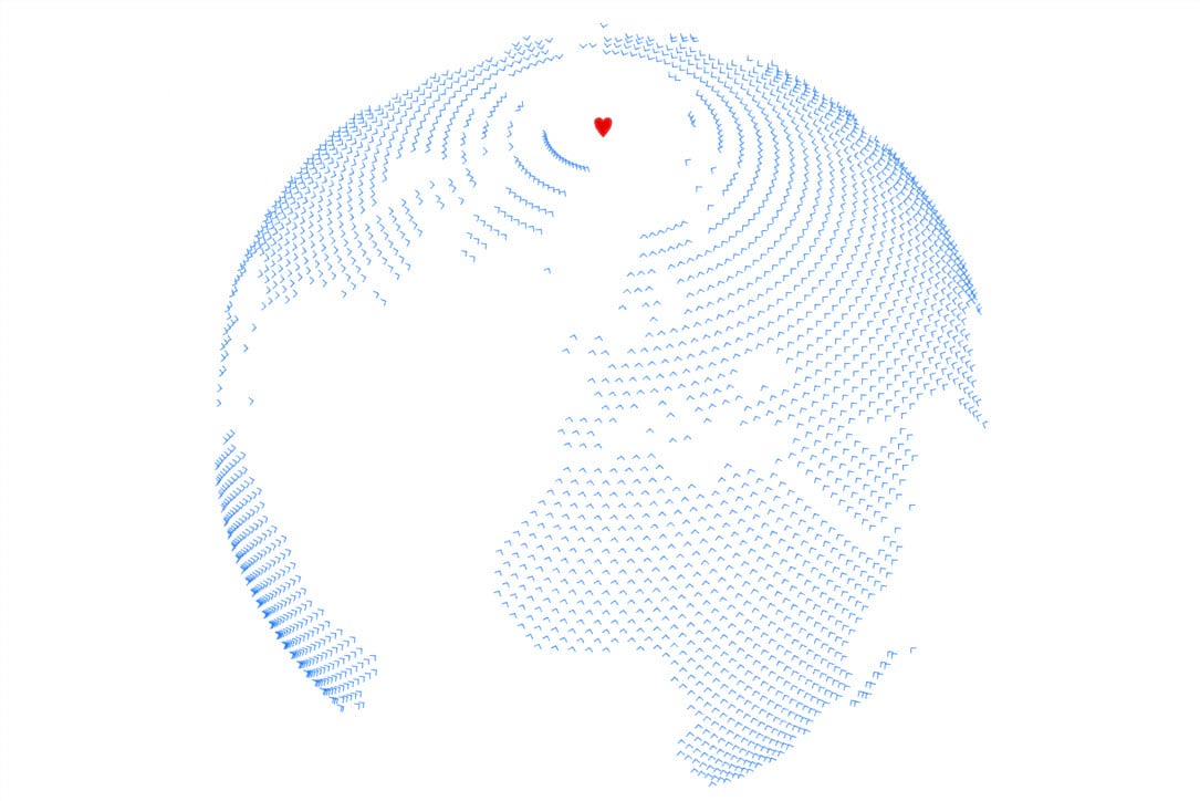
So yes, projections are honoured. As are other feature types. If you enter a line or polygon feature class then the Angle to Points tool simply uses the centroid of the feature.
But the seasonal map is a little boring so let’s turn it into something a little more attractive and befitting of the holiday season. I envisage a wreath made of holly that you might hang on your front door. What would a mappy version of that look like, and wouldn’t every geogeek want that on their door to welcome family and friends? That requires another style to be created with holly leaves used as the arrow symbols. I made them BIG, applied a little random transparency, threw in some berries, added a North Pole, plus a little owl (we’ll call him Nelson because his diet consists almost entirely of fireflies) to top the wreath off. And there you have it – a mappy Christmas wreath.
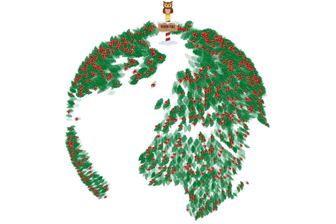
And that just about wraps it up. Oh, I nearly forgot…you want presents right? There’s no point the Angle to Points toolbox sitting on my hard drive so our gift to you this holiday season is this new toolbox. You can download it here, and add it to whatever projects you think might benefit from its magic.
I’d be really interested to see what you can make with the tool. Perhaps a ‘home is where the heart lies’ map showing all points leading to your town or city? Maybe a map of the location of sports teams orientated towards the team you support? Or maybe add 180 degrees to the angle expression and have the arrows point away from an origin point?
I doubt whether any of you will create dribbles of meatball sauce oriented towards the south pole of a giant globe meatball as a way to modify an image created by a large Swedish company. But I may have done that. I’m off to have a G&T, and a lie down.
Happy Mappy Holidays!

Commenting is not enabled for this article.