What is Socioeconomic Status?
What resources are available to gauge the socioeconomic health of your neighborhood? How can you compare the overall well-being of multiple areas of interest? These are critical questions to consider for businesses, governments, and other organizations as identifying socioeconomic disparities is increasingly important, and measures of socioeconomic status are effective tools to answer these questions.
Socioeconomic status can be thought of as the intersection of sociological and economic characteristics that are indicative of social position relative to other people, households, or geographic areas. When quantified, socioeconomic status serves as a proxy measure of an area’s access to resources and opportunity. This concept is useful to differentiate areas and an important determinant of health and quality-of-life. In other words, socioeconomic status is an attempt to condense a variety of important traits into a single concept. Common factors incorporated in a review of socioeconomic status include educational attainment, labor force and income characteristics, and other variables indicative of household resources. However, it can be cumbersome to incorporate all possible variables into an initial review of an area. This is where measures of overall socioeconomic status can be of great benefit.
Esri’s Socioeconomic Status Index
Indexes are useful to quantify and express socioeconomic status for use in research and analysis, and the components and computation of these indexes vary by source. New for 2023, Esri’s Socioeconomic Status Index (SEI) provides a composite measure derived from a mix of input variables from Esri Updated Demographics and the American Community Survey. This index ranges from 0 to 100, where larger values indicate higher socioeconomic status.
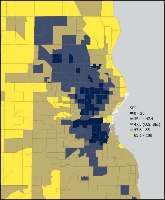
Let’s see what this measure reveals when we examine a major metropolitan region. The image below displays the SEI by Census tract within the Milwaukee, Wisconsin area. The darker-shaded areas represent lower SEIs, while the brighter yellow represent higher SEIs—when indexed to the U.S. SEI value of 47.5. The map reveals tracts with lower SEI values are concentrated largely in the dense, urban center of the city versus the surrounding suburban areas with higher estimated indexes. This is a common trend as characteristics like the rates of crowded housing and unemployment often diminish and improve as you extend your analysis from highly urban regions to the neighborhoods on the outskirts of a metro area.

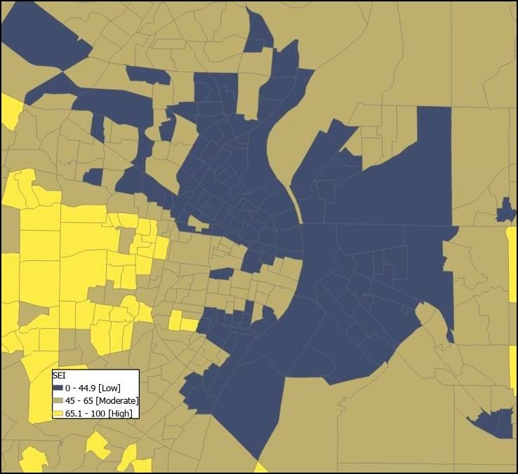
Based on the full U.S. distribution of the SEI at the Census block group level, the index values can be further combined into broader groups for categorical analysis. SEI values that range from 0 to 44.9 are considered “low”, values ranging from 45 to 65 are ”moderate”, and values that are 65.1 or larger are ”high”. For example, an SEI of 75 would indicate that the area possesses a population with a high degree of socioeconomic status relative to all other neighborhoods in the U.S.
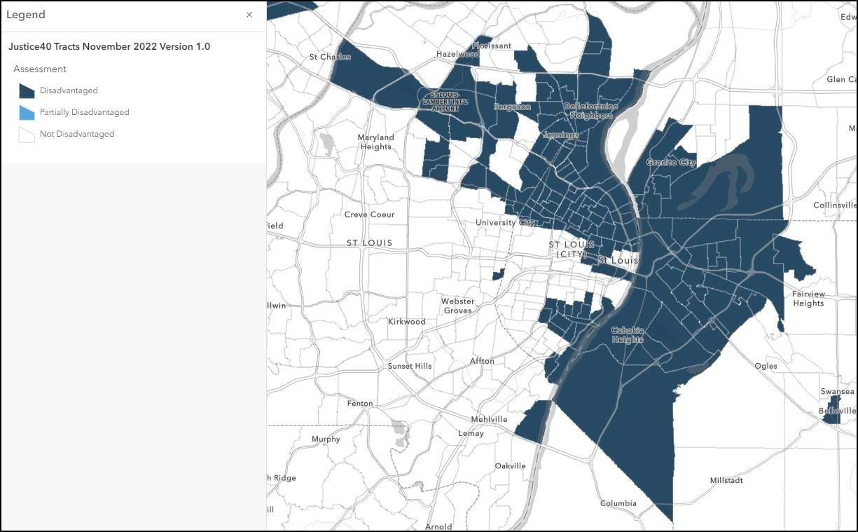
Let’s shift to this new index categorization and emphasize the SEI’s predictive power by folding another source into our analysis. The image below is taken from a Web Map published in the ArcGIS Living Atlas of the World that is displaying Census tracts in the St. Louis, Missouri area with symbology based on the Justice40 Initiative criteria. This tool is designed to highlight disadvantaged areas in the U.S. based on categories of burden, including disadvantages based on an area’s health, housing, or transportation characteristics. The tracts identified as Disadvantaged are largely clustered together along the Mississippi River.

In the below SEI map of the same area, a similar pattern emerges where tracts identified as Disadvantaged also typically have lower SEI values that place them in the “Low” category. This direct relationship demonstrates how the SEI has value as a standalone measure but can also be used in combination with other data like detailed demographic characteristics or additional measures of socioeconomic well-being to gain a more complete understanding of an area of interest. Note: Some discrepancies between the maps may be attributable to differences in geographic boundaries between these two sources. The Justice40 data is thematically mapped using the older Census TIGER 2010 boundaries while the Esri SEI map reflects current TIGER 2020 geography.

The SEI is an effective tool for comparison and isolating areas as a jumping off point for even deeper evaluation. This new measure in conjunction with additional variables from the suite of annually updated U.S. demographic data available in Esri Updated Demographics provide the resources needed for socioeconomic analysis.
Accessing the Data
With Esri’s 2023 demographic release, this new socioeconomic measure is a complement to other Esri Demographics databases. It is available for all geographic levels and any user-defined polygons such as rings or drive times.
Learn more details about Esri’s SEI data with the How to use and interpret Esri’s Socioeconomic data tutorial.
To purchase Esri’s Socioeconomic Status Index dataset, contact our data sales team at 800-447-9778 or email your request to datasales@esri.com.


Commenting is not enabled for this article.