Inspiration for maps can come from many different places but usually there’s a spark that sets the mind off down the path. Here’s a journey down a slippery slope to a map of California’s record 2022-23 snowfall.
A few months ago I saw that the Natural History Museum (NHM) in London, England had digitised a fabulous publication from 1899 by Wilson Bentley. Wilson was otherwise known as ‘Snowflake Bentley’ and was a meteorologist, and photographer from Vermont, U.S. in the late 1800s and early 1900s. He became famous for his microphotographs of individual snowflakes, and the books he published were collections of the photographs.
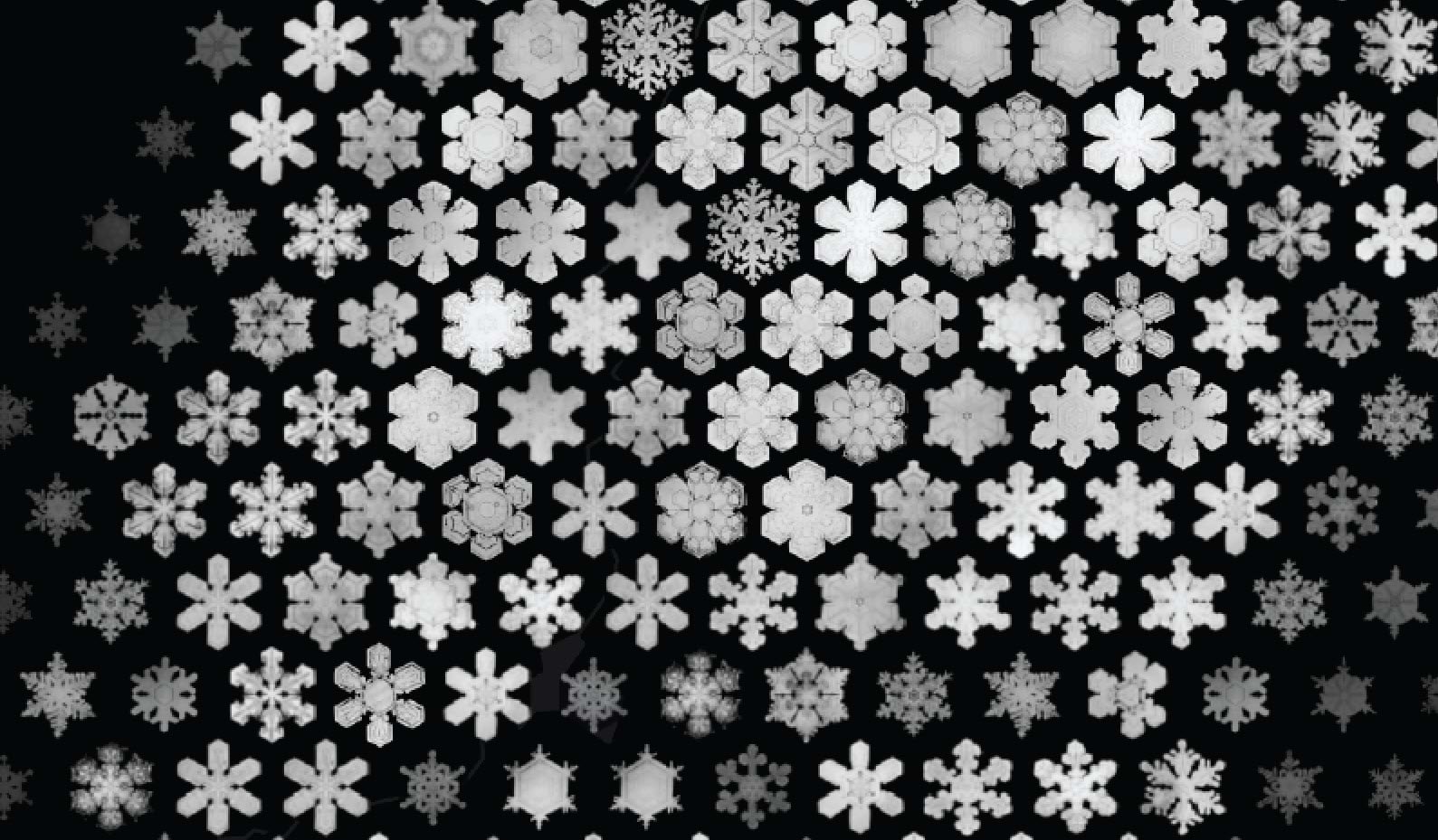
The NHM placed one such book in the public domain and the images of hundreds of snowflakes are beautiful. I was enthralled. Here’s one of the pages from the book which shows the individual snowflakes on a black background:
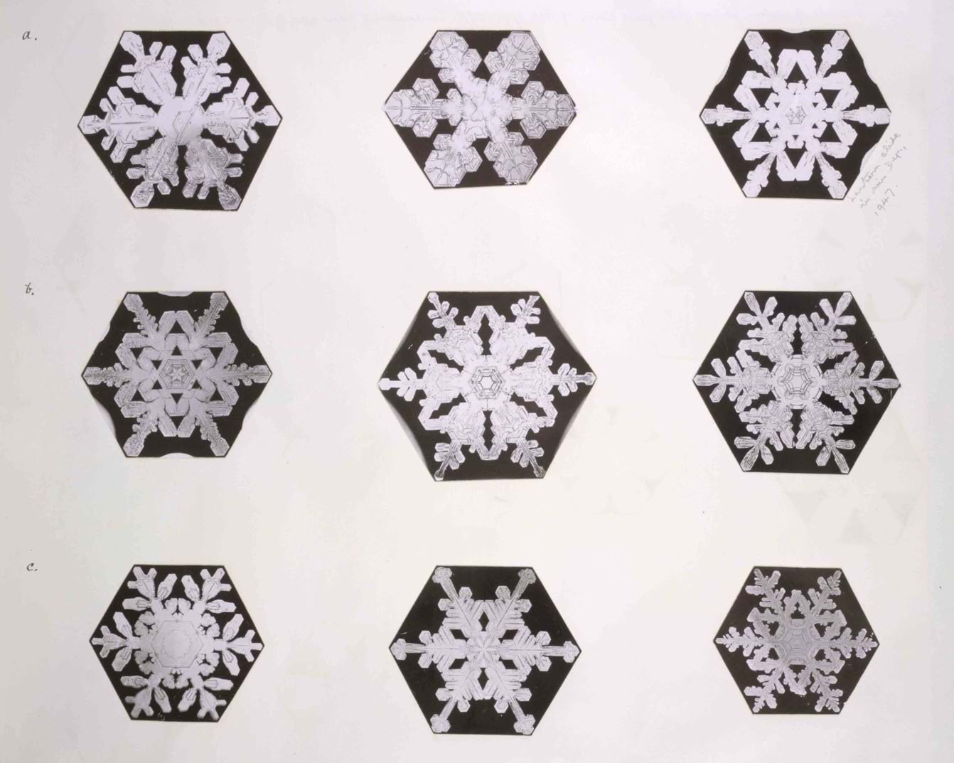
It’s pretty much common knowledge that no two snowflakes are the same, and Bentley’s photographs go some way to illustrating that fact. But there’s one other characteristic that they share: they broadly exist in a hexagonal, 6-sided form. Hmm…hexagons…I like hexagons…the mappy thoughts started to crystalize.
Some weeks later, I happened across a wonderful small scale thematic map by the USGS Data Science team:
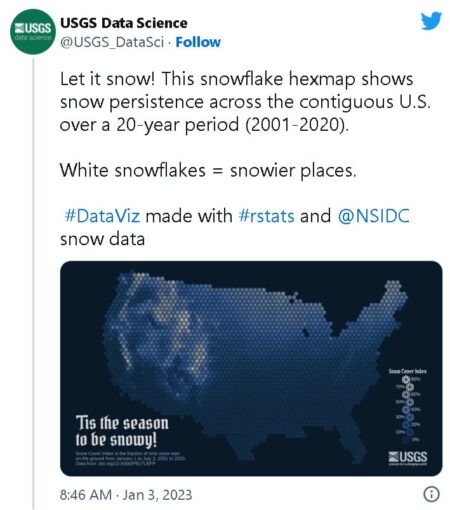
Wait a minute…hex-binned snowflakes to show snowfall across the U.S….but that was going to be my idea. Never mind. There’s nothing new under the sun, and especially when it’s cold and snowy.
USGS had hex-binned their data, and applied a vector graphic snowflake which was consistent in size and shape, but with changes in the colour from whiter snowflakes showing snowier places to dark blue showing least snowy places. A really nice map, but hmm…what if every snowflake was different? And what if every snowflake on the map was a real snowflake?
Timing is everything, and with record rain and snowfall impacting California in the early part of 2023 a slew of weather ‘maps’ began appearing and, typically, they were full of rainbow colours which is really not the most effective way of representing snow (or pretty much anything). But now is not the time for a full exposition of using spectral colour ramps on maps.
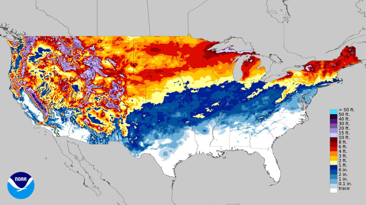
But given the proliferation of such maps it seemed just the right time to make a map of California’s record snowfall and I had the perfect trifecta of inspiration: the USGS map; Bentley’s recently digitised, and available microphotographs; and a map purpose based on a current situation.
While the symbology of the map above from the National Weather Center is questionable, actually it’s really just a representation of a dataset available for download. So it’s simply a case of downloading the snowfall accumulation data for the date range you’re interested in, conveniently as a GeoTIFF (don’t you love convenience?). OK – let’s grab the data for the entire snowfall season to date. That’s a lot of snow!
First…a little data processing because no map project would be complete without it.
Let’s get the data in shape. First, I used the Generate Tesselation tool in ArcGIS Pro to generate a hexagonal surface that would look good at my desired final scale. I intended to make a large format poster at A1 size (23.4in wide x 33.1in tall) which would be a map scale of 1:1,500,000. After a little trial and error I settled on a hexagon that covered 50sq km (roughly 16sq mi). Enough for some detail, but not too generalised. I used the Feature to Point tool to convert the polygons to a grid of points representing the centre of each hexagon. Then the Extract Values to Points tool to do just that – extract the values from the snowfall GeoTIFF to the gridded points. I now had a grid of points, each attributed with the snowfall accumulation value in inches.
Now the fun part…the snowflake symbols. Well, not really that much fun. Actually, really quite laborious. While the pages of Wilson Bentley’s fantastic book were digital, downloadable, and in the public domain when I looked closely at each snowflake photograph they were all slightly different in size, and the background hexagon wasn’t a perfect hexagon. So… I selected 100 of the snowflakes I liked the most ranging from big, fluffy flakes that almost filled a full hexagon, to light, delicate whispy flakes. I used Photoshop to clean them up by giving them a pure black background, and gave them a consistent size using a pre-configured shape, and a small amount of warping. In simple terms I wanted them all to have the same size and background. Several days later I had a set of 100 separate files of snowflakes.

The reason for selecting a range of snowflakes ordered from full and fluffy to light and whispy was that I wanted to use the former to represent areas of high snowfall, and the latter to represent low snowfall. And I was going to vary the symbology across the data range by making lower values have smaller snowflakes that were more transparent to make them less visible. The idea was to create a greyscale appearance from dark to bright across a black background to show the difference in accumulation across the state. Better than a rainbow right? (Just nod, please).

And don’t those snowflakes look beautiful…but wait…how do I get them into my map? Well there’s lots of ways but my good friend, and sometime cartographer John Nelson (you may have heard of him) often tells me that it’s important to be as lazy as possible, and make sure if you do something once you can do it again with minimal effort. It’s almost his trademark but he’s so good at it I decided to follow his advice.
So instead of using the Unique Values renderer, and uploading symbols for each unique value, I created a style. Styles are brilliant. Build a style, and you’ve built a re-usable, shareable resource. I created a style of 100 snowflake point symbols with black backgrounds. And just for good measure, a second style of the same white snowflake symbols but with transparent backgrounds. And you noticed those hyperlinks right? Click ’em and go grab the styles to use in your own maps and save days of photoshopping.
But don’t go yet, I need to finish telling you about my map.
Next, a little sleight of hand. When I say every snowflake is unique weeeeelllllllll…there’s nearly 8,000 point features on my map and there’s no way I was going to create a style with 8,000 unique snowflakes. 100 was enough. But that means I’m going to have to classify the data and apply each of the 100 snowflakes to a range of values. This can be achieved a number of ways including creating a new field in the attribute table and recoding the original snowfall data into new values. But I wanted to keep my original data. And I was going to use the Match Layer Symbology to a Style tool which reads values in a Field, then takes the symbol in a style that matches that value, and applies it.
After exploring the data range it became obvious a linear scale wasn’t going to work. Snowfall goes from less than an inch, to well over 700 inches, and there were way more values at the lower end than the upper. But if I used a logarithmic scale (0-1; 1-10; 10-100; 100-1000) I’d get a good range of data across the symbols and, crucially the map would look better!
And I can achieve all of that using an Arcade Expression in the Match Values parameter in the tool.
return When(
  $feature.RASTERVALU >= 600, "snowflake1",
  $feature.RASTERVALU >= 575, "snowflake2",
  $feature.RASTERVALU >= 550, "snowflake3",
  $feature.RASTERVALU >= 525, "snowflake4",
  $feature.RASTERVALU >= 500, "snowflake5",
  $feature.RASTERVALU >= 480, "snowflake6",
  $feature.RASTERVALU >= 460, "snowflake7",
  $feature.RASTERVALU >= 440, "snowflake8",
#repeat as necessary...
  $feature.RASTERVALU >= 0.09, "snowflake93",
  $feature.RASTERVALU >= 0.08, "snowflake94",
  $feature.RASTERVALU >= 0.07, "snowflake95",
  $feature.RASTERVALU >= 0.06, "snowflake96",
  $feature.RASTERVALU >= 0.05, "snowflake97",
  $feature.RASTERVALU >= 0.04, "snowflake98",
  $feature.RASTERVALU >= 0.03, "snowflake99",
  $feature.RASTERVALU >= 0.01, "snowflake100",
  "snowflake100"
);
It might look like overkill with one line to specify the upper limit of a data value per 100 symbols but it is actually more efficient than creating new Fields in the Attribute Table, and having to go back and recalculate if you wanted to make changes to the relationship of symbols to values. And the additional benefit is that usually you need a Field in the Attribute Table that holds the value of the symbol’s name, which the tool references to attach the correct symbol. But this expression incorporates that by returning the the symbol name as the value, for each class. A few copy and pasted lines, change a few numbers, and you have a simple, efficient way to handle this process that needs no additional Fields creating in your data.
This is one of those tools that when you hit ‘Run’ you wait for the magic to happen. Nearly 8,000 generic point symbols were transformed into a carpet of glistening snow instantly. A grin emerged across my face, just like you get when you wake on a morning to find fresh snowfall, and you can’t wait to get your snowboard out (try it!)
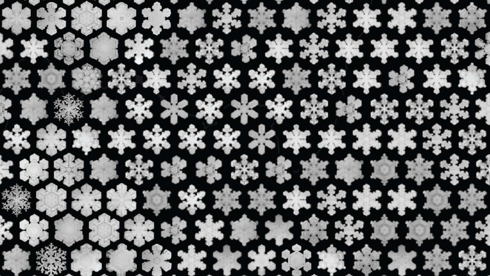
And that’s the basic map done but there’s always a little polish to apply. I used the snowfall value attribute to vary the transparency of the symbols a little in the Vary Symbology by Attribute tab of the Symbology pane. I wanted the lower snowfall symbols to fade to the background a little, so as not to be as visually prominent as the full fluffy bright snowflake symbols that represented the heavier snowfall areas. And I used another Arcade expression to change the size of the snowflake symbols depending on their value.
return When(
  $feature.RASTERVALU >= 500, "6.2",
  $feature.RASTERVALU >= 400, "6",
  $feature.RASTERVALU >= 300, "5.8",
  $feature.RASTERVALU >= 200, "5.6",
  $feature.RASTERVALU >= 100, "5.4",
  $feature.RASTERVALU >= 50, "5.2",
  $feature.RASTERVALU >= 10, "5",
  $feature.RASTERVALU >= 5, "4.5",
  $feature.RASTERVALU >= 1, "4",
  $feature.RASTERVALU >= 0.01, "3.5",
  "6"
);
Finally, add the map to a Layout to complete with title and other text elements, a histogram of snowflakes that acts as a legend for the snow accumulation, a picture of the beautiful San Bernardino mountain range swathed in snow taken from my front yard in Redlands, and a border made of snowflakes.
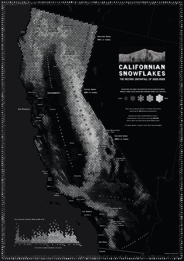
You can grab a copy of the map here to print and put on your own wall. It’s A1 in size (23.4in x 33.1in), and you’ll need a lot of black ink. And just a reminder that the two snowflake styles are here and here.
Happy snowy mapping!

Commenting is not enabled for this article.