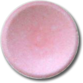
Here’s how you can brew some depth into a point symbol so your map has a clear sense of “fore” and “ground” which is map-nerd speak for making the stuff on your map look more important than the background stuff there to provide context.
Naturally, this leads us to a perennial Halloween candy favorite…smarties (not to be confused with the M&M-like candies also known as “smarties” in nearly all non-US countries).

Smarties have a charming concave disk shape with subtle edge beveling: both a tactile, and delicious, object of joy. Turns out this sort of shape is an excellent basis for designing point features. It has a light-catching edge, a darker internally shaded component, and a general shadow. It is clearly visible over light or dark backgrounds and affords excellent visual hierarchy. What’s not to love?
Here’s how to design point symbols with a bit of shady dimensionality…
0:00 A bold statement about Halloween candy.
0:36 A dog-gone good illustration of visual hierarchy.
0:45 These things are called “rockets” outside of the US. Mind blowing!
0:56 You can have many visual layers in a single symbol. Sweet, right?
1:03 The little lock graphic lets you protect it from dynamic thematic color overrides later on.
1:22 Gradient transparency to the rescue!
1:58 Digging into the shade fill to give it a negative offset (pulls it in).
4:57 Ok, time to harness that top shade symbol layer and re-purpose it for a little makeshift shadow.
There. Little disks that just pop off the map a bit. Use these powers for good!
Love, John

In the UK they are called Fizzers! Apart from the obvious cool affect you created I never understood what those lock buttons did, so seeing you leave one on to allow you to change the colour has meant the light bulb above my head finally turned! 🙂
I think I would like to tour the world’s candy racks and immerse myself in the cultural/marketing/confectionary nuances.
Also, great! Yes, that lock is particularly handy when if comes to making stacked up symbols. This way thematic mapping auto-coloring doesn’t ever break the shady effects.
“What the deuce!!??”
Your videos make my day.
hanks Jillian! my grandma Beattie used to say that when she was startled.