Here is a map of the Great Rift Valley, in Ethiopia.
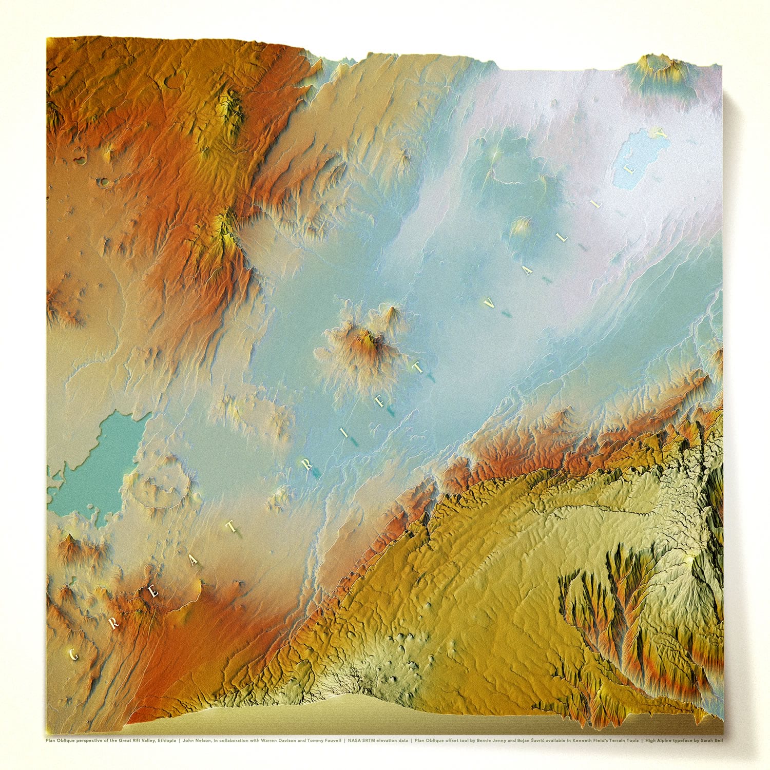
It is very much a 2D map. Sort of. Absolutely. In a sense. It uses the Plan Oblique tool, available in the glorious set of Terrain Tools for ArcGIS Pro, released by Ken Field some time back. Developed by Bernie Jenny and Bojan Šavrič, based on some beautiful hand-wrought oblique examples from mapping’s rich history, it is a wonderfully sneaky way of vertically warping elevation data so that pixels are pushed “up” commensurate with their elevation. The result is a modified elevation model (a NASA SRTM digital elevation model image, given a UTM projection) that gives the impression of looking slightly sideways at terrain. But it’s not 3D, you hear me!
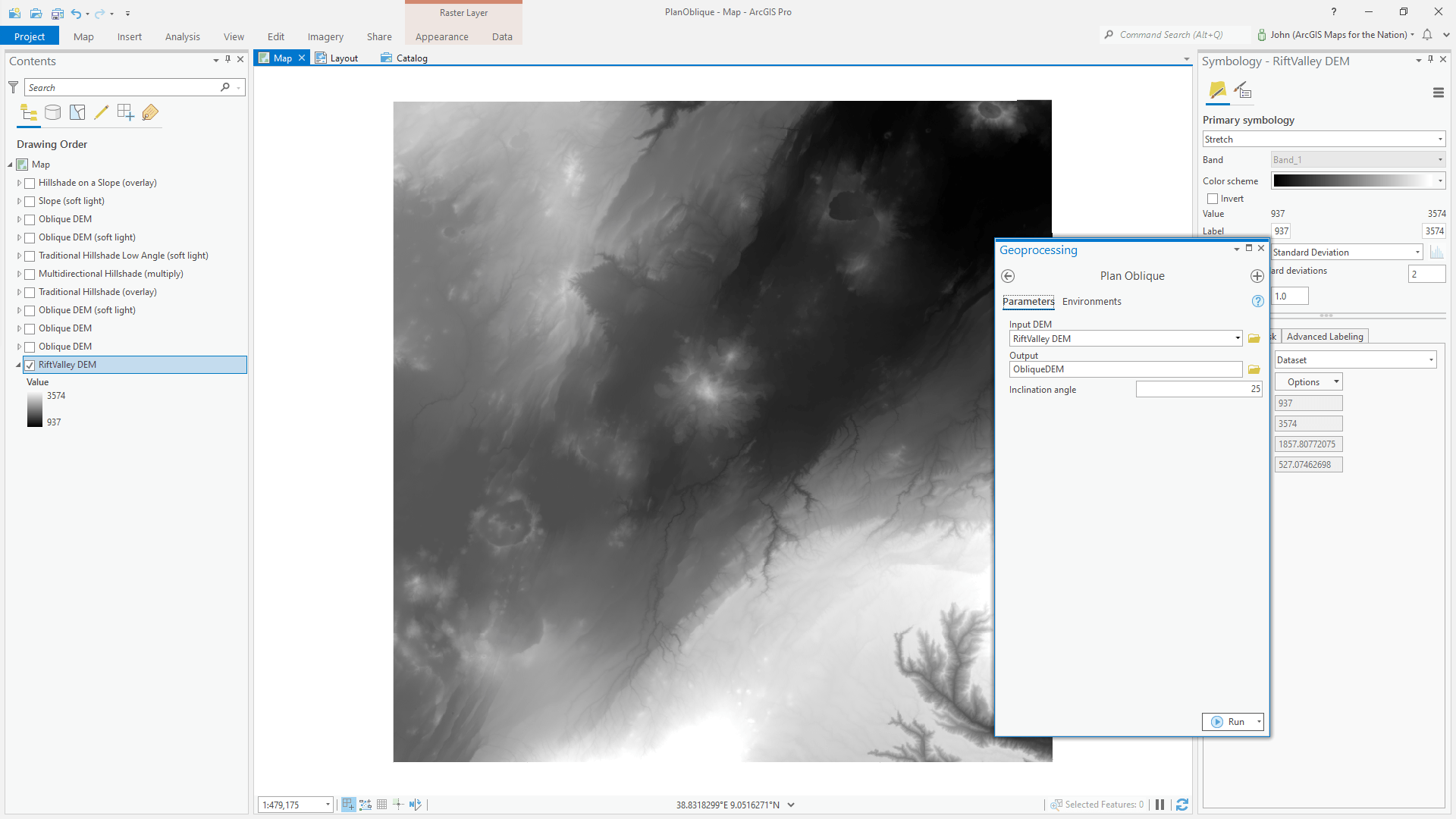
The Plan Oblique tool has one parameter: inclination angle. 90 degrees is a top-down look and will pretty much have no effect. 0 degrees is like sitting on the horizon with mega extreme stretching. I set it to 25 degrees, which had a nice tilty effect. Also, heads up, this tool has a…nuance…when you give the result a name, make sure it is 13 or fewer characters long, or else it fails. This section of the Great Rift Valley, in Ethiopia, has an impossible assortment of interesting landforms and is one of my favorite places to terrain-ify. I’d love to see it someday with my own eyes.
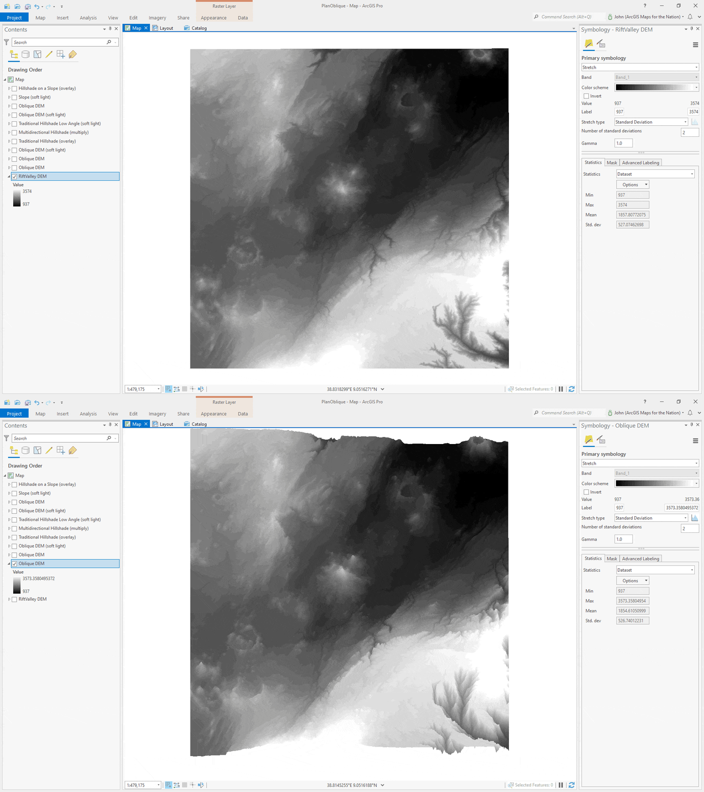
But mainly this is a story of blend modes. This map is comprised of 9 layers, all of them the same oblique elevation source layer, each with a color scheme and/or blend mode to cook the stacked result into something touchable. Here’s how…
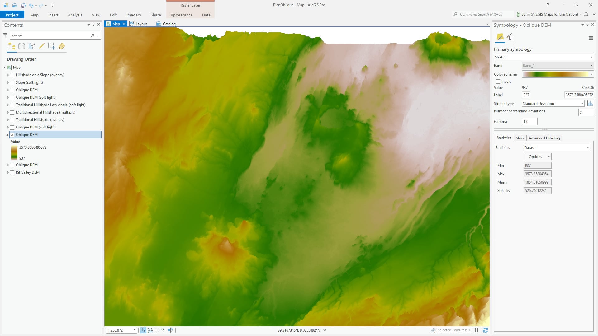
The resulting oblique DEM layer is given a terrain color scheme (“elevation #8”).
To warm it up a bit, I duplicated the layer, gave it the “inferno” color scheme, and applied a “soft light” blend mode to merge its hues to the layer below, and increase contrast.
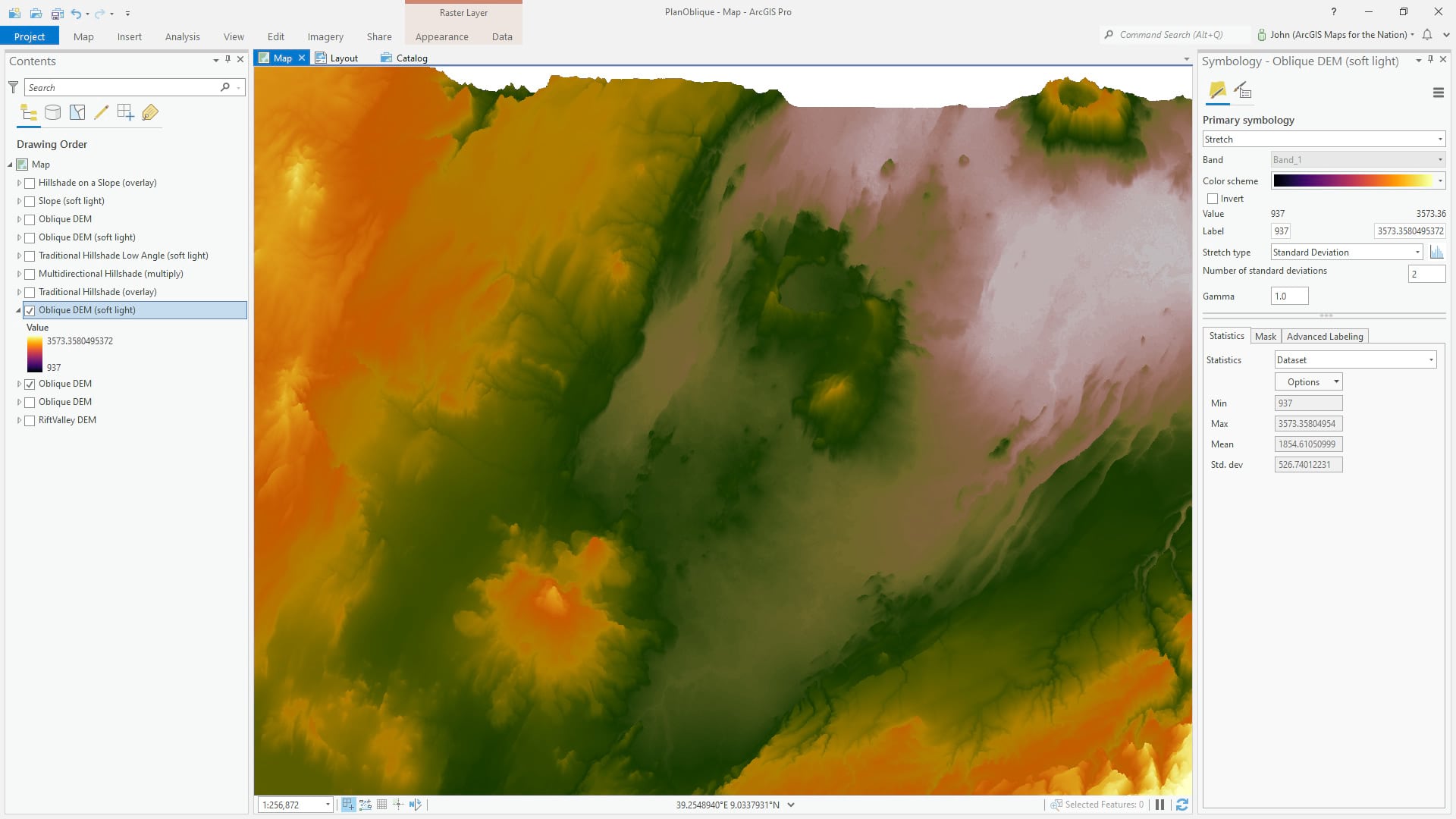
Then I created a hillshade from the oblique elevation layer, using Raster Functions. This is a traditional (single light source) hillshade with an overlay blend mode. Overlay uses the tones of the hillshade to brighten or darken the underlying content. Now there is a sense of surface texture.
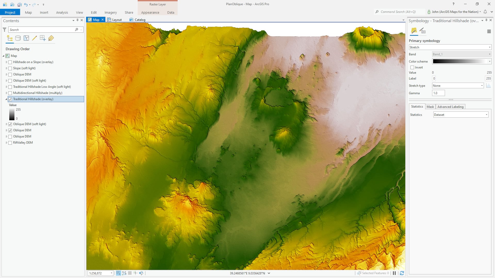
Once again from the Raster Functions, I ran the hillshade tool, but this time I chose “multidirectional” hillshade to provide a more nuanced and rounded surface texture. I gave this layer a multiply blend mode so that the new shadows would create darker and richer colors in shaded areas.
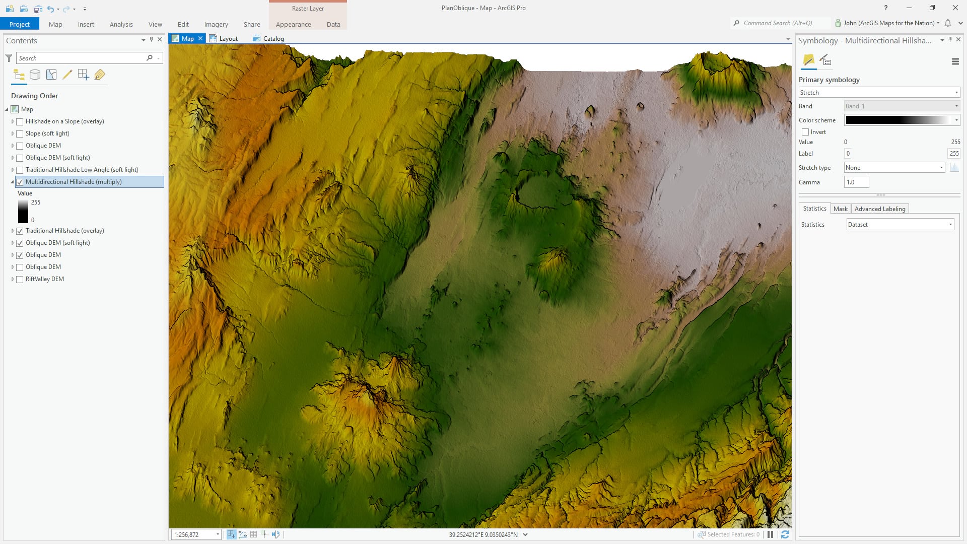
Feeling like the lighting effect could be boosted even more, I added a third hillshade layer. This was again a traditional (single light source) hillshade, but I gave it a lower sun angle so the effect would be more shady and dramatic. The soft light blend mode merges these tones into the underlying content so that the lighting has more contrast without losing the vibrancy of the colors.
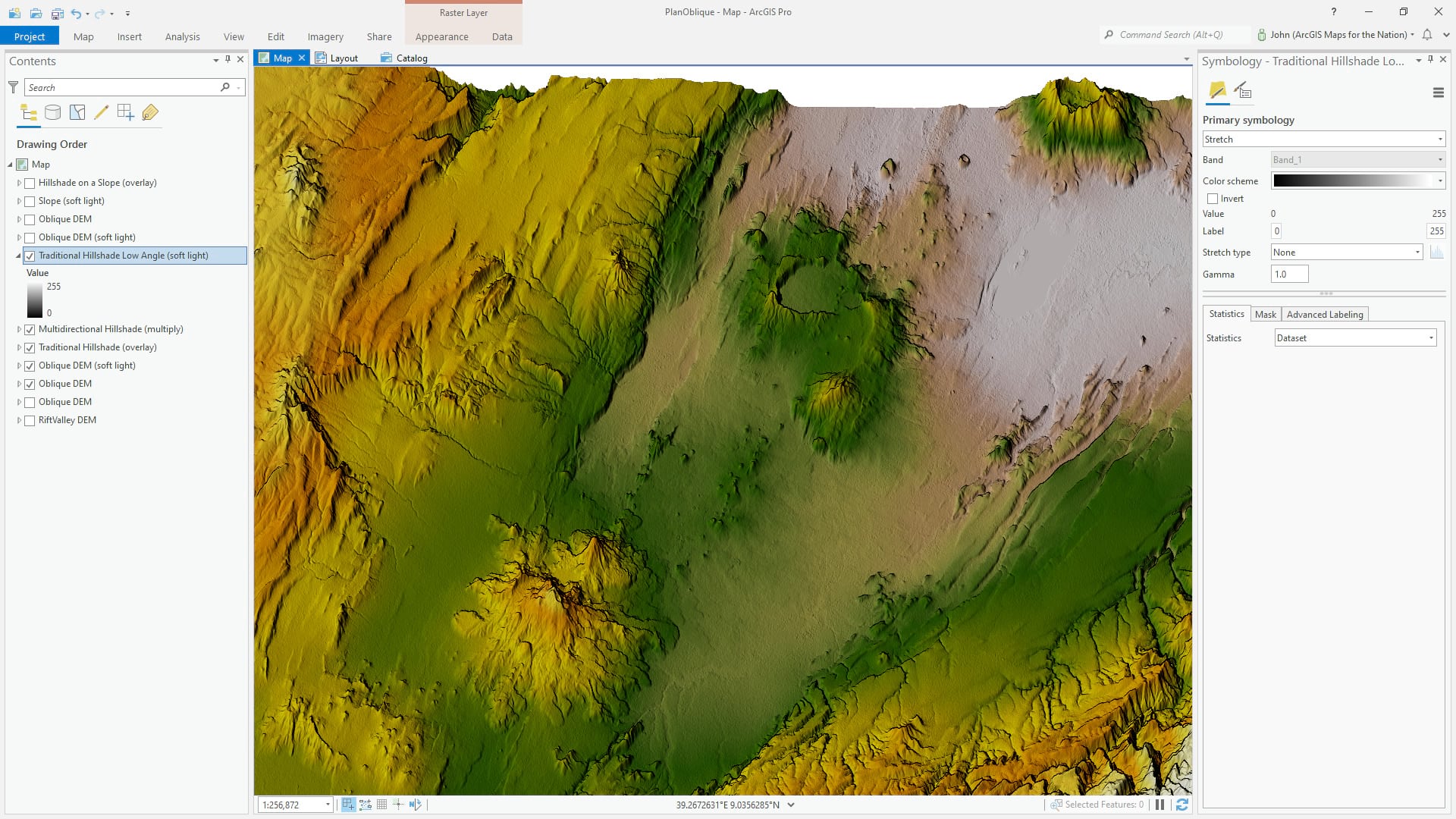
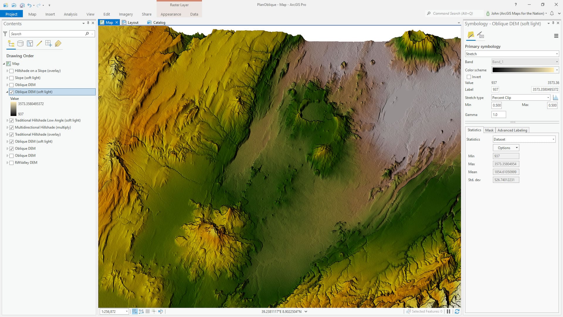
In the real, non-pixel (well, maybe) world, lower elevation areas of bumpy terrain are generally darker. Less direct light makes it to the bottom of valleys. We can hack this learned experience of our minds and force a bit more dimensionality into the map. This is the oblique DEM (not the hillshade, just the regular oblique DEM) with a yellowish to black color scheme for high to low elevations, with a soft light blend mode to bake those elevation tones into the map. Now higher elevation areas a a bit more sun kissed and lower elevation areas have deeper tones.
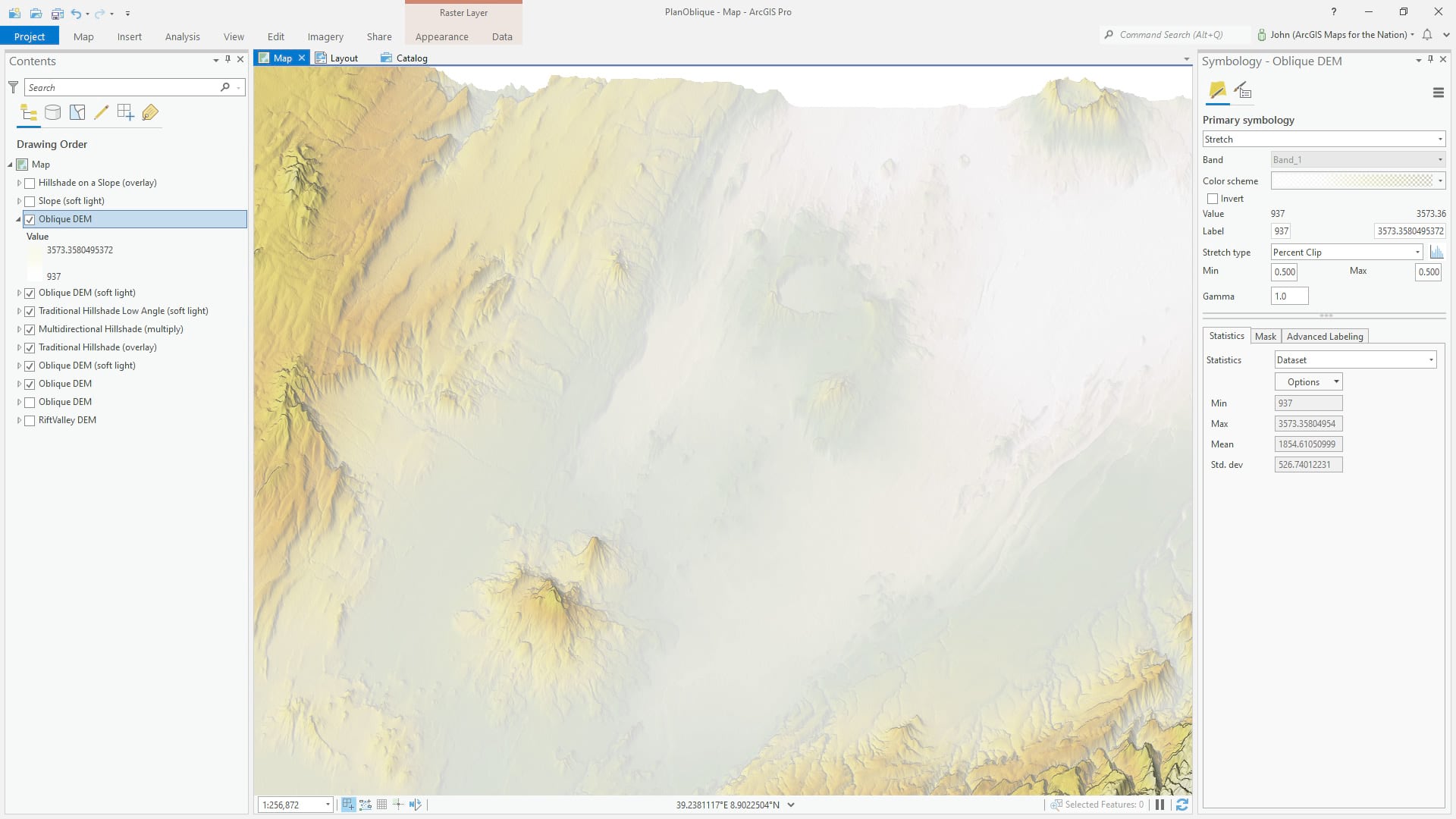
There is a much more extreme version of this hack. Any why not dabble in extremes? Here we have the oblique DEM added once more, but this time it has no blend mode and it has a color scheme of transparent white at the highest elevations and opaque white at the lowest elevations. This approximates mist. Ahhhh glorious mist. A low-lying fog immediately provides a sense of wispy reality and informs our brains of the complex meanderings of of low-lying channels.
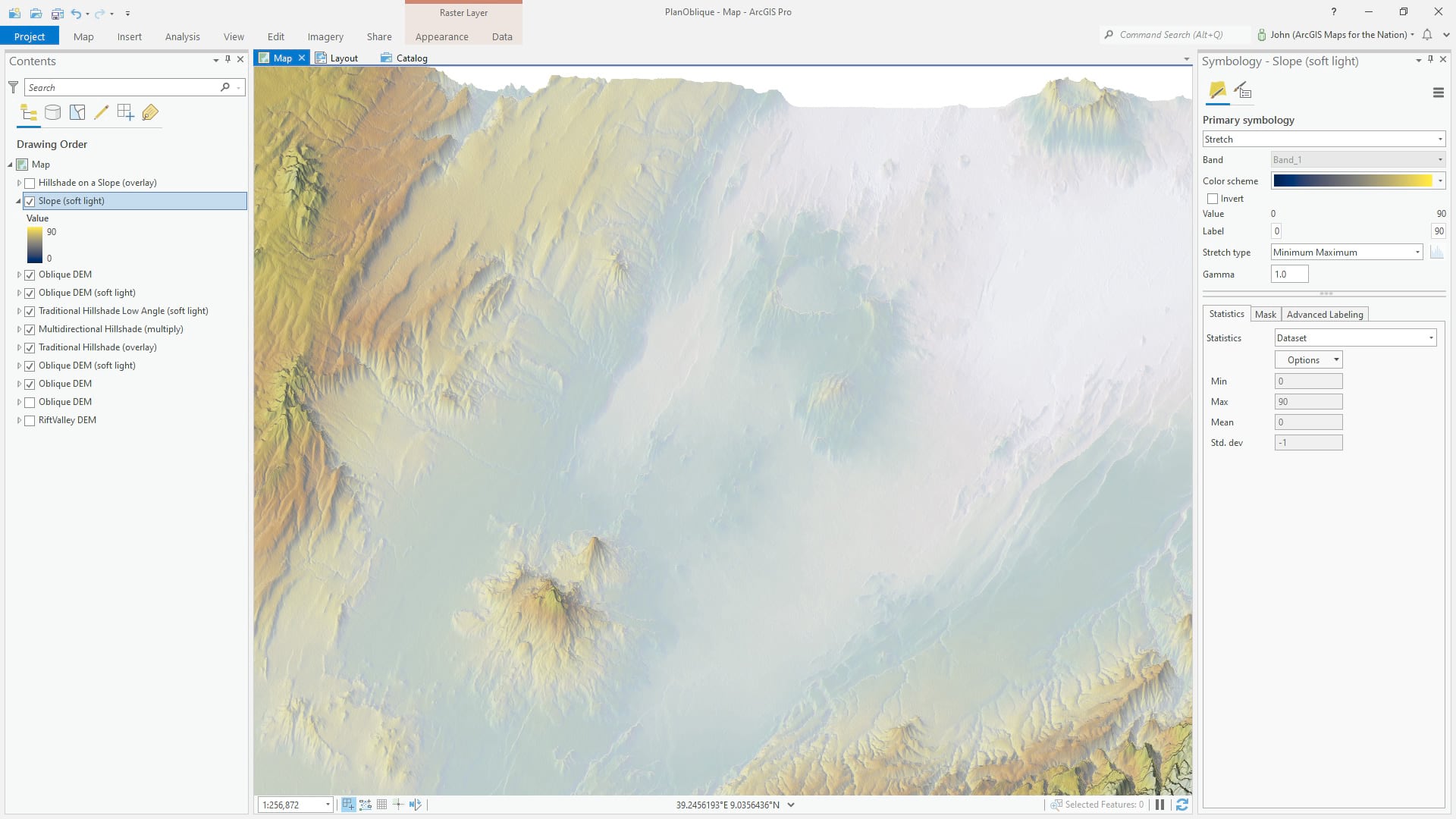
In our reckless pursuit of over-the-top realism, we’ve lost a lot of our palette and texture. That’s ok, I mean, we have like 7 layers already why not add some more? In this step, I’ve run a “slope” raster function. This calls out areas of steepness, which are given a yellow golden hue, while flatter areas are bathed in the blues of a scattered dusk. The soft light blend mode merges these colors into the map for a richer sense of light and shade.
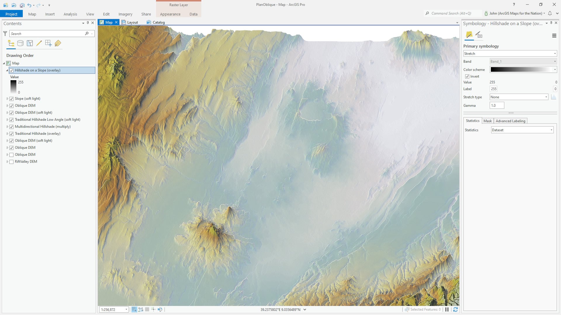
Did someone say hack? Ok, well if you thought the shadow and mist things were hacky, and you’d be right, buckle up for a blatant misuse of otherwise-honorable GIS tools. If we run a hillshade raster function on a slope layer, the result is an edge detection! The texture of a terrain is immediately given a boost of light and shadow at all the sharp edges of the terrain. It sort of reminds me of the inking pass of a comic book illustration. This hack is also a player in this Learn Lesson, if you’d like to pop over for a short course in hillshade fun.
Ok, that’s our hillshading homework sorted. Next I’ll add it to a layout, and export it as an AIX file. AIX is the Adobe Illustrator-compatible format enabled by the Maps for Adobe extension.
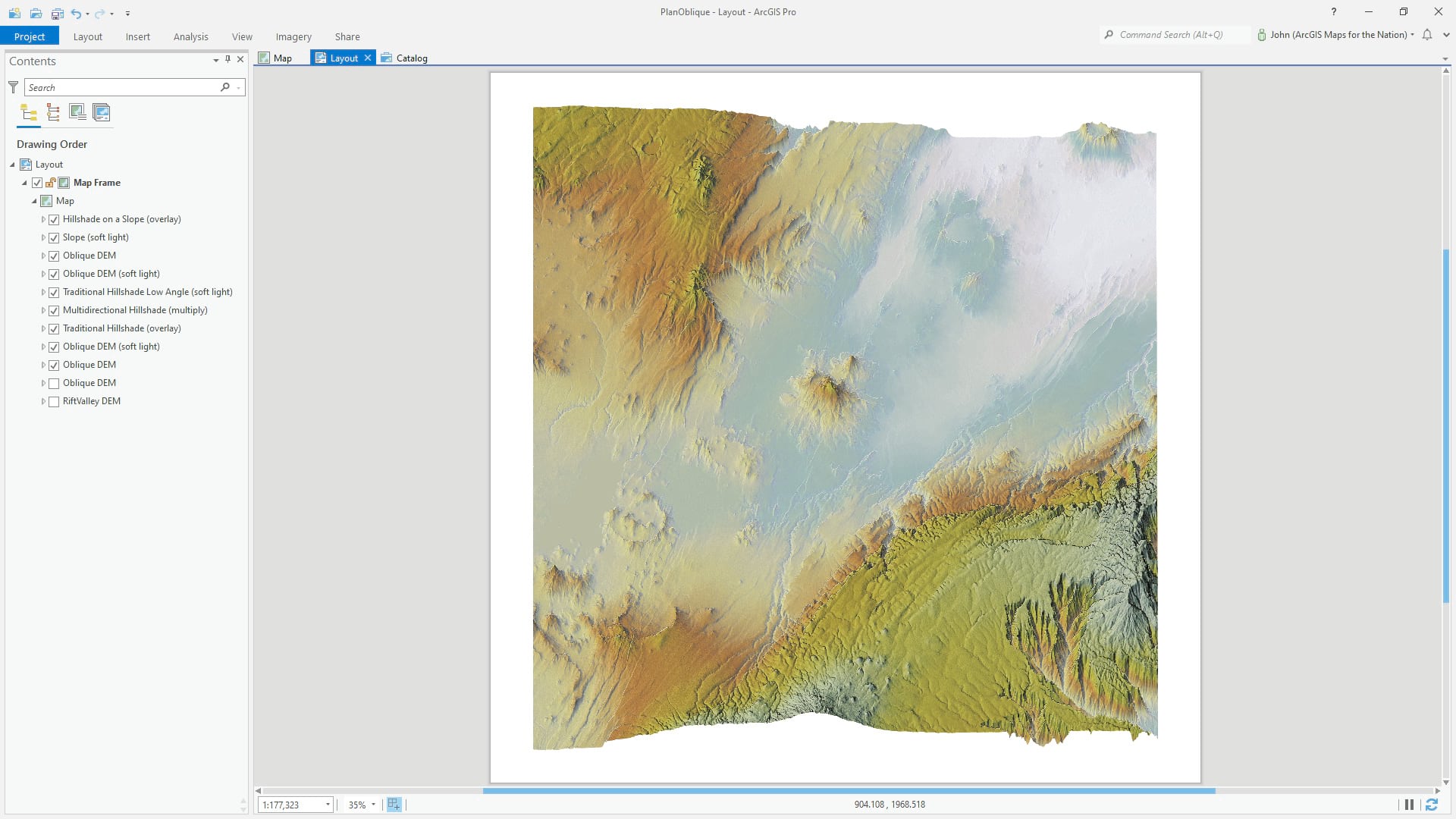
One of the outstanding things about the AIX format is that it remembers all the hierarchy and names of your input layers, and maintains them as discrete layers in Illustrator. Very tidy. Very convenient. But, why doesn’t it look the same? Because the blend modes applied in ArcGIS Pro aren’t yet automatically applied in Illustrator (the team is working on that seamless experience and if you are reading this in the near future, then you can ignore this next step).
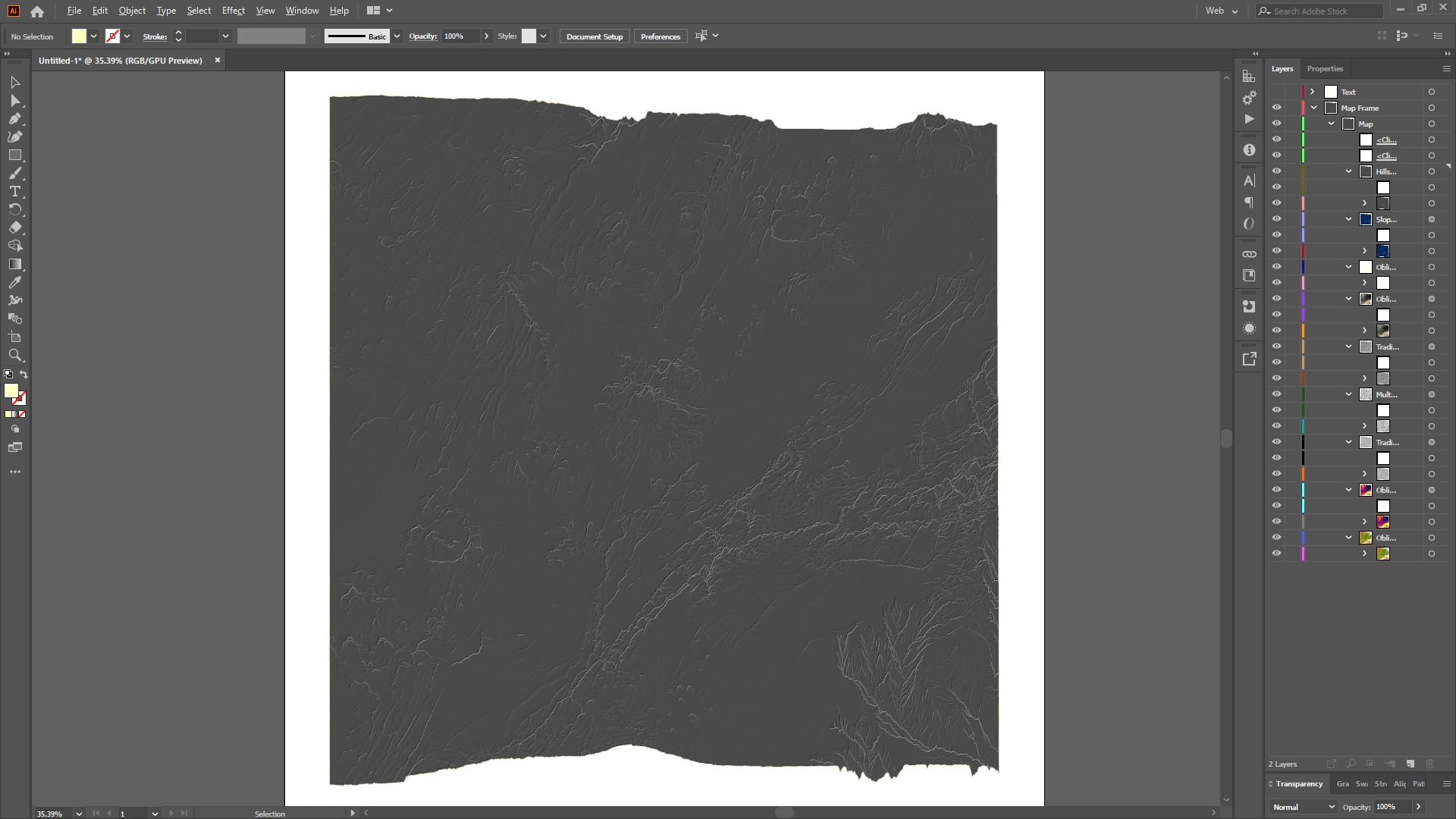
So I quickly re-apply the same blend modes here in Illustrator. Because the blend modes of ArcGIS Pro are effectively the same as those in Adobe, they will look exactly the same.
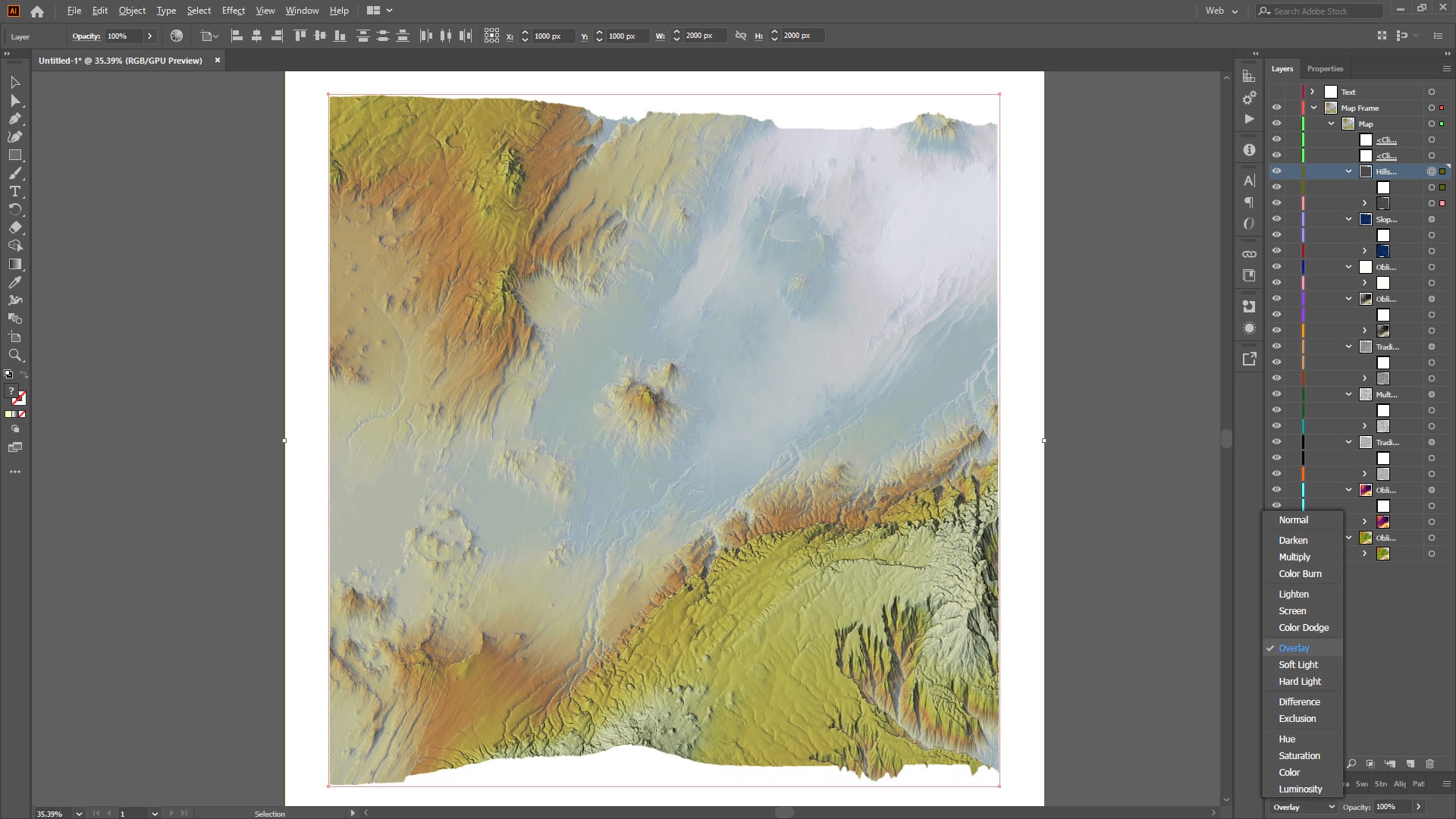
Why bother porting the map over to Illustrator? Well many GIS/cartography shops use this workflow so it’s not anathema for a map nerd to dive over into Illustrator for a bit. I like to because there are purely-design capabilities like grain filters and blur that I like to apply wantonly. Also, I tend to apply a contrast boost (10-12%, typically) to the overall map because it makes me smile.

Give it a click and take a closer look. The GREAT RIFT VALLEY label font is the lovely seriffed High Alpine, courtesy Sarah Bell. I gave it enormous letter spacing and a blurred and warped version of itself to serve as a shadow falling off at a greater offset distance in lower elevations (more on that here; used on this map and this map). It’s a fun and trippy little thing to do; you can do this manually in a Pro layout too, but getting the blur effect there is a bit harder.
I’m so happy with the clever sense of dimension that the Plan Oblique tool provides. I know that Warren Davison (who convinced me to add the sliced-earth cross-section at the bottom) is casting his artful gaze in the Plan Oblique direction so I anticipate some objects of joy to manifest as a result. I’ll keep my eyes peeled. Relatedly, thanks to Warren, and Tommy Fauvell, for their fun carto-collaboration with this map.
Startling Admission
I realize this blog sequence reads like I had a fully formed model of the result in my mind and that I proceeded deliberately though all these steps in ArcGIS Pro to get there. Oh my, no. No. This is just the best way to describe the stacking and rationale for all the layers. But my workflow was more like trying something randomly, applying a bunch of color schemes to see what looked best, and trying out every blend mode to see what worked. Then if it looked better than it did before, I’d keep it and add another layer and go through the same pseudo-random process again. Map making is largely exploration and experimentation and small un-confident iterative steps forward. The final map is just the additive result of all that flailing.
We take lessons from previous maps and have them at the ready in our mental design toolbox. The happy accidents are plucked joyfully from the mix, their utility is considered and rationalized, and they are filed away in our minds. Ready for the next map. I believe that’s what we all do, generally, if we’re honest. And it doesn’t apply to just maps. Few things apply to just maps.
Happy Accident-Having!
Love, John

Article Discussion: