By Aileen Buckley, Mapping Center Lead
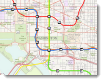
When creating maps using the basemaps that are available in ArcMap or from ArcGIS Online, best practice is to add the basemap to your ArcMap session (if it is a map service that you can open in ArcMap). Then you can design your operational data, which will overlay the basemap, so that it complements the basemap and so that the basemap appears to support the operational data. You can check the results of the map service you create in a Web map viewer. If you need to make changes once you review the results, you can simply edit the ArcMap document until you get the final product you want. In this blog entry, we give you some tips and tricks for designing the operational layers, whether they include point, line or polygon data, and text.
Dim the Basemap
One thing you can think about is lightening up the basemap a little more so that the symbols you overlay will be even more prominent. This is not really required in many cases because the basemaps have been designed to support overlaid features. But depending on your needs you may decide that this would help (figure 1).
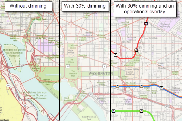
Figure 1. Variations in the appearance of the map when no dimming is used, when 30% dimming is used and when an operational layer is overlain on the 30% dimmed basemap.
To lighten up the basemap, you can use the Dim function that is new for basemaps in ArcGIS 10. This is on the Effects toolbar, so if you do not yet have that available, click Customize on the top bar menu, then click Toolbars > Effects. The fourth tool from the left is the Adjust Dim Level tool — use that to lighten up the basemap to the level that you want.
Colors
We designed many of the basemaps with less saturated and lighter colors and dark gray text so that you can use brighter and black text. For example, the colors used on this basemap are low in saturation (not very brilliant) and high in value (light) (figure 2).
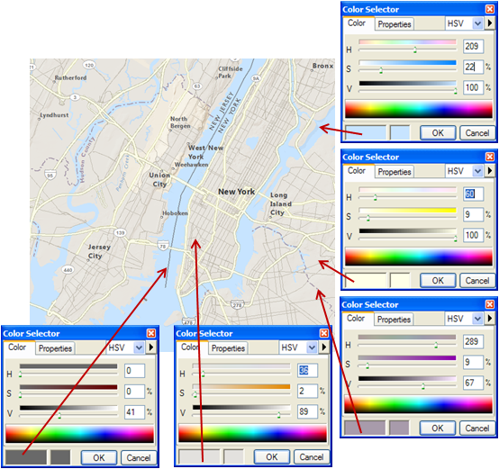
Figure 2. Color definitions for symbols used on this basemap.
So you can use higher saturation and lower value colors to symbolize the data in your operational overlays (figure 3).
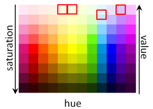
Figure 3. The colors used on the map above are outlined in red. The operational overlays can be symbolized in colors that are quite different – those higher in saturation (brighter) and/or lower in value (darker).
Using Variations of the Colors on the Basemap
To make the overlaid data appear to “sync” with the basemap, one trick is to use variations of the basemap colors. If you want to create a higher saturation, lower value variation of a color in the basemap, use the Eye Dropper tool to find the RGB color specification for the color you are interested in (figure 4).
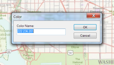
Figure 4. The result of using the Eye Dropper tool.
Then input that in the Color Selector and switch to the HSV color model (figure 5).
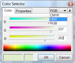
Figure 5. Setting the RGB Values in the Color Selector. You can change the color model in the Color Selector by clicking the down arrow next to the current color model (RGB in the example above).
Now you can vary the saturation and value accordingly (figure 6).
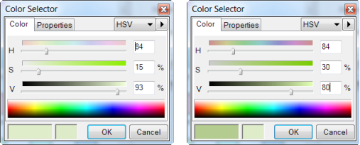
Figure 6. The original color is brightened and darkened by making the saturation higher and the value lower.
Point and Line Symbols
Also, to help your point and line data show up even better on the basemap, you can use slightly larger symbols than you would normally (figure 7).
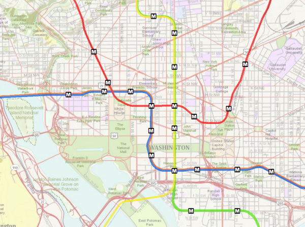
Figure 7. Subway lines are shown on this map with wider solid line symbols that have bright (high saturation) colors.
Also, consider using a cased symbol (a symbol with an outline) so that the feature will be legible (seen and understood) even if the background varies between light to dark (figures 8 and 9).
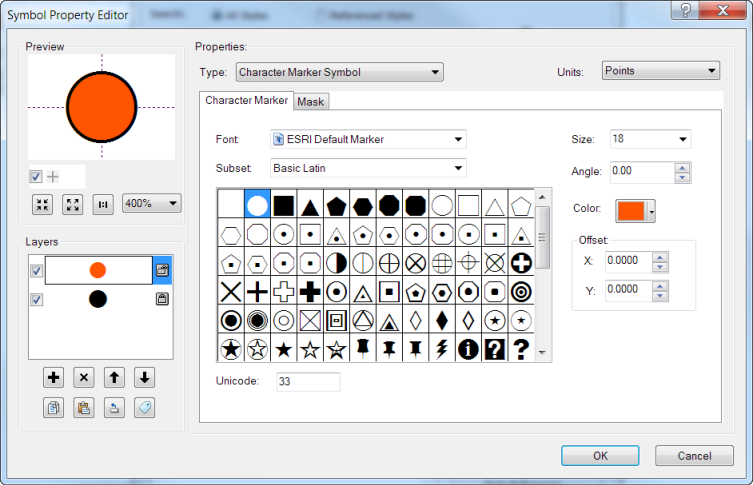
Figure 8. Cased point symbols can be created using two layers and making the bottom layer larger.
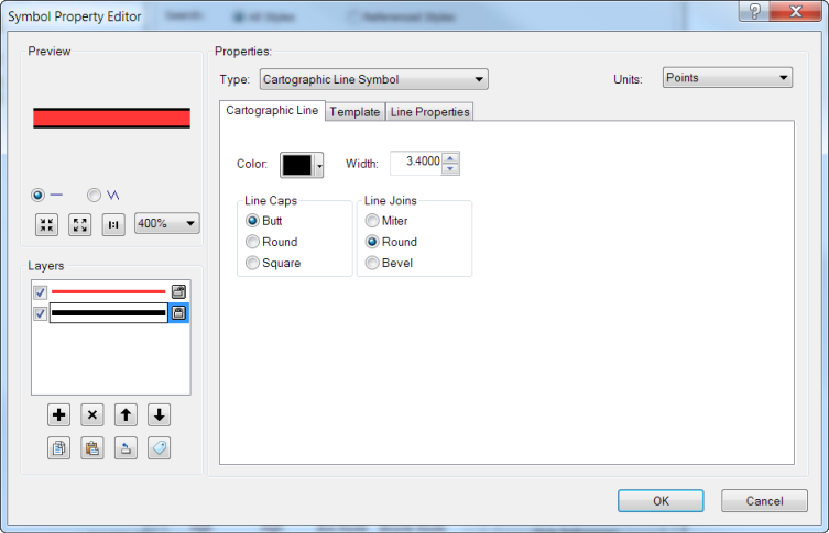
Figure 9. Cased line symbols can be created using two layers and making the bottom layer wider.
Polygon Fill Symbols
If you have to symbolize polygon overlay data, consider using the terrain basemap and the reference overlay basemaps, with your polygon data as the middle layer.
Some of the other basemaps use polygon fill symbols, like the topographic (topo) basemap. This means that they do not easily support polygon overlay symbology such as solid fills. With solid fills for which you do not use any transparency on the overlay you’ll obscure the underlying symbology (figure 10).
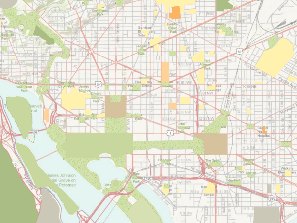
Figure 10. Landmarks are shown on this map with solid fill symbols obscuring the underlying basemap.
And if you do use a transparency you’ll compromise the legibility of polygons that overlay one another because your overlaid color will change the appearance of the underlying color, and visa versa (figure 11).
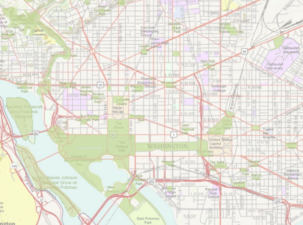
Figure 11. Landmarks are shown on this map with transparent fill symbols making both the overlaid data and the underlying basemap hard to interpret.
If you have to symbolize polygon overlay data with a basemap like the topo basemap, consider using polygon outlines (figure 12) or pattern fills (figure 13).
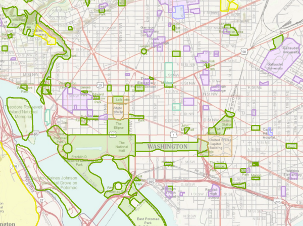
Figure 12. Landmarks are shown on this map with different outline colors.
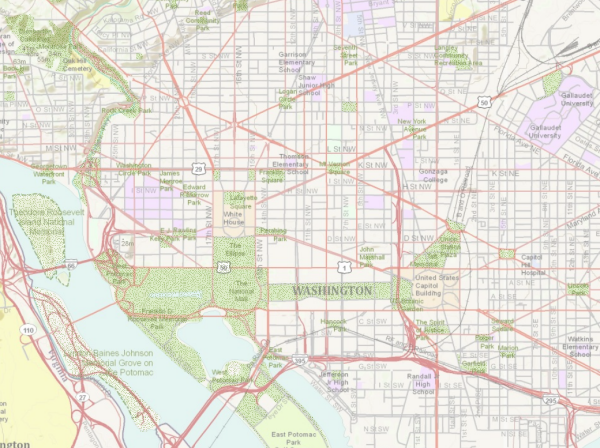
Figure 13. Parks are shown on this map with a stipple pattern fill.
TIP – Patterns can be used for qualitative or quantitative distributions. If the distribution is qualitative, vary the pattern arrangement (the shape of the symbol within the pattern) or the pattern orientation. For quantitative distributions, vary the pattern texture (spacing of the marks within the pattern). Note that line patterns that use parallel lines (especially vertical) can be irritating to the eye. If you have to use line patterns, orient them at 45° and make sure that the spacing between lines is greater than the line width.
Labels
For labels, you can use darker colors (black) and bolder fonts. You may also want to use shadows (e.g., black text with a white shadow) so that the text can be read even if the background varies from darker to lighter tones. Avoid using a mask (a single color “buffer” around the text, as this solution is best used when the mask color is the same as a single color background) (figure 14).
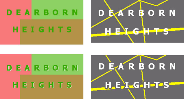
Figure 14. Use shadows to help distinguish text from a background with multiple colors; use halos to distinguish text from a background with a single color (from Brewer, 2005, Designing Better Maps).
Also, you will probably want to convert your labels to annotation so that you can position them so that they do not overlay the basemap text.
If you are labeling some of the same features as on the basemap, for print maps you could consider using an index to numbered or lettered features on the map (figure 15). For online maps you could again use the numbered or lettered symbols, but you could use pop-ups to display the specific site information.
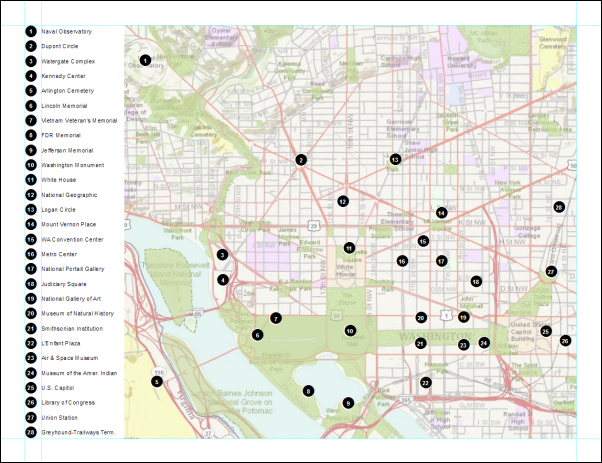
Figure 15. Use of an index helps you avoid adding text to the map so that the basemap text remains legible.
TIP – You can combine the use of the index with the use of a reference grid to also add grid cell coordinates to the locations listed in the index.
Map Scale(s)
One other thing you will want to do is to give some thought to the map scale or scales which will be shown in the final Web map. To mash up on the basemaps from ArcGIS Online, set your map scales to use the ArcGIS Online/Bing Maps/Google Maps scales (click the down arrow next to the map scale in the top bar menu of ArcMap, click Customize This List, click Load and choose the ArcGIS Online/Bing Maps/Google Maps scales) (figure 16).
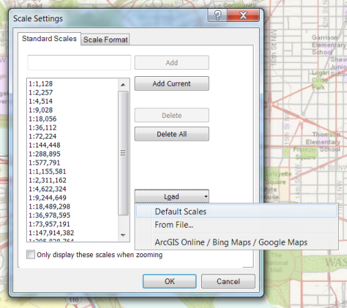
Figure 16. Loading the ArcGIS Online/Bing Maps/Google Maps map scales.
Conflation Issues
In cases where you are overlaying data that is already represented on the basemap, you may run into conflation issues (the data do not “line up”.) You will have to decide if you want to adjust your data to the basemap (not usually the case since your data will likely not be something you want to change, but if you do, you can use cartographic representations to just change the appearance of the data and not the underlying geometry) or figure out if you can “mask” the problem using creative cartography.
In the example below, we overlaid the major highways in the Washington DC area on the topo basemap, and the data do not line up in all locations. So we could use some cartographic tricks to mask the problem, such as wider line symbols, adding a casing, adding a drop shadow (using cartographic representations and the Offset geometric function, which will also add a 3D appearance) or adding more transparency to the basemap (figure 17).
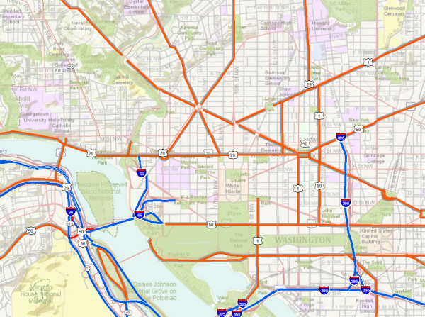
Figure 17. Roads on this map are symbolized with an offset geometric effect to create a drop shadow effect, which helps “mask” conflation problems between the basemap and the operational overlay.
You might also have an issue with labeling – if you want to use your labels for the roads, they may be duplicates of the basemap labels, or in some cases they might not agree with the basemap labels. Again, creative solutions exist, such as using bolder fonts or showing only some of the labels (e.g., the highway shields but not road names). As noted above, annotation will give you control over your labels so that they appear to complement rather than compete with the basemap.
Creating the Map Service
When you create the map service, you’ll normally turn OFF the basemap layer so that it does not become part of the map service you are creating. Then when you are done creating your service, you can re-combine the basemap service and your new service in the Web map application (app). This separation during the process of making the map service is necessary since each layer in the Web map that can be interacted with differently must be a separate service. Often, you want the user to be able to turn the operational layers on or off or to turn the basemap on or off. In our next blog entry, “Creating a Web Map Service”, we discuss the process of making the map service in more detail.
The Web Map Application
It is in the Web map app that you will set up things like HTML popups or other report elements, map elements such as a scale bar or zoom slider, etc… To do this, you’ll use a Web-based programming language like Flex, JavaScript or Silverlight (figure 18). Web APIs (application programming interfaces) make this part of the process easier.
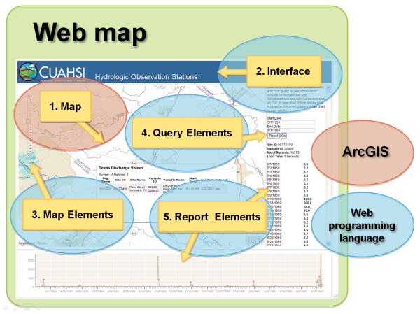
Figure 18. ArcGIS is used to compile the map used in the Web map app but most of the other content is added using a Web API.
If you don’t want to make your own Web map app, you can use the map viewers available on ArcGIS Online. There are two: the ArcGIS map viewer and ArcGIS Explorer Online. Both are free and neither requires any additional software installation. With these you can create and share maps with other ArcGIS clients, like ArcGIS Desktop and ArcGIS apps for smart phones. See the Summer 2011 issue of ArcUser for an article titled Share and use maps created in free online viewers for more information on these ArcGIS Online map viewers.
Coming Up Next…
In our next blog entry, we discuss the basic process for creating a map service. Also, look for an upcoming blog entry in which we review some basic guidelines for Web map design.
Thanks to Mamata Akella, Cartographic Designer on the Mapping Center Team, for her help with this blog entry!

Article Discussion: