Part 1 of 2
…
If you’ve ever been in the position of looking for a rich and wonderful globe graphic for marketing or because you need to communicate the scale and majesty of geography and you do a quick bit of searching (like the “detailed earth” example below), you will find that stock photography sites are just jam packed with vaguely-realistic idealized hyper-saturated sort-of-glowing highly-textured marvelous globe images.
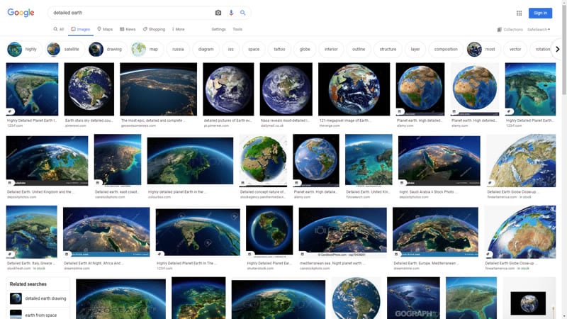
We map folks know that (most of) these are digital creations, but still there is something just sort of entrancingly realistic about them. They look big but charmingly small at the same time. You want to touch them. I see them all over.
Do you want to make one?? Well if you are a map maker then promise me that you will at least consider joining this endeavor and together we may swiftly overwhelm the ranks of stock image content.
Why?
Sometimes I can get too fixed on the theme or locational topic of a map. Focus and simplicity are nice aspects to a map, but when the theme is the beauty of Earth itself, then we have an opportunity to add in some rich context. When we build up a texture and atmosphere for our map we can present the reader a wonderful highly-visual world that will gain attention, and perhaps better capture some imagination and find a place in their memory. This is a wonderful goal for any map.
Let’s, as an exercise, take that example to the extreme. Take this building in the Faroe Islands for instance. It can be tempting to complete the aim of a map by addressing only the theme. But sometimes the theme is reinforced by building for it an information-dense setting. Consider how much more interesting the last image is compared to the first.

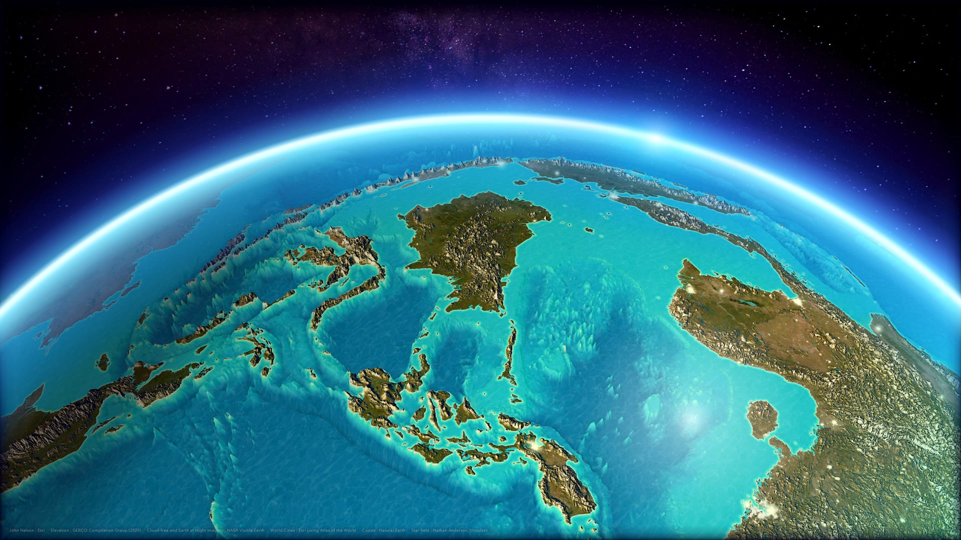
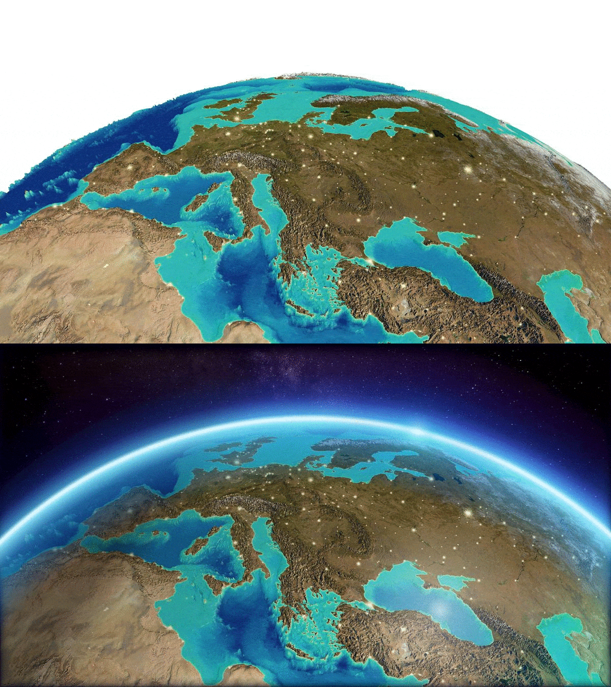
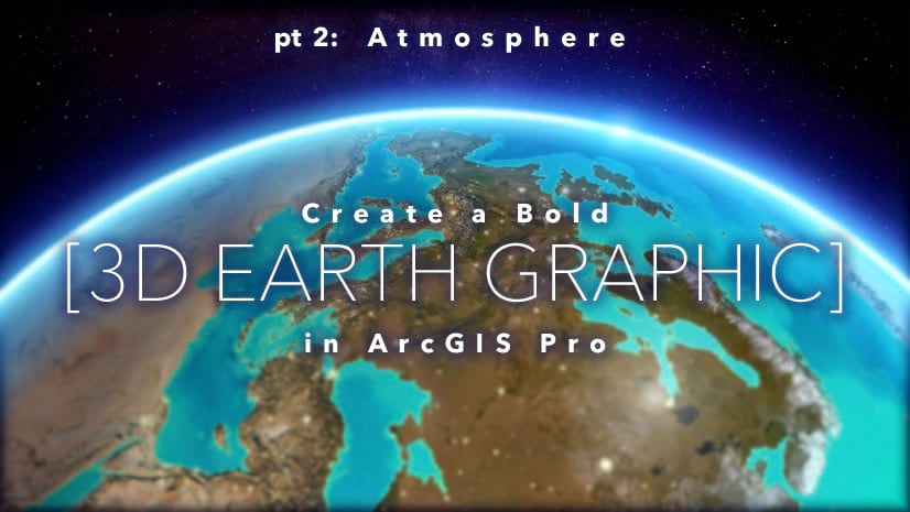
This two-part blog series (jump over to part 2, atmosphere) will walk through the creation of this “detailed earth” sort of image. Part one will focus on constructing the layers of the 3D map. Part two will demonstrate adding some bonkers custom atmospheric illusions.
Imagery
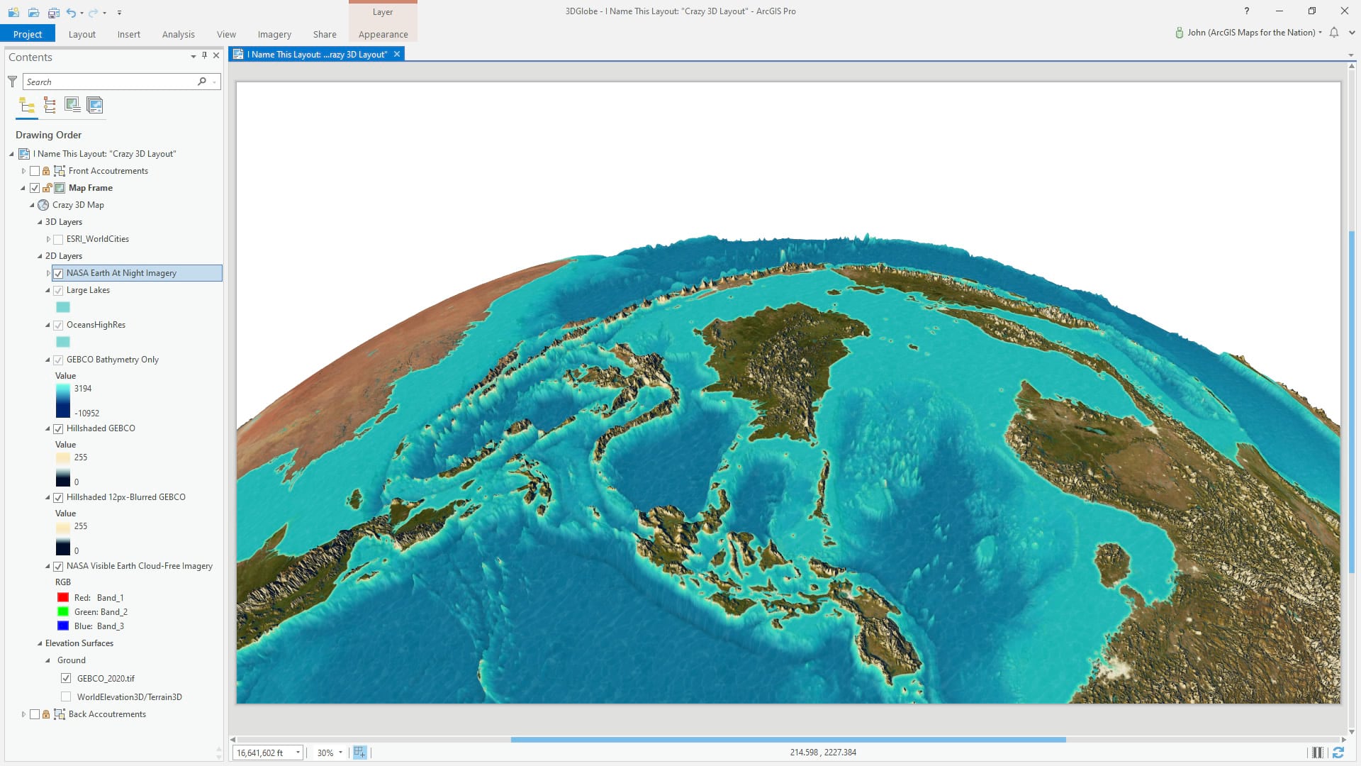
You have lots of options when it comes to choosing an imagery base. You can pull in the World Imagery basemap, or use the World Imagery Wayback app to time travel back to any previous instance of the imagery basemap if that suits you. I knew I’d be layering in lots of hillshade so the goal of the underlying imagery is largely to provide color and texture, so I used a local high resolution cloud-free mosaic of Earth from NASA Visible Earth.
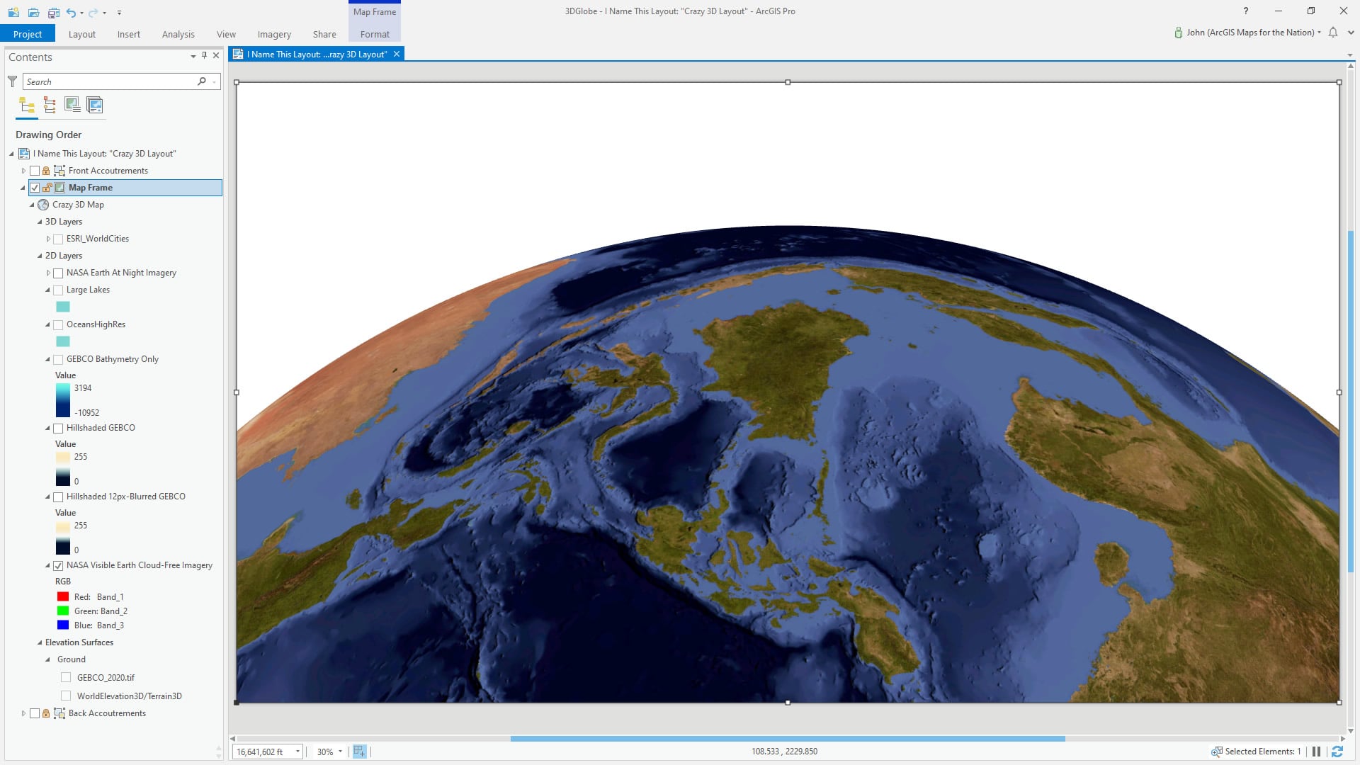
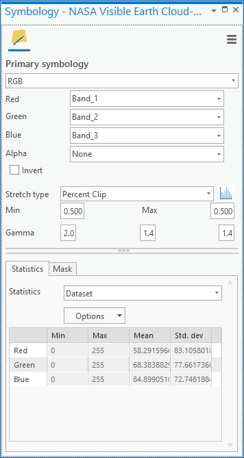
You might notice that the tint is a bit red. This is intentional, and possible by boosting the red channel of the RGB image with a higher gamma value in the symbology panel. I knew I’d be adding in lots of cooler tones for the atmospheric effect in part 2, so I wanted to proactively balance the globe’s hues with a toasty golden basemap image.
Terrain
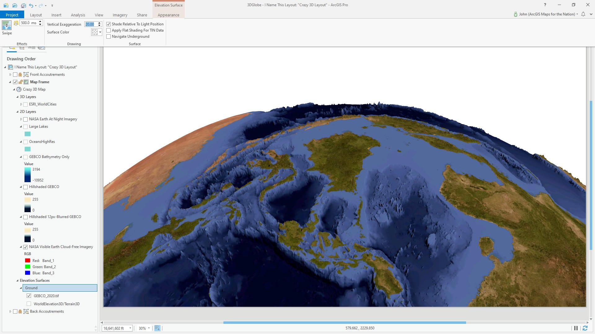
I added a GEBCO elevation image to the project, and dragged it into the “Elevation Surface” category in the table of contents. This gives the 3D map a super high-resolution elevation reference for the terrain. One of the defining characteristics of those luscious detailed earth stock images is the cartoonishly exaggerated terrain, so I applied a 20x vertical exaggeration. Yes! 20 times! Just look at the wondrously jagged result…
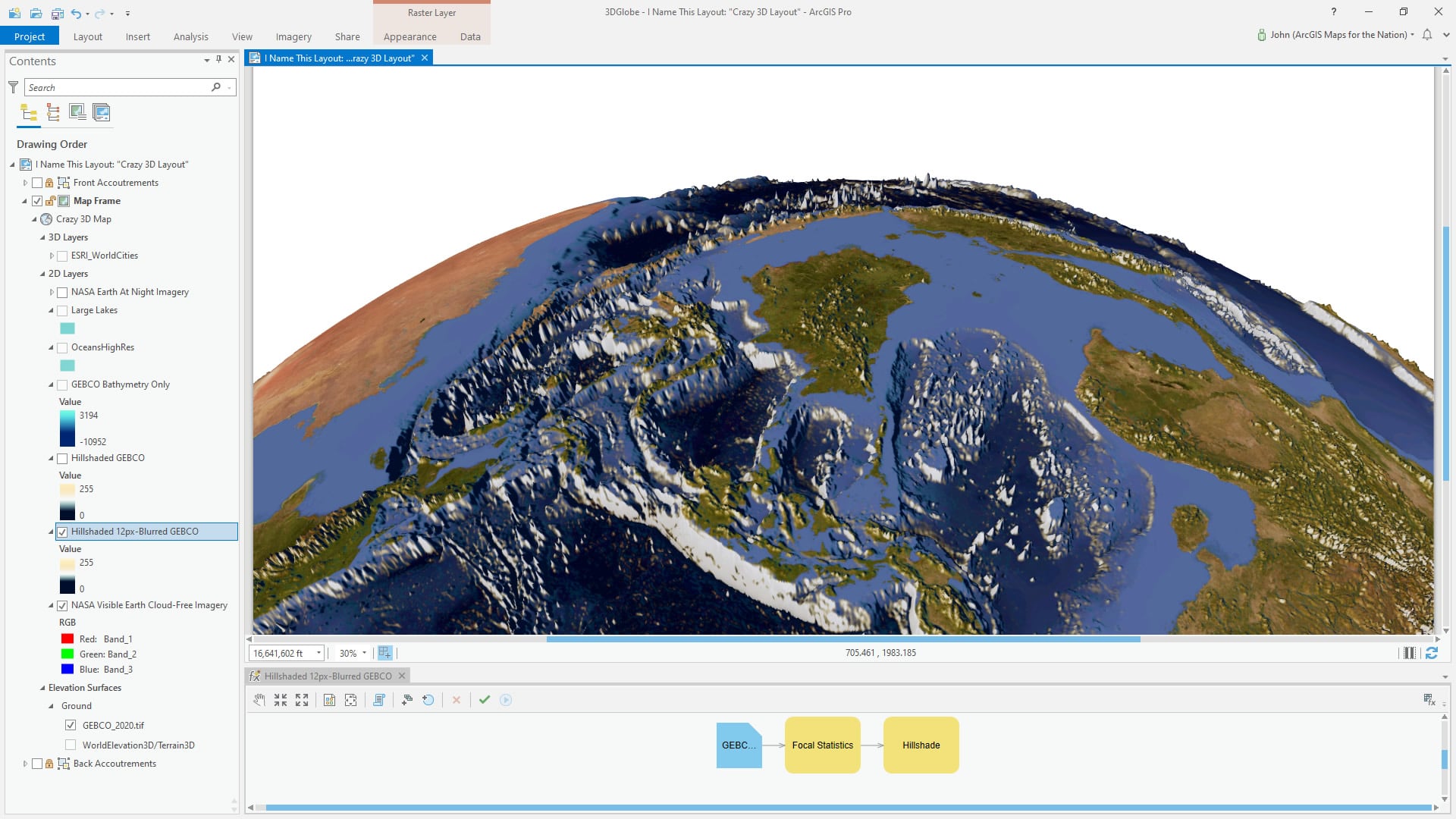
I used the same GEBCO elevation data to create two hillshade layers. You could also use the outstanding Topobathy (topographic and bathymetric elevation) image service from Living Atlas. I chose this local GEBCO elevation file because I knew I’d be exporting high-res images later and image services can have restrictions on how many pixels can be included in an export. The first hillshade layer I first blurred (which is effectively a way of visually generalizing a raster) using the “focal statistics” raster function (requires Spatial Analyst or Image Analyst). The hillshade of a blurred elevation gives a higher-order sense of mountains and overall structure.
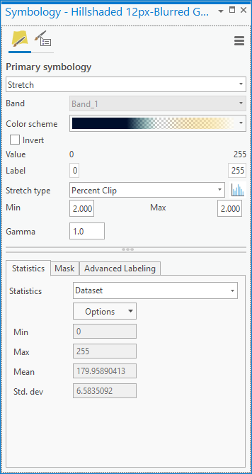
The color gradient of the hillshade only paints in light golden colors for sun-facing slopes and dark blue in areas of shade. Flat intermediate areas are transparent to allow the imagery to show through.
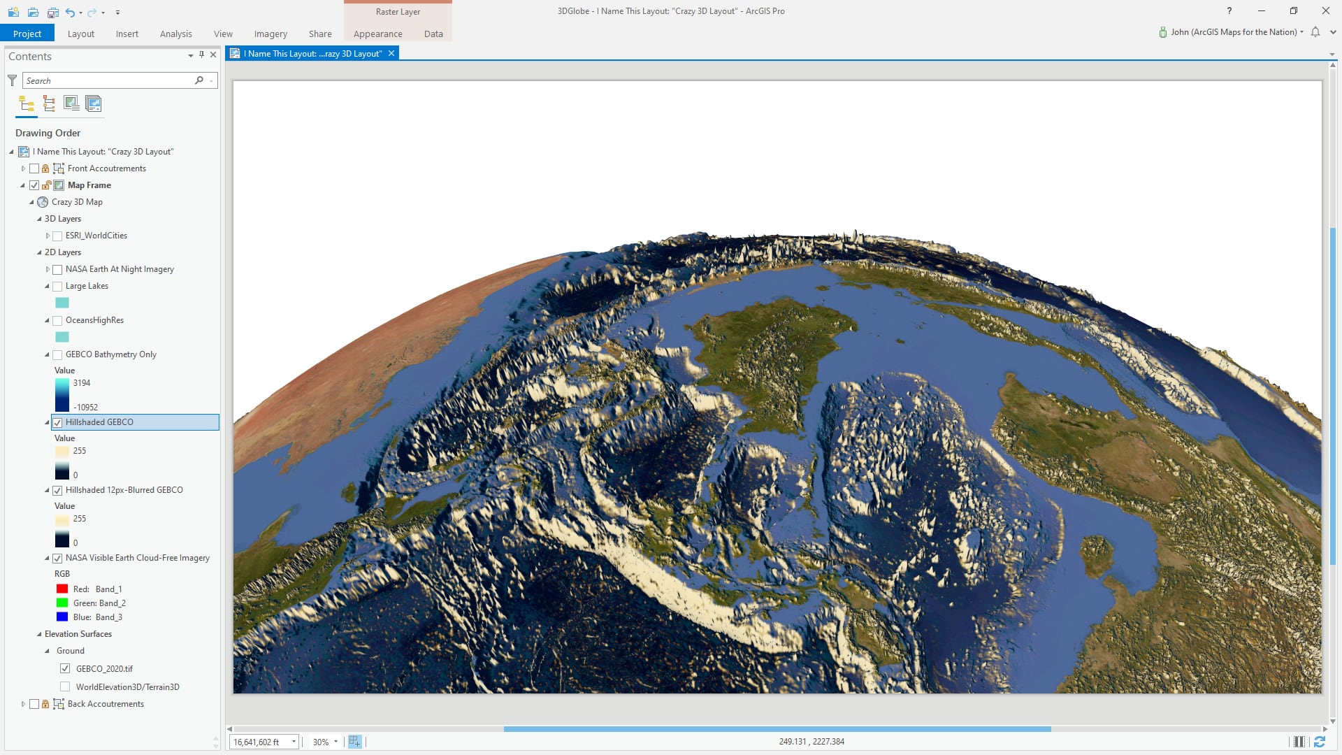
Then right on top of that generalized hillshade, I added a second hillshade with the same color scheme—but this one was full resolution to provide a sense of detailed local texture.
Bathymetry
This GEBCO elevation layer was used once again to paint a specific color palette in the oceans. Using the clip raster tool, the global GEBCO imagery was trimmed to show only oceanic areas.
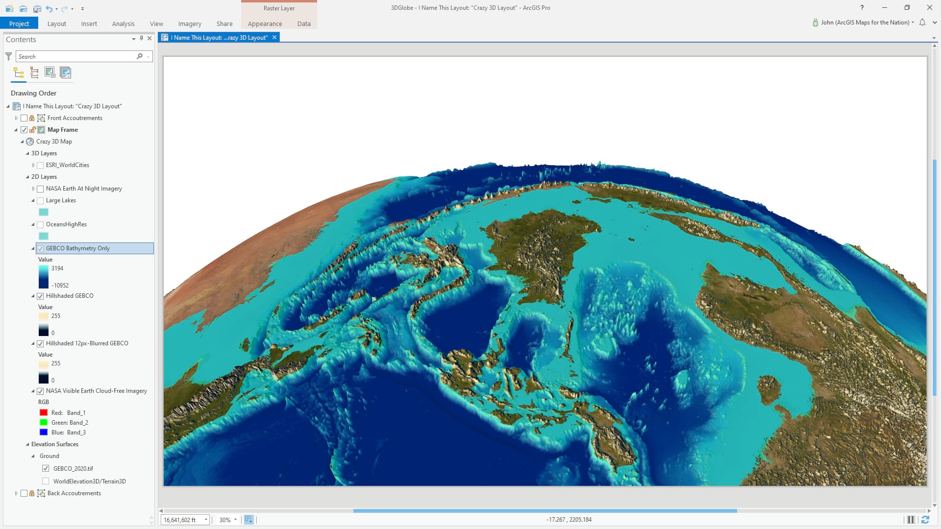
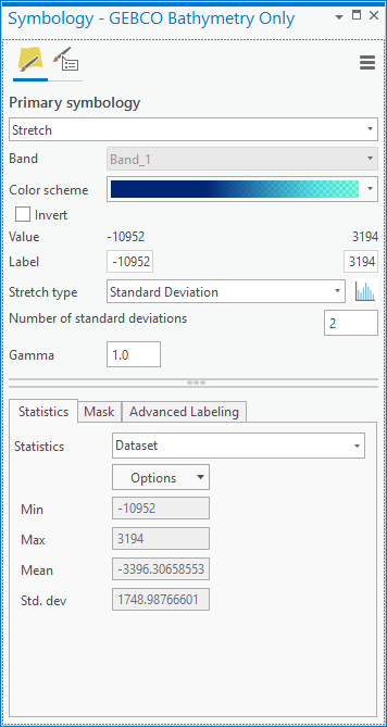
The oceans-only version of the GEBCO layer got a semi-transparent cyan in shallow water to opaque dark blue in deep water.
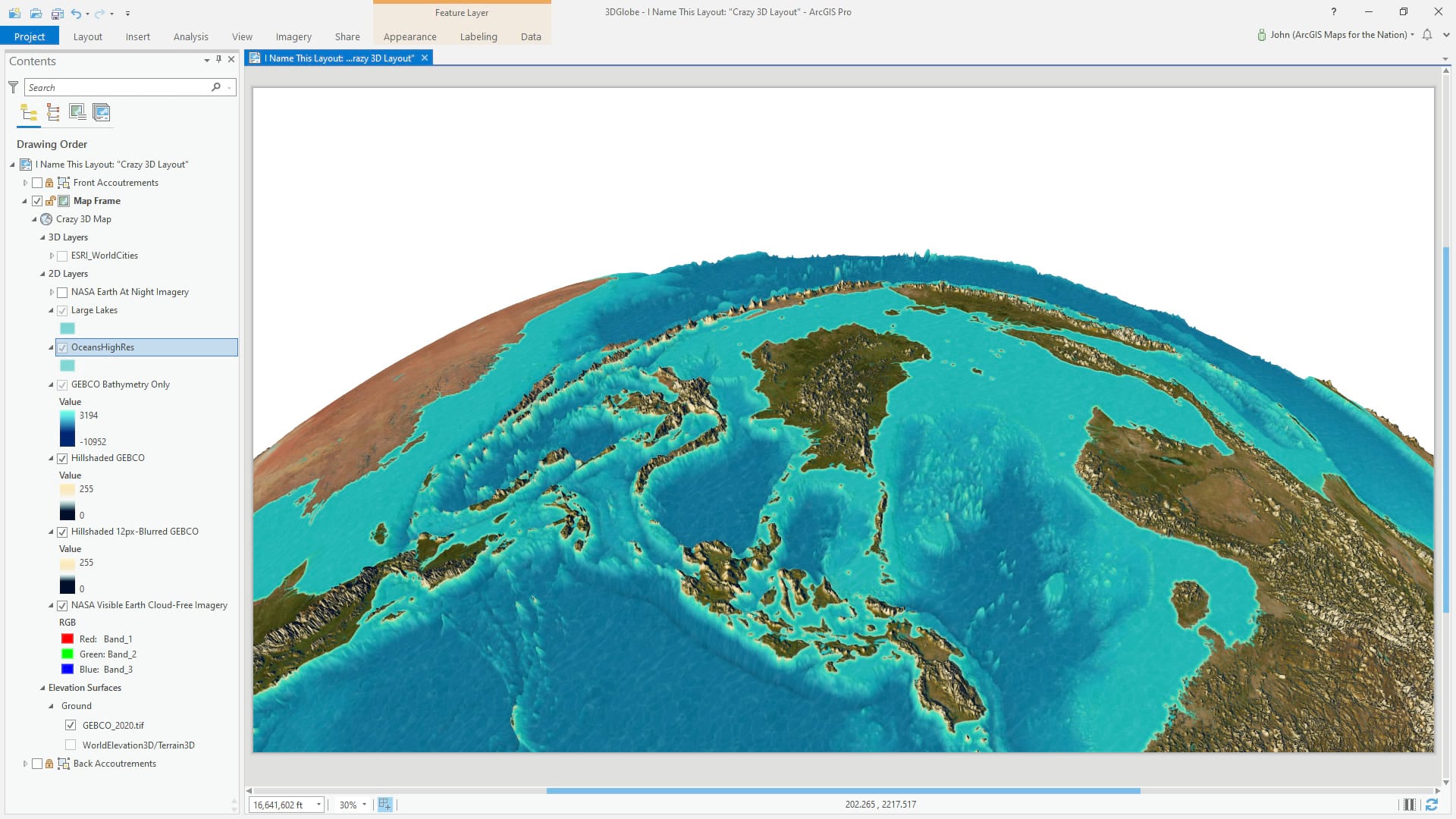
An oceans layer from Natural Earth (and dissolved into one multipart feature) was added in to create an exaggerated coastal beach effect and a reflective water texture.
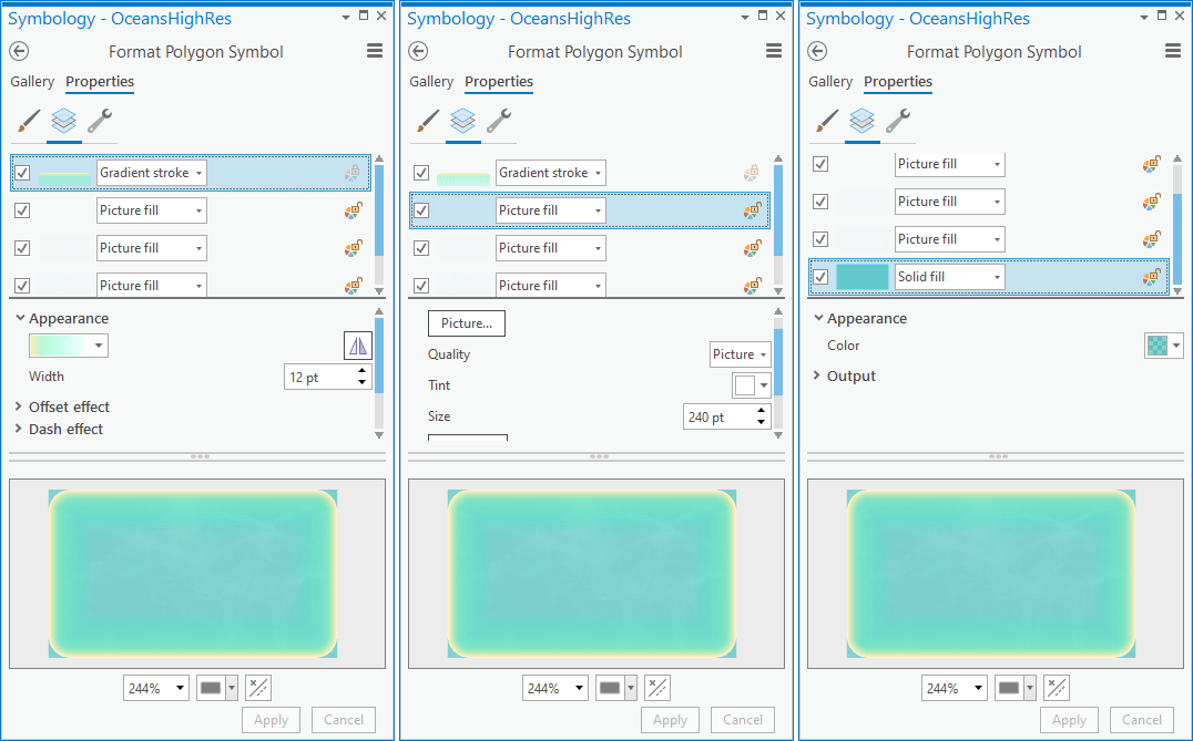
Here’s a look at the symbol layers given to this ocean polygon. A gradient stroke with a tan-to-cyan scheme, a reflective water picture texture, and a semi-transparent cyan fill all contribute to creating the effect of a cool body of water.
Glowing Cities
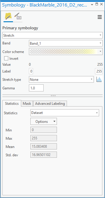
Lastly, one of the hallmarks of the “detailed earth” stock image aesthetic are the glowing population centers. The NASA Earth at Night imagery is a helpful source for these luminous urban tendrils that serve as an almost tangible proxy for population. To remove all not-night-light portions of the layer, a color scheme was applied that paints in white at full light areas and quickly fades to transparent yellow in darker areas. This is the result in the map.
Here’s a look at the color scheme.
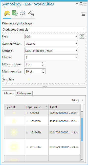
To reinforce these points of light, I added a World Cities point layer and gave each city a Firefly symbol, graduated by population. Moving this layer to the 3D layers section of the table of contents makes these point symbols appear to “stand up” in 3D.

And that is it for the crazy cartographic conflagration. Stay tuned for part two, where we’ll breathe some strange life into this 3D map with some custom atmospheric lighting…
Thanks for following along, I’ll see you over at part 2 where we blast in some excellent atmospheric effects!
Love, John

Article Discussion: