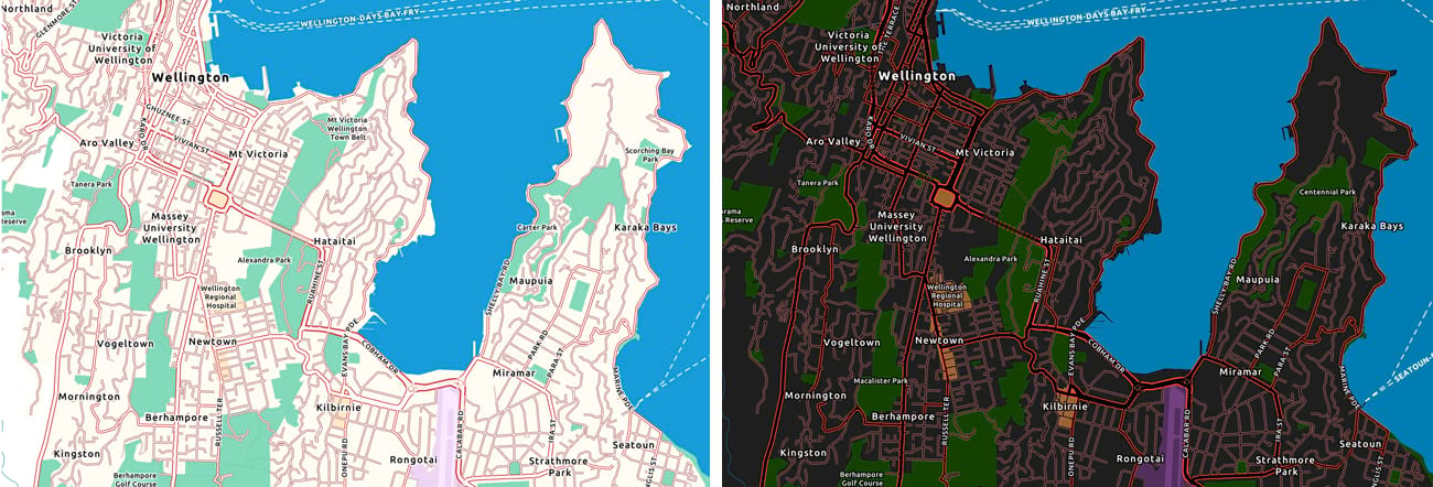
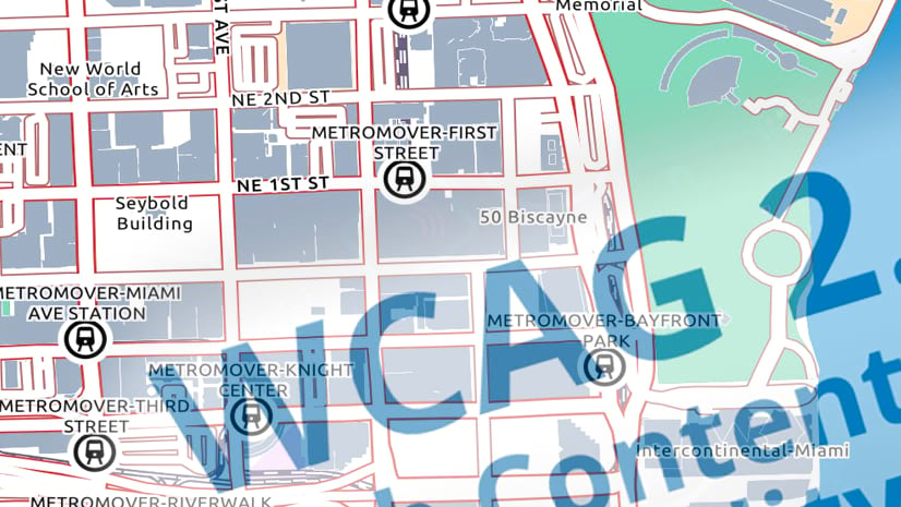
In October (2020) I wrote about my attempts to create an accessible, color-blind-safe (and WCAG-compliant) basemap. Since then I’ve worked on creating a ‘dark’ version.
‘Dark’ basemaps have become more popular in the last few years, driven by the drama of placing bright information over a dark and subdued background, so an accessible version would be a nice addition. The challenge is the same though: How do you achieve an effective visual separation between basemap features (implying stronger colors and symbols), without compromising its function as a base for your information?
The Results

As before, I’ve created two versions:
• This one is a single layer basemap that sits below your information.
• This one breaks-out the city and boundary information into a separate reference layer, to be placed over a base layer with the rest of the map content.
And as with the first version, I have been trying to find that balance between accessibility and functionality. The content is the same as the first map. The only differences between the two are color, and some minor adjustments in line widths. The palette is necessarily strong, so it should be considered more of a reference basemap, where your information is added to the overall picture (a ‘base-MAP’ in the words of the original blog)

Using the Basemaps
These basemap webmaps will be available for you to use via the URLs linked above for the foreseeable future (individual vector tile layers can be accessed from the ‘Details’ page). The map content is updated with our regular basemap data updates. I may make periodic changes to these map styles as needed based on your feedback and our experience using the maps.
If they prove popular, we’ll consider incorporating them into the core basemap set. We’ll try to give you plenty of warning if we decide to shut these URLs down and replace them.
I would appreciate any feedback you care to provide, either via the comments section below, or directly at askinner@esri.com.
Thanks again! Andy Skinner
Color-blindness suitability was assessed using ‘Color Oracle‘. Color contrast was assessed using contrast-ratio.com.


Article Discussion: