With the ArcGIS Business Analyst Web App’s extensive library of charts, tables, interactive maps, and easy-to-customize templates, you can present information and communicate the most important facts quickly and clearly using infographics.
The Business Analyst Web App, accessed through an ArcGIS Online organizational account, applies GIS technology to extensive demographic, consumer spending, and business data to deliver on-demand analysis, presentation-ready reports, and maps.
The best infographics are self-contained summaries of what the reader needs or values. They should be designed to display content clearly so complex relationships and patterns can be understood quickly. The Business Analyst Web App has many tools for creating effective and stunning infographics. Here’s my top 10 list of key features to make your infographics better.
- Floating Panels
- Conditional Images
- Copy an Element from Another Template
- Infographic Template Sharing
- Multi-Area Comparison Table
- Comparison Geographies
- Nearby Tables
- Conditional Style Lists
- Background/Overlay Images
- Copy a Cell Style or Conditional Style
Each feature improves your workflow and the reusability of your best infographic elements. I think of my infographics as a reusable library of styles and components that I can use to quickly build a new design to meet the specific needs of my audience. Thinking about infographics in this way and curating my ever-growing collection of design elements has saved me hundreds of hours working on new ideas, concepts, and customer-focused designs. Let’s explore my top 10 list in more detail.
1. Floating Panels
Most of the Esri infographic templates (accessed from Reports > Build Reports > Build Infographics) use a grid design. Each element in the infographic fits into a specific cell on the grid. This makes it very easy to create uniform templates that are aligned both horizontally and vertically. While you can merge and resize individual cells, this has an impact on other cells in the template, so all designs look very rectangular.
Floating panels remove those constraints to allow you to design panels that can be of any size, positioned anywhere, and overlapped. You get pixel perfect control of the size and positioning of each elements. Three other capabilities make this my number one feature: alignment, display order settings, and automatic resizing.
Like Microsoft PowerPoint, you can align elements with other objects on the canvas. You can also change the order of panels to send them backward or forward in the display. This lets you float text boxes as titles in charts, build compound elements, or move infographic “furniture” such as your company logo, copyright information, or data source references. All these noninteractive elements are best moved into the background, allowing you to work more productively on the key charts, tables, and graphics that are the meat of your infographic.
Finally, when you resize a floating panel subelement, such as an image or text, it will automatically resize that subelement, so you can make any individual panels larger or smaller with confidence.
2. Conditional Images
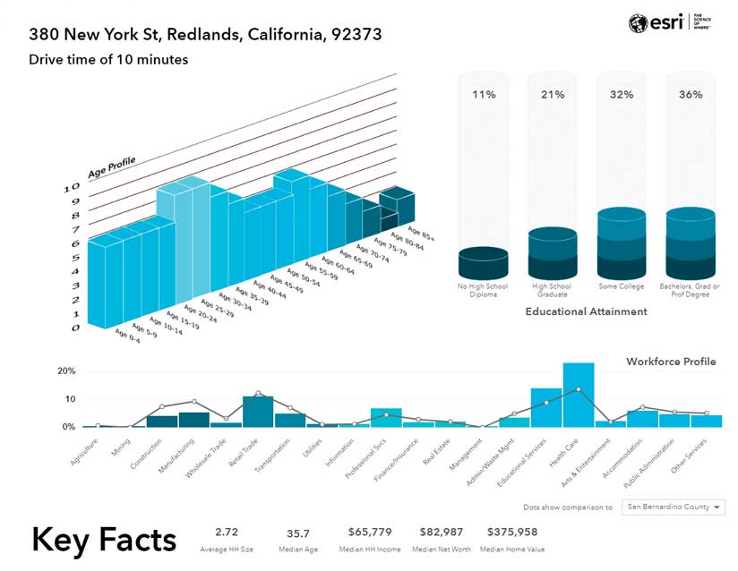
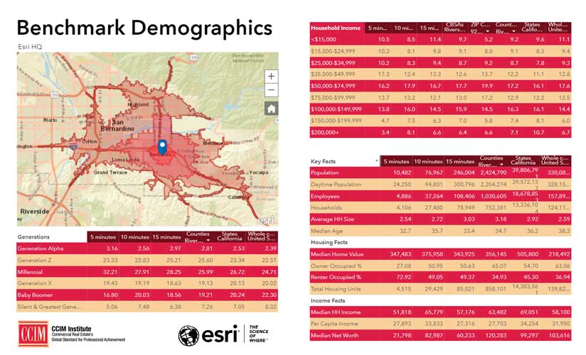
Any attribute can be restyled using conditional text and image formatting. The graphs grow and shrink with the variations in each class, and the graphs are labeled, using a floating panel, within the chart.
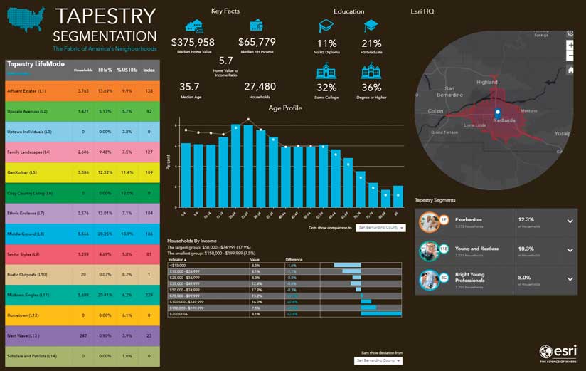
In the 3D graph in figure 2, the conditional image rules based on the percentage of people in each educational attainment group has been used to create a stacked cylinder graph. Conditional images and floating panels were used to construct the Age Profile chart as well. Each age band is sliced into 10 categories, with bars of different sizes and colors for each category. This chart uses conditional lists (which is eighth on my top 10 list). I copied the style for each of the 18 bands and aligned and ordered the elements to create the bar graph.
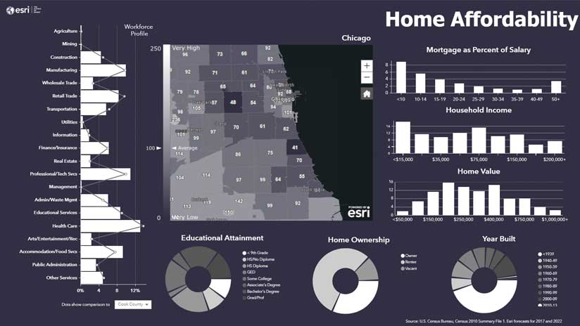
3. Copy an Element from Another Template
I often reuse and restyle elements between infographics. My Home Affordability design uses multiple elements, which were copied from other infographics in my library. The donut chart of educational attainment was restyled from a bar graph in another design, and the workforce profile was reoriented from horizontal to portrait to fit this new design layout.
By using a design theme, I could quickly change the blues in my original to the all-white style of this template. Design themes and infographic styles didn’t make my top 10 list, but they are fantastic for adding your corporate branding and quickly restyling infographics. I encourage you to check them out.
4. Infographic Template Sharing
Sharing templates lets you and everyone in your organization get access to the best work, designs, and elements. Esri has provided you with a starter kit. Esri templates are opened by default when you choose Reports > Build Infographics. I copy them all the time. I have shared a couple of my designs—the Executive Summary and Tapestry Profile infographics—with the development team, and those designs have been added to Business Analyst Web App so now you can access them.
5. Multiarea Comparison Table
Typically, infographics are compiled for an individual area. Multi-area comparison tables let you see the demographics or site attributes of multiple areas side by side and compare your functional geographies—such as drive times and rings—with formal geographies like counties, urban areas, or the entire nation.
Multiarea comparison tables also allow you to interactively highlight the characteristics of each area by hovering over the map or a column in the chart. Better still, any column can be sorted or filtered to show which geographies match your leading indicators. For example, if you are looking for areas with income above the national average, use a filter to select just those geographies. All data can be swapped between a table and chart view to provide different visualizations.
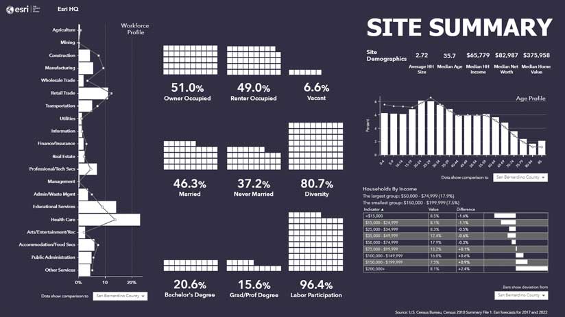
6. Comparison Geographies
Charts can also be visually compared with different geographies. In the Site Summary infographic in figure 6, graphs, and tables have a drop-down list which allows the user to compare the current area with other formal geographies they cover like ZIP Code, counties, or states. If an area covers multiple formal geographies, they will be shown in the drop-down list, just as they are in multiarea comparison tables. When using comparison geographies in charts, the details of the formal geography will be shown as a line on the chart, so the reader can quickly view differences. Once again, the panels allow you to switch between chart and table view.
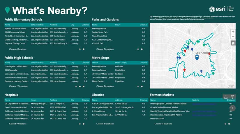
7. Nearby Tables
Nearby Tables are another interactive feature that can be added to infographics. Esri has a curated list of businesses by type, which you can automatically add as a table and interactive map. In addition to restaurants, shops, and convenience stores, you can add your own nearby point data using maps from ArcGIS Online. Nearby Tables show which points are in your current trade area and how far away the area is from your site.
In the What’s Nearby example in Figure 7, I have added schools, parks, libraries, and other destinations published by the City of Los Angeles into a residential neighborhood infographic. Each table lists the closest facilities, which can be filtered by name, direction, or distance. Schools, hospitals, and parks are shown with different symbols on the map, and hovering over the map pin highlights the feature in the corresponding table.
I particularly like the fact that I can add a data source, like farmers markets, as a table but not show it in the map. This reduces map clutter and improves readability while still providing a dynamic table of points of interest.
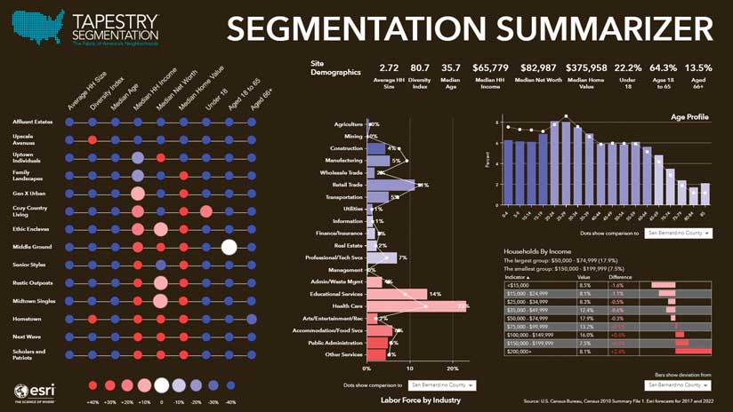
8. Conditional Style Lists
I often need to develop tables that reuse styles and images. In the Segmentation Summarizer infographic in figure 8, I am comparing nine different attributes for each of the 14 Tapestry LifeMode groups. The color and size of each dot in each cell are determined by the average value of the attribute for each segment with nine different conditions for each attribute. That’s 1,134 different conditional tests (if I were to hand code each one)!
Conditional lists let me set up a rule set that I can apply whenever needed. Each list contains the categorical groupings (greater than/less than XYZ) and the image used for each category. By applying a list, I can quickly slice any variable in different ranges and then style the text using font and background colors or replace the text with an image. If I need to use a different category interval or style, I can simply edit the current styles and rules. This is considerably faster than defining those rules each time. Similarly, if I need fewer or more conditions, I can add or subtract them and be assured that I maintain the same style rules.
Conditional lists are my secret weapon to creating many different visualizations, but there are so many other features I love that it came in at number 8 on my list.
9. Background/Overlay Images
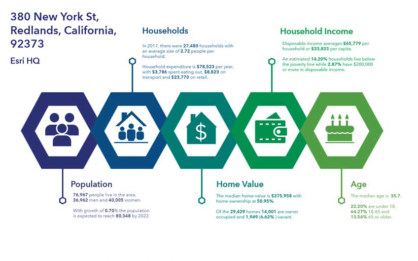
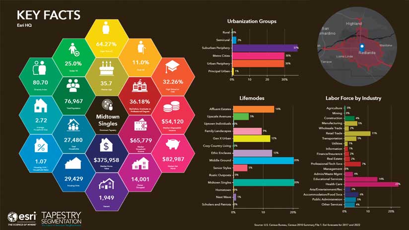
Another secret weapon is using images behind or above other elements to enhance them. In the Key Facts infographic in figure 9, I use floating panels to accurately position, align, and group the 19 different facts into the center of the honeycomb image. Many other infographics use images to enhance the design or provide the reader with more information by using legends and key art. I often use transparent and full-page images to add design effects to infographics such as drop shadows, texture, and brand colors.
10. Copy a Cell Style or Conditional Style
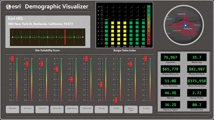
Last, but certainly not least, on my top 10 list is cell-based copy and paste. I built the crazy retro Demographic Visualizer infographic using almost every one of the noninteractive features in this list. It uses background and overlaid masking images; 3D shadows; conditional lists to add textures to each cell and multiple; and floating panels to develop the entire effect. Key to achieving the final product was being able to copy and paste styles between cells and data variables.
The slider button visualization was created using a conditional style in a table that contained 10 different variables. I wanted each variable to be shown in a position that reflected its variation from a target score. By copying the style of my master cell, I was able to style each column in the table in a consistent way. Using a conditional style meant I only needed to change the ranges for the different variables. I also used this technique to set the text style on the readout displays in the bottom right of the infographic.
Give It a Try Yourself
Creating beautiful, communicative infographic designs in Business Analyst Web App is much easier than most people imagine. Each of these techniques takes just a few minutes to learn and master. With a little creative flair or some inspiration found on the Internet, you’ll be well on your way to making infographics that give your reader a better understanding of the demographics in an area.