I have more than 50 years of experience as a cartographer, and a large part of that time has been spent designing and building complex reference maps. Over time, I’ve developed my own techniques for handling this work.
Thanks in part to my commercial background, I’m a reactive cartographer. I tend not to dream up new ideas myself. (I leave that to the innovative Esri cartographers around me, particularly my colleagues on the ArcGIS Living Atlas of the World team.) My background is in developing concepts based on the requirements of a customer and I’m skilled at it!

Defining the Concept
This may be the trickiest part of the whole process, particularly if you are developing a map for someone else. You need to be a good map designer, but you will also need to be a collaborator, a teacher, and a diplomat. Some people see cartography as just another design exercise and others see it as a form of alchemy. You need to be ready for both possibilities.
The customer could be a book or map publisher, website developer, or just a colleague—anyone who is coming to you for some help. If the product is part of a larger presentation, you will find that cartographers tend to be towards the bottom of the food chain. For example, a book will have an author, a publisher, and a designer, and all of them will have opinions about how the map works with their content.
Usually, I would try to identify the key player and ask them what they want to achieve with the map or maps. They may have a very clear idea of what this is, but frequently they are not too sure themselves! They may say “You’re the cartographer—you tell me.” It will require some discussion. Almost certainly it will require some tact and diplomacy. It may require two or three blind attempts that result in reactions, such as “Oh…that’s not what I imagined at all,” before you get them to provide clear direction.
If you have the time, try to come up with more than one approach and present them as alternatives. You have a better chance of getting inside your customer’s head if you have something for them to look at. You don’t need to develop the ideas fully, but you may find that your customer has problems seeing your efforts as a draft, so be careful.
And try not to get too frustrated! Whether the customer is internal or external, they are looking to you to bring some clarity to their concept. Whatever you think about the agreed result, they will be proud of it. They may want to take credit for it as well! It happens, and you will need to develop a thick skin.
If your map is going to be part of a larger presentation (a book or magazine, or a website), it’s possible you will be working with a graphic designer who has the responsibility for the overall look of the product. There is the potential for some tension here.
The graphic designer will be focused on how the map fits into their work, and that is important. They may, justifiably, want to have a say in some of the components of the map (such as color palettes and font treatments). Our focus as cartographers is the successful depiction of the map’s message, but we have a responsibility to do that in a way that fits comfortably in the map’s surroundings. Be willing to follow the designer’s guidelines but be ready to push back if you feel that the effectiveness of the map is compromised by their requirements.
How Many Maps?
Is this one map, designed by you, or is it one of a series? This has important implications.
If it is one map, then dive in! You are probably designing and building it, so you can go where you (or your customers) want.
If it is part of a series, you will need to establish a common style, which will probably involve standardizing map furniture (e.g., titles, frames, scales, pop-up styles) and font treatments. It may involve some common symbols within the map. Are your boundaries dashed lines with a tint band behind? Can you stick with dashed lines for the entire set without having it clash with other symbols? Do you need to make subsets of designs based on themes? If so, how do these themes hang together?
Who Is Doing the Work?
There may be more than one person working on the maps. If you are the cartographic designer, you will need to provide other people with a template and/or a list of common specifications and guidelines so that the whole set has a unified look and feel. Building specifications or templates can be tedious, but as a designer you will need to accept that as the less-fun part of a fun job.
If you are working to another cartographer’s design, you will need to be objective. You may not like what you are building, or you may think you can improve on it. That may be true, but the designer has the responsibility for holding the whole set of maps together, so don’t be a maverick.
Executing
How do I go about starting a map design? I’m focusing here on the type of detail-rich reference map that I used to build, and the basemaps that I now build.
Establishing a Hierarchy
A visual hierarchy (as distinct from a layer order) is the key to making a map work. That is doubly true with a complex reference map. A starting point might be to build a quick and generalized list of what you think is that hierarchy. This depends to some extent on the map’s subject. It may be a reference map, but it’s going to focus on roads or boundaries or physical features or whatever you decide. (An admission: As I’ve become more experienced, I find I tend to just dive in, and work it out as I go. If you are starting out though, a bit of structure is not a bad thing.)
Printed or Static Maps
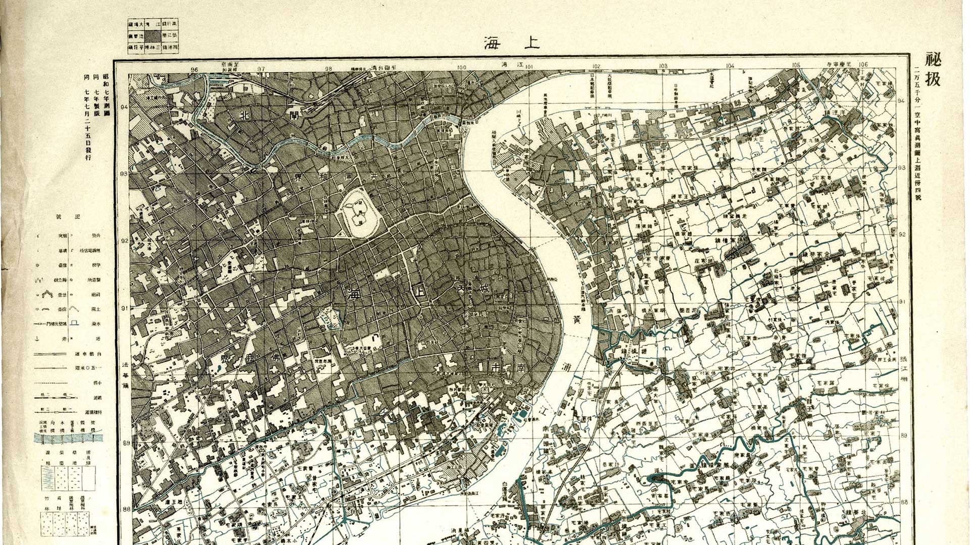
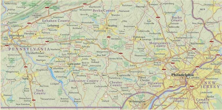
A static reference map is basically a huge puzzle. The first job is to decide how many pieces it has, so get everything in there! Start the design work by establishing that hierarchy with color and symbolization, then start moving symbols—particularly labels—around.
If you are in a GIS environment, a lot of the label placement can be done automatically using the labeling rules in ArcGIS Pro. It does a pretty good job if you take the time to set it up properly, and it’s very possible that you will not have the time to do more than that.
If you do have the opportunity for some manual adjustment, don’t ignore it. A skilled cartographer should be able to transform a GIS map from adequate to exceptional. The changes may be invisible to the user, but they sharpen up the map. A user may not know why the map is working better, but they’ll know that it does.
Multiscale Online Maps
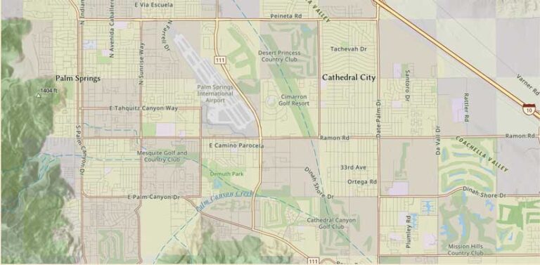
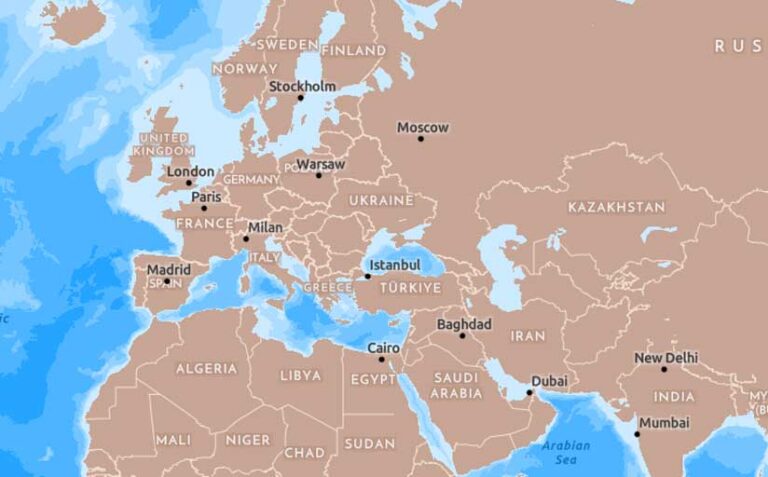
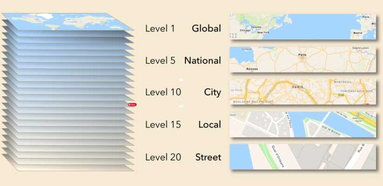
A multiscale map gives you the opportunity to develop the symbolization across more than 20 scales or zoom levels. It’s the reverse of a static map. Rather than packing everything into one view, some details can be introduced at more appropriate scales.
The map appears empty when compared to the static version, but in fact it has far more information as you zoom in. That makes things easier to work with at each scale, but the transition between scales needs to be seamless. We spend a lot of time working on those transitions so that they happen in a way that doesn’t draw attention. We’re not always successful. Sometimes we are limited by the data available, but in most cases we cartographers do a pretty good job.
The Approach
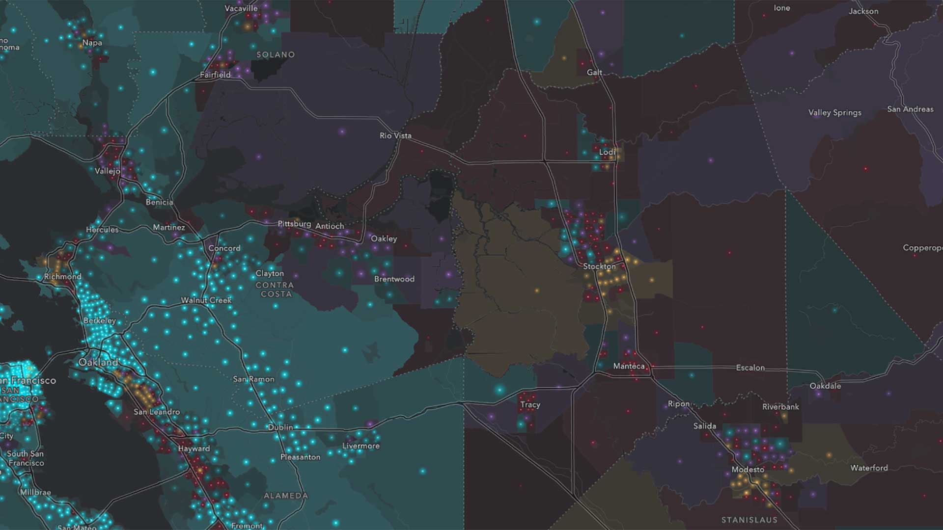
If you have used Esri basemaps, you know they contain a massive amount of information, so this is a complex issue. I’ve always been interested in the concept of separating information by reversing some of it out. Esri does this to some extent with Canvas basemaps, which have reversed roads, but those are kept subdued so that they are part of a pale background. As a challenge, I wanted to build an online basemap/reference map that separates boundaries and administrative data visually from the rest of the content without oversimplifying the map.
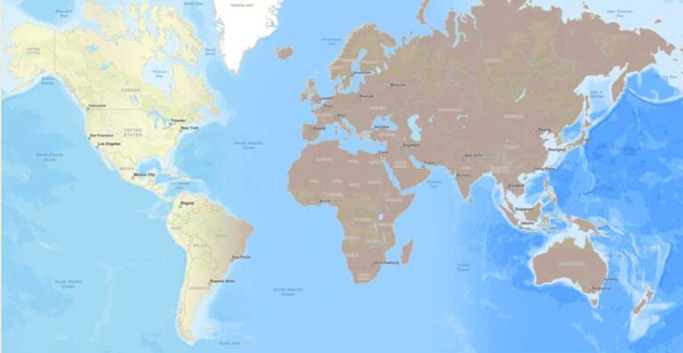
As a starting point, I look at the broad-brush items of the map, such as land, and set the agenda for the rest of the map information from there. I may change these items as the map progresses, but this gets the work off the ground. The reversed information would be a feature of the map. It required that the land color be in the mid-tones, between 30 to 60 percent, which is not something ordinarily done with a basemap. The goal is for the reversed features to be the background. My source was the Streets basemap, so I opened that into the Vector Tile Style Editor, saved a copy, and made the adjustments to the land and water.
Working the Detail
Usually, I work from small scales in, adjusting the increasing content as I go. It’s not a linear process though. I am constantly zooming out and back in as I come up against more items or symbols. It can be frustrating! Just as you feel the map is coming together, you will find something new that forces you to rethink the map.
Others prefer to work out from the largest scales, establishing the full range of symbolization available, then figuring out how to thin it out at smaller scales. Neither is the correct way. Do whatever you are most comfortable with.
One compromise is to find some key scales to set up, then transition between them. For example, Esri Basemap symbols tends to transition to large-scale data sources around Zoom 11, so it may be worth establishing a design at this scale, then working in both directions.
Nitpicking
With the basic concept established, the work really starts. Zooming in and out across the whole world, looking for combinations of features that don’t work together, then tweaking them, then checking again. It’s the least enjoyable part of the process, but also the most critical. This is where the product moves from being a concept (what an old manager of mine called a map-like object) to a fully functional map.
Review
Never trust your own judgment 100 percent! Once I’m happy with the map, I’ll send it to a few trusted colleagues for review. It’s almost guaranteed that they’ll find something I’ve missed. While I’m waiting for the reviews there are some other tasks to do.
Layering the Map Online
Usually I’m working on a single-layer version of the map while I’m designing it. At this stage I decide if I want to use the sandwich option—separate out layers and/or other information into a reference layer. If I’m building a basemap, I’ll bring in some sample map content to see how the whole concept hangs together. This may lead to a little bit of redesign around label haloes and the like.
For my map, I decided to use a base layer, a label reference layer, and a separate reference layer with the boundaries that are the feature of the map. I needed to adjust the boundary lines so that they will work over any content. The best way to do that is to give the line light and dark components. In this case that is a light line with a dark casing.
The Details Page
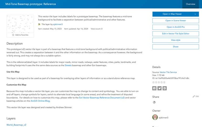
This is tedious, but critical. It’s likely that the information in the details page is what a user will interact with first, so it needs to be filled out. Not just for a web map version, but for each of the component layers.
Letting Go
So, the reviews are back, you’ve made some adjustments, and you’ve finished the metadata—but there’s just that one thing you noticed that you want to change. This is the dangerous stage of the project. You can spend days sitting on the map, trying to make it perfect. I’m not immune to that.
The most important skill you can learn is how to decide when the map is good enough. Let it go! There is other work waiting for you! Publish the map, then decide if you need to get the word out about it, and how.
In my print days, it was a literal letting go. Once a map has gone to press there’s nothing more you can do about it. Partly for my own sanity, I learned to forget about a job after it was done, to the extent that I had very little interest in it when the published version came back.
That is not as true with online maps. You want the first release to be as presentable as possible, but it’s easy enough to make revisions later. But that doesn’t mean redesigning! Correct and improve, but the map is in use, and you don’t want to make changes that affect the way it interacts with a customer’s content. As for me, I’ve had to learn to reengage, so that I’m able to maintain my maps going forward.
Building Experience
As I stated at the start, this is my personal approach to planning. It’s a model that you may want to try out but expect to develop it into something that suits your way of working.
If you are just starting out as a production cartographer, the chances are that you’ve come from a college environment where you were encouraged to innovate. You were given plenty of time to develop your ideas, and you may have been very successful at it.
Now, you are building maps for customers. That may be a paying customer or your manager or a colleague. While you still want to innovate, there is now a decision-maker who might have their own ideas of what the deliverable might be, and there is a cost involved. The treadmill aspect may be a bit daunting at first, but with time and experience you will learn how to hone-in quickly on those great ideas, turn them around on time, and do it to the satisfaction of you and your customer.
