Many local government organizations are searching for quick, cost-effective ways to get more out of their data. Dashboards are a great tool for presenting operational, analytical, and other kinds of data. But while they are becoming more popular across various industries, local governments appear to be adopting them at a much slower rate. That is because impediments—such as lack of staff resources, budgetary constraints, having too many other priorities, and a shortage of expertise—oftentimes slow the growth of technological innovation at the local government level.
With local governments collecting ever-increasing amounts of data, however, there needs to be an easy way for managers and officials to see this information so they can stay informed and make critical decisions. Dashboards do just that, providing officials with access to data in real time or near real time so they can drill down into it quickly and effectively.

The property tax assessor’s office—which identifies, lists, and values all the properties within its jurisdiction in a fair and equitable manner—amasses an especially large amount of data. Although GIS is still an emerging technology in many of these offices, particularly when it comes to contextual solutions that make assessors’ jobs easier, using dashboards can help with a range of processes, from collecting data and conducting analysis to streamlining workflows and ensuring compliance. What’s more, dashboards can be deployed quickly to help property tax assessment professionals better understand how their assessments are performing compared to actual sale prices via industry-specific metrics.
Two types of dashboards in particular—operational dashboards, which provide a high-level glance at information, and analytical dashboards, which furnish more in-depth analysis of valuation trends—can together help property tax assessors better understand their data.
Operational Dashboards Help Guide Managers, Appraisers, and Administrators
Operational dashboards, such as those made with Operations Dashboard for ArcGIS, are often very illuminating. They can provide assessors with important contextual information about how their assessments are performing, the efficiency of their workflows, the rates at which appraisers are doing inspections, and more. They also usually convey these details in real time or near real time.
For example, to stay on top of heavy workloads, assessors’ offices often track the number of property appraisals and appeals they need to process in a given day, week, month, or other time frame. Using Operations Dashboard, staff in an assessor’s office can visualize all these metrics and more in one place and then create a to-do list to better identify everyone’s workloads and determine where to concentrate efforts.
At the manager level, an operational dashboard can provide metrics on the distribution of staff workloads. For instance, if one appraiser has 500 appraisals left to do and another one has none, a manager can redistribute some of those outstanding inspections as the deadline for finishing them approaches. These kinds of managerial dashboards can also be used to see the number of building permits the assessor’s office has to process or how current assessments in particular areas are performing (i.e., how equal or uniform they are).
For appraisers and administrators, an operational dashboard can provide them with a breakdown of their individual workloads. For example, an appraiser could see how many inspections they have to do in each neighborhood, or an administrator could keep track of how inspections, sales, and building permits are spatially distributed within the appraisers’ respective areas.
All this data, visible in an easy-to-understand operational dashboard, can help decision-makers allocate resources appropriately and foster continual improvement.
Analytical Dashboards Allow Deeper Data Dives
Analytical dashboards enable staff members to gain an understanding of the distributions and relationships among their data. When it comes to making sense of business intelligence data, these kinds of dashboards equip analysts to draw concrete conclusions, give good recommendations, and make better decisions.
Assessors are often looking for information to analyze how well their assessments are performing at various levels of the spatial hierarchy—in certain market or submarket areas or neighborhoods. Assessment inequity, or dissimilarities among assessments of similar properties, can be caused by many factors, such as field appraisers miscoding a property’s features or outlier sales that aren’t representative of an entire neighborhood. This can play into how data analysts define assessment models and draw market areas.

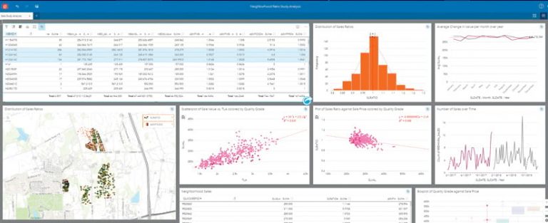
ArcGIS Insights can help property tax assessors evaluate business intelligence data in several different ways. For example, assessors need to understand how property assessments compare to existing sales prices—a metric known as the sales ratio. Sales ratio studies are used throughout the industry to measure the overall level of assessment and uniformity, both of which show how accurate assessments are. The International Association of Assessing Officers (IAAO) provides industry standards for evaluating assessment level and uniformity throughout a jurisdiction. Additionally, in the United States, most states have their own regulations to ensure the level and uniformity of assessments.
Using Insights, assessors can visualize sales ratio studies at different levels of aggregation—by the market, submarket, or neighborhood level, for instance. This helps assessors see where they are performing well and where assessments may need to be shored up or reevaluated.
Insights is easy to deploy and use. Assessors can select property data and drag it onto a card to visualize it as a map, chart, or table. The cards can be linked, which makes digging deeper into the data quick and easy. To concentrate on one data selection, such as market area or quality of construction, a user can pick that row in a table to automatically change the maps, charts, and graphs in Insights so they center on that data selection.
Analytical dashboards, like the interactive maps, charts, and tables available in Insights, can help keep analysts apprised of performance metrics throughout their jurisdictions and remain compliant with IAAO standards and state regulations.
Resources for Implementing Dashboards
There are great resources available for local governments that want to implement more GIS—and location-based dashboards—into workflows at their assessors’ offices.
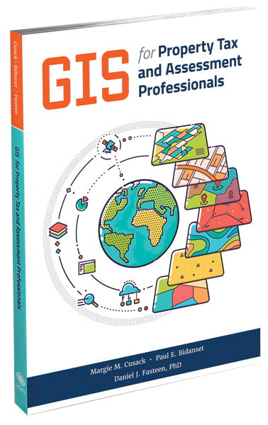
The IAAO recently published a book called GIS for Property Tax and Assessment Professionals, which provides an in-depth look at the use of GIS within the assessment field. The book was written with two audiences in mind: GIS professionals looking to understand the technology’s role in the assessor’s office and assessment professionals who want to enhance their analyses and workflows using GIS.
In addition, there is the annual GIS/Valuation Technologies Conference, presented by the Urban and Regional Information Systems Association (URISA) and the IAAO. The conference shows professionals in the property assessment, tax administration, mapping, and information technology fields how GIS and other integrated technologies can help with valuation and assessment. The next conference, in Louisville, Kentucky, in March 2020, is themed Thriving in a Disruptive Tech Era. The keynote speaker, Louisville’s chief of civic innovation and technology Grace Simrall, will share her experiences implementing new and emerging technologies in city government.


