And Showing a Strategic Supply Chain Management Class the Value of GIS
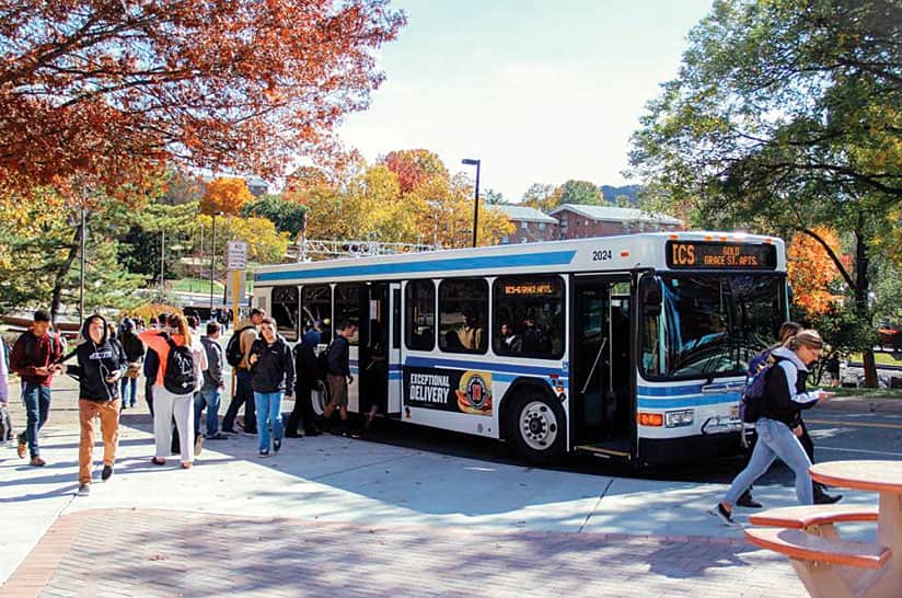
Three years ago, weekend bus ridership in Harrisonburg, Virginia, had dropped, and the Harrisonburg Department of Public Transportation (HDPT) had no idea why. In 2009–2010, HDPT’s buses served 192,766 passengers from Fridays to Saturdays, but by 2015–2016, this bus ridership had fallen to 40,283 passengers, according to HDPT.
Students at James Madison University (JMU) make up a large portion of HDPT’s bus passenger base. So figuring out a solution to this drop in weekend ridership was an excellent project for Dr. Bill Ritchie, a professor of management in the College of Business—not least because he could use it to illustrate to his supply chain students the benefits of using GIS for transportation and logistics.

There were two objectives: first, to figure out which alternative modes of transportation students were using besides buses, and second, to find the primary locations where students were relying on alternative forms of public transportation. Ultimately, Ritchie wanted his class to learn how ArcGIS could be used to identify routes that would be more in sync with students’ transportation needs. And if HDPT got a new bus route out of it, that would be outstanding.
Digging into the Data
It didn’t take long to figure out that the decline in bus ridership was only part of this story. The university has a service called SafeRides, which relies on volunteers and a fleet of six cars to offer students free rides home on Friday and Saturday nights. Over a three-semester period, SafeRides received nearly 10,000 ride requests and served 28,000 riders. However, only 62 percent of the students who requested rides received them due to limited capacity and delays. Other transportation services, such as Uber and a Sober Rides Facebook group, are available as well, but some students have indicated that they don’t always feel safe with these alternatives.
To address these concerns, Ritchie teamed up with JMU sustainability analyst Avery Smith and JMU sustainability coordinator Mike Dalmolin to develop plausible solutions using ArcGIS technology. Smith and Dalmolin provided Ritchie with multiple spreadsheets of SafeRides data that included where trips originated, their destinations, and the pickup and drop-off times for more than 27,000 ride requests spanning multiple semesters.
The first challenge for Ritchie was to convert much of that raw data into usable addresses, since location records were often listed by residence hall or apartment building name rather than street address. Working with a team of graduate assistants, he cleaned and geocoded the data using both ArcGIS Desktop and Microsoft Excel’s VLOOKUP function. He then presented this geocoded data to his supply chain class to illustrate initial transportation logistics problems. For that, Ritchie used the Kernel Density tool in ArcGIS, which calculates magnitude per area from point or polyline features, and the Optimized Hot Spot Analysis tool, which shows statistically significant hot and cold spots on a map.
Analyzing Ridership Movement
To determine how the information from SafeRides could potentially inform the optimization of late-night bus routes, Smith and Dalmolin dived deeper into the data.
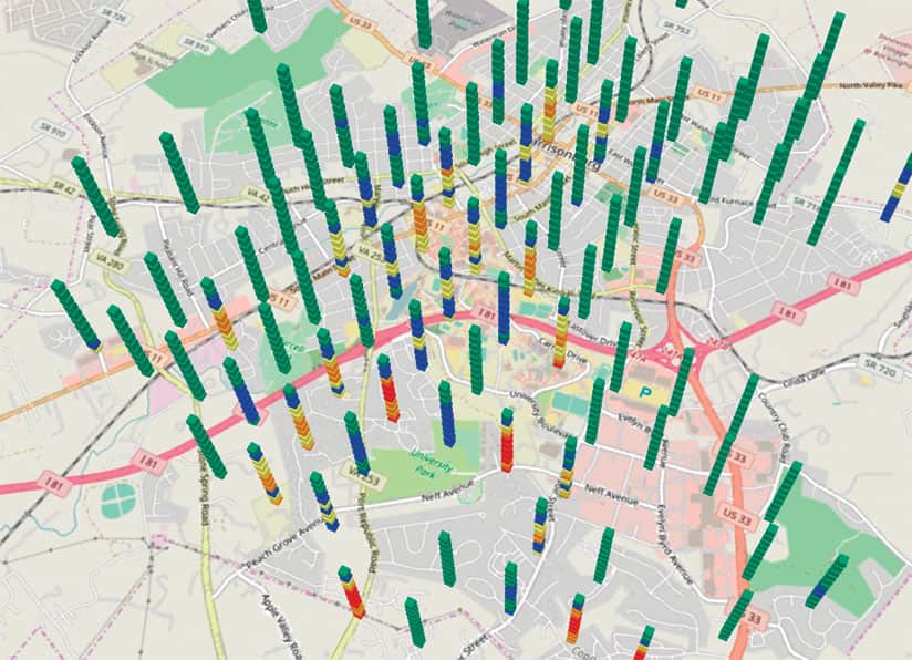
First, they wanted to see if there were any patterns and trends in ridership that occurred in similar spaces over the same periods of time. Using ArcGIS Pro, they created a Space Time Cube to visualize, in 3D, all the rides that occurred within a 1,500-square-foot area over a 30-minute time scale from 10:00 p.m. to 3:00 a.m. This way, they could see how a location’s ridership changed over time.
Next, the two engineers used the Network Analyst extension for ArcMap to graphically create routes for all 10,000 requested SafeRides trips. With this, they were able to estimate average drive times and distances and then configure optimal routes, which would help decision-makers determine where new bus routes needed to be created and where existing ones could just be altered.
The most crucial analysis, however, came from an origin-destination (OD) pair table that conceptualized SafeRides movements across Harrisonburg. With this, Smith and Dalmolin sought to discover the main origins and destinations taken by riders. Their central questions for this analysis were as follows:
- Given a specified location, how many people, on average, arrived from or left to go to other respective locations in the city at night?
- How do these movements change between 10:00 p.m. and 3:00 a.m.?
Smith and Dalmolin created a stand-alone Python script that aided in building the OD table. They digitized all the main student housing complexes, campus zones, the downtown area, and commercial districts in Harrisonburg to form a polygon feature class in ArcMap. Then, they assigned each polygon a unique identification number and joined them all to two new point feature classes that represented SafeRides’ pickups and drop-offs, respectively. As a result, each pickup and drop-off point captured the unique identification number of its related polygon. Additionally, in the original SafeRides spreadsheet data, the engineers had preassigned every related pickup and drop-off point a unique travel code to show a completed trip. Thus, even though the shapefiles for pickups and drop-offs were separate, since they necessarily occur in different locations, the matching code made it easier to identify full trips. The Python script used the unique IDs and codes to tie trips and requests to two locations—the origin and the destination—as an OD pair.

Getting Precise with Modeling
With all this, Smith and Dalmolin were able to do finer-scale ridership modeling at various locations. For example, ridership to and from downtown Harrisonburg was, in general, known to be moderately significant. But with the Space Time Cube, the team could see that the western section of downtown experienced more active ridership between 12:00 a.m. and 1:00 a.m., while the eastern side of town barely saw any. This was an important find. It would enable city planners to match bus frequency proportionally to the ridership for different sections of downtown. This would lower headways—the amount of time it takes between bus service stops at any one location—by eliminating travel to areas that don’t need bus service.
In addition, the Space Time Cube revealed that 12:00 a.m. to 1:00 a.m. is the most active period for nighttime ridership in the city. This was significant because it revealed when and where students’ travel needs were the greatest. Several student housing locations stood out when it came to evaluating travel volumes and times. For instance, The Harrison and Sunchase apartments had high levels of movement consistently from 10:00 p.m. to 1:00 a.m., while other apartment complexes, such as Pheasant Run, and campus dorms only showed significant travel at midnight.
Based on the network analysis, the team discovered that the average SafeRides trip time was 3.9 minutes, with the longest trip being 11 minutes. The average distance for trips was 1.9 miles, and the maximum distance traveled was 5.4 miles. These findings assisted in understanding students’ expectations when it comes to travel times and how far they’re willing to go.
One of the most valuable pieces of information that the OD analysis revealed was that student travel between off-campus locations accounted for 51 percent of all SafeRides trips, while only 32 percent of these rides occurred between on-campus and off-campus locations. This was a crucial discovery, since four out of the five active HDPT bus routes included travel between on-campus and off-campus areas. Meanwhile, the other route traversed campus and downtown Harrisonburg, which only accounted for 4 percent of SafeRides ridership. Without a single route that provided travel among off-campus housing locations, student ridership was bound to be down.
A New, Optimized Bus Route
After Smith and Dalmolin completed their analysis, they designed a new HDPT bus route and presented it to city planners. The proposed route would directly serve the highest-volume movements among student housing facilities, and it would only have a 22-minute headway, taking significantly less time than the existing bus routes.
City planners accepted the proposed route with minimal changes. Hopefully, this means that bus ridership in Harrisonburg will pick back up and that JMU students feel like they have safe transportation options both during the day and late at night.
For more information about integrating ArcGIS logistical functions into a university supply chain course, contact Ritchie at ritchiwj@jmu.edu or 239-218-9759. For more information about the routing analysis conducted in this study, contact Smith at smit23ac@jmu.edu or 540-568-6798.

