Arcade can be used in ArcGIS Dashboards for advanced formatting in list elements, indicator elements and table elements. I’ve had a number of people reach out requesting access to samples I’ve showed in the past. So, I figured I’d share them with everyone. If you are new to Arcade in dashboards, get started with formatting expression basics or data expression basics. Push the limits with data expressions here. Looking for tips on Arcade in tables – check out this one.
Note: The sample expressions are not polished, per se, and don’t always provide explanatory comments.
Transforming attribute-value pairs
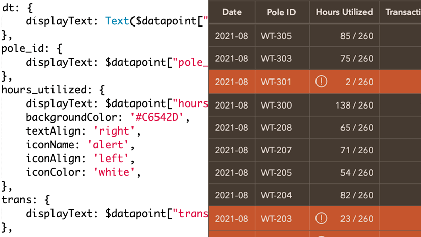
Are your field names and values written in a way to support data entry workflows? Although helpful when recording data, it can be difficult or awkward to display in pop-ups and list elements. Using an Arcade expression in the list, we can transform “Reviewed by supervisor: Yes” into “✓ Verified” when a submission has been reviewed.
To illustrate this, we looked at a dashboard summarizing COVID-19 testing locations, a data set managed by GISCorp. Using an Arcade expression we turned “yes”/”no” values into easy-to-interpret text with icons. Take a look at the dashboard to see the transformation (before and after lists) or create your own copy of it and dive into the Arcade expression.
Note: Custom HTML was also used in the Line Item Template to achieve the design shown. To view it or copy it, click the Source button on the rich text editor.

Visualizing stages of an incident
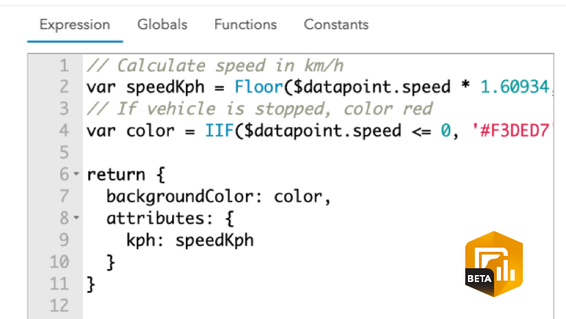
Are you monitoring incidents, assignments, or projects that go through multiple stages? For each stage you can have a date field for recording the time at which it entered that stage. You can then pull valuable information out of these fields and display it in a list.
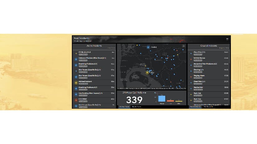
In the session, we used an Arcade expression to evaluate a series of date fields to conclude which stages had been completed, how long they took to complete, and what the current stage was. The expression also created a table to visualize this information. Check out the fire incident dashboard that visualizes this information or create a copy to see how it was made, complete with the Arcade expression and line item template.

Making media cards in a list element
Do you have images associated with your features? With a bit of HTML and an Arcade expression, you can spruce up your list element to show an elegant media card.
In the session I showed a list of cards with fire station images and information in this dashboard. It’s quick and easy to reuse this example for your dashboard. Simply save the dashboard and copy the HTML and expression from the list. Then, swap out the field information with yours.

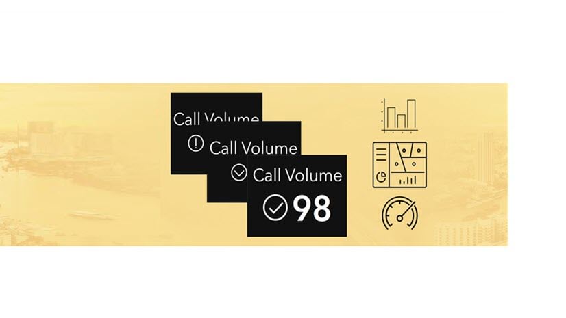
Calling attention to unmet goals
The indicator element is great for displaying key performance metrics. You can also format them based on conditions to add additional context. Sometimes you may need to evaluate the metrics against goals or regulations. In the session we took a look at a fire incident dashboard that compared the 90th percentile response times to departmental goals. When response times exceeded those goals, a red footer would appear to call attention to it. Create a copy (if you haven’t already above) to see how it was done. Make sure to click the Source button on the Description of the indicator to see the HTML and expression attribute used.

That’s a wrap. I hope these samples help you on your way to enhancing your lists and indicators in ArcGIS Dashboards. If you can, share what you create using #ArcGISDashboards.


Article Discussion: