Searching for the American Dream
Have you ever been reluctant to accept a job because of housing costs? Do you want to leave your current area and move somewhere more affordable? Whether you are a current homeowner searching for a more affordable housing option, or a newcomer onto the housing scene, high homes prices are felt across the country.
In addition, variation in affordable housing across cities may impact migration patterns. Some households are pushed out of expensive cities and are forced to find a better balance between income and housing costs. Other households may be reluctant to follow economic opportunity to expensive parts of the country.
Given that a home is often the most expensive purchase households make, an understanding of housing affordability is crucial for understanding the broader economy. Several new data products help us investigate the relationship between housing affordability and the growth of cities.
Esri’s Housing Affordability Index
Esri’s Data Development Team established measures to understand the housing market (What’s New with Housing Demographics), including a Housing Affordability Index (HAI) that measures the ability of a typical resident to purchase an existing home in an area.
The index has a base of 100, representing an area where the median income is sufficient to qualify for a loan on a home valued at the median home price and not be cost-burdened. We use a common measure where a household is considered cost-burdened if they spend more than 30 percent of their income on housing-related costs.
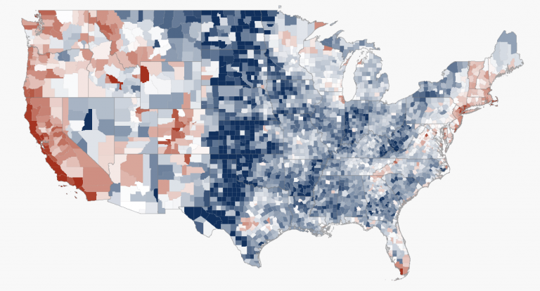
An index greater than 100 references areas where homes are affordable. An HAI less than 100 indicates areas where homes are less affordable and where median income is not high enough to purchase a median valued home. The map below shows the HAI by county, highlighting the spatial distribution of housing affordability. Darker blue areas represent higher housing affordability, while darker red areas represent lower affordability when indexed to the US average of 124.

Housing Affordability Across Metropolitan Areas
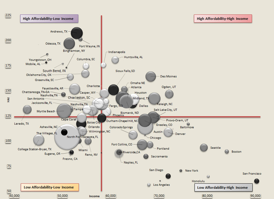
Major metropolitan areas in the bubble chart below use 2018 median household income and the 2018 HAI as the axes, or $58,100 and 124, respectively. The four quadrants thus represent different categories of income and housing affordability. The bubble size represents household growth from 2010-2018.

Cities in Colorado, Utah, Washington, Texas and Oregon have long been destinations for Californians fleeing high housing costs. While these areas remain more affordable than major cities in California, many of these cities are in the Low Affordability portion of the chart. As people move to these places in search of affordable housing, they can become unaffordable due to limits on their growth.
Will cities like Denver, Seattle and Austin eventually move further to the bottom of this chart to become as unaffordable as Los Angeles and San Francisco? Or will growth patterns there slow before affordability levels get to that point and households move on to more affordable locations?
Understanding the Relationship between Housing Affordability, Income, and Household Growth
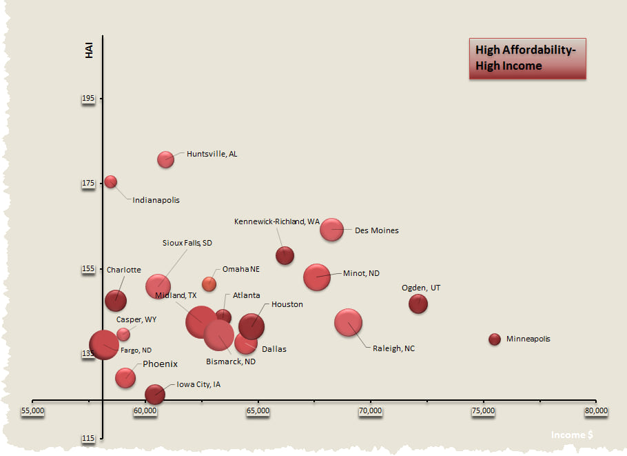
Unsurprisingly, growth has slowed in the traditionally expensive urban areas of California and the Northeast. Some of the highest growth rates have been in the South and Mountain West. Where should one move to get both affordable housing and a high income? Potential destinations include:
- Dallas
- Houston
- Atlanta
- Charlotte
- Raleigh
- Huntsville
- Phoenix

So why doesn’t everyone move to these cities? How have these cities grown while maintaining affordability? What are the trade-offs?
While the HAI provides an accurate measure of affordability, what is truly affordable depends on your own situation. How has Austin grown at such a high rate even though it is unaffordable? It depends on where a household is coming from. Austin may continue to be an affordable destination for households leaving the major cities of California. However, Austin is likely an unaffordable destination for households leaving Fayetteville, Arkansas.
As homeowners build up equity in their current homes, the affordability picture can also change. Perhaps a current homeowner in California is willing to move to an area with lower incomes due to the difference in housing costs. Similar patterns may be true for retirees.
Thinking of Moving?
Use Esri’s Relationship Between Housing Affordability, Income, and Household Growth in the US Web App to explore housing affordability in your area and see which cities provide the best balance between income and housing costs. Click on cities below to explore these relationships. Or better yet, create your own relationship style map using any of our demographics.
Accessing the Data
Available for all geographic levels for Esri’s 2019 demographic release, housing affordability measures are a complement to other Esri Demographics such as income and household growth. Accessing the Affording the American Dream? story map will provide a more detailed explanation of the relationship between housing affordability, income, and growth.
To purchase Esri’s Housing Affordability Index (HAI) data set, please contact our data sales team at: demographics@esri.com or call our toll-free number at: 1-800-292-2224.
For more information about U.S. demographics click here.


Commenting is not enabled for this article.