There are times, when working on a map, that artifacts along the seams of mosaiced imagery can be a visual distraction in large water bodies. This guest blog post comes from Kristina M. Smith, GIS Analyst with the St. Johns River Water Management District, in Florida. Kristina has no shortage of opportunities mapping water, and we think you might find this workaround for ocean imagery useful. Here is Kristina’s method which includes the creative use of geoprocessing tools and a gradient fill…
…
While making a map layout, I noticed that our local imagery coverage did not extend fully to the edge of the map layout, leaving a void. I tried some approaches to fill in this void, like using the World Imagery basemap behind our imagery, but the colors and textures of the two image sources didn’t sufficiently match. Additionally, I tried a picture fill of an ocean pattern but this didn’t provide an ideal blending either.
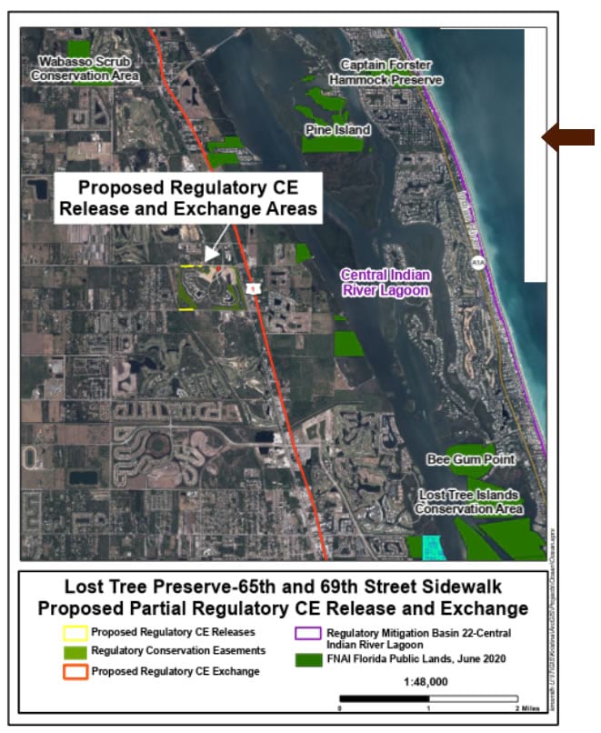
I settled on a method that involved creating a polygon to cover all the water area and the imagery void, and a gradient fill to give it a pleasing and consistent appearance.
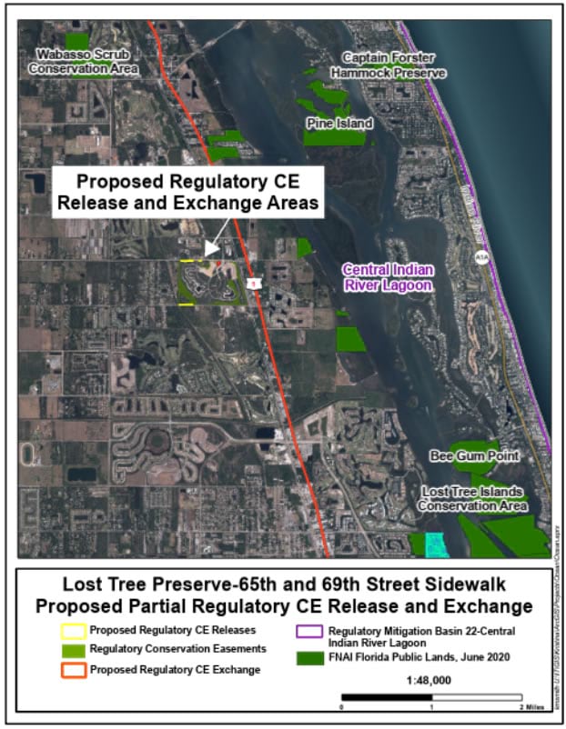
The first step was to create a new ocean polygon covering the water extent of my map’s layout. If you already have a detailed water polygon covering your area then lucky you, you can skip down to the step of colorizing the polygon with an ocean gradient!
Geoprocessing up a coastal mask
To do this, I started with a high resolution collection of counties, extending just beyond my map’s area of interest. Around these counties I applied a 10-mile buffer, but you can choose whatever distance works for your scale and area. I then moved this buffered blob out to sea (in my case, into the Atlantic, due east) using the move tool. The right distance was the result of some trial and error, but the goal is to push the polygons out to see such that they cover the layout’s water area (including the imagery voids) but not past the coastline. Next I used the erase tool to cut out the original county shapes from the buffered-and-moved shapes. Lastly, I dissolved all the water polygons into a single (multipart is ok) polygon. The result is a polygon that covers the ocean area and has a detailed coastline.
Watery gradient
Now that I had a water layer covering up my map’s oceans (including the gaps in the mosaiced imagery), it was time to give it a somewhat realistic fill effect. There are a lot of options in this step, including smooth buffer gradients or image fills, but the best looking option in my experience was a linear gradient.
Here is a gradient with two ocean-blue colors, one light and one dark. The colors can be sampled from the underlying imagery using the eyedropper tool in the color picker. The gradient can be further modified in the “color scheme editor.”
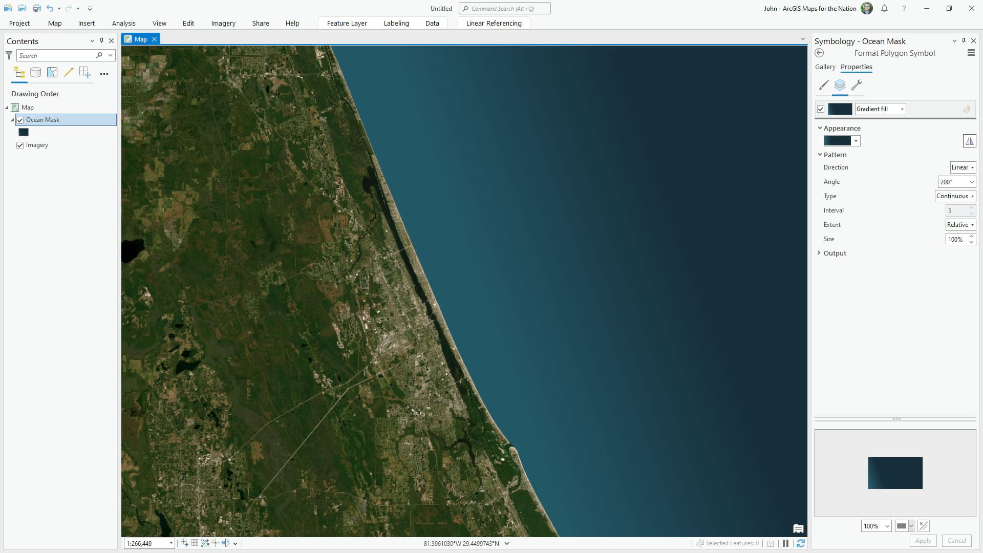
The color scheme editor, shown here, allows for an amazing amount of control in what colors to use, and where to place them along the gradient. In this case, the near-coast water is lighter and deeper waters are darker.
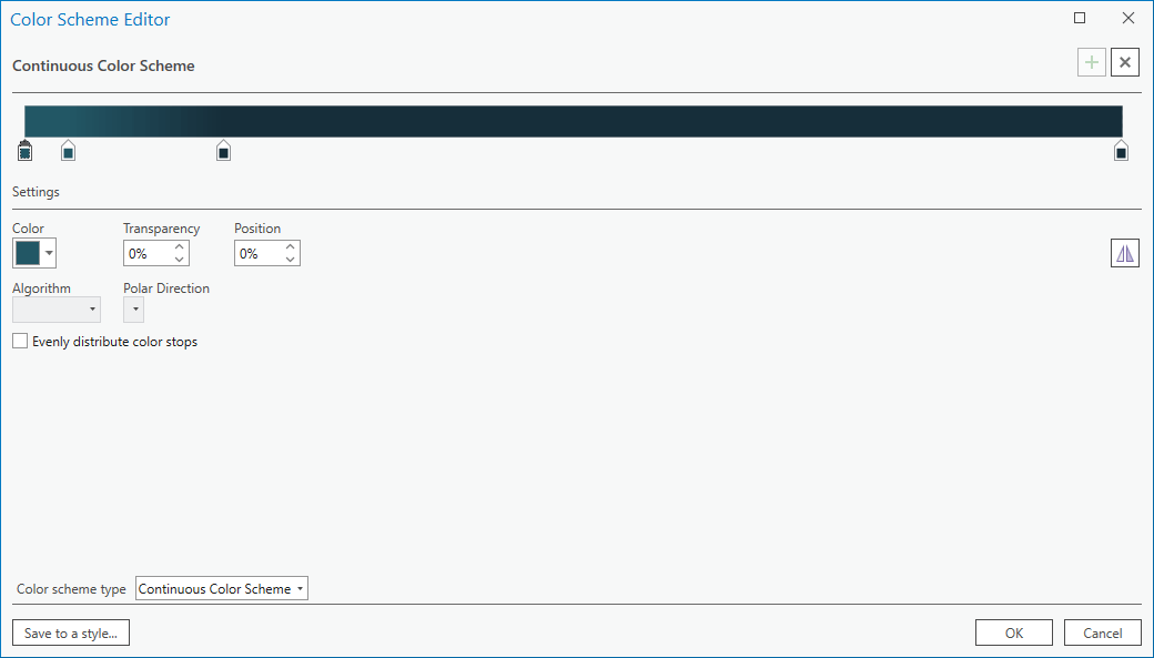
But this can be reversed, if you like, to have whatever visual effect best suits your map.
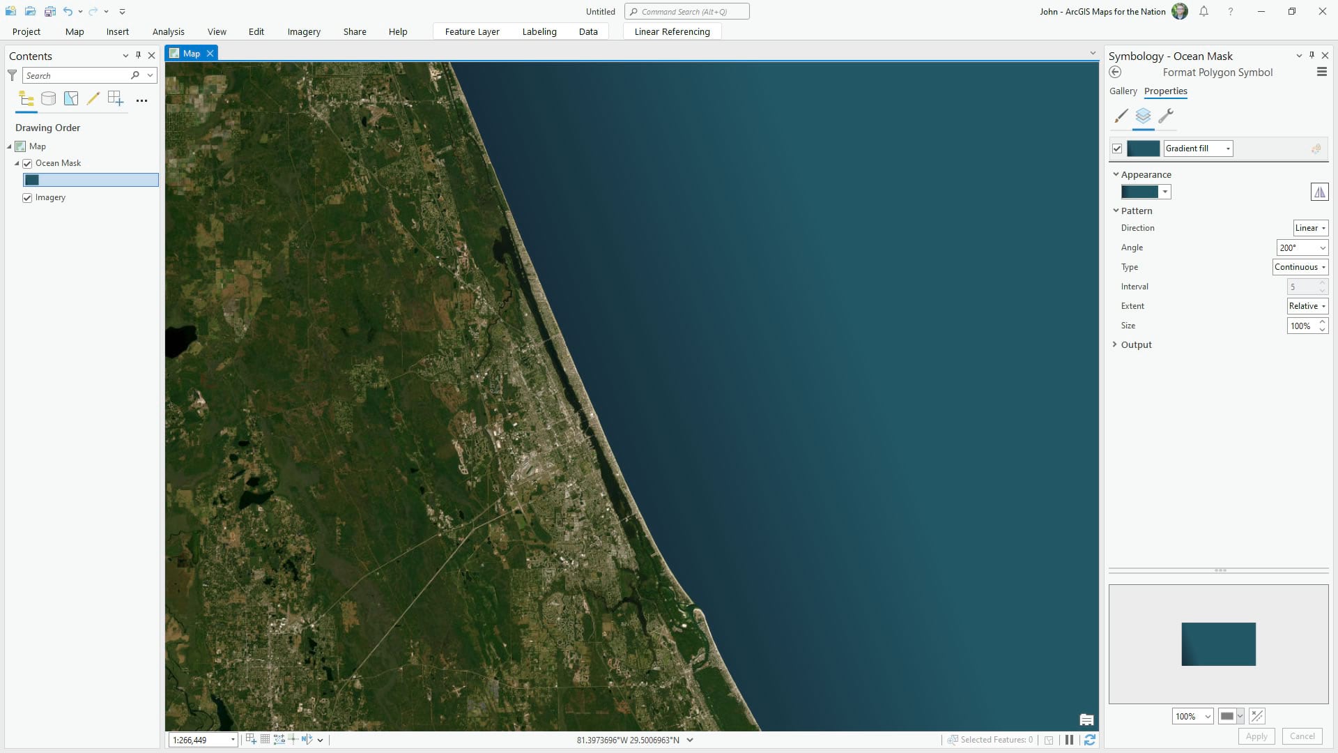
If your coast isn’t a relatively straight one, consider using the “buffered” option for the gradient direction. This setting will render the gradient along the perimeter of your polygon.
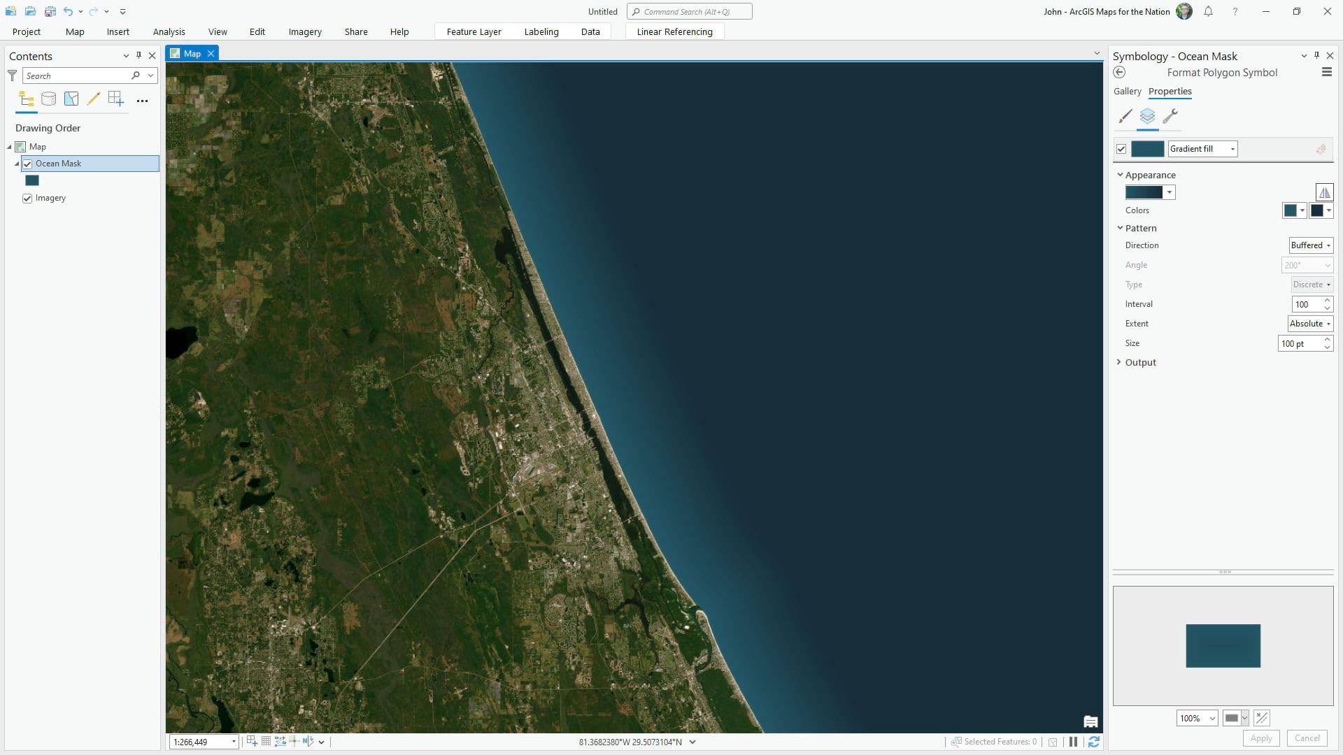
So if you find artifacts in your imagery’s water to be a distraction, consider covering it up with a detailed water polygon and applying a custom water-colored gradient.
Kristina Smith
…
Thanks Kristina! I find it’s tricks like these (the imaginative use of geoprocessing tools and the artful use of colors and gradients) that elevate a map and give them a visual polish that lets readers focus on just what matters. We hope you keep using these tools in novel and fun ways to create beautiful maps!
John


Article Discussion: