The June 2024 Broadband Data Collection (BDC) is now available within ArcGIS Living Atlas. This ready-to-use layer shows fixed broadband availability for every Census Block and H3 Resolution-8 hexagonal area in the U.S. and outlying territories. The layer summarizes the June 2024 BDC data showing the number of served, underserved, and unserved Broadband Serviceable Locations (BSLs) in total and by transmission technology for a given geography. It is a composite of six sublayers – State, County, Tract, Block Group, Block, and H3 Resolution-8 hexagons – each with a related table listing all Internet Service Provider (ISP) offerings by technology and speed tier.

About the BDC in Living Atlas
The Broadband Data Collection (BDC) is a combination of two datasets. The Broadband Serviceable Location Fabric (“Fabric”) are the point locations “where fixed broadband internet is or could be installed.” And the Broadband Availability Data is the list of all available broadband services available at each Fabric location as reported by internet service providers (ISPs). The Federal Communications Commission (FCC) updates the BDC twice a year.
The BDC layers in Living Atlas are summary aggregations of these two datasets. They show the total number of Broadband Serviceable Locations (BSLs) for six geographies – H3 Resolution 8 Hexagon, Census Block, Block Group, Tract, County, and State – and their corresponding service tier.
The service tier is defined by speed and latency and each BSL is categorized into one of three buckets:
- Served – low-latency Fiber, Cable, Copper, or Licensed Terrestrial Fixed Wireless offering of speeds greater than or equal to 100/20 Mbps.
- Underserved – low-latency Fiber, Cable, Copper, or Terrestrial Licensed Fixed Wireless offering of speeds less than 100/20 Mbps, but greater than or equal to 25/3 Mbps.
- Unserved – all service that is not low-latency or less than 25/3 Mbps, and all Geostationary Satellite, Non-geostationary Satellite, Unlicensed Terrestrial Fixed Wireless, and Other.
Each layer includes a related table that captures information on every unique broadband service offering for all providers.
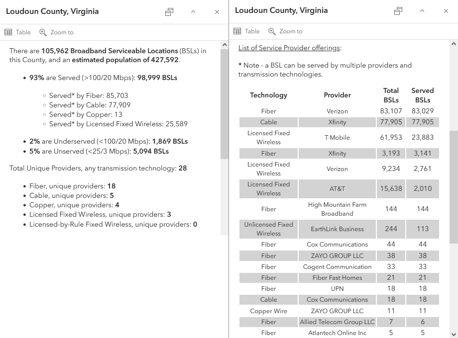
This distinction is best captured in the layer popup. In the image below, the popup section on the left shows the summary statistics for the feature. These are the attributes the layer can be visualized on. The default symbology for the layer is the combination of unserved and underserved locations. On the right, the popup shows a table entry for every unique provider and transmission technology combination, with the number of BSLs passed (with any speeds), and the number of BSLs passed with service of at least 100/20 mbps.
For more information about the Broadband Data Collection in ArcGIS Living Atlas of the World, please see this blog.
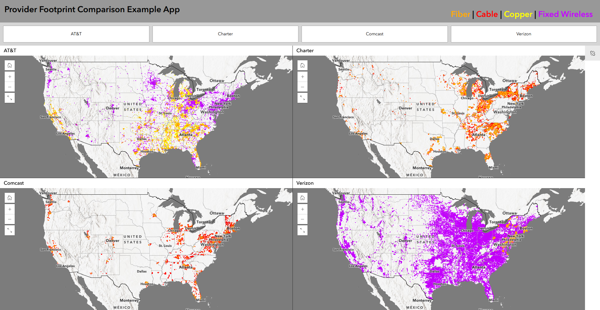
Provider Footprints
The example below maps the network footprint of four (4) of the largest broadband providers in the United States – AT&T, Charter, Comcast, and Verizon – based on the BDC H3 Resolution 8 hexagon footprint. Fiber is in orange, cable in red, copper in yellow, and fixed wireless in purple.
Because unique provider information is captured in the related table, the layer cannot be readily visualized by that attribution. In Map Viewer, it is not possible to visualize based on attributes in a related table. Esri colleague Kristian Ekenes does a great job explaining why that is in his blog Visualize data from related records using Arcade.
In ArcGIS Pro, however, a Definition Query can be used to filter the feature based on provider information captured in the related table. In Episode 089 of Telecom GIS in 5 Minutes, we show how to do this with the Living Atlas data.
Provider Footprint Dashboard
In addition to visualizing the network footprint for a provider, we can interrogate the data and learn fundamental information about that footprint. Key metrics like the total number of BSLs in an area, the number that are unserved and underserved, the number of providers, and the mix of technologies, provide insights and identify opportunities to intervene. The following dashboards compare the technology footprint of the provider with the summarized BDC data.
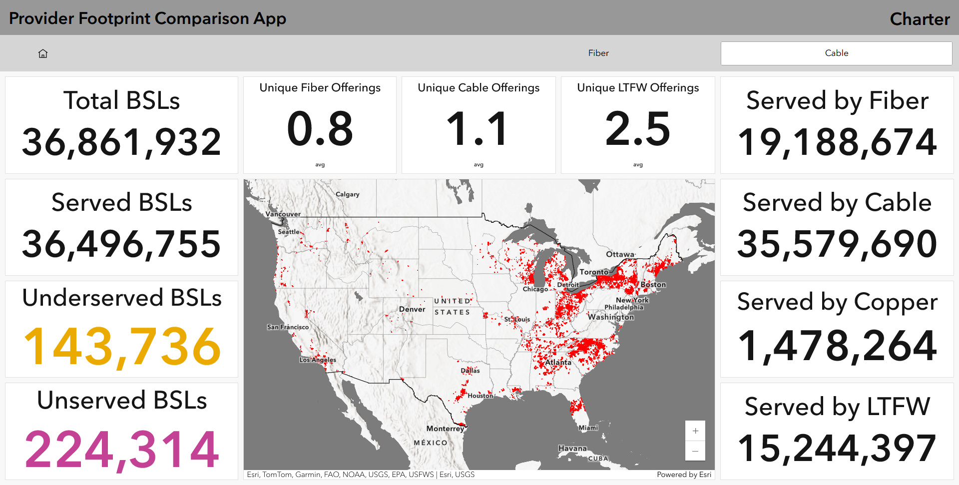
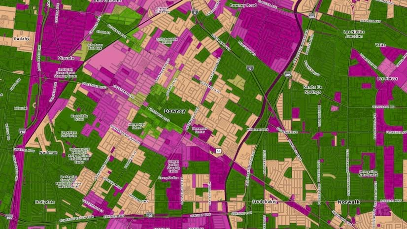
In the first example we see Charter Communications cable footprint in the continental US. And within that H3-resolution 8 hexagon footprint we see that there is close to 37 million total BSLs, 97% of which are served by cable and a little more than have by Fiber. Yet, there are over 360,000 unserved and underserved BSLs.
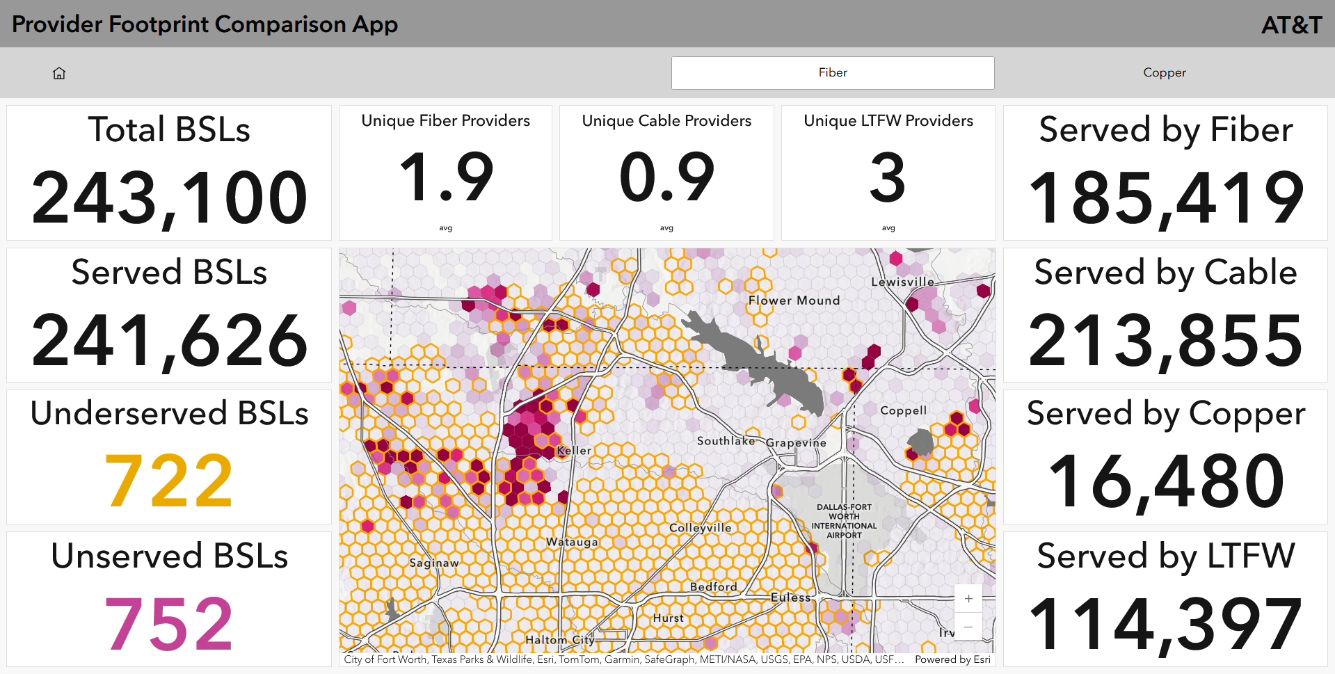
Zooming in to the area just west of Dallas-Fort Worth International Airport, we see a cluster of unserved and underserved locations between areas of AT&T fiber coverage. At this scale, the BDC data is visualized twice. The orange hexagon outlines represent the AT&T fiber footprint. And the magenta color hexagons are the default symbology from Living Atlas and show the number of unserved and underserved locations. The dashboard indicators show close to 1500 in this view. We also see that there is an average of two fiber providers and one cable provider across the area.
Provider footprint maps and dashboards like these help us better understand the broadband landscape. Communities can use this information to assist with planning initiatives and broadband providers can use this information for competitive intelligence. Ultimately, this information can help with broadband expansion and adoption efforts.
If you would like to explore this data in more detail, the Provider Footprint Comparison Example App can be found here.
We love to hear how you are using these layers, so please continue to connect with us on Esri Telecom Community.
And as always, Happy Broadband Mapping!!!


Article Discussion: