Described here is an update for this blog.
Here’s a clever (and better) way of putting together an Arcade expression to allow your symbol to adjust accordingly as your viewer zooms in and out of your map.
We will be using the new Active Hurricanes, Cyclones, and Typhoons Hosted Feature Service that is available in the Living Atlas of the World. The final map is here and the app is located here.
What do we Want to See on Our Map?
We are mapping Active Hurricanes and are symbolizing the forecast path of tropical activity from the National Hurricane Center and Joint Typhoon Warning Center.
We need:
#1 – The symbols to increase in size as the storm gets more intense…

#2 – The symbols need to adjust appropriately as the viewer zooms in and out of the map.
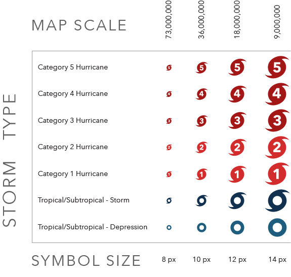
Arcade to Classify, then to Scale
The first thing to do is grab the new Hosted Feature Service layer for Active Hurricanes from the Living Atlas.
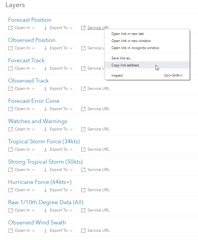
Scroll down to see the list of layers at the bottom of the page.
We are only interested in Forecast Position for this exercise. This layer shows the probable point path of the hurricane based on 12-hour increments.
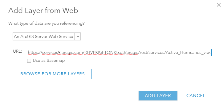
Copy the Service URL for “Forecast Position” and add that as a new layer to your web map.
NOTE: Because this is Live Feed data there may not be any active storms when you access this layer and you will be unable to apply the expression. If that’s the case, there is a sample storm and track here for you. It will not contain all of the wind speeds, so keep that in mind.
The list of layers will look like:
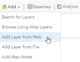
Add that Service URL to your web map:
Enter it in here:
Arcade Expression I: Classify the Data
The Saffir-Simpson Hurricane Wind Scale is a 1 to 5 rating based on a hurricane’s sustained wind speed. This scale estimates potential property damage.
Hurricanes reaching Category 3 and higher are considered major hurricanes because of their potential for significant loss of life and damage.
Category 1 and 2 storms are still dangerous, however, and require preventative measures.
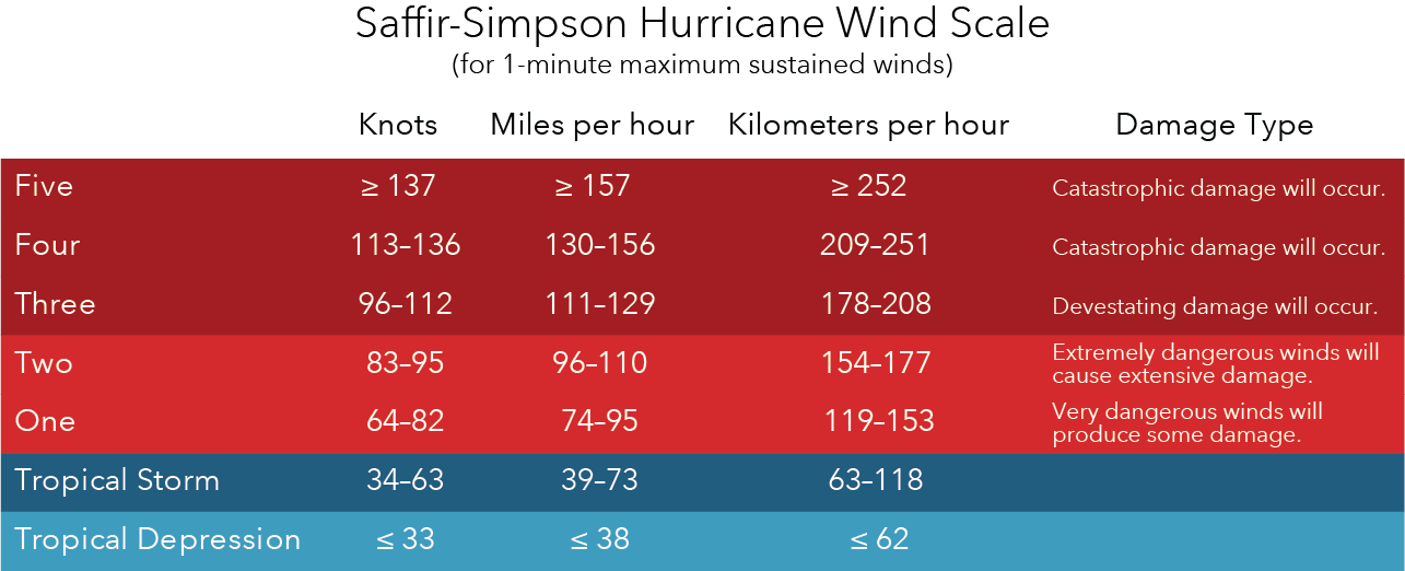
Let’s assign these wind speed classifications to our layer.
“Change the Style” of the layer and scroll to the bottom to create a “New Expression”.
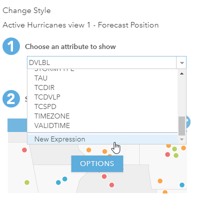
Name your expression “Classify by Wind Speed”.
Use the field feature.MAXWIND (as shown below) to classify the storms.
Select “Test” to see if the expression works.
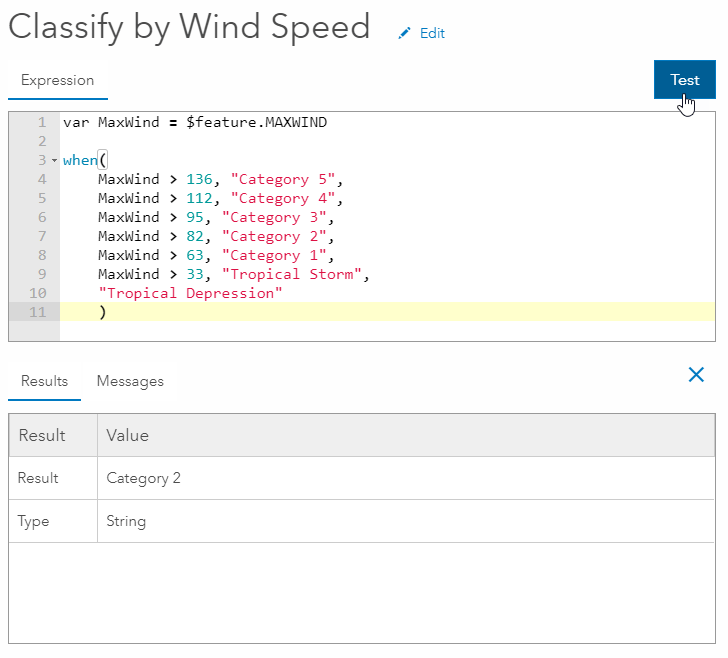
What the code is saying is when the “MaxWind” is greater than this speed, classify it as this storm, and if it does not fit any of those, then classify it as a Tropical Depression.
The code is below. If you copy and paste it please be mindful of how the formatting comes into Arcade (quotation marks in particular) and that it matches the image above.
var MaxWind = $feature.MAXWIND
when(
MaxWind > 136, “Category 5”,
MaxWind > 112, “Category 4”,
MaxWind > 95, “Category 3”,
MaxWind > 82, “Category 2”,
MaxWind > 63, “Category 1”,
MaxWind > 33, “Tropical Storm”,
“Tropical Depression”
)
Close the Arcade window.
Arcade Expression II: Set the Symbol Size by Map Scale
We need to add another expression for the symbol resizing at the varying map scales.
Underneath the expression we just created click on “Add attribute” and scroll to the bottom to create a “New Expression”.
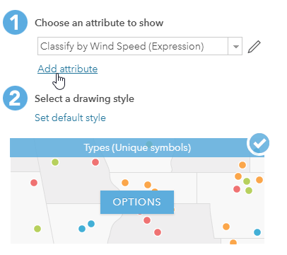
Name your expression “Set the Symbol Size by Map Scale”.
We are using two fields: “$feature.MAXWIND” and “$view.scale”.
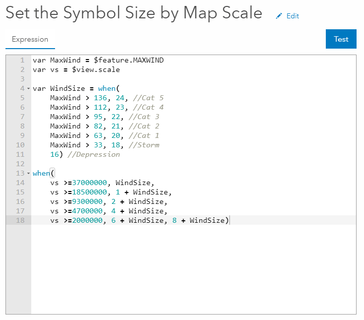
Here’s the code:
var MaxWind = $feature.MAXWIND
var vs = $view.scale
var WindSize = when(
MaxWind > 136, 24, //Cat 5
MaxWind > 112, 23, //Cat 4
MaxWind > 95, 22, //Cat 3
MaxWind > 82, 21, //Cat 2
MaxWind > 63, 20, //Cat 1
MaxWind > 33, 18, //Storm
16) //Depression
when(
vs >=37000000, WindSize,
vs >=18500000, 1 + WindSize,
vs >=9300000, 2 + WindSize,
vs >=4700000, 4 + WindSize,
vs >=2000000, 6 + WindSize, 8 + WindSize)
There are two things going on here concurrently.
In the first section we are setting the symbol size with MaxWind.
For example, when MaxWind is > 136, it gets a symbol size of 24.
In the second section we are setting symbol sizes using addition as the map scale changes.
For example when the “vs” is > 37,000,000, keep the symbol size at what “WindSize” already specified (which is 24). Next when you zoom in and the “vs” is 18,500,000, increase the size by one (which would make it 25). Next when it is > 9,300,000 increase it by two (which would make it 27), and so on. The maximum symbol size for our map will be 24 + 8 = 32. The smallest size will be 16.
You can set whatever increment you want here.
Click “OK” and then click on “OPTIONS”.
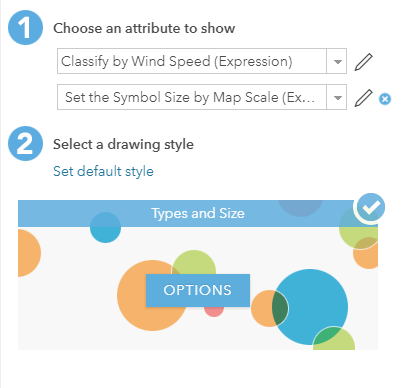
Assign the Symbol and Set the Size
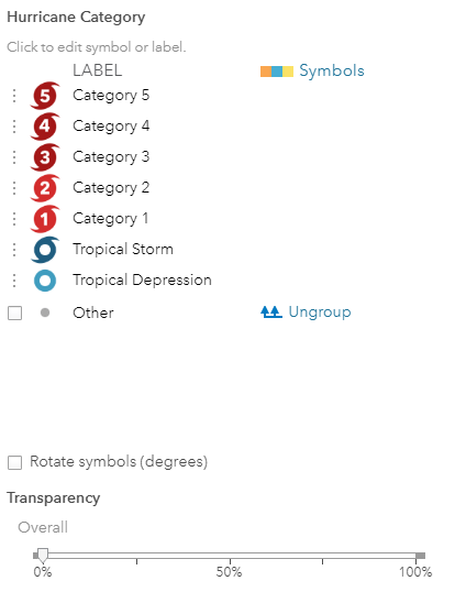
Click on the “OPTIONS” for the first expression “Classify by Wind Speed”.
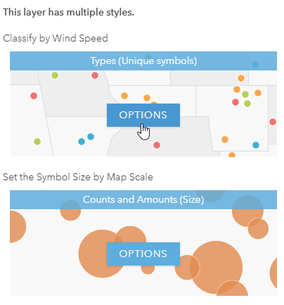
You can find the URL’s for the Hurricane Symbols shared in the ArcGIS Online group here. Individually add those URL’s as a “custom image” in the symbol style selector.
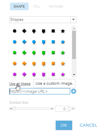
Once completed they will look like:
Click “OK” and now click on the “OPTIONS” for “Set the Symbol Size by Map Scale”.
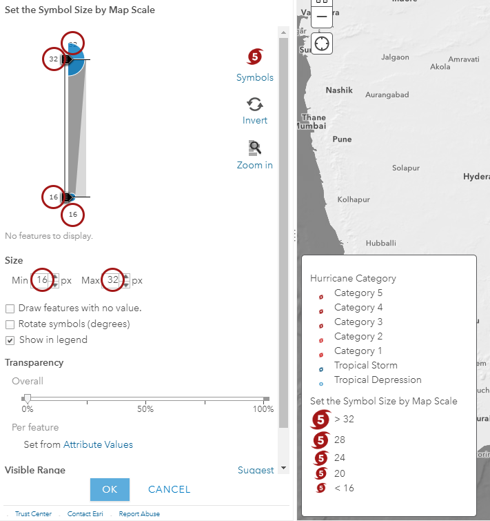
Set your Max value as 32 (in three places) and the Min value as 16 (in three places).
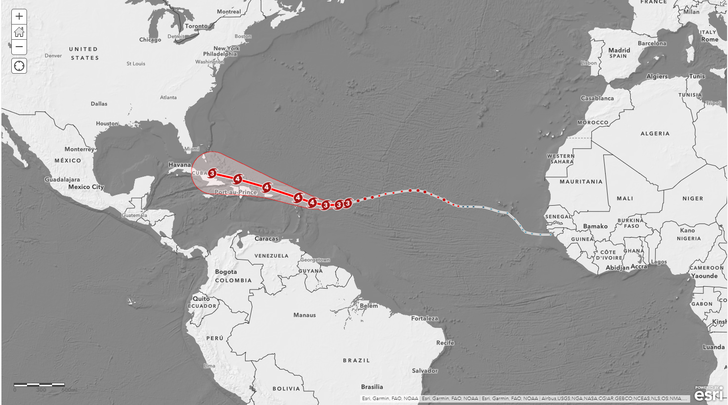
With all of that said and done…Checkout Hurricane Irma at > 36,000,000:
Here’s Irma at > 18,000,000:
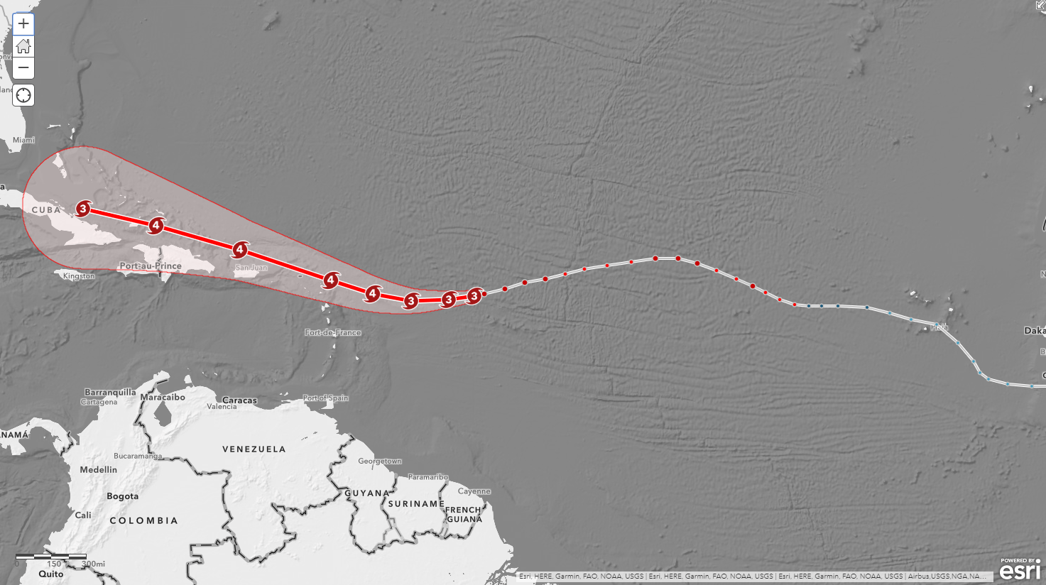
Here she is at > 9,000,000.
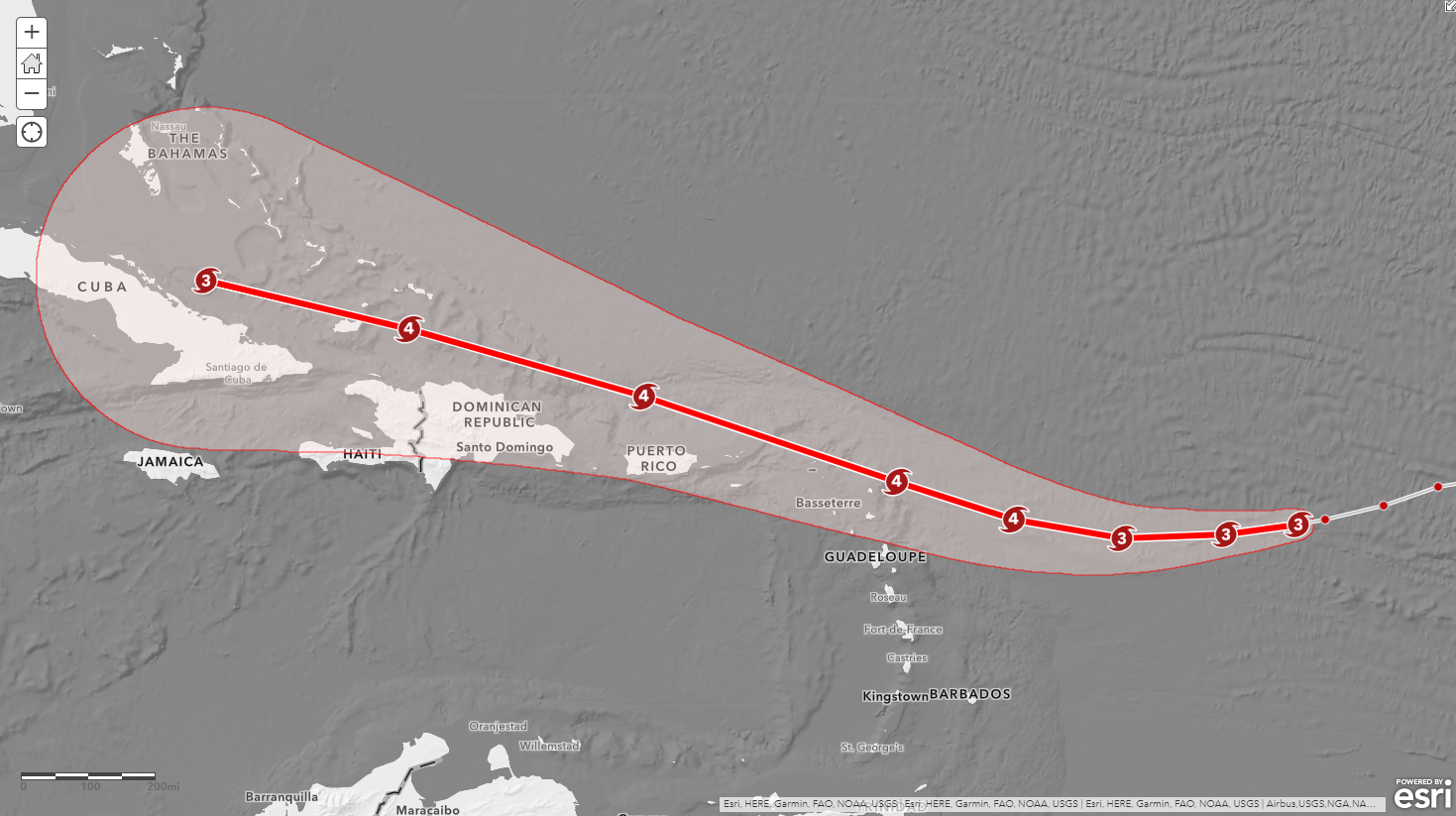
The symbols are adjusting just beautifully as the viewer zooms in and out of the map!
Additional Resources
There are resources available for using Arcade in your ArcGIS Online maps. You can start by visiting the Arcade documentation page, Esri Technical Support, or check out this blog on Smart Mapping for other Arcade examples. There are also a few more linked blogs below.
The final web map does contain all of the layers in the Hosted Feature Service for Active Hurricanes. There is also an app available.
For more information about Esri’s Hosted Feature Services please visit here.
Thank you for joining me here today. I am glad to be part of your mapping journey and I hope you enjoy the symbol scaling!

Commenting is not enabled for this article.