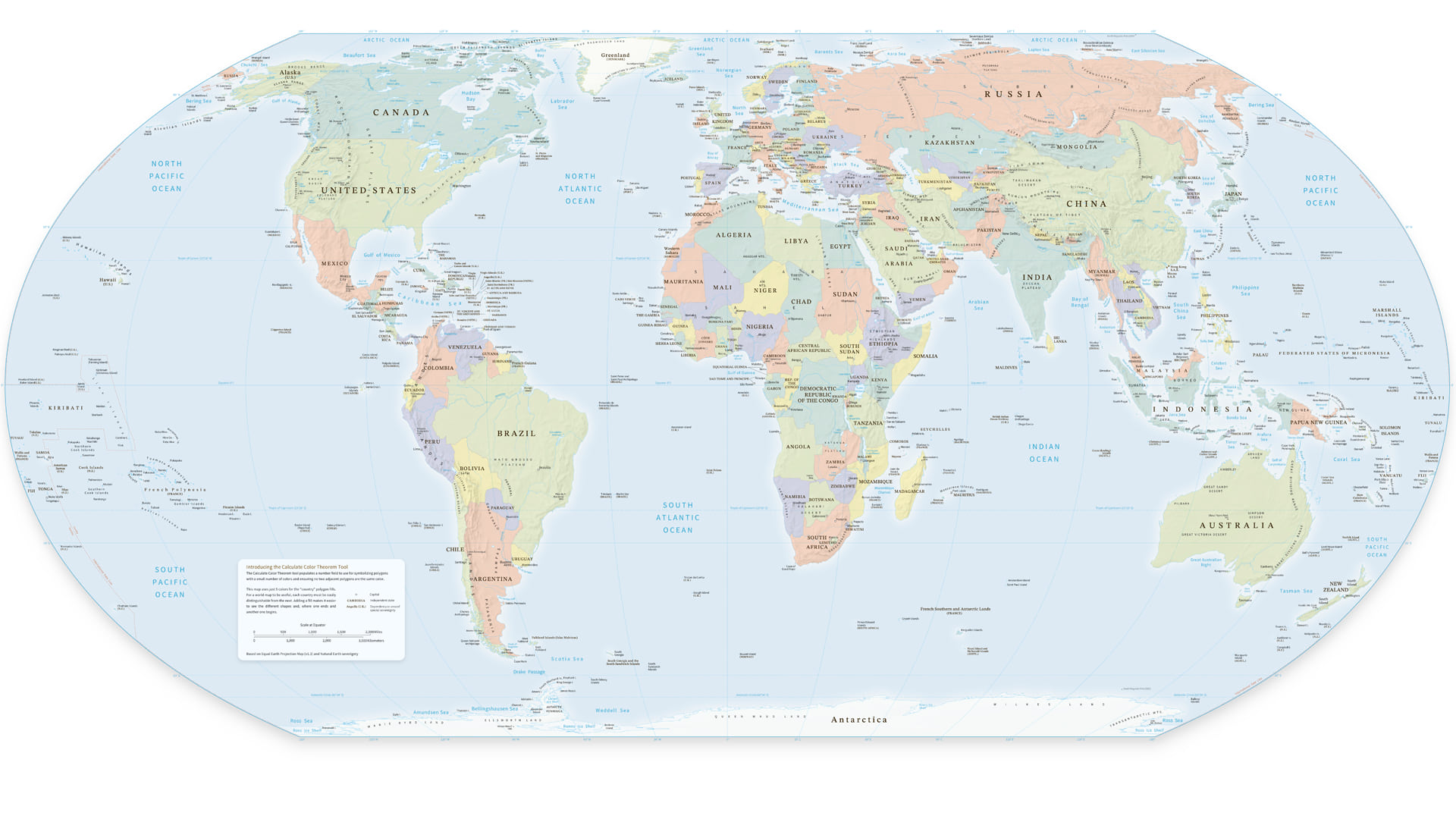
We have created a new tool to help you color map polygons while ensuring that any two adjacent polygons will not have the same color.
You will have likely made or come across maps like the one above: Political maps in atlases or World wall maps. Or perhaps you have created your own maps of administrative regions, states, counties, plot boundaries, or other polygonal reference maps.
These are all applications where the subject is the polygons themselves. There is no thematic field or choropleth value to color by but instead the creator wants to add a fill to make it easier to see the different shapes and where one ends, and another one begins.
Borrowing a quote from Megan Johnson at NCSA, For a world map to be useful, each country must be easily distinguishable from the next.
Conversely, if we color in every country differently, it becomes visually overwhelming and similar colors start to look thematic or “of the same group”.
Background
The idea that a contiguous set of 2-dimensional polygons can be colored with no more than four or five colors (while still ensuring that any two adjacent polygons will not have the same color) has been around since the 1800s but a series of claim and counterclaim as to its proof continued right through to 2005.
Since then, we have had various developer samples and solutions both from Esri and from our users in the various GIS ecosystems over the past twenty years, but generally most cartographers have chosen to color these in map form manually.
While there is still a case for cartographers manually improving certain decisions, driven by many customer requests, we were keen to produce a tool to automate as much of the process as possible.
Welcome the ’Calculate Color Theorem Field’ tool!
Most solutions until now insisted that data must be contiguous (have no gaps), have no overlaps, and be comprised of only singlepart features. We know that GIS data and use cases are often not quite that simple! Also, our developers were very keen that none of these should be prohibitive. So, rather than enforce four or even five colors, our tool works out both neighbors and proximity using graph theory and respects and retains multipart polygons. By doing this we keep the number of colors used low but ensure that every neighboring, overlapping or very near feature has a different color to the one next to it.
Rather than dictate colors, we provide an integer field that you can use with the Unique Values renderer to effectively “color by number” with a palette of your own choosing. Some data providers already provide color index fields with their datasets in a similar fashion.

Using the tool
- Search for the tool or find it in the Cartographic Refinement toolbox (Cartography Tools)
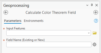
- Select the input features you wish to color and the name of the field (existing or new) that will contain the new values
- Run the tool and it will populate the chosen field with an integer value, e.g. 1 through 5
- Now, open the Symbology options, and choose to style by Unique Values. Choose the updated integer field and a suitable color scheme. That’s it!
Pro tip: If the resulting field has many unique values, there is a high chance that this is caused by a lot of overlaps in your data or by duplicate geometries. You may want to consider some data cleansing before running the tool again.
Multipart polygons
To ensure certain polygons are assigned the same color value, for example a mainland extent with a chain of islands under the same sovereign rule, or a country and its enclaves, then make them a multipart feature and the tool will treat them as one.
A side note on the Number of colors
We have tried to use as few colors as possible and to use them evenly. However, under some circumstances our tool does not use the absolute minimum number of colors. This is usually when the data is non-contiguous, overlapping or multipart: Solutions that enforce minimum colors often won’t run on such scenarios.
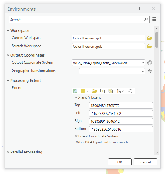
If you wish to reduce the number of colors, it is possible to edit the field for manual fine-tuning after running the tool; or run the tool several times on different geographic extents. To set the processing extent, go to the Analysis ribbon and under Geoprocessing choose Environments.

That’s all folks!
In case you were wondering, I created the map at the top – full version here – simply by running our tool on Natural Earth data, applying colors, and pasting it into my own customized version of the Equal Earth map: A wonderful resource created by Tom Patterson and our very own Bojan Šavrič.
Article Discussion: