Pt 1: GIS-ification
Pt 2: Cartographi-izing
This is a look at 100 years of California wildfires aggregated into 100-square-mile cells. Cells are color-coded by the cumulative burn area within each. In many cases, a cell’s 100 year accumulation of burns represents more than 100% of its area.
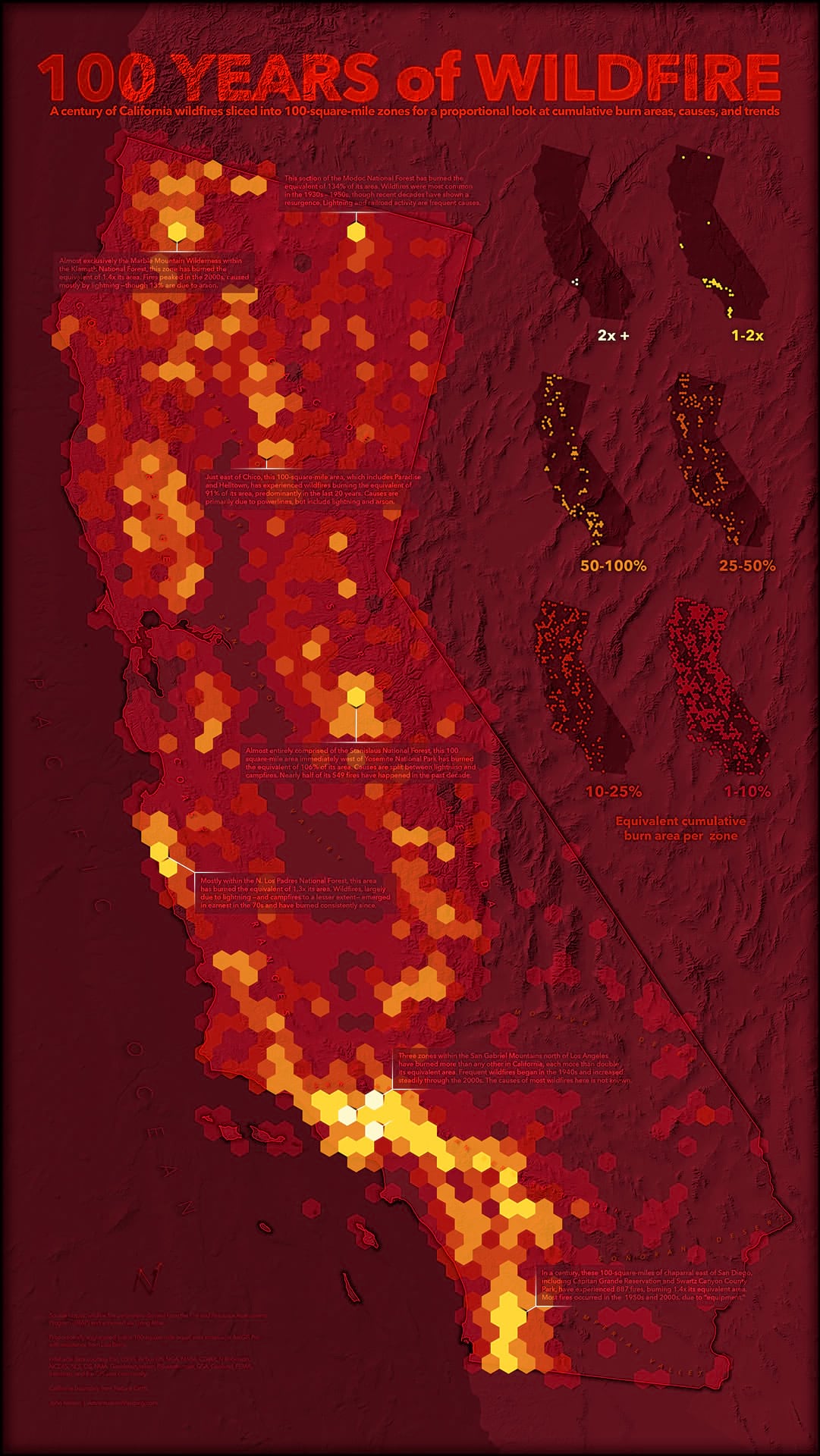
As the scale and complexity of California wildfires grows drastically, a long-term look at wildfire zones in the state can provide helpful context for areas of risk, a summation of causes at the local level, and a course decadienal perspective of rates.
Its intention is to provide a simple survey of a highly-overlapping phenomenon occurring over a broad time period into a discrete artifact to, perhaps, inspire questions, prompt connections, and understand causes. Some of the more punctuated cells have been annotated in this map, but a dynamic version of this map is available for exploration as well.
Here are a few closer looks…
The cells use six color classes driven by the proportion of the area that has burned, ranging from high (opaque yellow) to low (semitransparent deep red).
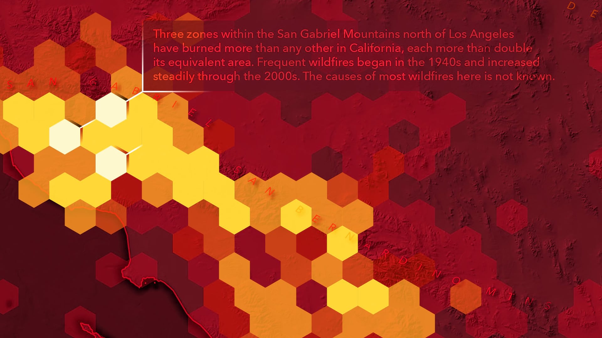
Rather than a simple legend (which I generally avoid if I can), a set of six mini-maps (aka small multiple) serve to key the cell colors and also provide categorical snapshots. Double-duty.
A small aside about labeling ranges: You might notice that I overlap my labeled range breaks. For example, 25-50% then 50-100%. Some folks would chafe at the notion of that, but it doesn’t offend my sensibilities. Simple repetitive ranges are much easier on the brain (is 25-49.99% and 50-99.99% really easier to understand?) and my data is precise enough not to have any problematic fence-straddlers (no features are, for example, exactly 50.00% so such a razor’s edge when cutting and labeling ranges is useless precision clutter).
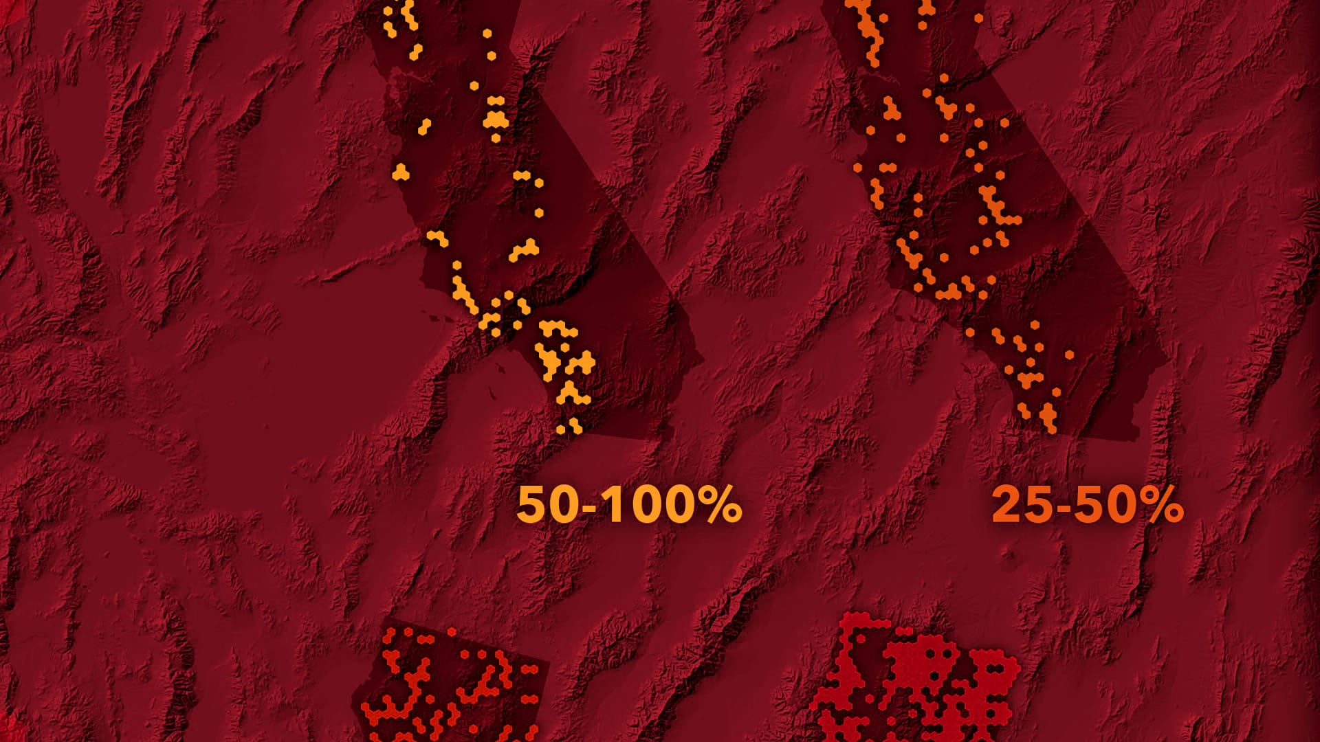
Hey, look at that wacky north arrow! You didn’t think I’d go through that trouble and not use it myself, did you? Even though it was roundly rejected in a scientific vote.
The first part of this 2-part blog series will focus on the ArcGIS Pro geoprocessing that resulted in the aggregated fire cells (which you can check out in ArcGIS Online). The second part will focus on the visual cartography.
Here is a general look at the process for part 1…
- Data access/filter/save
- Create an equal area tessellation (hexagonal cells) and slice up the wildfire areas by it
- Calculate the area for each fire/cell polygon
- Transpose categorical fields (like cause and year) and blow them out into lots of boolean fields (so they can be aggregated)
- Spatially join the attributes of constituent fires into the hexagonal cells, sum up all the fields
Ready to rock and roll?
Data
The data is available in Living Atlas, as the California Fire Perimeters 1878-2019 layer. This was based on perimeters provided by CAL FIRE’s Fire and Resource Assessment Program. Here’s how you can add glorious Living Atlas content into Pro…
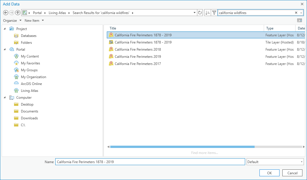
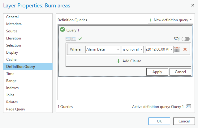
There are three categories of data that come in with this Living Atlas layer. I’m only interested in the wildfire data, which are called “Burn Areas.” The data goes back to 1878 (one hundred years before I was born, as it happens) but for the purposes of this map, a nice tidy 100 Years is an easier thing for an audience to wrap their heads around than 141 Years. So I’ll open up the properties of the Burn Areas layer and apply a Definition Query to retain only fires since 1920.
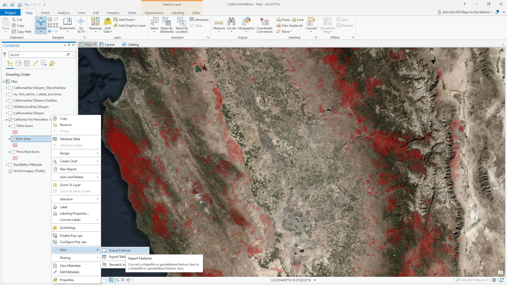
And because I just like working with local data (I don’t know; I’m a data hoarder?) I save this time-filtered wildfires layer into a geodatabase.
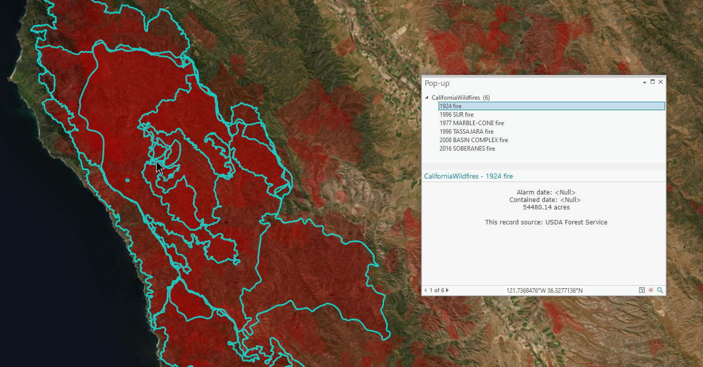
Now, one of the challenges of working with natural phenomena is occlusion. So many of these fires have burned the same place over and over. How can we get a discrete cumulative sense of a place, or even visualize it, when there is so much overlapping that happens?
For example, take a look at this area near Big Sur. In just a single clicked location, six separate wildfires have burned. What can we do to visually make sense of that?
One strategy is to flatten out all those overlapping layers into a single aggregated layer comprised of neutral equal area shapes.
Tessellation Aggregation for Conflation Eradication
Nice, huh? Ok, If we cast a net over all these polygons we can just count up all the instances of fire (including the area, cause, and decade) within each cell. Like an archaeologist would do at a dig. Then we’ll have a single summary layer to symbolize. The Generate Tessellation geoprocessing tool is a marvel. So simple, so useful. So with an equal area projection (this is critical, otherwise the areas will be inconsistent and you won’t have a fair apples-to-apples comparability of cells), I’ll create a hexagonal (rotated the cool way, transverse, pointy sides up/down) tessellation of 100 square mile cells.
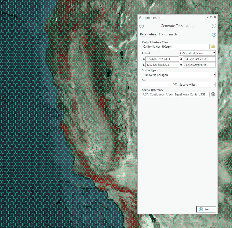
Next I’ll use this hexagon layer like a cookie-cutter on the fires. Open up the Union tool and add the fires and the hex layers as inputs. Afterward, to clean up the resulting layer non-fire polygons, delete all the features with an ID of -1.
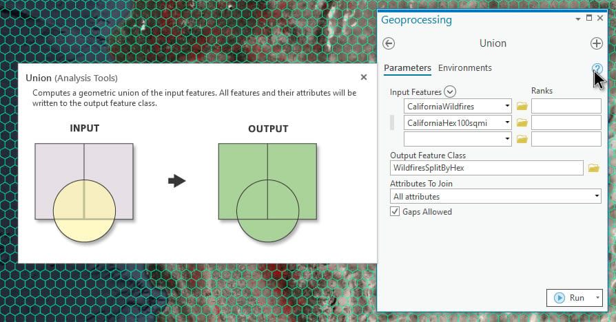
Look at this nice chop job. Now every fire is split if it spills outside of a hexagonal cell. This gets us one step closer to fairly aggregating the fires into these 100 square mile hexagonal cells.
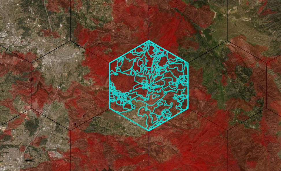
Conveniently, when you run a Union, the resulting polygons have their areas calculated automatically. So if a single fire straddles two cells evenly, half its area will be in one resulting polygon and half its area will be in the other. We’ll need that. The unit of this projection (USA Albers Equal Area Conic) is meters, so the area calculated is in square meters. You can check your projection’s units by looking at the map’s coordinate system in the map properties. If you are unsure about all that, it’s easy just to calculate an area attribute and choose whatever unit you like.
Blowing up a Categorical Field into a Bunch of Boolean Fields
Ok, so now we have accurate areas for our newly hexagonally-split-up fire polygons. Our goal is to be able to aggregate fire data into hexagons. That’s easy for something quantitative like area. But how do you count up a categorical attribute like cause? Or something even crazier, like how many fires happened in a hexagon each decade?
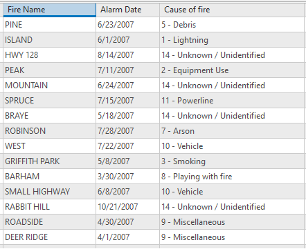
There are 14 separate possible causes and ten decades in our data. How do you add up each different cause into a hexagon when you just have a single categorical attribute? Things are going to get a little wacky…
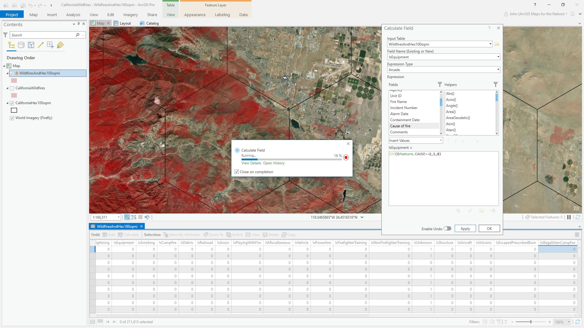
I need to create a bunch of new fields and transpose the categorical attributes into. Each field will be a yes/no sort of thing for each categorical option. For example, I’ll add a new numeric field called “IsArson” and write a little line of arcade that gives a feature a 1 if the answer is yes and a 0 if the answer is no. The result is way more fields, but at least they can be aggregated.
Also, all you developers out there shaking your heads thinking that all of this can be handled by 12 lines of code and no manual work…more power to you (and paste it into a comment below). I am only capable of one line of code, and even then I had to ask Lisa Berry to help me. This is the non-developer brute-force approach.
So here are a bunch of new fields that I made to house these attributes as a boolean 1/0 sort of thing instead of categorical…
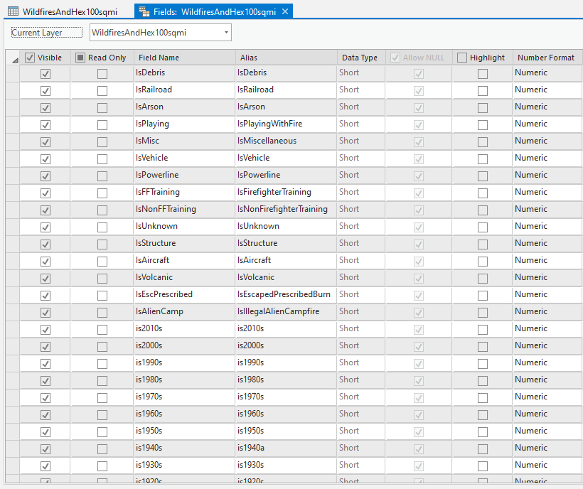
Each of these new attributes got a 1 or a 0 based on fire cause and decade. Here is the code that assigns a 1 or 0 based on an individual cause type…
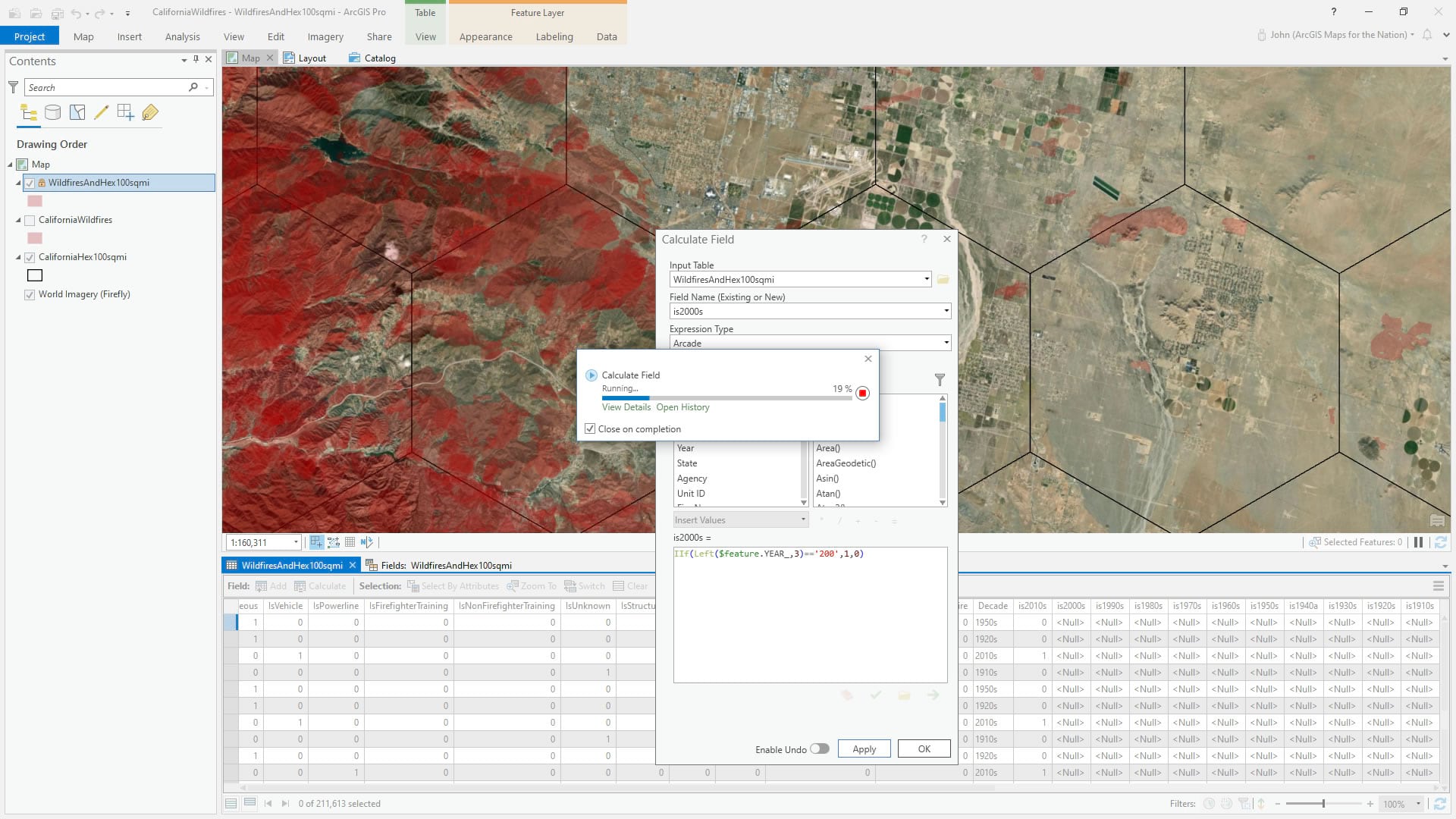
And here is the code for decade (Lisa helped with the clever “LEFT” function to assign a decade based on matching the first three characters of the year. Thanks Lisa!)…
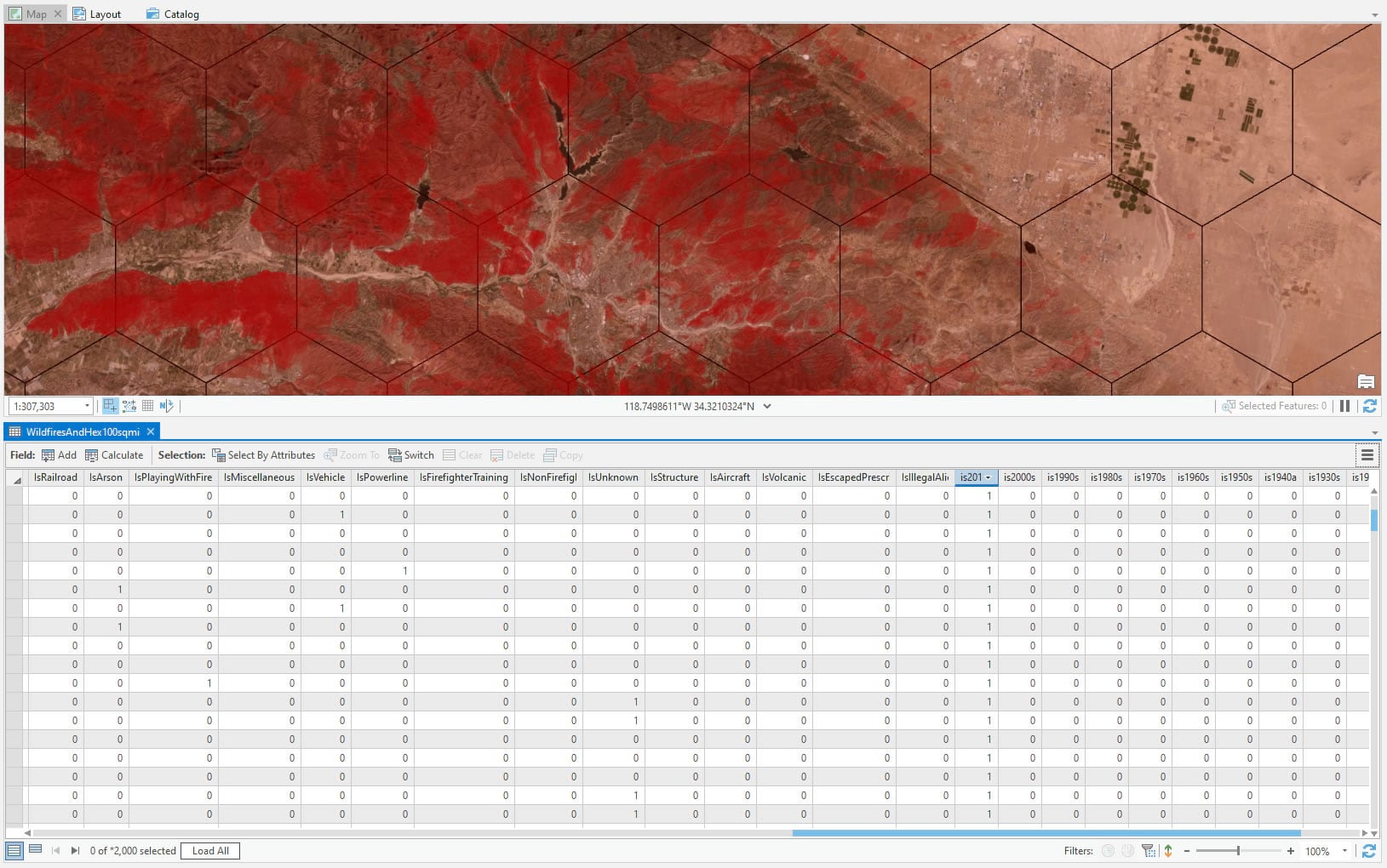
Oh my goodness what a beautiful thing to see all those bloated transposed quantitative attributes! Wow, I am a dork.
My goodness, what time is it? Is anyone still reading this?
Spatial Join
Whew, alllll this homework out of the way so we can get to the really good stuff: spatially-joining the fire data into the hexagons. I think spatial joins as just absolute spatial magic —the thing that exemplifies that spatial data is not just another number and that non-map tools can’t just do maps. Spatial is a dimension; a way of thinking. Where was I?
Oh, right, spatial join. Ok, now we will aggregate the attributes of these fires into the hexagons. When joining the attributes, I made sure to use the “SUM” option for merging the attributes of all fire polygons that fall within a hexagon using the “Contains” spatial operation (here’s a look at all the interesting spatial relationships you can use for selecting/joining). Our piles of cause and decade fields will tally right up. Magical.
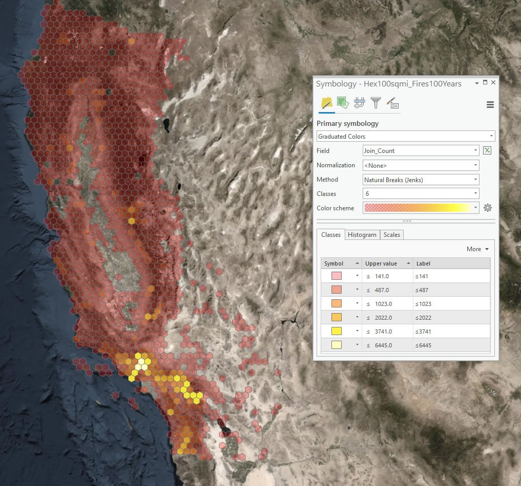
And I can color code the data-empowered hexagons by all sorts of things. Here’s a map showing the simple count of the number of fires in each hexagon.
Calculating Burn Proportion
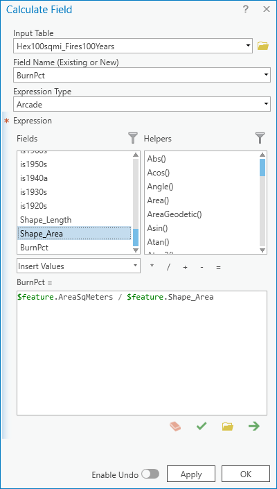
But not all fires are equal. Many fires are quite small while others are massive. We have the sum area of all wildfires in each hexagon and we know the size of each hexagon. Both are conveniently calculated for me in the steps above, and both are in square meters so it’s a simple calculation.
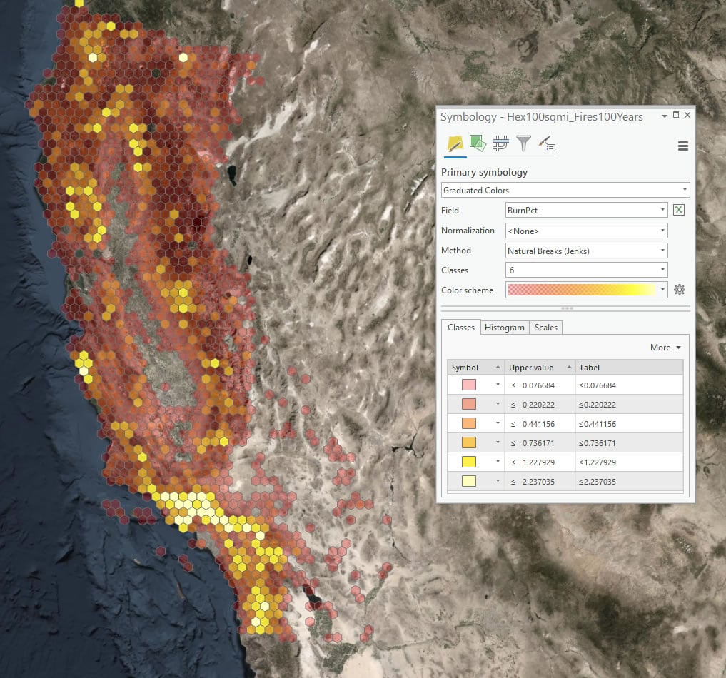
The result shows the percentage of the hexagon’s area that has burned in the past century. Many hexagons have burned the cumulative equivalent of well over 100% of their area.
On Mistakes
I make a lot of mistakes. Though I earnestly try my best to avoid them, it happens; and they happen to you too, I’m sure. When I made this map the first time I used “intersection” as my spatial relationship instead of “contains.” What I didn’t realize was that “intersection” includes all polygons that share a border with each hexagon so I was waaaaay over-counting the fire data. I only realized it when I was walking through the process of making this map a second time, to write this blog post. Otherwise I never would have caught it. I’ve made enough mistakes to know that they are inevitable and it’s best just to own it quick and see what can be done to remedy. There’s no shame in making mistakes (well, I mean, there’s a little) but the biggest mistake is not learning from the initial mistake.
Even though this map is somewhat similar to a couple of others I’ve made in the past (drought and tornadoes) it was full of lessons. Each map brings its own challenges and adventures and opportunities. This was initially an opportunity to play with the new AIX export functionality for ArcGIS Maps for Adobe (which I’ll get into in part 2) and to satisfy my curiosity about transposing categorical attributes into quantitative attributes and to better understand a phenomenon that is impacting my friends and family. It turned out to be an opportunity to dig into the fascinating nuances of topological relationships and admitting goofs. That’s the wonder of making. You never know where it will take you, and the next thing you make will be better for it.
My regards to those who have suffered because of these wildfires. I hope that, as with any map, a visualization can help reveal some amount of insight and awareness, however small.
So stick around for part 2, where I focus on the Cartography of this map. Looking forward to seeing you there!
Love, John
**Update: in the first draft of this blog post I mistakenly used the spatial operator “within” rather than “contains” when summing up all the fire burn area into the hexagons. A mistake compounded by another mistake. It has since been edited to note the correct spatial operation, which is “contains.” Such is life.**

Article Discussion: