In Map Viewer in ArcGIS Online and ArcGIS Enterprise, smart mapping helps users build beautiful, informative maps with just a few clicks. It unifies Esri’s advanced mapping technology with streamlined workflows to enable seasoned mapmakers and mapmaking novices alike to explore their data and uncover insightful patterns.
Smart mapping takes the guesswork out of mapmaking by suggesting map styles that go best with the data users are working with. It allows them to employ default options quickly and still customize the shapes, symbols, colors, sizes, transparency, rotation, and outlines used in the map. To help the map tell the same story at every scale, smart mapping gives users the option to adjust symbol sizes automatically as the map zooms in and out, enabling certain map styles to work at multiple scales.
Recent enhancements to ArcGIS Online and ArcGIS Enterprise have made smart mapping a more powerful tool for quick and thorough mapmaking. Here’s how to get started using it, and an overview of many of the sophisticated things it can do.
Begin with One Question, Then Ask Three More
Some of the best maps answer some of the world’s toughest questions. And that’s how the mapmakers got started: with a question.
To get under way with smart mapping, just ask a question. Questions that begin with, Where does…? can be answered with a smart mapping style that reveals the locations of things on a map. The map will either unveil a pattern that looks interesting as is, or it will entice you to ask, What else?
Whether the resultant map is or isn’t revelatory, it’s time to ask more questions. Try starting with, How much/how many…? What is the most common…? How has this changed over time…? and What is the relationship between…? Asking more questions after visualizing your data can lead to deeper insight.
So after creating a map that answers your first question, explore your data further by asking three more. You’ll be surprised at the new information your existing data can show you.
Now, Get Started with Smart Mapping
In Map Viewer, once you’ve added a data layer to your map and chosen the attributes you want to show, choose the Styles option from the menu bar on the right to start working with smart mapping. Keep in mind that smart mapping styles work best when you select a basemap that has neutral colors but still shows important details.
Now that the basics are out of the way, explore the different smart mapping styles and see how you can apply them.
Single Symbol
Where are the electric vehicle charging stations? or Where do we have gaps in our electric vehicle charging station offerings? are the kinds of questions that the Single Symbol style can help answer. This creates a simple map because it just shows the locations of things.
This style can be used for points, lines, and polygons. For example, a map consisting of points can represent the locations of certain items, such as restaurants. And a map consisting of lines can represent features like highways and roads.
Types
Types is a smart mapping style in which each color or symbol on a map represents a different category for a chosen attribute.
A question that can be answered using Types is something like, Where are the wind turbines in the United States grouped according to manufacturer? With the Types style, users can apply unique symbols to show categorical data, though it doesn’t work for counts or numeric measurements.
Users can customize line colors to specify which category each feature belongs to. They can also use symbols to represent different categories.
Be sure to experiment with various colors, shapes, sizes, and outlines to enhance your map of categorical data.
Counts and Amounts
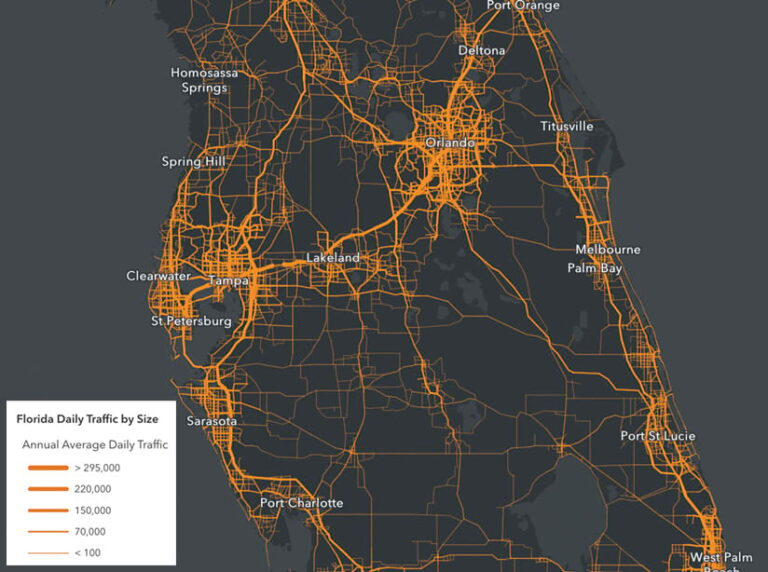
Say your question is, Which highways in Florida experience the most traffic each day? Counts and Amounts is a good style to use to answer this.
It’s easier to discern patterns in numeric data on maps when distinct colors and sizes are used to represent different values. With smart mapping, users can distinguish features using graduated colors to reflect various amounts. They can also represent numeric data or ranked categories using different sizes.
Alternatively, users can assign specific colors to numeric ranges. This technique also works with averages, means, medians, rates, ratios, percentages, and other normalized data. Not only does smart mapping make it easy to represent distinct counts and amounts, but it also helps show how big or small the differences are.
Color and Size
Map Viewer makes it simple to vary a feature’s color or size based on only one numeric attribute. But with smart mapping, you can go one step further by using both color and size to represent one or two numeric attributes.
This style helps answer questions like, Which areas have high poverty rates? and Which areas have the highest number of people living in poverty? For this, colors can be used to represent poverty rates, while the size of the symbol can show the number of people living in poverty.
Compare A to B
This is the smart mapping style to choose when you want to compare two attributes as a percentage, a simple ratio, or an overall percentage. A good question for this style is, Which areas have high and low population growth relative to overall population change?
Even if you don’t have a percentage or ratio as an attribute field, you can still use Compare A to B as long as the numerator and denominator are somewhere in your data. This means that you can compare two numbers and represent their relationships as a percentage or a simple ratio. This would be useful for comparing populations based on political affiliation, homeownership, or veteran status.
Predominance
With the Predominance smart mapping style, users can analyze multiple columns of related data to see which has the highest value for each feature. This style can help answer the question, What are the most common races and ethnicities in the Los Angeles, California, area?
To use the Predominance style, select between 2 and 10 numeric attributes to compare within the smart mapping window. Don’t hesitate to get creative with various size and color options. You can also try using a sequential color ramp to map a topic with sequence or order, such as income ranges. It’s helpful to play around with different shapes, too, such as triangles, squares, or diamonds.
Users can even build a predominance map using a custom ArcGIS Arcade expression.
Relationship
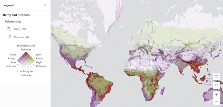
If you want to answer a question such as, What areas have high rarity of species and low richness of species?, try the Relationship style. It allows users to visualize patterns that are normally hidden among numeric attributes in point, line, or polygon feature data.
This kind of map shows where the relationship among the attributes is most or least pronounced. It combines map patterns to explore where they overlap or diverge and uses two individual color ramps to show a mixture of the patterns. Users can also add a third variable into a relationship map to create a relationship and size map.

Clustering
When mapping several points, it is common for those points to overlap. This can prevent your map from conveying the story it is meant to tell. While there are other workarounds, such as making a heat map or doing statistical analysis, these approaches often require restructuring the data.
The Clustering style groups points together dynamically so the map is easier to read at different scales. When viewers zoom out, more points are aggregated into fewer groups, and when they zoom in, more cluster groups appear. Clusters are proportionately sized according to the number of features within each cluster. The bigger the symbol, the more features it contains.
Try Clustering the next time you want to answer a question like, Where are the highest and lowest concentrations of public schools in my city?
Heat Map
Like Clustering, the Heat Map smart mapping style helps resolve overlapping points. It can help answer the question, In which areas of New Zealand are you most likely to see great white sharks?
Heat maps analyze the features in a layer and display the relative density of the points as a smooth, varying set of colors. For example, cool colors, like blues and greens, might represent a low density of points, while hot colors, such as oranges and reds, could indicate a high density of points.
Heat Map is a good style to use to show event-based data where points are likely to coincide, such as the number of traffic violations given out in a specific area of town.
Dot Density
Instead of filling an entire polygon with a thematic color, the Dot Density style represents counts in data using dots. This allows users to visualize the distribution of one numeric attribute or compare multiple numeric attributes with differently colored dots. One question that can be answered using Dot Density is, How is the population distributed by race across Los Angeles?
This technique can be used to map any type of numeric or quantitative data and is commonly employed to map demographic and socioeconomic patterns. With Dot Density, you can evenly represent counts regardless of the size of the polygons in that layer as compared to using size. For example, each dot could represent a household or person, with the dot color symbolizing race.
Continuous Timeline and Age
Two styles—Continuous Timeline and Age—help users visualize date and time attributes.
A Continuous Timeline can convey when something happened using color or size to represent the dates associated with each feature on the map. With this style, users can view the data sequentially, from old to new or before and after a key date. Some questions this style helps answer include, What buildings were rebuilt after the Rotterdam Blitz in World War II? and Which emergency calls took more than 10 minutes to respond to versus which ones took less than 5 minutes?
The Age mapping style can be used to show the age of features on a map. As with Continuous Timeline, age can be expressed via color or size.
Flow
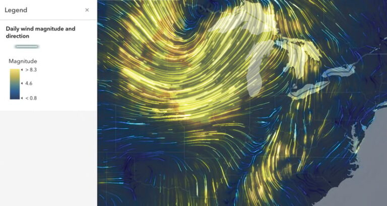
Flow is among the newest smart mapping styles. It now appears as an option if you have tile imagery layers or dynamic imagery layers that contain data on magnitude and direction.
This style is great to use in meteorology, climatology, hydrology, and oceanography to animate wind speeds and directions or ocean currents. It can help answer a question like, What is the direction and magnitude of wind in the Midwest?
If you would like to explore this style but don’t have the right kind of data (UV or MagDir), use the HYCOM – Ocean Current Vectors dataset in ArcGIS Living Atlas of the World.
Create Thematic Maps in Minutes
It has always been possible to make these maps in ArcGIS Online and ArcGIS Enterprise, but it has previously required extensive customization and planning. Now, anyone can create insightful thematic maps in minutes rather than days, weeks, or months.
To learn more about the different smart mapping styles, check out the ArcGIS StoryMaps collection Smart Mapping Styles in Map Viewer.
