Just over a year ago, a rocket carrying NASA’s Orbiting Carbon Observatory-2 (OCO-2) satellite launched from Vandenberg Air Force Base in California. The mission: measure carbon dioxide (CO2) in the earth’s atmosphere. This will help scientists create a more accurate, global picture of the sources of CO2— where it’s produced—and the sinks—where it’s absorbed.
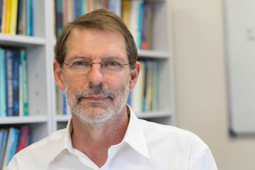
Noel Cressie, keynote speaker at the 2015 Geodesign Summit and an expert in spatial and spatio-temporal statistics, serves on OCO-2’s science team at NASA’s Jet Propulsion Laboratory (JPL) in Pasadena, California. He is one of the people who will help make sense of the data that’s being beamed back to JPL from a sensitive instrument on OCO-2 that, according to JPL’s website, measures “the intensity of the sunlight reflected from the presence of CO2 in a column of air.”
“This is big data,” said Cressie, a distinguished professor at the National Institute for Applied Statistics Research Australia (NIASRA) at the University of Wollongong (UOW) in Australia and a distinguished visiting scientist at JPL. The OCO-2 data will be transformed into digital maps that will show the CO2 sources and sinks and how they change over seasons, he said. (See the first mapscreated from mission data collected last fall.)
Because of global-warming concerns, scientists and the public want to learn more about how much CO2—a greenhouse gas that can cause a rise in global temperatures—is in our atmosphere. They also want to learn where it comes from; where it’s geographically distributed over time; and where it’s absorbed, which is referred to as CO2 flux.
A Princeton University graduate, Cressie wrote the classic textbook Statistics for Spatial Data and coauthored, with Christopher K. Wikle, the award-winning book Statistics for Spatio-Temporal Data.
Cressie sat down with Esri writer Carla Wheeler to discuss his work on the OCO-2 mission and about how probability calculations play an important role in studying and better understanding climate-related data. Here are some excerpts from the interview:
Wheeler: Tell me a little about yourself.
Cressie: I was at Ohio State University up until about two years ago. The University of Wollongong— which is an excellent university located 50 miles south of Sydney—and ranked among the top two percent worldwide—offered me a research position with an opportunity to build a team in spatial and spatio-temporal statistics and, more broadly, in studies of the environment. I’ve had an interest in environmental informatics for a long time.
Wheeler: Why are you so passionate about environmental research?
Cressie: I think we can make a difference in how we treat and improve our environment. My general feeling is, if you can’t measure it, you can’t manage it. The measurement process automatically involves statistics. And because the environment is so spatial and so map-oriented, it quite naturally leads into spatial statistics. And because the environment is dynamic and evolves, quite naturally it leads into spatio-temporal statistics.
Wheeler: During your presentation at the Geodesign Summit, you spoke about a warmer, drier climate in the future. What do you expect will happen to our climate toward the end of this century?
Cressie: I am, of course, worried about how things will work out for the planet and those who live on it. On the other side of things, I am a scientist. So one tries to be dispassionate about the future and simply present the facts. And the facts might be good news or they might be bad news. The work that I’ve done that didn’t come up during my Geodesign Summit keynote was on analyzing regional climate models. Climate models try to take you from the present into the future. So climate models will give you future temperature and future rainfall and that type of thing. And generally speaking, if you are in a hotter world, you are in a drier world with more droughts.
Wheeler: Tell me about some of your work analyzing climate models.
Cressie: I’ve analyzed, from a spatial statistical point of view, the North American Regional Climate Change Assessment Program [NARCCAP] data from the National Center for Atmospheric Research [NCAR] in Boulder, Colorado. NCAR brought together a number of international teams, each of which built a regional climate model for North America at a 50-kilometer resolution. Physicists and climate scientists use the laws of physics to allow us to crystal-ball gaze into the future. Generally speaking, climate scientists believe that we can sustain our way of living if warming is held to [an average of] two degrees Celsius beyond pre-industrial levels.
We are already a bit behind the eight ball because, since the Industrial Revolution, on average, we’ve warmed on the order of .5 to .7 degrees Celsius. So we only have 1.3 to 1.5 degrees Celsius to go.
The two-degree sustainability limit is coming at us quite fast. What the NARCCAP models showed consistently—all of them—is that there are many, many areas of North America that will warm on the order of three to five degrees Celsius by 2070. At that point, there will clearly have to be some mitigation, and our society will have to adapt. In general, higher temperatures mean less rainfall, and we may not get the yields that we need from crops. Flora and fauna will move. For example, the natural seeding of trees will move them to different bioclimates. Other species may become extinct. Probably the best example that most people think of is the melting of sea ice in the northern polar region that’s also impacting Alaska and Greenland. The ice is thinner, and that affects the polar bears’ habitat. It is an endangered species because of warmer temperatures and, hence, thinner ice.
Wheeler: You then created some maps that projected where temperatures will be higher in the future in North America?
Cressie: What I’ve done using spatial statistics is make some quantitative summaries of regional temperature changes that project into the future decades from 2040 to 2070. We are able to take three to four million surface-temperature outputs and come up with maps and summaries using data-dimension-reduction techniques that offer ways to analyze big spatial and spatio-temporal data.
Wheeler: Do you look at what happened in the past to model the future?
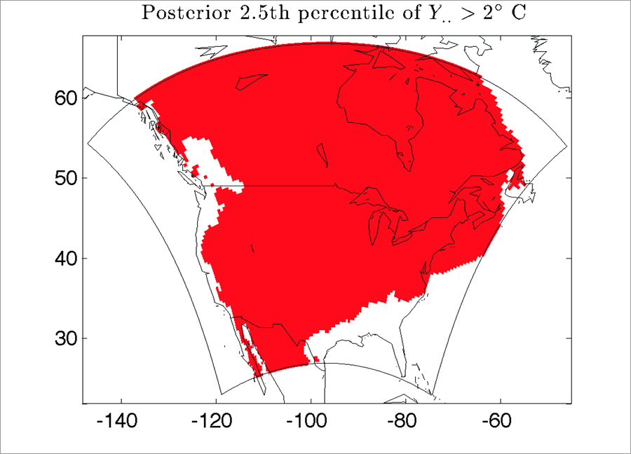
Cressie: Yes, the climate models are run from 1970 to 2000 to get a baseline. Then they are run from 2040 to 2070. In my geodesign presentation, I showed CO2fluxes, which are differences in time. This work I did on North American regional climate models also looks at time differences between the future period and the baseline. Using spatial statistics, I calculated that two-thirds of the North American region had a 97.5 percent probability of its temperature increasing by more than two degrees Celsius.
Wheeler: Why is using probabilities so important?
Cressie: We don’t know the future. It’s notoriously hard to predict! We don’t even know the present. We have data on the present, but we, as a society, don’t have sensors out there collecting data about absolutely everything. So we have missing data. The data we do have has measurement error associated with it. And the data we do have is sometimes aggregated to levels that our sensors can measure, such as for remote sensing. We often want to make decisions about what’s happening at spatial scales that are different than those of our measurements. So we run into issues of knowing what we want but having imperfect measurements of them. And that’s in the present. For the future, we have projections approximated by the laws of physics but no data. So uncertainty hits you in the present and the future—not only not having the information on the processes that you want but having imperfect looks at them.
Wheeler: So you can fill in the blanks or quantify uncertainties using math?

Cressie: Yes, using statistical inference based on math and, in this study, based on physics.
Wheeler: Tell me about the OCO-2 mission that launched July 2, 2014. How does the instrument that measures CO2 work? I understand it indirectly measures carbon dioxide by measuring the intensity of sunlight that is reflected from the CO2 molecules that are present in the atmosphere.
Cressie: We are used to the part of the spectrum that we see—the images, the color that goes from red through violet. On the red side, the stuff we can’t see is called infrared, and on the other side, it is called ultraviolet. There are parts of the spectrum that are not visible but are sensitive to oxygen and to carbon dioxide. The instrument measures radiation reflected from the earth’s surface through a column to the satellite, and the energies absorbed in these parts of the spectrum effectively give a count of the number of oxygen molecules and the number of carbon dioxide molecules in the column.
The satellite’s instrument takes readings of radiances, or energies. For a single sounding, it’s measuring about 3,000 radiances, or energy amounts, in those sensitive parts of the spectrum, and these are used in the algorithm that retrieves the carbon dioxide values in units of parts per million.
Wheeler: What is your role on the OCO-2 science team?
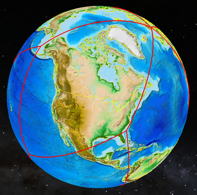
Cressie: With other statisticians and with geophysicists, I’m involved in the algorithms that convert these radiances into total column carbon dioxide [in parts per million] between the earth and the satellite and then into CO2 fluxes at the earth’s surface. These estimates have uncertainties that we quantify statistically. The satellite orbits about 700 kilometers above the earth’s surface and the trajectory is from pole to pole. There are 14 orbits per day, and complete coverage is achieved in 16 days. The instrument is passive and only takes readings during the daylight hours. So for half of its cycle, it is not sensing.
While it’s a wonderful instrument, even under perfect conditions, there will be measurement error. It looks straight down but can be tilted to target a location or get maximum reflectance of energy from the surface of the ocean. Generally speaking, the data locations of the satellite are tracing out ribbons that are actually quite thin. That means between one ribbon and the ribbon next to it, there are probably about 150 kilometers where there is no data at all.
Wheeler: Tell me more about CO2 sources and sinks, meaning the fluxes.
Cressie: Some are natural, and some are caused by humans. For example, after the farmers have harvested their crops, they plow their fields. That will release carbon dioxide from the soil into the atmosphere—that’s a source. When plants are growing, those plants take up carbon dioxide—that’s a sink. The Amazon jungle is one of the larger sinks in the world—some people call it the lungs of the earth—it sucks up all this bad stuff. When you start to burn off the Amazon jungle, two things happen: you are decreasing the size of the sink and you are turning that sink into a source because all that burning introduces carbon stored in the wood into the atmosphere as carbon dioxide. A very large sink is the oceans. The oceans tend to take up carbon dioxide from the atmosphere. However, it makes them more acidic and usually results in their becoming warmer, so there’s the potential to kill coral and other important species within the marine ecosystem.
Wheeler: How does mapping play a role in how the OCO-2 data will be presented to the public?
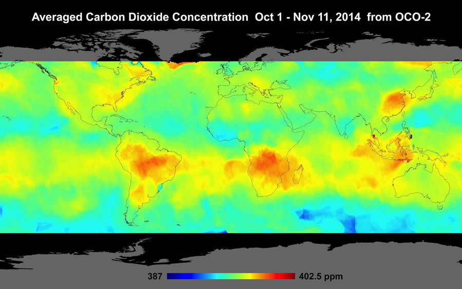
Cressie: JPL has produced a map using some spatial statistical technology called kriging. Maps— particularly dynamic maps—allow us to understand the carbon cycle better. Where are the borders of the regions—during the different seasons—of the sources and sinks? Some parts of the earth at different times will be a source and at other times will be a sink. We would like to understand the conveyor belt of carbon dioxide through sources and sinks so we can project climate into the future. We can introduce carbon dioxide through systems models, run it through the carbon cycle and see what effect that will have on temperature change. It might actually be better or worse in different regions, but generally speaking, Earth’s temperatures will increase.
Wheeler: In a map posted on the OCO-2 website that shows time-averaged carbon dioxide concentration between October 1 and November 11, 2014, there seem to be CO2 concentrations over South Africa, Java, China, and South America.
Cressie: The high CO2 levels are probably due to the burning of savannas and forests. As I mentioned before, these things are seasonal. The maps produced in the future will be much better than these early snapshots, as the OCO-2 data used was preliminary.
The eventual goal is to come up with maps of the CO2 fluxes at the earth’s surface, which basically tell you where the CO2 is coming from and where it’s going to. In principle, you could run a movie and watch these sources and sinks move and carbon-cycle experts would likely say, ‘I knew that. That makes sense.’ But then there would be some surprises. We know there will be surprises because there is a sink that scientists have so far been unable to locate. They have hypotheses, but because we haven’t had the data at a sufficiently fine spatial scale, so up to now, they don’t know. Data from OCO-2 will help resolve that problem.
Wheeler: How much CO2 do we estimate is in the atmosphere?
Cressie: In April this year, the 400-parts-per-million level was surpassed worldwide. Natural sources of CO2 are largely balanced by CO2 sinks. Human-induced sources, such as from fossil-fuel burning and cement factories, are not in balance; a little over half is removed by the biosphere and oceans, but the rest—more than two gigatons of carbon—is added to the atmosphere every year. So if we reduce what we produce, we’ve got a better chance to keep global warming under the two degrees Celsius sustainability limit.
For more information about the relationship between spatial statistics and geodesign, watch Cressie’s video interview.
