Esri’s Cool Maps Gallery Is a Great Location to Find Inspiration
Do you just need a little inspiration for your next mapping creation? Or do you want to teach students to think spatially? Then check out the Esri Cool Maps gallery, which contains 15 interactive mapping apps that may spark ideas for your next map or classroom lesson.
The Sale of Two Cities is one of the mapping apps currently featured in Cool Maps. The app description reads, “The grass is always greener on the other side. But how much more ‘green’ does it take to live in San Francisco versus West Palm Beach?” Viewers can use the app to compare the cost of living between those cities or two others from a choice of dozens of other communities throughout the United States. Using a drop down menu, you can choose two cities, and the app’s map will tell you where the cost of living is higher by percentage.

For example, the cost of living in the cities of San Francisco, California, and Las Vegas, Nevada, are compared on this map (right). The comparison shows that housing, utilities, groceries, and healthcare are more expensive in San Francisco, while transportation is more costly in Las Vegas. The mean cost of living among the five measures in the mapping app is 67 percent higher for San Francisco.
This makes sense, given the high cost of housing alone in San Francisco. San Francisco’s rapid transit and bus system, combined perhaps with more people living in close proximity to their workplaces, makes transportation costs lower than in Las Vegas.
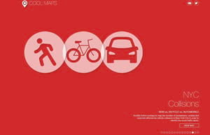
Another app now in the gallery is NYC Collisions, which maps the numbers of motor vehicle, bicycle, and pedestrian fatalities and injuries in New York City. Other maps focus on topics related to real estate, crime, economic development, urban growth, and even the world’s happiest countries.

The stated goal of the Cool Maps gallery is to stimulate ideas, and these maps are perfect tools for classroom teaching. The maps also nudge people to think spatially. They are cool and, because of that, are great conversation starters.

