Create Beautiful Infographics with ArcGIS Runtime SDK for Qt and Qt Charts
One of the great things about Esri’s ArcGIS Runtime SDK for Qt is that it provides an API that seamlessly plugs into a rich framework that is platform agnostic and has nearly endless possibilities.
This allows you to bring the power of location and ArcGIS into larger projects that take full advantage of the framework and its multitude of APIs and plug-ins. One of my favorite modules from the Qt Framework is Qt Charts, which is an enterprise add-in that allows you to easily create visually appealing charts and graphs. These charts and graphs, coupled with beautifully designed maps from ArcGIS, allow you to create data exploration tools and infographics that are extremely valuable when trying to tell a story about your data.
As an example, I created a data exploration tool for Los Angeles County. I wanted to explore how demographics, crime rates, and income were related in the Los Angeles area. To do this, I used block group-level demographic data from the US Census available from Data and Maps for ArcGIS along with some crime data for 30 days in CSV format from the Los Angeles County Sheriff’s Department. Using analysis tools in ArcMap, I was able to quickly aggregate the data by block group and publish it as a feature service to ArcGIS Online.
Now to the fun part—writing code! I envisioned my app as an interactive tool for users to explore the map and obtain summarized data as they navigated to new areas of the map. To do this, the user clicks on the map, and a buffer around that point is created using the geometry engine that is built into the Runtime API.
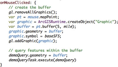
This buffer acts as a cookie cutter. All the demographic and crime data for blocks that intersect with the buffer is summarized quickly and represented on the graphs.
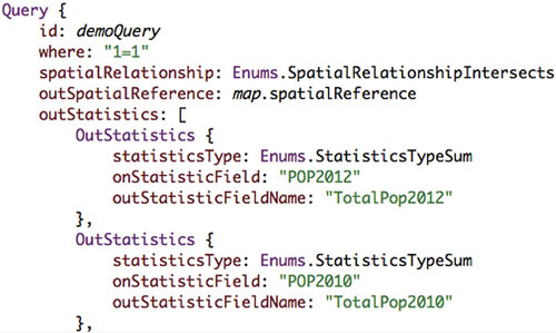
The coding was straightforward and revolved largely around executing Query Tasks against the Feature Service, then feeding the results to the different elements in the charts. Query Tasks takes advantage of a concept called Out Statistics, which allows you to specify a field and a statistic type. Instead of returning all the features inside your input geometry, Out Statistics will return one feature with all your summarized statistics. Listing 2 is an example of the code to do this written in QML.
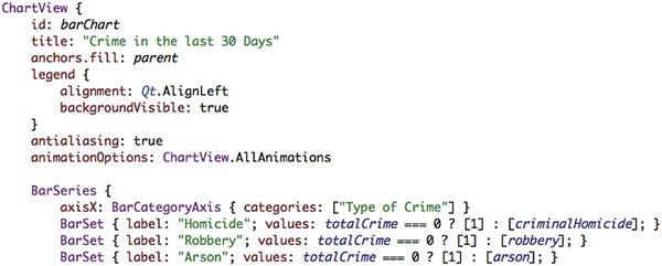
Once the Query task completes, the code in Listing 3 causes the data to be fed into some bar and pie charts for easy data visualization.
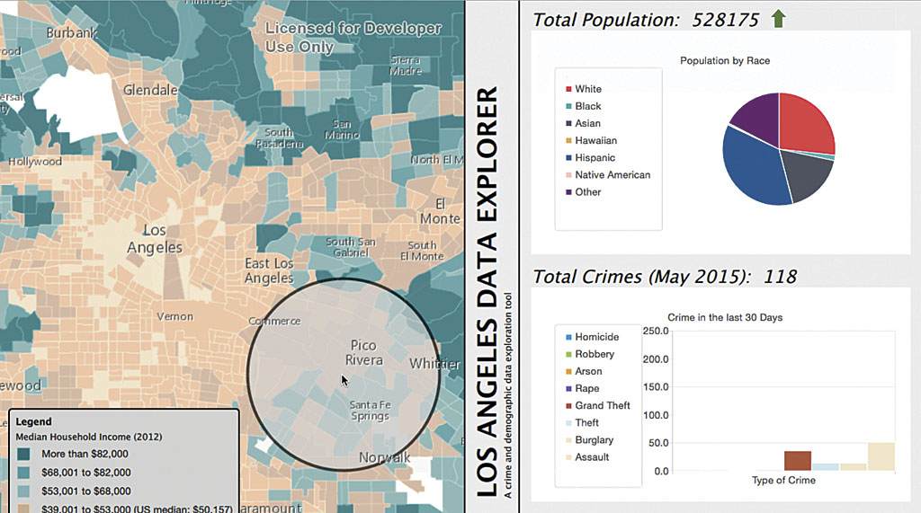
Finally, all this is overlaid on an Esri-provided Median Household Income dynamic map service. I chose this specific dynamic map so the user can see trends and correlations between the demographic, income, and crime-related data.
This project, called QML Maps and Charts, can be found on ArcGIS Online. Feel free to download the source code and explore the application on your own. If you’re interested in ArcGIS Runtime SDK for Qt and haven’t already downloaded it and started developing, visit ArcGIS Runtime SDK for Qt or ArcGIS Runtime SDK for Qt on GeoNet to learn more.

