Who hasn’t found themselves engrossed in the route maps at the back of flight magazines and asked themselves, “How do they make those maps?” Readers who have a few years of GIS experience can read through this article to find out how. This article will be most relevant to readers wanting to know how GIS can illustrate movement from one location to another when those origins or destinations are shared, such as flights arriving to and departing from an airline hub.
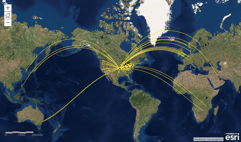
One splendid spring day in Lawrence, Kansas, GIS specialist Rhonda Houser was working as a colleague (her boss) was busy planning a big conference. For conference attendees, Houser had created a map of favorite local destinations. This was a straightforward process in ArcGIS Online that had a satisfactory result. Her colleague also asked if Houser could make a map showing where attendees had traveled from to attend the conference.
Houser found a helpful post on the ArcGIS Blog from September 6, 2011, “Creating radial flow maps with ArcGIS,” by Mamata Akella. It described how radial flow maps can show the movement of goods or people, using lines to depict transportation and communication routes and relationships. A radial flow map can show multiple origins converging on a single destination (or vice versa). Best of all, she learned that ArcGIS has a tool that generates radial flow data from geographic coordinates.
Her colleague had provided a spreadsheet of attendee data that included the country, state (if the attendee resided in the United States), city, and ZIP code. Registrants were also coming from more than 100 places in Africa, Japan, Australia, and the Philippines.
Houser used Microsoft Excel to clean and format the data. She didn’t touch the ZIP code data because mapping this geography is tricky. She summarized all records for each city into a single row and added a column for the number of attendees per city. She structured the data this way so the tool would create a line for each city instead of each attendee. She also added the four columns required to hold the geographic coordinates for origins and destinations.
GeoNames seemed like a comprehensive and authoritative source for latitude and longitude (x,y) data for the cities. [GeoNames is an online geographic database that provides place names for all countries. Available under a creative commons attribution license, place-name data can be downloaded at no charge.]
Cleaning data is naturally messy. GeoNames data is available based on city population, so the coordinates Houser needed were scattered throughout a few large, delimited text files.
Dealing with duplicate city names was another challenge. Guess how many Springfields there are in the United States? GeoNames city data seemed to include unique identifiers, though the attendee data did not. Preparing the data for a giant join was going to be a lot of work. Instead, Houser found an easier method. She entered coordinates for each city, using Google Maps to fill in a few gaps.
For local attendees, she assigned coordinates roughly equivalent to the city center. Although discernible only at a very large scale, this line intensified the overall density of the lines leading to the University of Kansas campus at other scales. A few x,y values that stubbornly refused to be formatted as decimal numbers conformed after some prodding.
Success in GIS requires outlandish displays of problem solving, driven by an array of tactics and a relentless determination to solve, fix, or finish. Creativity is often the result rather than the intent when resources are scarce or ideal resources are not present. What seems creative is also a reflection of the particular combination of tools, expertise, and time available in each unique environment.
Houser used the XY To Line tool in ArcGIS Desktop 10.5 to generate a line dataset from the spreadsheet data. [The XY To Line tool uses origin and destination values as inputs from a table and creates a new linear feature class that represents the path connecting these two points.] The output shapefile included default vector data fields and starting and ending coordinates but not the rest of the spreadsheet data. To join that data, she needed a field containing unique identifying values. She joined the rest of the spreadsheet data based on the starting longitude value field—and it worked.
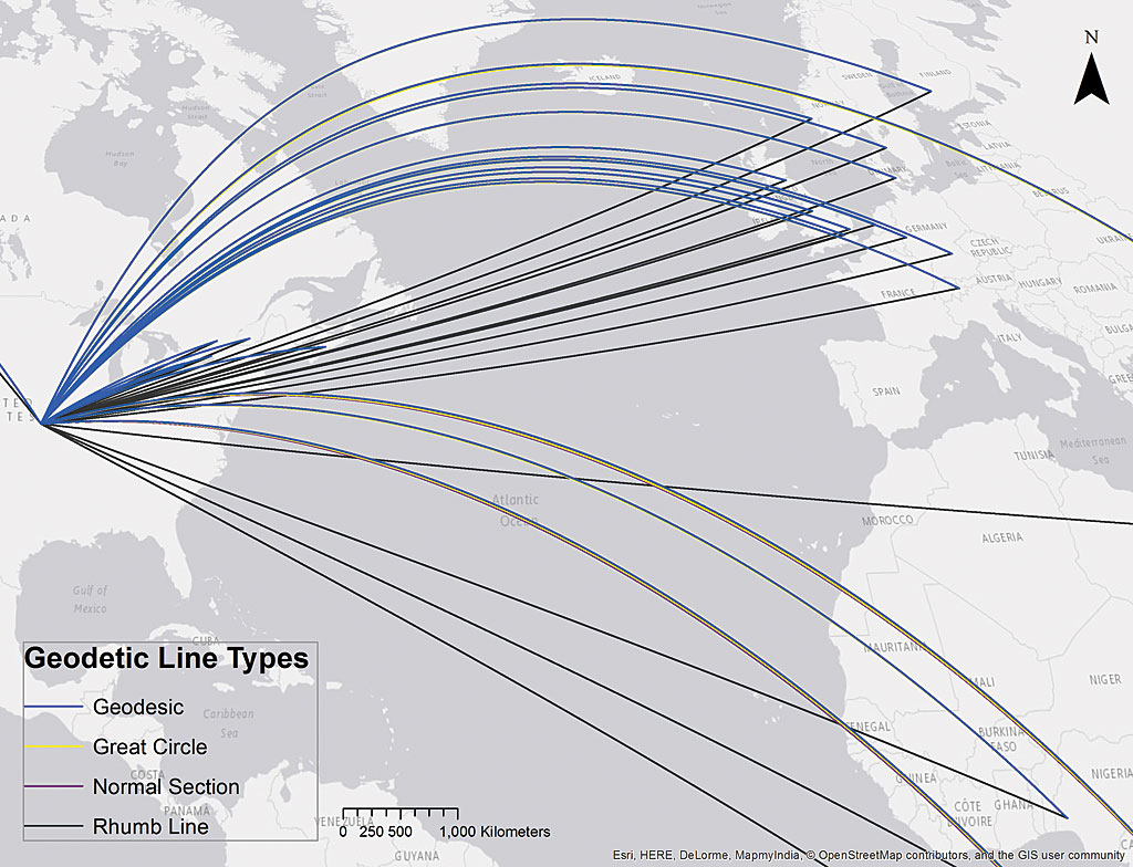
Houser wanted graceful, arched lines that appeared to leap off the map into the air and rocket down to their destination. The XY To Line tool options for line type have fun names like rhumb line, geodesic, great circle, and normal section. After reading their definitions, the names seemed less whimsical but were still interesting. Except for the rhumb line type, which produced straight lines, the other line type options produced similar results.
The geodesic line type, the default choice, is the most accurate for representing the shortest distance between two points on the earth’s surface, and the lines are visually appealing. As the objective was a map balancing a clean and appealing appearance with geographic accuracy, the geodesic line type was the winner.
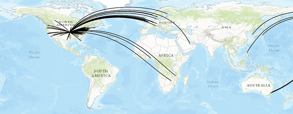
The ArcGIS Blog post described how to center the data by setting the prime meridian of the map projection to match the local longitude. If the default coordinate system of World Geodetic System 1984 (GCS WGS84) with a custom central meridian was used, the flowlines seemed to crawl off the map. Instead of lines flowing from the map edge inward to Kansas at the center, the data resembled a spider crouched on one side of the map with its legs broken off on the other side.
To make radial flow data draw with the destination at the center of the map, the map’s spatial reference needs to be set to a projected coordinate system with a custom central meridian.
Now for a moment of geospatial gratitude for the utility of the ArcGIS Geoprocessing Results window, since most people don’t take copious notes on every step and setting during geoprocessing operations, Houser used the log saved in the map project, along with her notes, to determine which tool settings generated optimal radial datasets.
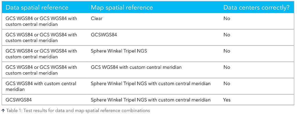
Houser experimented with spatial references for the data and map, shown in Table 1. The only combination that correctly centered the data in ArcGIS Desktop or ArcGIS Online was the data in GCS WGS84, with the map in a projected coordinate system with a custom central meridian.
The file was too large to upload to ArcGIS Online, so Houser divided the data into attendees within the United States and attendees from outside the United States. This worked conceptually and geographically and provided more map viewing options.
Working with her colleague, Houser chose a contrasting basemap and data symbolization combination that highlighted attendee data at all scales. Mapping line thickness by number of attendees was somewhat effective at a global scale and improved with each successive zoom. This worked reasonably well with the US data alone (at national or larger scale) and worked better when showing attendees from outside the United States (at any scale). To highlight the attendees’ places of origin, Houser created a point shapefile of cities. She symbolized them in a way that differentiated them from cities shown on the basemap.
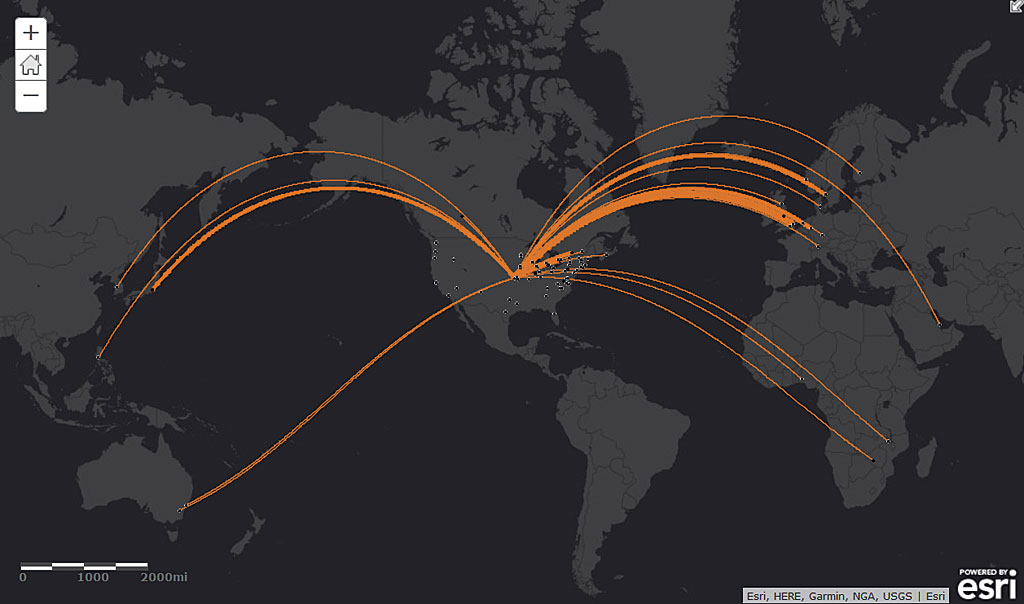
Houser spent a solid four to five hours building this map. This was a relatively small map project that used a tiny dataset, but a new project has already arisen that could use these techniques to illustrate immigration stories.
When applying these methods to similar data, keep in mind that generating a simple map is often a complex process that involves formatting data, troubleshooting, streamlining methods, and clarifying messages. This process takes time, skill, and persistence. It can take hours to prepare even a small dataset so it can be turned into dots or lines on a map. However, it’s usually worth it—especially if someone thanks you or publicly recognizes the hard work and expertise that is essential for creating that simple map.
For more information, contact Rhonda Houser, GIS and mapping specialist at the University of Kansas Libraries, at rhouser@ku.edu or 785-864-1238.

