Feeling Boxed In?
Whether you call them chem boxes, analytical callouts, spider diagrams, or exceedance tables, chances are you’ve been frustrated by putting them on a map. The process to plot these tables, typically displayed on maps for environmental remediation, Phase I and Phase II site impact assessments, and environmental compliance projects, is nothing less than laborious.
Test results of air, soil, and water values of chemical analytes are compared against the Maximum Contaminant Levels (MCLs) and Regional Screening Levels (RSLs) to determine if there are anomalies on a project site. The formatted tables have typically been manually added to maps. After getting the lab results as flat Excel files and formatting them into tables that correspond to specific locations at a project site, GIS staff then copy and paste the tables as static images onto a map, taking care to ensure the leader lines pointing from a table to the mapped location avoids crossing any other lines or tables. If that doesn’t sound tedious enough, test results are continuous throughout the project lifecycle and therefore changes are inevitable, requiring revisions and updates to the information inside the tables or to their placements on the map. There could be changes needed to style and scale, too. Sound daunting? We agree and there is a better way. Streamline the workflow and create tables that can be more easily modified by leveraging ArcGIS Arcade.
Try It Out
Sample data and quick start instructions are available in this community post titled “Use ArcGIS Arcade for Environmental Analytical Callout Tables in ArcGIS Pro, ArcGIS Online, and Enterprise”. The ArcGIS Pro project with sample data as well as a foundational Arcade script to build the data tables in both ArcGIS Pro and ArcGIS Online are in the zip file which includes (…Analytical_Callout_Chem_Box_Files):
- Environmental_Sample_Data.gdb – includes the Sample Points feature layer
- ArcGIS Pro Analytical Callout Chem Box Arcade Script – to create a new label class and display labels in ArcGIS Pro
- ArcGIS Online Analytical Callout Chem Box Arcade Script – to display pop-ups in web apps in ArcGIS Online
- Analytical_Callout_Chem_Box_Files.aprx – an ArcGIS Pro 3.1 project file with Arcade label script applied to Sample Points layer
For this exercise, the script is referencing the Sample Points feature layer and is written using variable list functions. Variables enable you to make quick changes to the fields of specific analyte result feature layers or feature services specific to work with your projects. This workflow dynamically generates labels of the analyte result tables on a map, which can then be exported as a PDF, to support your regulatory reporting workflow. Let’s get started below.
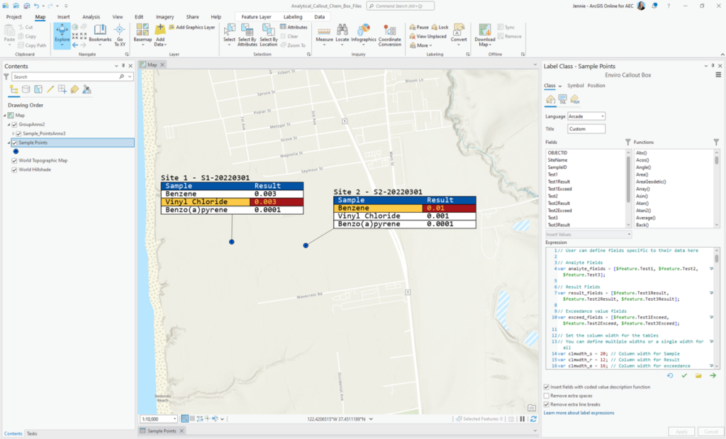
ArcGIS Pro: Creating Custom Callout Box Labels with Arcade
Arcade allows you to customize the appearance of the labels including the column width, colors used to display exceedances or default values, and font styles for highlighting specific results. Right click the Sample Points feature layer in the Table of Contents and go to the Labeling Properties to begin defining the analyte, result, and exceedance variables to be displayed. In the Label Class pane, choose “Create label class.”
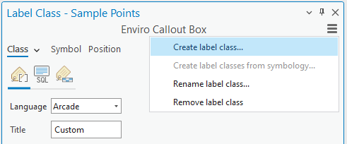
The Arcade script is structured in such a way so that the displayed table is built from individual cells and the format settings are applied to customize how each cell in the table will appear in color, style, and font. This Arcade script is designed to have minimal input from the user and to leverage the built-in font styles of ArcGIS Pro.
- The example project file (Analytical_Callout_Chem_Box_Files.aprx) includes a customized script for the Sample Points label class, as seen in the Enviro Callout Box above.
- Copy and paste the script into the new label class you just created.
- Since the script was built using variables, you will replace the analyte, result, and exceedance fields referenced by the variable feature with those listed in the Fields section of the Label Class pane.
- Decide on which analyte and result fields to include in the table and set the variable list of these fields in lines of the script 4 to 10. Replace the placeholder fields denoted by < > brackets (e.g. <analyte 1>, <result 1>, <exceed 1>) with a choice in the Fields list such as $feature.Test1.
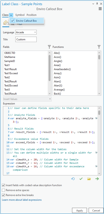
You can further customize the script to change the appearance of the table. Justification and spacing of the cell are defined by the maximum length of the text value. Adjust the cell spacing with the column width variable.
REMEMBER: The “Insert fields with coded value description function” and “Remove extra line breaks” will be unchecked each time changes are made to the Arcade script, so ensure these are enabled after each applied edit.

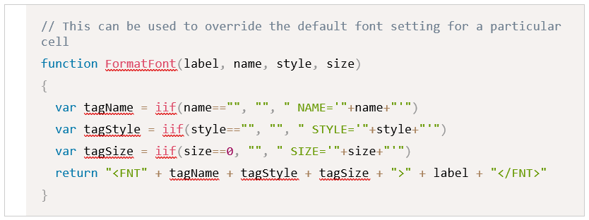
If you would like to choose a different font color, font style, cell background, or cell outline, use the function “FormatFont(label, name, style, size)”. These customizations can be helpful when highlighting a value or exceedance above the MCL or RSL.
Add sample, result, and exceedance headings with defined variables and use a “n” soft break for multiline text.

Exceedances are defined with an IIf function and styled using the functions “FormatBO” and “FormatFont.” The section of code below handles those properties.
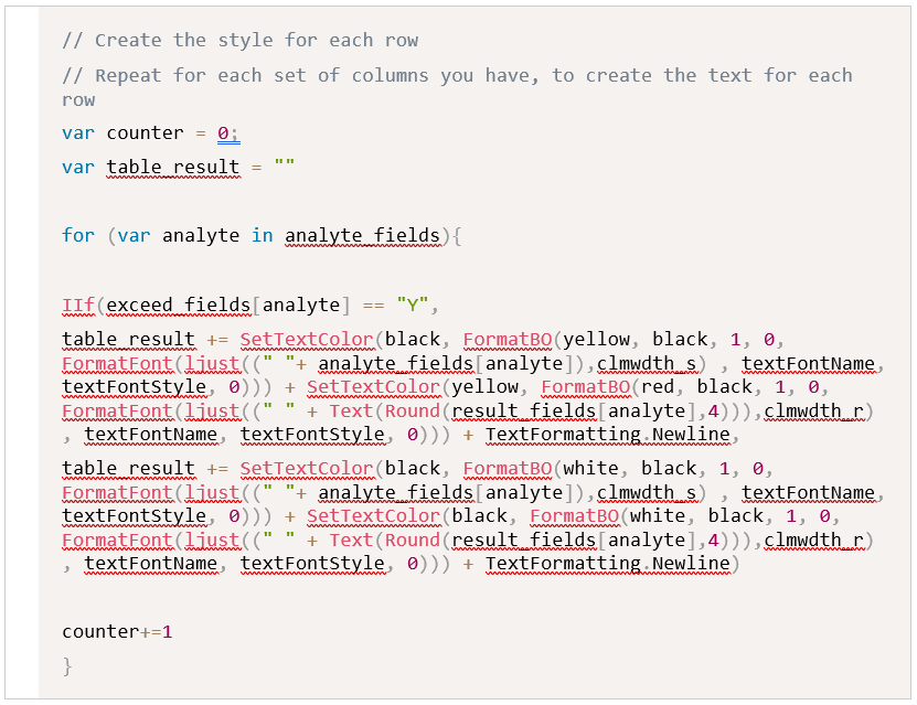
There are a few ways to structure the dataset. For example, you could define the MCL or RSL and compare results to whether they are greater or lesser than those standards.
For simplicity’s sake, this script assumes there is a field that is categorized by a “Y” (yes) or “N” (no) value indicating whether the result is exceeding or not.

Lastly, a table title is defined using one or more fields of your choice. The table is built from individual cells and the “<LIN Leading…>” value will need to be adjusted based on the type of font and font size used. The cells may overlap or appear with a gap between the cells depending on the ArcGIS Pro monospaced font chosen. Display the cells cohesively as a table by adjusting the “LIN leading” as either a positive or negative number.

Once the tables have been made, you may want to move the tables around to the best fit on the figure or map. This can be done by converting the labels to annotation on the “Sample Points” layer. Select feature-linked annotation if you plan on having frequent updates to the sampling data.
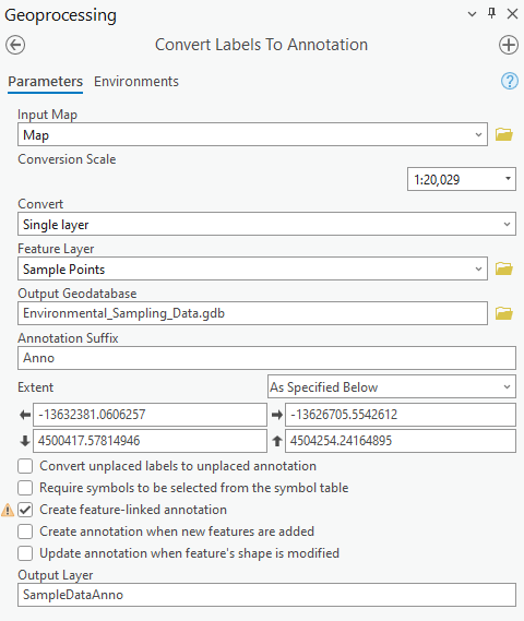
This workflow still involves the need to manually move the tables in a figure layout, however the effort is greatly reduced by the dynamic nature of feature-linked annotation. When feature class updates are made through QA/QC review the annotation will be automatically updated.
Now that you’ve created custom labels in ArcGIS Pro, here are some helpful reminders:
Once you are ready to apply the script, ensure that the “Insert fields with scripted value description function” and “Remove extra line breaks” are checked on to show the cells in an evenly spaced table. These will be unchecked each time changes are made to the Arcade script, so ensure these are enabled after each applied edit. See below for a screen capture of how this looks.
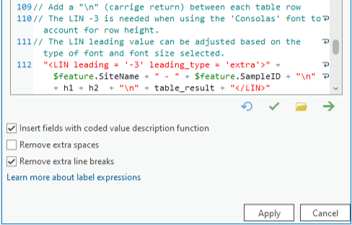
Using the Maplex Label engine, choose a monospaced font like Courier New or Consolas to display the result tables in an aligned, spaced, and structured way. If a non-monospaced font is used, you’ll notice the cells that make up the table are not evenly spaced, and each cell will be a different size based on the maximum length of the text or value in the cell.
ArcGIS Online and ArcGIS Enterprise: Creating Custom Pop-ups
If you’re using ArcGIS Online or ArcGIS Enterprise, you will need to develop result tables through pop-ups instead
https://www.esri.com/arcgis-blog/products/arcgis-online/mapping/configure-pop-ups-basics/
The pop-ups code is a combination of an Arcade script and HTML tags. The code below shows the last few lines of the Arcade script have a text return with the HTML formatted tags that individually build the cells of the table.
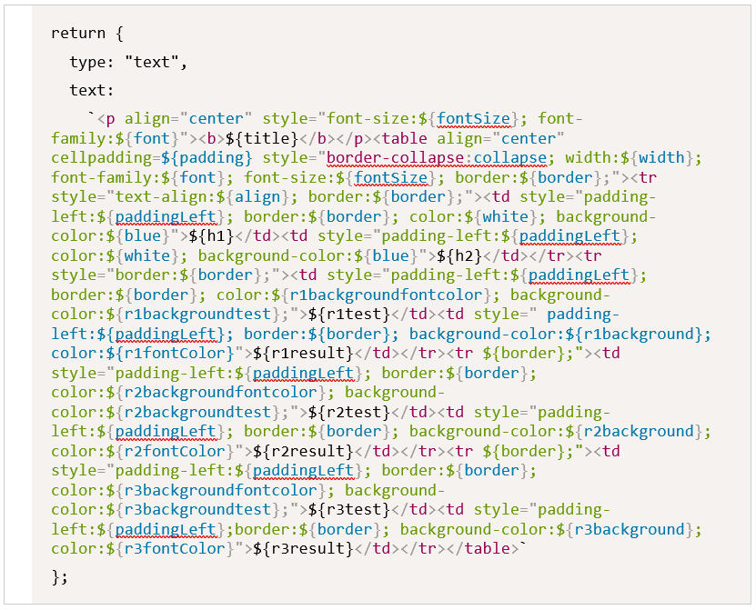
By sharing the Sample Points feature layer to your ArcGIS Online or ArcGIS Enterprise environment you can create a pop-up using the “ArcGIS Online Analytical Callout Chem Box Arcade Script” as a starting point. This script will dynamically show lab results in the web app environment. When you receive new or updated lab data, use the Append tool and newly extended “upsert” functionality to insert new records and update existing records. This enables you to communicate more effectively with project managers and stakeholders throughout the project lifecycle.
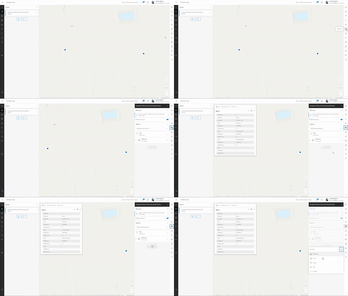
Begin by selecting the Sample Points feature layer, then in the Pop-ups pane click “Add content” and choose Arcade. Add the script from the “ArcGIS Online Analytical Callout Chem Box Arcade Script” file in the window and choose a new name for the title of your script. The script includes a listing of variables that reflect the analyte and result fields within the feature service, as well as variables used to define the style and coloring based on whether the result exceeds the MCL or RSL standards. Review the previous ArcGIS Pro section for more information.
Ready to Play with Arcade?
If you are new to Arcade, this learning path is a great place to begin.
In addition, this blog post “I’m a developer. Do I really need Arcade?” provides context with use cases, which can help demonstrate the benefits of adding Arcade to one’s existing arsenal of programming languages.
Additional resources: Updated Arcade documentation, this post from a November 2022 release, and a blog on pop-up Arcade essentials.
Arcade can provide a dynamic approach to visualizing environmental analyte results as a table on a map. We can’t wait for you to tell us what you do with it, and how you plan to spend all that free time now that you’re spending less time moving around static table images.

