A GIS Methodology to Measure Eutrophication Using Satellite Data
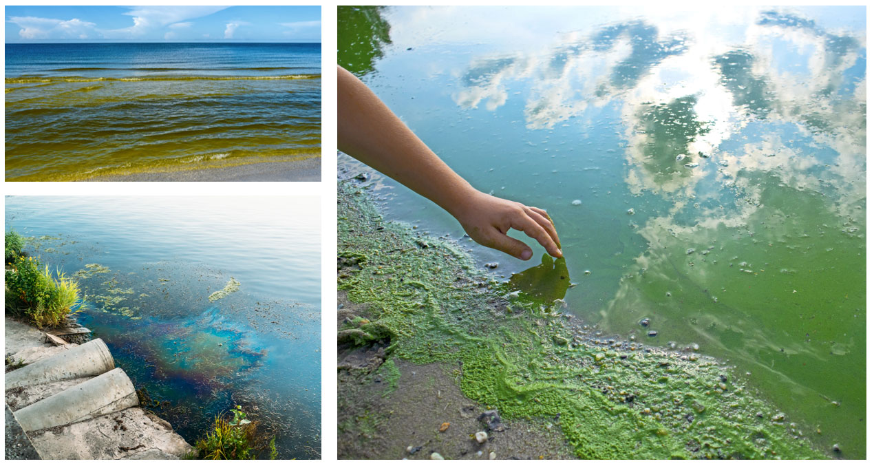
It turns out, that slimy green stuff at the beach – which you don’t want your kids to touch because it’s yucky – really is concerning.
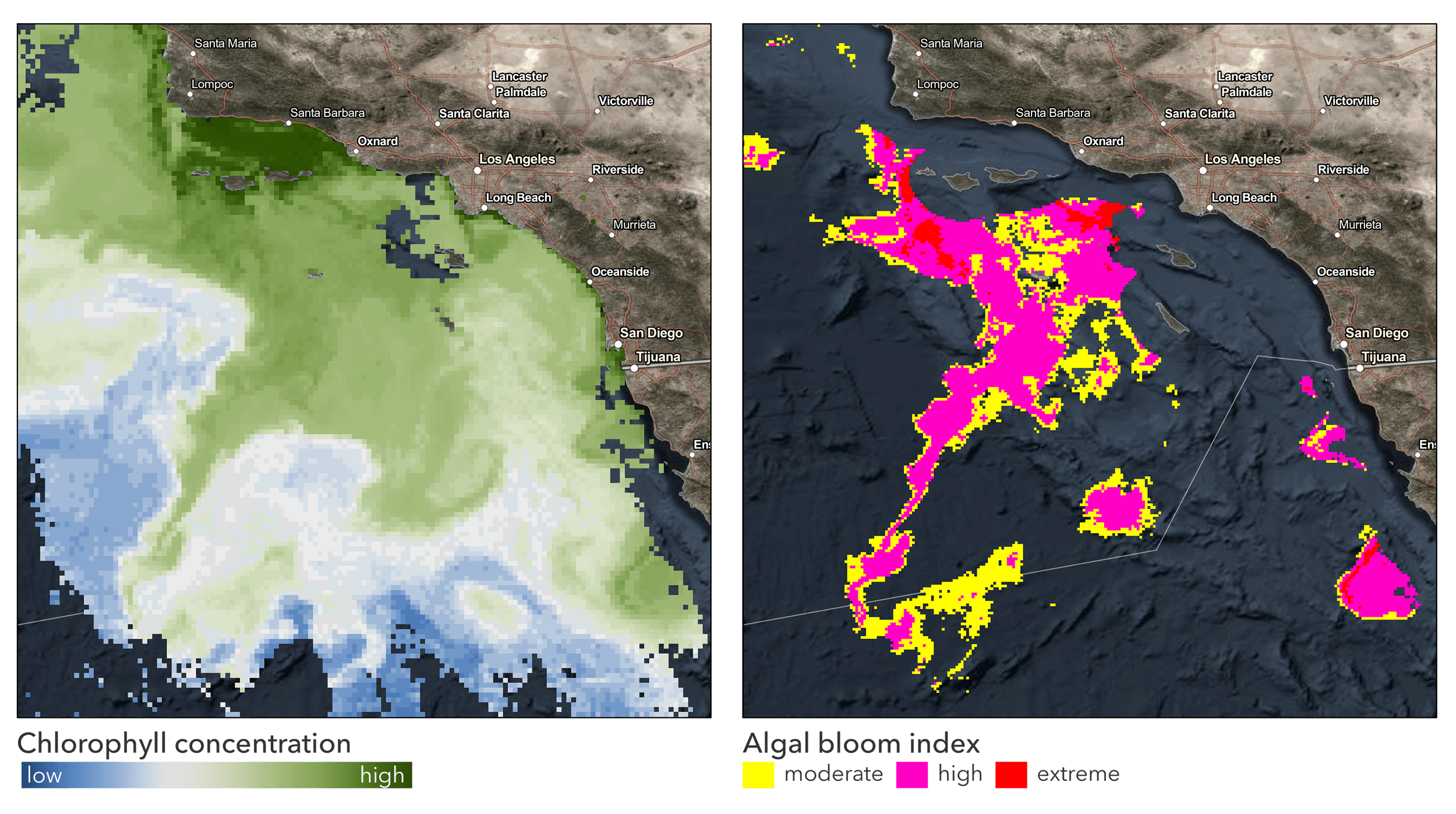
These are algal blooms, and are produced by eutrophication, a process driven by enrichment of waters by nutrients, especially compounds of nitrogen or phosphorus, leading to increased growth, primary production, and biomass of algae resulting in adverse changes in the balance of organisms and water quality. In plain English, excessive nutrients – often from fertilizers in agricultural runoff and also waste management practices – lead to algal blooms and low-oxygen waters. This can kill fish and reduce essential habitats in coastal waters, lakes, and other bodies of water, which in turn negatively impacts human health.
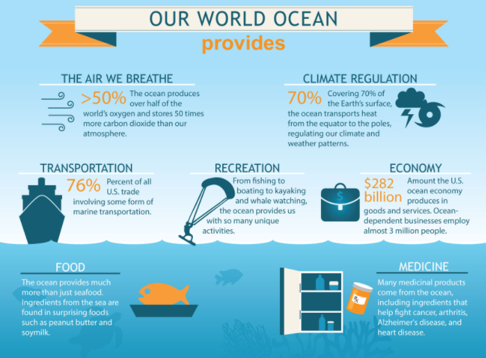
The ocean covers over 70% of Earth’s surface, and over one-third of the total human population lives within 100 km of the ocean. It produces over half of the world’s oxygen, absorbs 50 times more carbon dioxide than our atmosphere, and regulates climate and weather patterns.
Clearly, the oceans matter to humans, and to human health – no matter where we live.
So what does this mean for the slimy stuff at the beach? Measuring and monitoring chlorophyll concentrations in algal blooms is integral to understanding ocean health and delivering on the SDGs (Sustainable Development Goals) – specifically, SDG Indicator 14.1. Scientists, leaders, and policymakers are using data derived from satellite earth observations to drive better decision making and planning in support of the SDGs. GIS plays a critical role in making the data actionable.
Today, I’m joined by Keith VanGraafeiland. Keith is a product engineer at Esri. He serves as the ocean curator for the Living Atlas of the World team. Keith works to create foundational data layers that can help marine researchers, scientists, and others gain a better understanding of our oceans.
Q: Keith, can you tell us more about SDG 14.1, and why it matters?
A: Target 14.1 aims to reduce the impacts of pollution through prevention and reduction of marine pollution of all kinds, in particular from land-based activities, including marine debris and nutrient pollution. Target 14.1 has two indicators – 14.1.1a (index of coastal eutrophication) and 14.1.1b (marine plastic debris). Our focus here is to provide information about chlorophyll-a data in support of SDG indicator 14.1.1a.
Q: You’re part of a collaboration with various agencies and organizations to support SDG 14.1. Can tell us about this collaboration – what’s the purpose, and who are the partners?
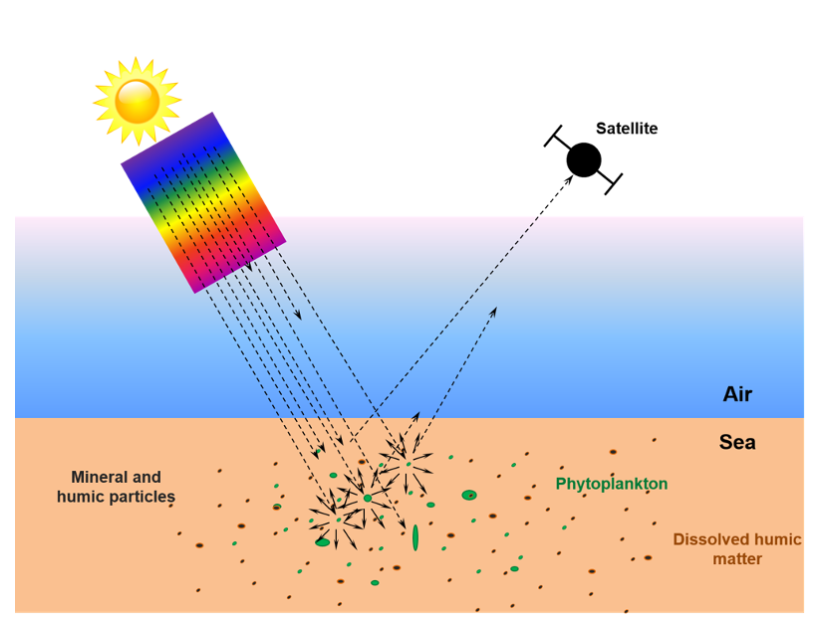
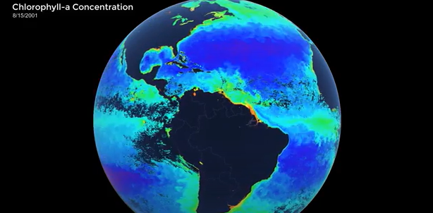
A: There is a lot of data available – but what we sometimes lack is the information derived from data that can drive decisions. For example, since the mid-1990s, measurements of global chlorophyll concentration in the ocean have been consistently measured from Earth observing satellites. This data has been fundamental in our understanding of phytoplankton patterns and ocean primary productivity dynamics, the global carbon cycle, and how climate change is impacting coastal and oceanic ecosystems. Understanding is a first step, driving action is an aspirational goal. The collaboration between UN Environment Programme, GEO Blue Planet, NOAA, and Esri is using these same observations to drive better decision making and planning in support of the Sustainable Development Goals. Specifically, SDG 14.1 calls for countries to prevent and significantly reduce all forms of marine pollution by 2025. But to do that, individual countries need to understand how much pollution is moving from land to ocean and have access to open, reliable, and routinely updated information products to guide policy as it is made and modified.
Q: You mentioned methodology. Please elaborate on the importance of methodology and the role that GIS plays.
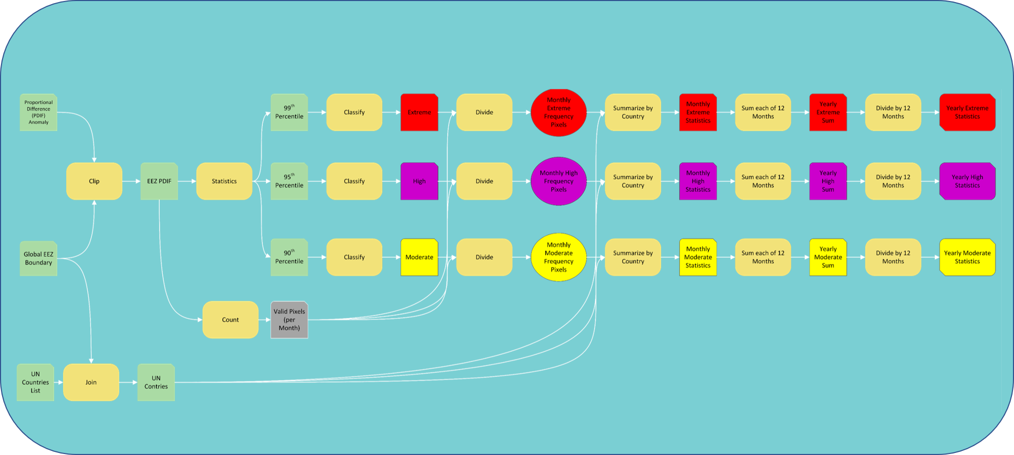
A: Esri’s primary role has been to implement, in ArcGIS Pro, a workflow to identify and quantify the number and severity of eutrophication events in nearshore waters globally. The initial workflow was formulated by a group of scientific experts from the ocean color and statistics domains. They provided the data and proposed a method for quantifying eutrophication based on satellite-derived chlorophyll measurements while Esri provided insight on how to better execute the methodology in a GIS.
The method was implemented and refined using ArcGIS Pro, and preliminary results were shared for evaluation and discussion. We have undergone several iterations of the proposed method to arrive at the current implementation, which has been adopted by the UN in the most recent update of the “Global Manual of Ocean Statistics.” This experience has been a textbook example of collaborative science powered by the Esri platform and allowed us to become more involved in the SDG process. ArcGIS Pro has proven to be an effective platform for creating a repeatable and understandable workflow that can be easily tuned or modified; this is essential for good science.
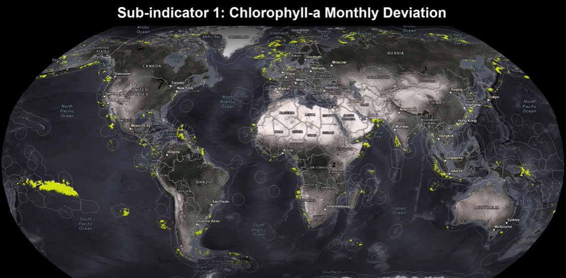
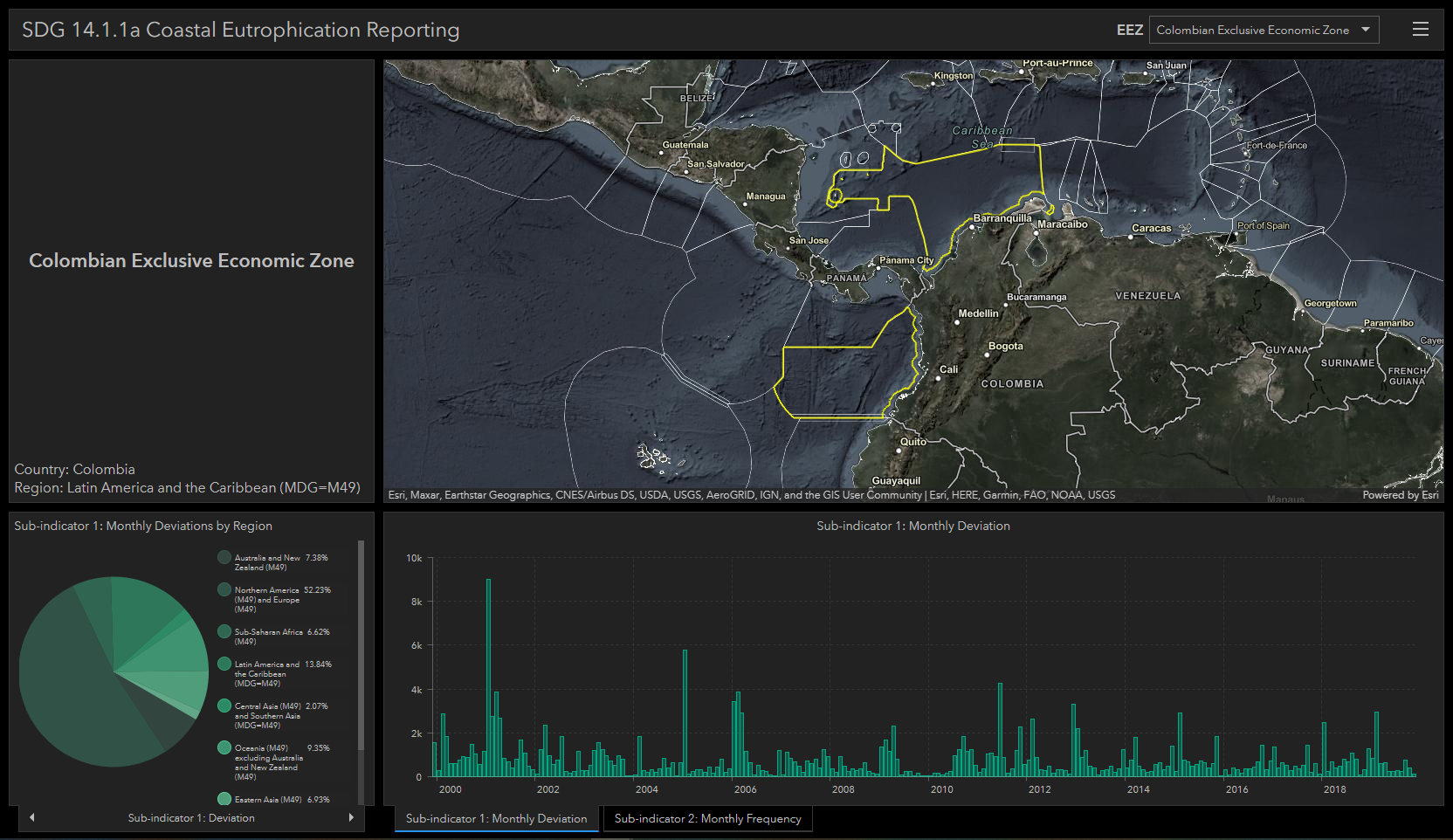
Using a series of ModelBuilder models, we produced and reported results for sub-indicator one and sub-indicator two.
Let’s look at some data examples –
Ocean and GIS Resources
It’s the United Nations Decade of Ocean Science for Sustainable Development! Esri supports ocean science with GIS to explore, map, visualize, analyze, and protect Earth’s last frontier. View GIS and other ocean resources:
- Esri Ocean Science
- Esri ArcGIS Oceans Hub, with apps, StoryMaps, and blog posts
- Index of Coastal Eutrophication
- Global Manual on Ocean Statistics
