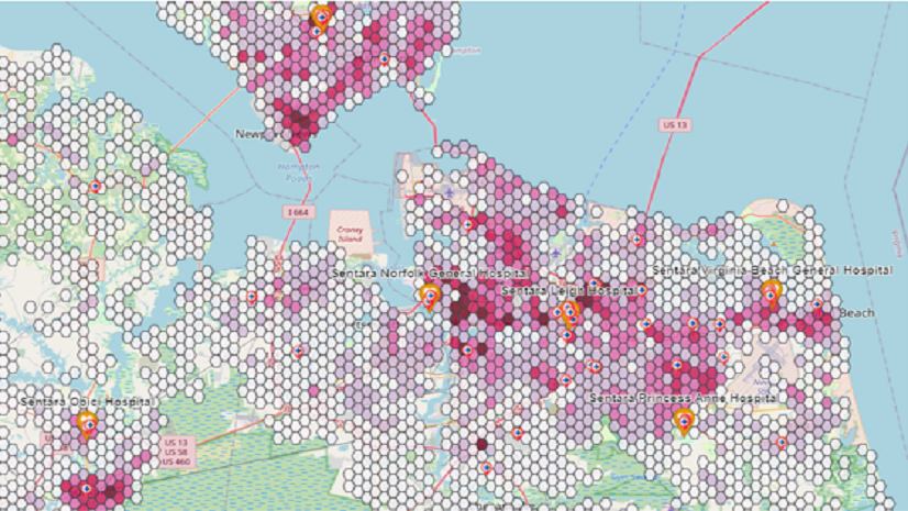
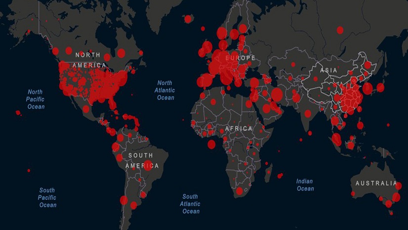
Don’t you wish making and using maps was easy? If you read my first Health GIS 101 blog, Introducing the Geographic Approach, you might have been inspired to add mapping to your repertoire. Or perhaps you already knew of GIS but hesitated to dive in, concerned about a steep learning curve. If so, you’re in the right place. This blog is your “easy button” for GIS—six quick and accessible ways to bring maps and spatial analysis into your health workflows with little or no prior GIS experience.
1. Esri Maps for Public Policy
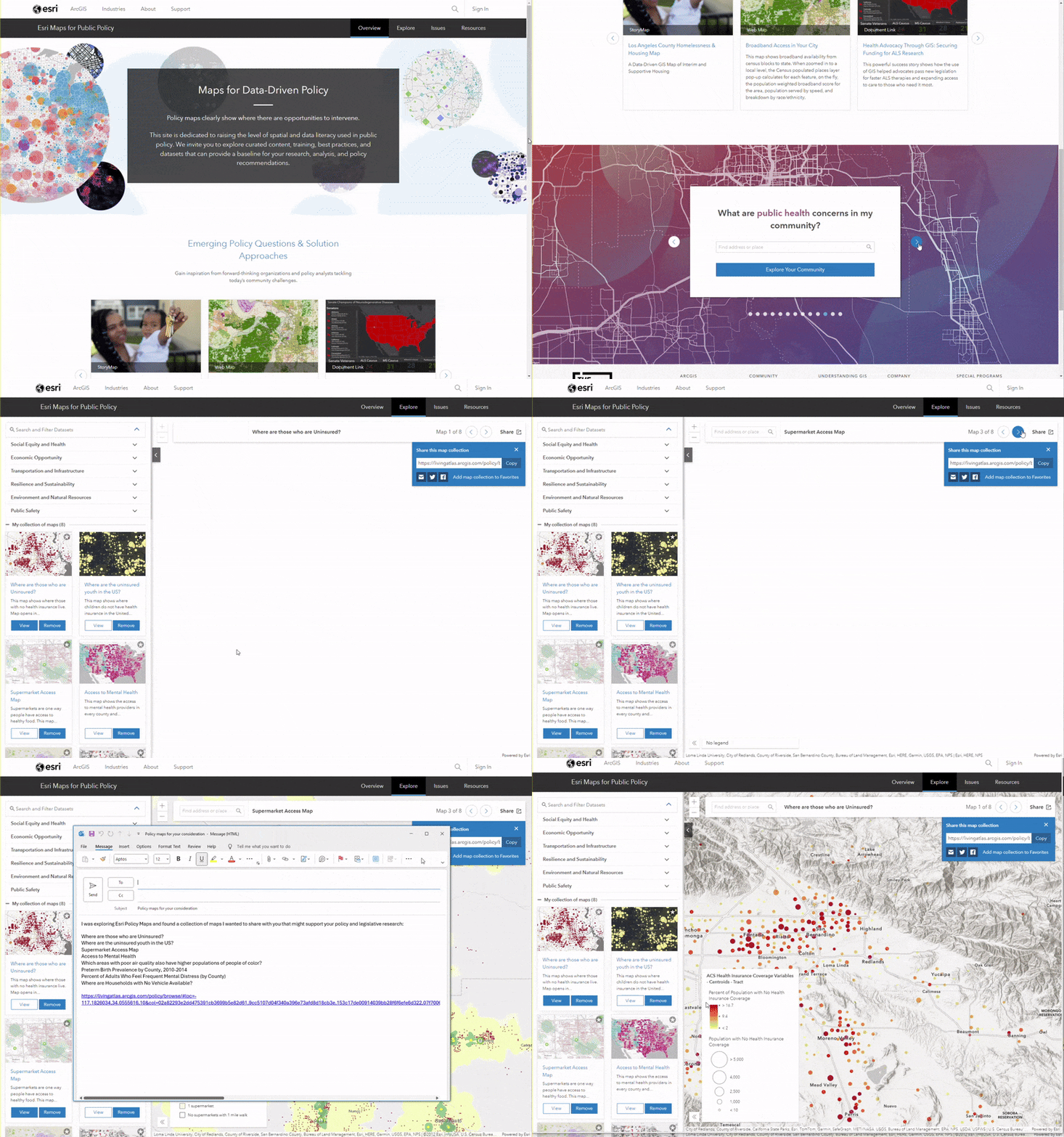
Esri Maps for Public Policy, part of the ArcGIS Living Atlas of the World, offers curated, ready-to-use maps that require no GIS expertise. These maps allow you to explore data on topics like health outcomes, social determinants, and policy impacts. Since they come with validated, well-documented datasets, you can be confident in the quality and credibility of the data you’re using.
Even better, you can embed these maps into your reports, presentations, or websites with no licensing required. For example, imagine using Esri Maps for Public Policy to answer questions like, “What are air quality patterns in the U.S. over time? Or “Where are people more likely to die from injuries?”—highlighting areas where stricter pollution guidelines or enhanced pedestrian safety measures could make a significant difference. Policy maps could be exactly what you need in your data-informed efforts to identify the best opportunities to intervene.
- Ease of Use: Intuitive, validated datasets
- Time to Start Using It: 5 minutes, see the blog
- Try It Out: Explore Esri Maps for Public Policy
2. Esri Maps for Microsoft
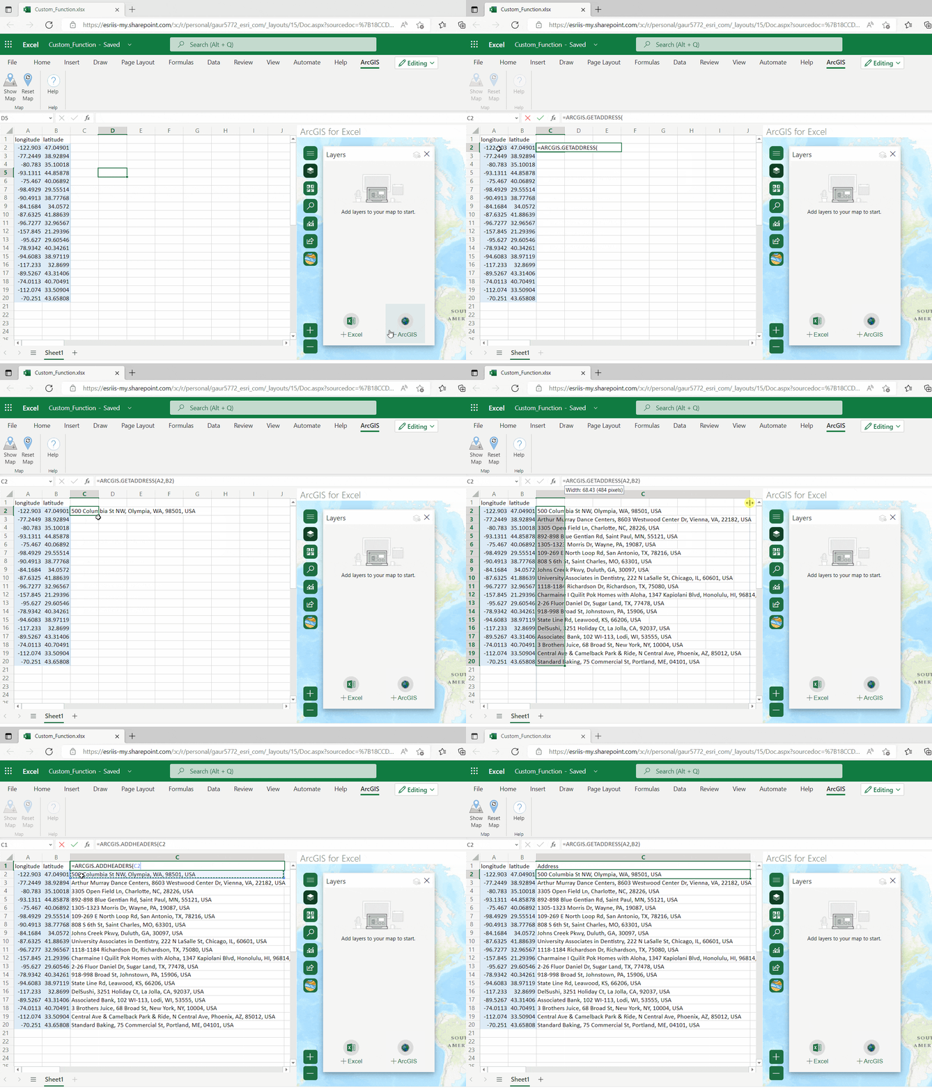
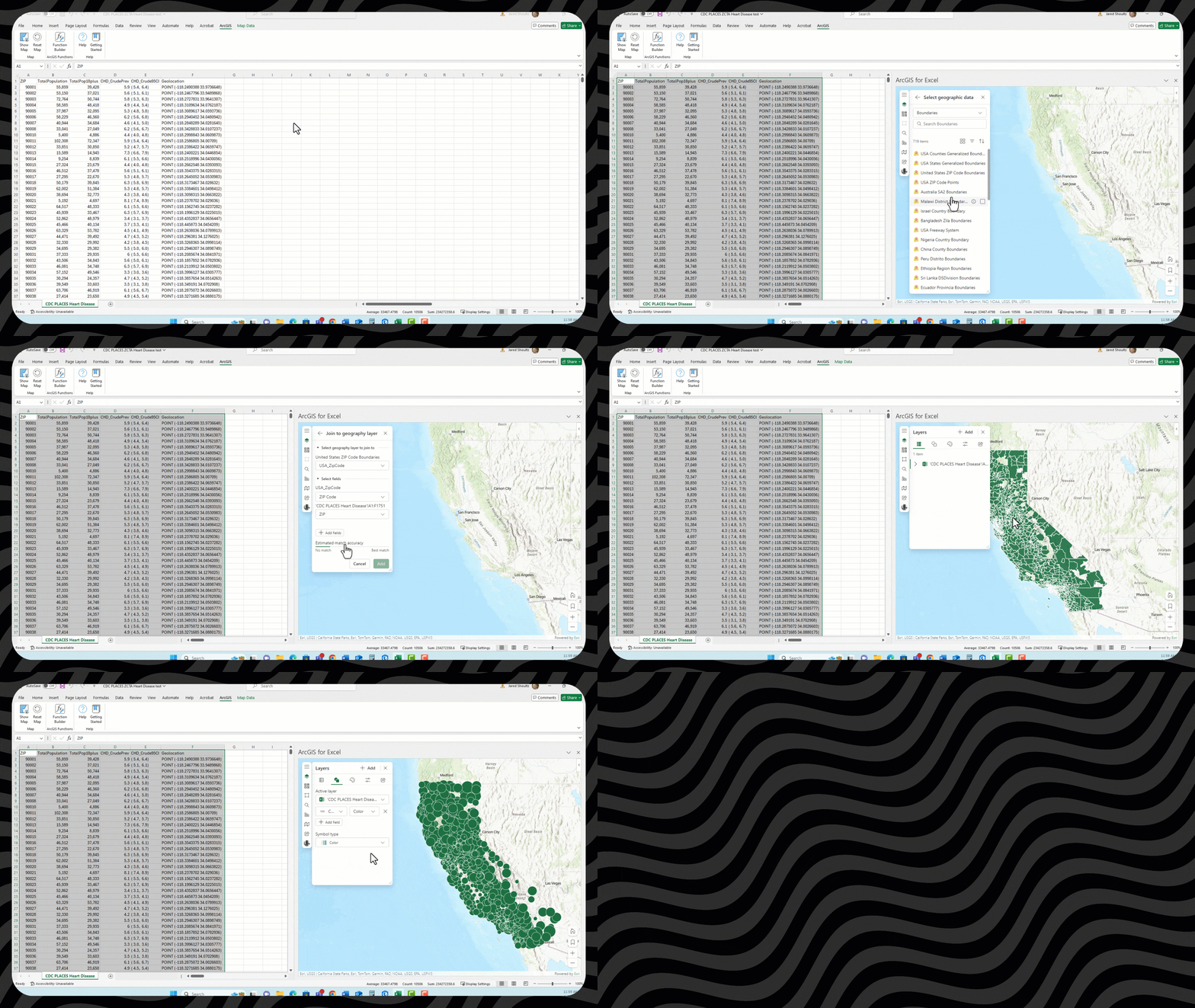
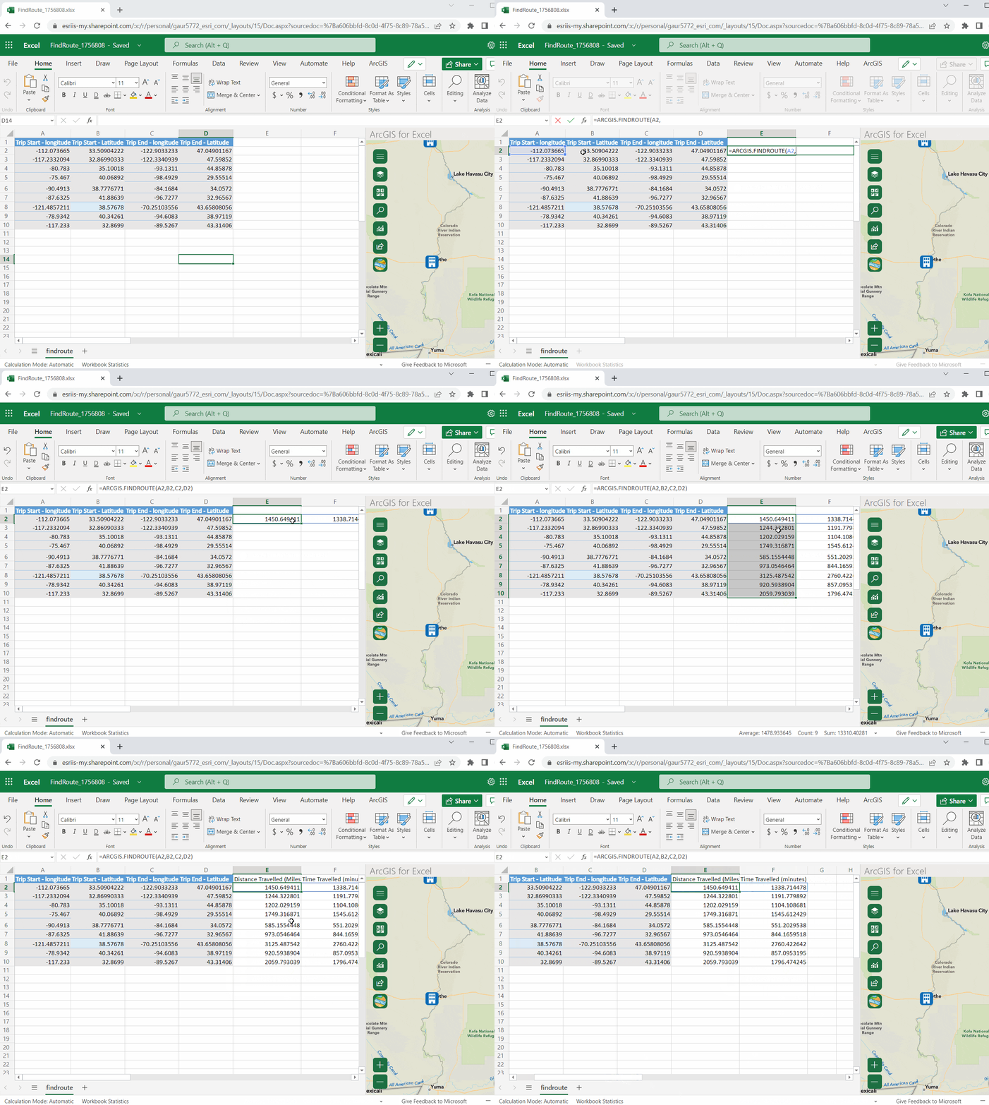
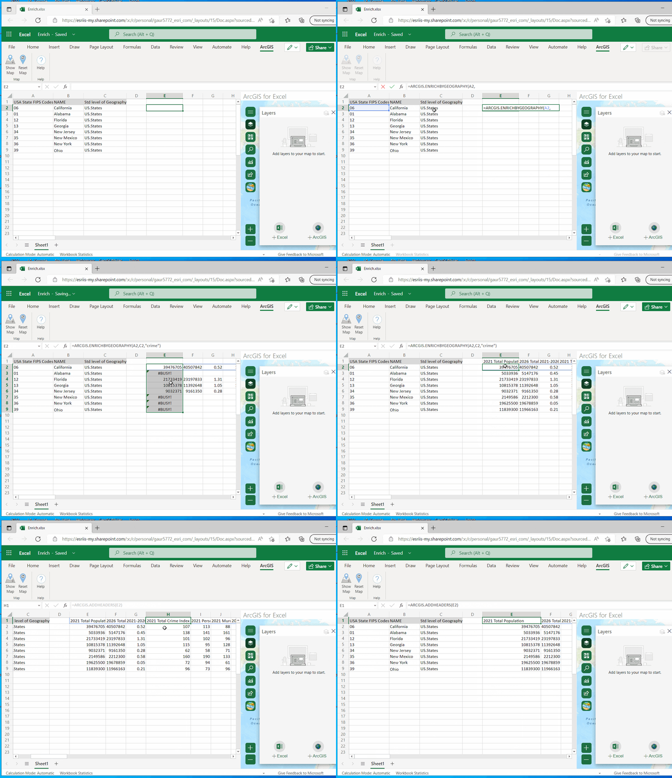
If you’re familiar with Microsoft Excel (and who in the health sector isn’t?), you already have a head start! Esri integrates GIS capabilities directly into Excel, reducing the learning curve by meeting you in a familiar environment. With a GIS ribbon and just a few clicks, you can map your data and analyze location-based trends—without ever leaving Excel.
For example, a public health department could use ArcGIS for Excel to map disease incidence rates across ZIP Codes. This can help visualize where chronic diseases or infections are clustering, empowering teams to prioritize resource allocation where it’s needed most. Beyond Excel, Esri integrates with tools like PowerBI and is built directly into the spatial capabilities’ library of Microsoft Fabric, giving you even more opportunities to apply spatial insights.
- Skills Needed: Basic Excel
- Time Start Using It: 10-20 minutes
- Features: Analyze location-based data without leaving Excel
- Get Started: ArcGIS for Excel
3. ArcGIS Online
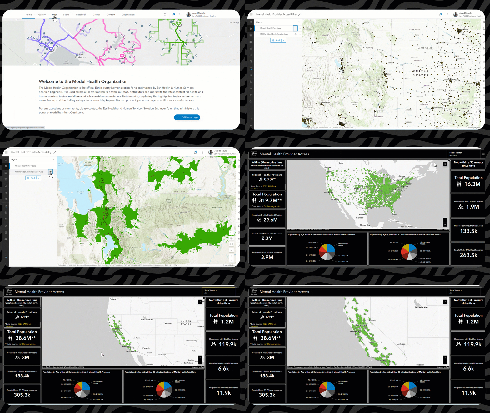
ArcGIS Online is a cloud-based mapping platform that makes spatial analysis accessible to everyone. It allows you to upload your data, use shared resources from other users, and/or leverage free, open and validated datasets from the Living Atlas of the World.
One could use ArcGIS Online, for example, to visualize data that combines population information with mental health providers to indicate the level of access to mental health services by U.S. County and determine how many additional mental health providers are needed.
- Ease of Use: Limited tools to learn; intuitive interface
- Time to Start Using It: 30 minutes
- Start Now Tutorial: Get Started with ArcGIS Online
4. ArcGIS Solutions
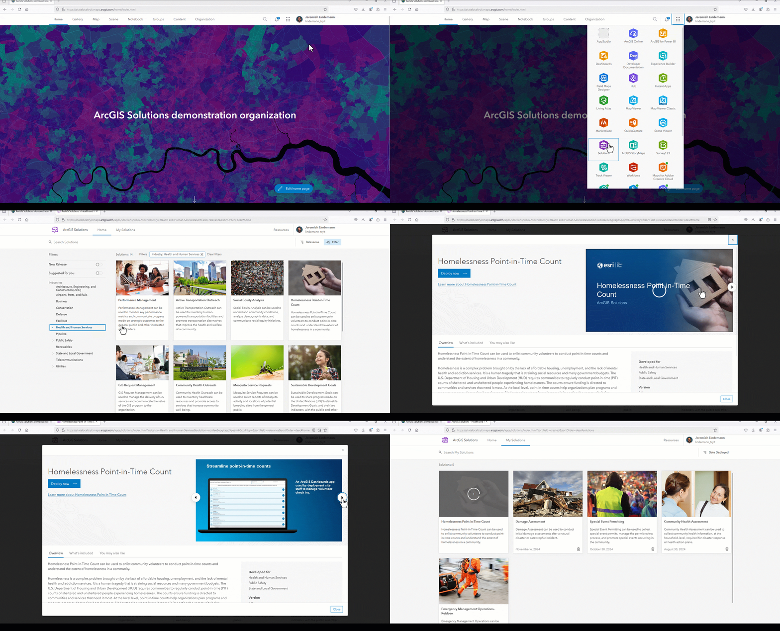
ArcGIS Solutions are a series of industry-specific configurations of ArcGIS to solve common challenges. These solutions come ready-to-use, with workflows tailored to address specific needs, making them perfect for health professionals looking to get started quickly.
Health organizations can deploy a solution to respond to an outbreak. For example, during flu season, a public health department could use the Immunization Outreach solution to inventory vaccine providers, communicate vaccination coverage, and promote available resources. ArcGIS Solutions are easy to configure and can be further customized to match your organization’s needs.
- Ease of Use: Guided, out-of-the-box workflows
- Time to Start Using It: 30-60 minutes
- Health Solutions: Discover ArcGIS Solutions for Health and Human Services
5. ArcGIS Instant Apps
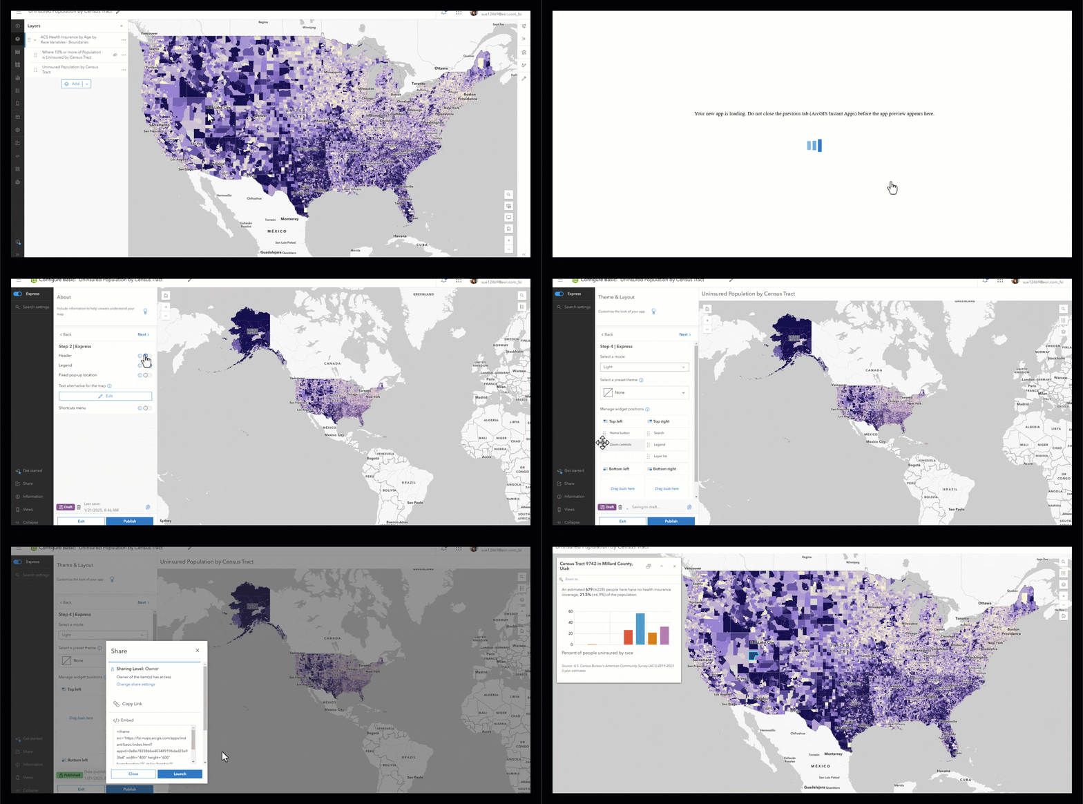
Instant Apps allow you to turn data into interactive, shareable maps in just a few clicks—no coding required. With a collection of prebuilt templates, accessible directly from ArcGIS Online, you can create applications to showcase your data and engage audiences in minutes whether it be the public or specific users in your organization.
For example, imagine creating an app to visualize the demographics associated with not having health insurance at a census tract level. With Instant Apps, health professionals can quickly build a map-based tool that stakeholders can use to understand those factors and take steps to expand access to health insurance coverage.
- Skills Needed: Basic familiarity with ArcGIS Online
- Time to Start Using It: 15 minutes
- Explore: Learn about Instant Apps
6. Business Analyst Web App
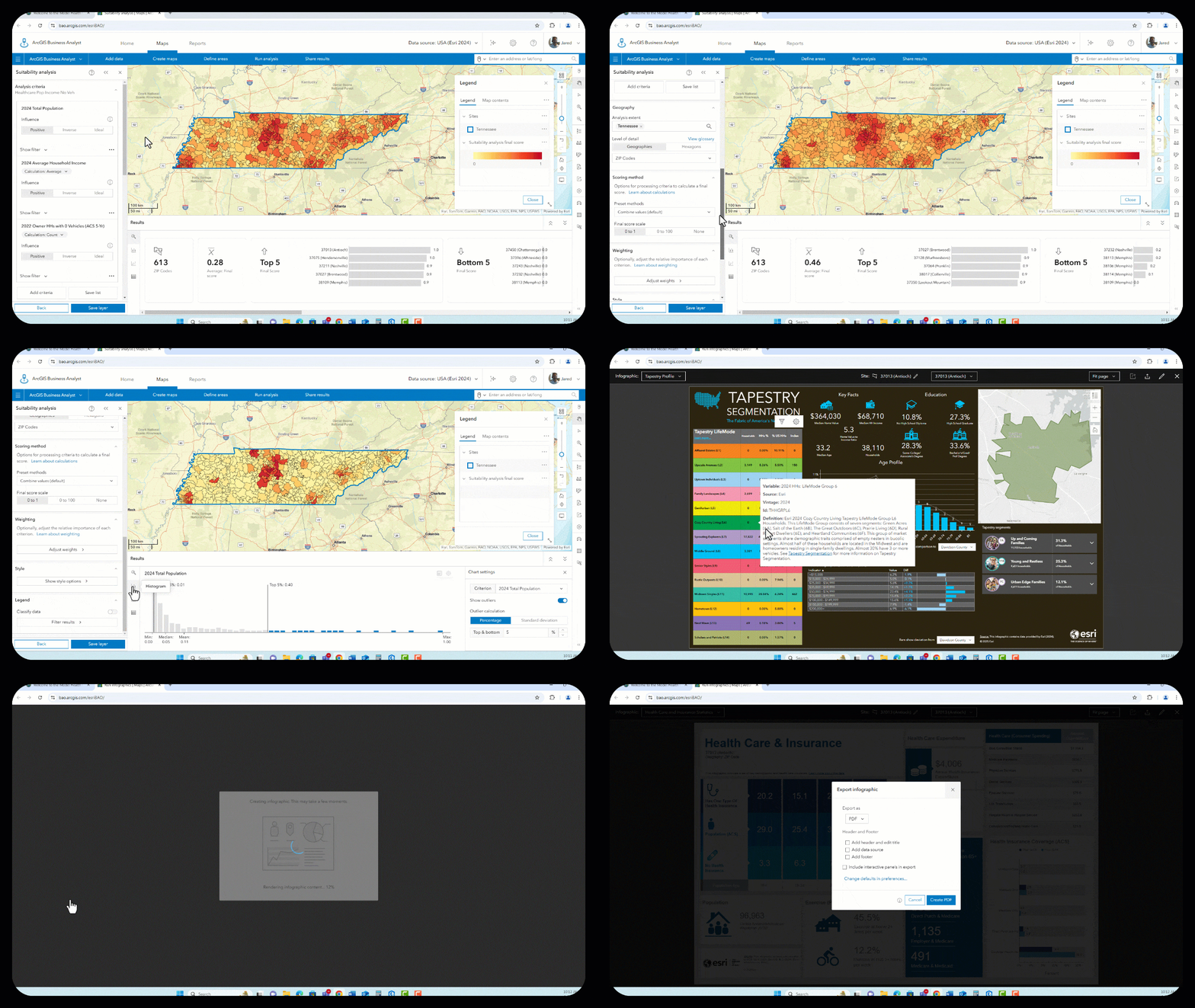
The Business Analyst Web App combines robust spatial analysis with easy-to-follow workflows, allowing health professionals to analyze demographic data, identify trends, and generate location-based insights. Built-in tools guide users through processes like site selection and market analysis.
For instance, a health network could use the app to identify ideal locations for new clinics based on population density, income levels, and existing healthcare accessibility. Business Analyst Web App also includes infographics and reports that can be easily shared with stakeholders to support data-informed decisions.
- Skills Needed: Basic navigation of web tools
- Time to Start Using It: 30-45 minutes
- Key Features: Guided workflows, preloaded data
- Explore: Business Analyst Web App
So you see, it is possible to jump into GIS for health with very little effort. Think of the learning curve in this case as similar to the Pareto Principle. You can use these six methods to get 80% value from only 20% (or less) effort. As you become more familiar with GIS, you can always expand your health-focused use cases.
Your Easy Button Challenge
I challenge you to try one of the above tools to experience how simple GIS can be. Whether you’re a beginner or a seasoned professional, there’s always something new to learn. And stay tuned for the next blog in this series, where I’ll discuss how GIS serves as a system of systems—connecting data, analysis, visualizations to improve health outcomes.


