It’s been exciting to see the story maps community adopt ArcGIS StoryMaps, the second-generation storytelling tool that we released in July 2019. Far more stories are being created in ArcGIS StoryMaps these days than all the classic apps combined. But the question inevitably arises: Should I maintain my classic stories as is, or should I remake them in ArcGIS StoryMaps?
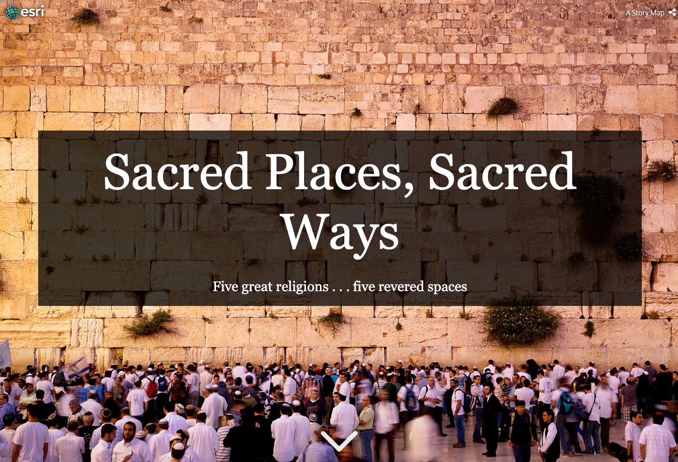
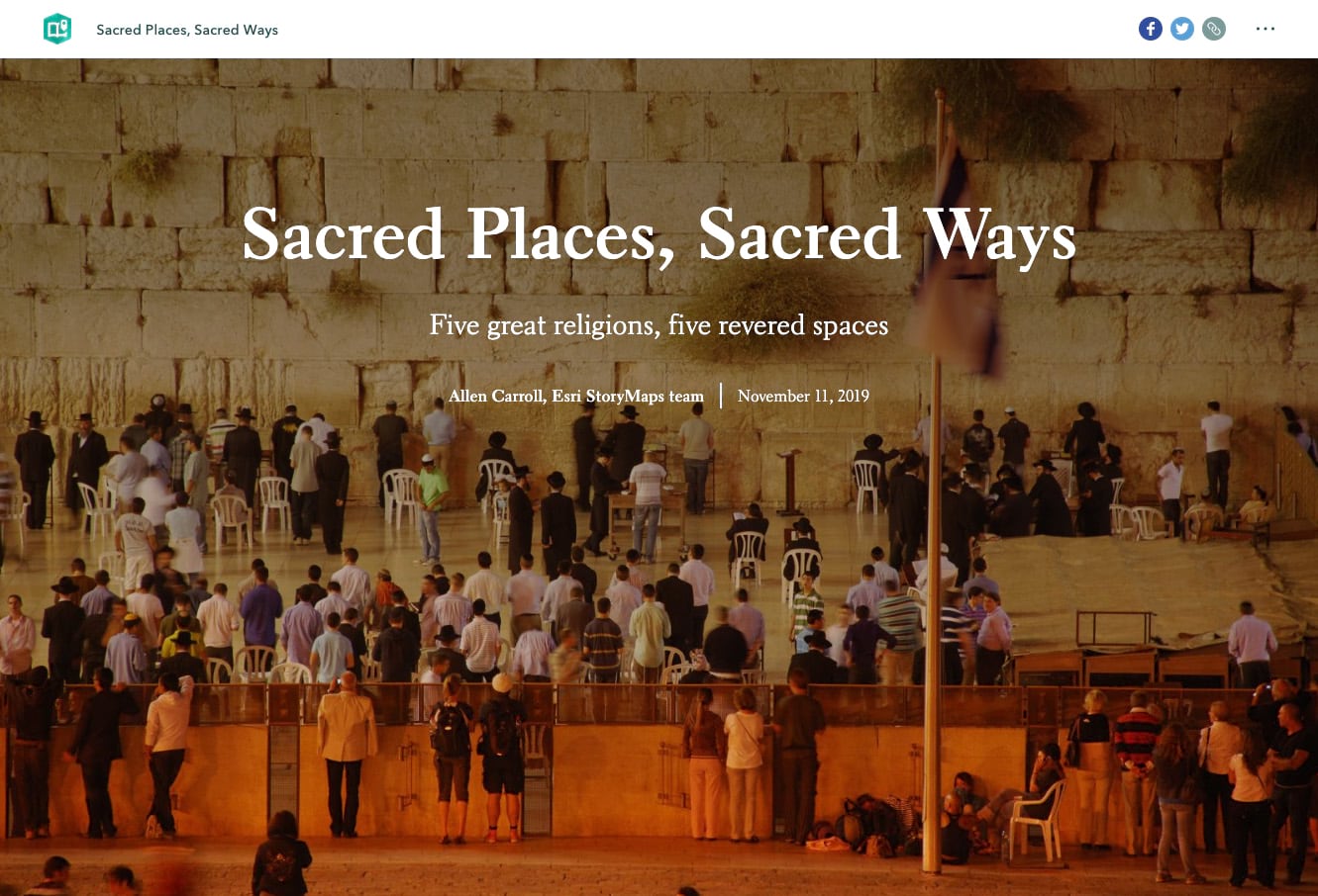
First—have no fear! The stories you’ve created using our classic apps will be around and available for years to come. Meanwhile, the many enhancements we’ve made to ArcGIS StoryMaps since its launch has brought us to full parity with our classic apps—and then some. What that means is that you can do essentially everything you used to do using our array of classic apps (Story Map Journal, Cascade, Series, etc.). Our immersive blocks—slideshow, sidecar, and map tour—plus our swipe tool, and the ability to aggregate stories and other items into collections, makes the full array of features you’ve loved in the classic apps available within a single builder experience.
Better yet, ArcGIS StoryMaps includes capabilities that were never available in our classic apps, among them a timeline function, immersive audio, and enhanced theming options including scores of font choices. And then there’s autosave, express maps, modern mobile experience, greater accessibility…you get the point.
Second, some of you have wished for a way to automatically reformat classic story maps into ArcGIS StoryMaps. But I’m afraid that’s just not feasible, for a variety of reasons. Chief among them is that there’s not a strict one-to-one relationship between the elements of classic stories and the “blocks” in ArcGIS StoryMaps. Since every story has its own character, you need to make some judgment calls about how best to remake them as ArcGIS StoryMaps. But to put a positive spin on it, that means there are ways you can make your story look and work better than ever as you move it to the new template.
The upshot: We highly recommend that you recreate classic stories that are continuing to be of value to yourself, your organization, or the public. We’ll continue to ensure that your classic stories load and perform, but we’re no longer updating or enhancing the classic templates. ArcGIS StoryMaps, however, is a living, growing resource that will continue to evolve.
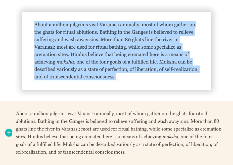
The nuts and bolts of recreating your story involve a good bit of copying and pasting of text. It’s a bit tedious, but having converted many stories, I’ve found that it goes surprisingly quickly. It’s a good thing to do during parts of your day when you’re less up for mentally onerous tasks. I’m a morning person, so for me that means later in the day.
Reformatting your old story is a great opportunity to give it a fresh look, and to update items that might be obsolescent. I find that, almost invariably, rereading a story after many months gives you a fresh perspective. Items that might have seemed fine at the time suddenly beg for refinement or updating.
Text involves simple (but repetitive) copy-and-paste. Images are another matter. Ideally you will have kept copies of your original story’s visuals on your hard drive. But if not, you can usually find the images by returning to the resources you used as you created the original story. In the case of Sacred Places, Sacred Ways, I had failed to save many of the visuals in the story; however, I had been conscientious in providing links to sources in my photo captions.
I was able to find, and re-download, nearly all the Creative Commons images that I had originally used. My cover photo was no longer available, but I was able to find an apt substitute. I prefer the original photo, but I love how the title on the ArcGIS StoryMaps cover doesn’t sit in a heavy box (see the screen grabs near the top of this post).
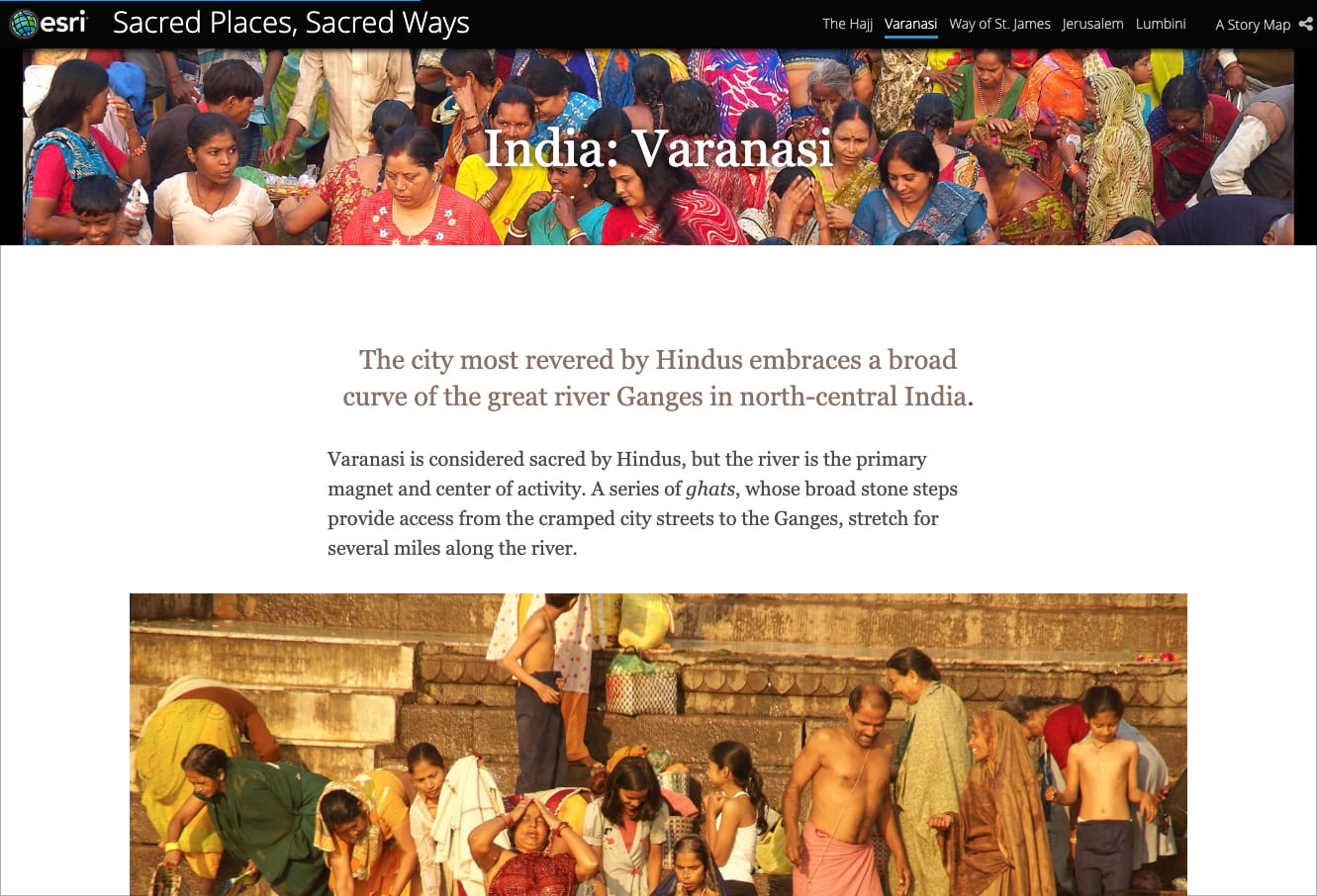
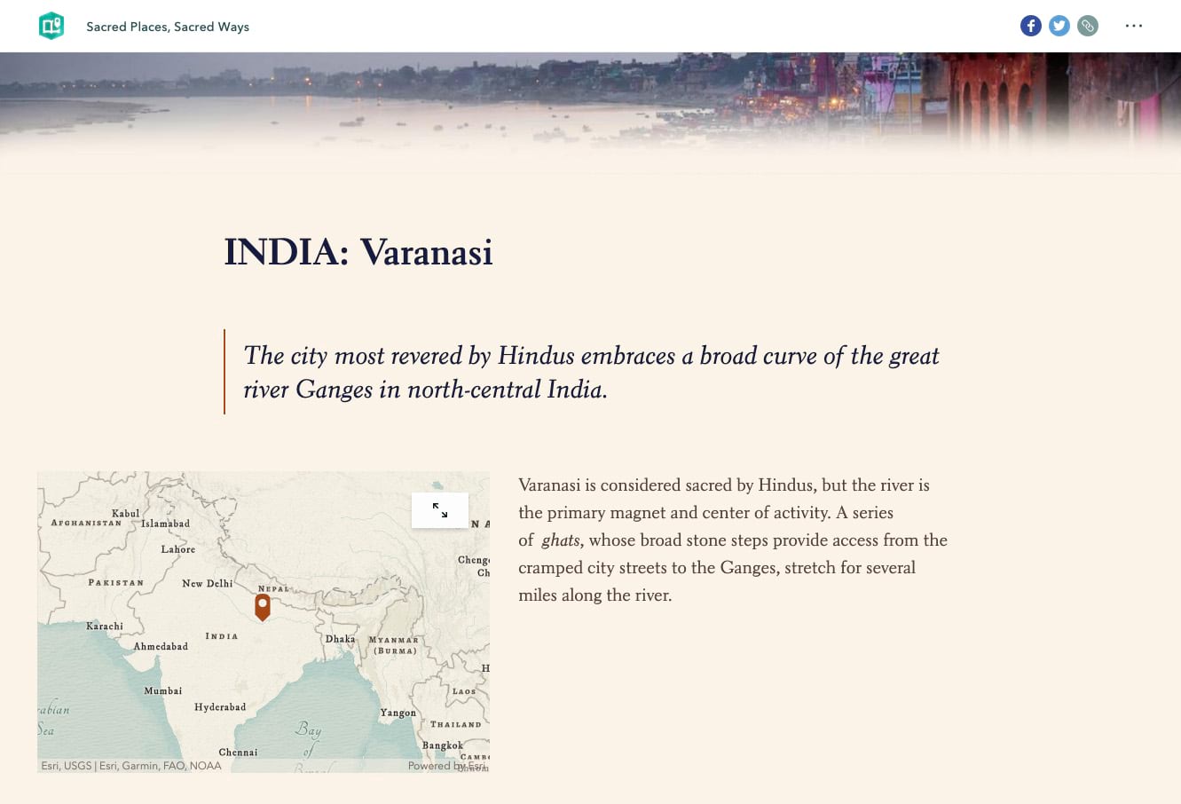
I used the ArcGIS StoryMaps builder’s design panel to chose the Mesa theme, which gives the story a warm, slightly historical look and feel. I could have further refined the fonts and colors using the theme builder, but Mesa nicely suited my purposes. I did need to adjust some of the static maps to match the theme’s background tint.
I decided to enhance the chapter headers with an artistic treatment: I trimmed horizontal strips from photos, created a vignette using desktop graphics software (admittedly my background as a designer gives me an unfair advantage), and paired the images with the headings. I used the bookmarks function to enable readers to jump from one section to another.
I used the quote block to open sections of the story. Most of the opening paragraphs aren’t actual quotes, but I liked the quote style, which seemed appropriate to the story. I often experiment with quote blocks and the “large paragraph” option to achieve a variety of effects.
The availability of express maps allowed me to easily create attractive little locator maps for each religious site, which is a real advantage of ArcGIS StoryMaps over our older templates.
Overall, it was surprisingly easy to convert Sacred Places, Sacred Ways to ArcGIS StoryMaps. Is the new version better than the original? You can decide for yourself, but I prefer the remake.
For more information see Owen Evans’ article, Moving to the new ArcGIS StoryMaps.


Article Discussion: