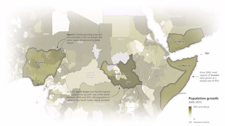
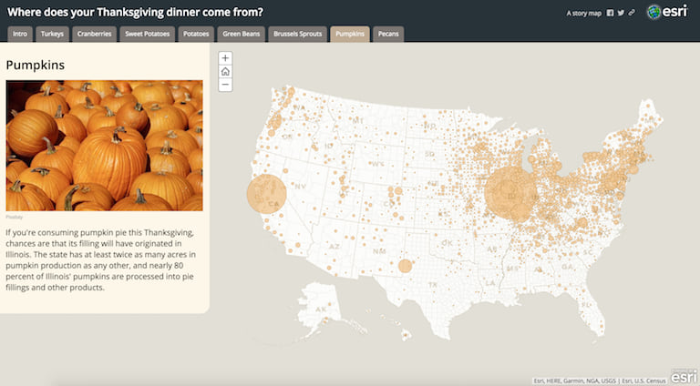
Your great story deserves a great delivery—these fives tips will help you wow your readers time and time again. (You can learn more about Story Maps and see these principles in action here.)

1. Connect with your audience
Who are your readers? Before you build your story map, think about who will be seeing it. Craft your text, maps, and other content to suit your audience. Avoid jargon and use accessible language. It’s not about dumbing down; it’s about striving for clarity and simplicity.

2. Lure people in
Start your story with a bang. Choose an image that’s exciting and attractive. Craft your title to be active and descriptive. “A Walking Tour of Springfield” is okay, but “Discover the Hidden Treasures of Springfield” is better. Make sure people know where they are. Springfield, Illinois, or Springfield, Massachusetts? Put your core concepts at the beginning rather than the end. Don’t include outbound hyperlinks in your introduction that would distract someone from starting to navigate through your story—put those at the end.

3. Choose the best user experience
The Esri Story Map templates come in a variety of flavors. Choose one with a user experience appropriate for your story. Story Map Tour, for instance, is great for sets of places with photos and short captions. If you have longer text, Story Map Journal might be better. If you want your audience to be able to compare different maps, Story Map Series makes the most sense. For a long, less structured narrative that people read like a web page, use Story Map Cascade. Browse all our templates to see which one makes the most sense for you.

4. Make easy-to-read maps
Make sure your maps are as simple, clear, and user-friendly as possible while incorporating cartography that matches your project. Edit your map to eliminate unnecessary detail. Choose an appropriate basemap; for example, in many cases, a simple gray background map might be better than satellite imagery. Think about what custom pop-ups, legends, and symbology you want to provide to deliver your map’s message.

5. Strive for simplicity
Stories are distillations. The more you do to remove nonessential elements, the more effectively you can communicate. Remember that attention spans are short in the digital age. Shorten your text and simplify your maps—and then go back and do it again. A person should not have to get to the fifth or sixth section in your story to understand its underlying concepts and mission.


Commenting is not enabled for this article.