Embedding story maps on your website is one of the best ways to showcase your work and ensure it reaches your intended audience. We’ve already provided lots of helpful tips that apply to embedding any story map in a website, but here are some additional tips on successfully embedding Cascade story maps as well as some good examples we’ve seen.
Consider Linking
So you’ve designed a beautiful Cascade story with compelling images, videos, and immersive 3D scenes — do you really want to scrunch it into a small frame on your website? Your Cascade story map will always look its best when your readers open it in a new tab so that it fills their browser page, so consider one last time if the best strategy is to simply add a screenshot of the story to your website and a link that opens the Cascade in a new tab.
Space
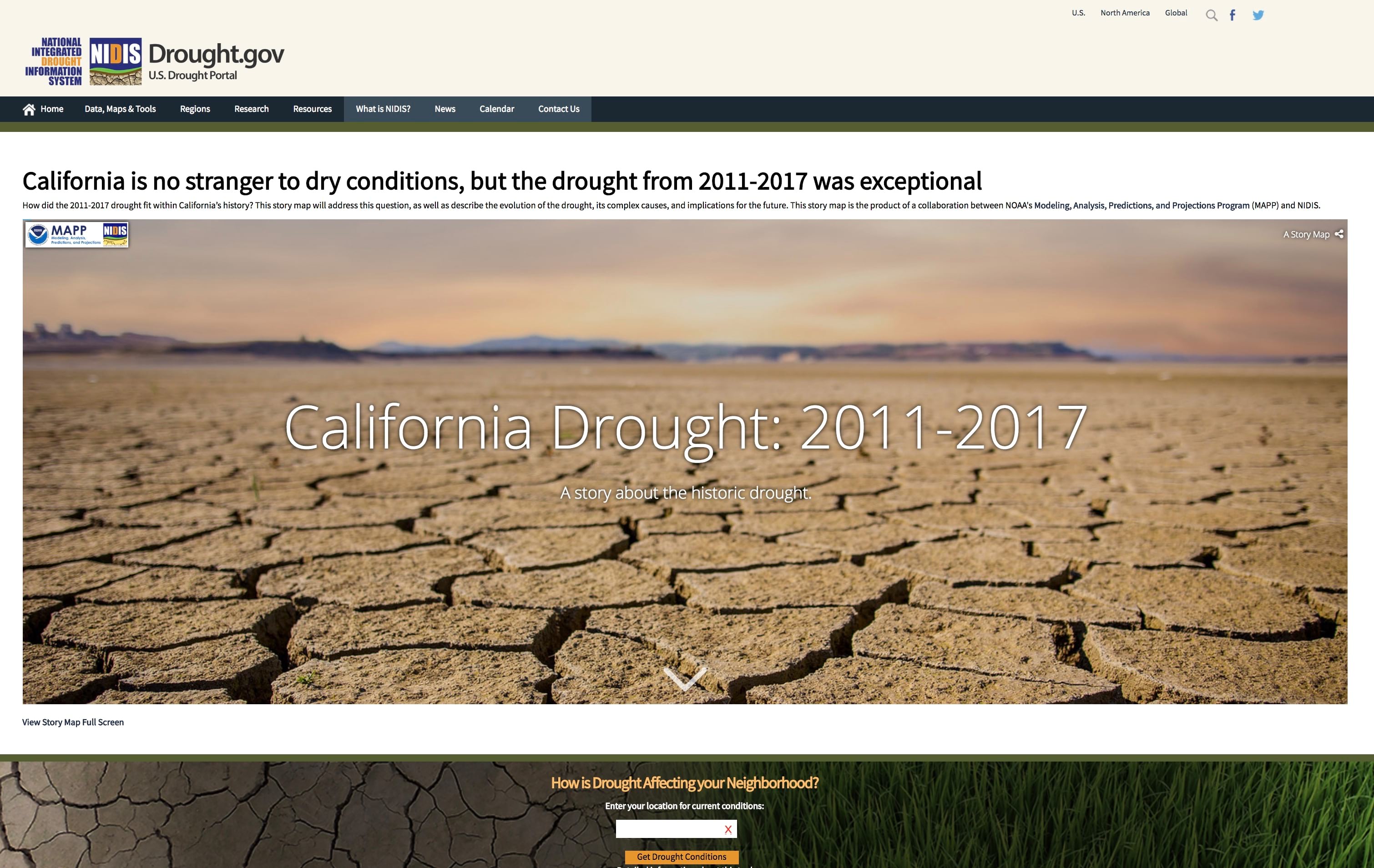
If you do decide to embed your story, be sure to: 1) give your Cascade as much space as possible on the page, but also 2) make sure the entire story frame fits on the screen. You don’t want the story to be cropped by the edge of the browser window since this makes reading and navigation difficult. The example below has sufficient space, a nice short title and subtitle, and is framed nicely on the page.
It’s especially important in embedded stories that narrative panels in immersive sections are short. Since the story is constrained to a small space longer passages of text may scroll within a panel or not fit in the entire frame, which is not desirable. If you have any panels that are too long, simply duplicate that immersive view and split the narrative into multiple panels across views with the same background media. You can also try using a wider panel.
Use almost the full page…
The best way we’ve seen Cascade stories embedded is on the International League of Conservation Photographers’ website. The ILCP site has a simple, clean header that persists across all pages of the website, and its Cascade stories fill the page below the header.
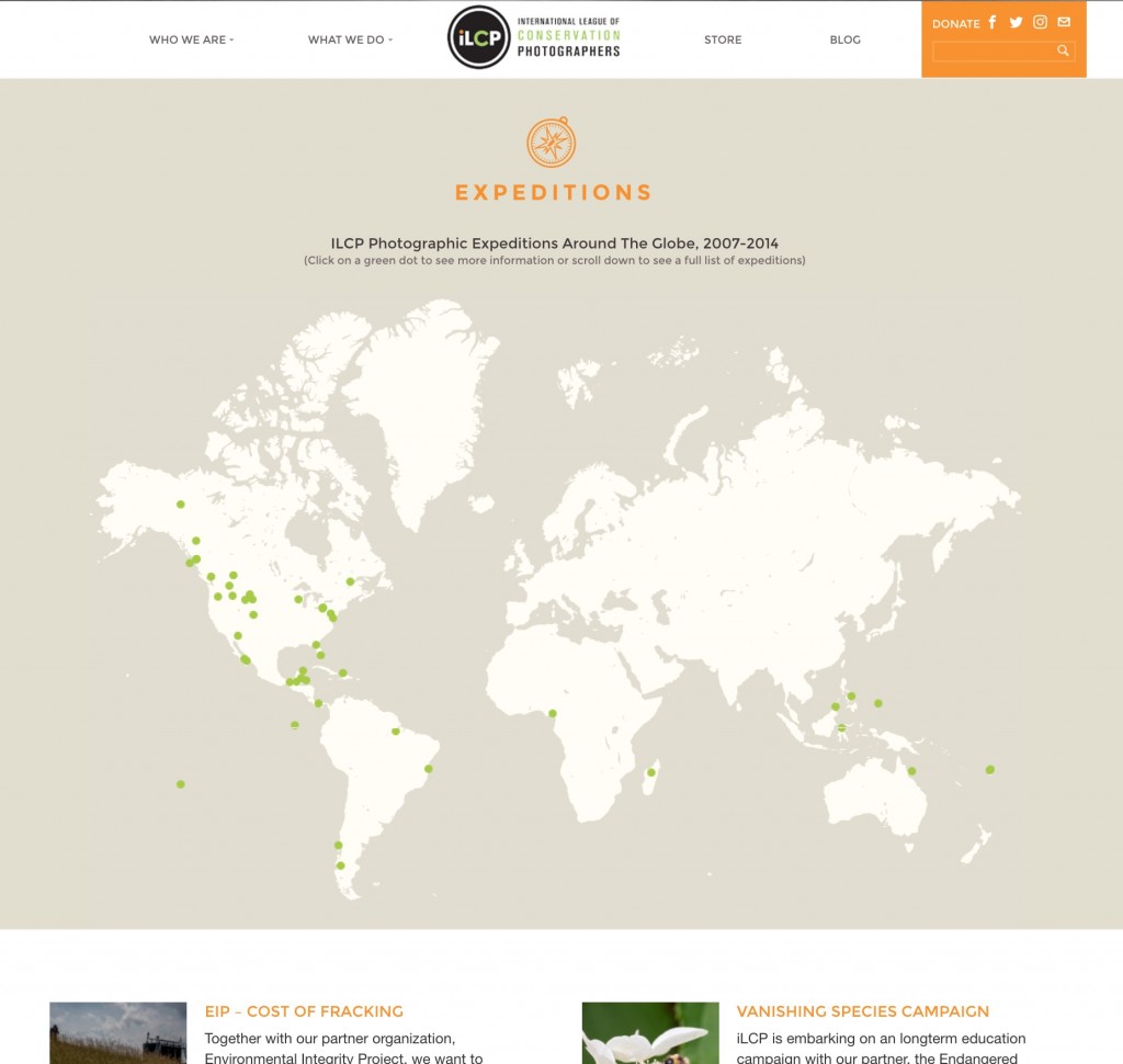
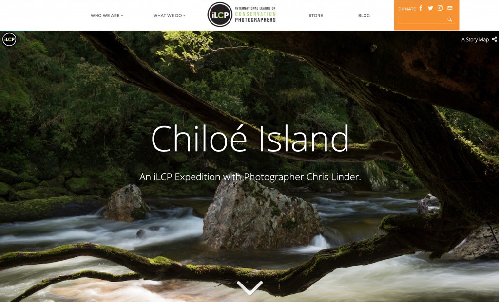 To see this in action, go to the ILCP’s Expeditions page and click one of the points on the map. Some points lead to regular web pages, while others (like the Great Barrier Reef expedition off the northeastern coast of Australia) lead to Cascade stories. If you navigate back and forth between expeditions and the map, you’ll notice that the header bar doesn’t reload, so the Cascades feel like an integrated part of the website. This embedding technique is fantastic and really helps Cascade stories look their best.
Consider mobile devices
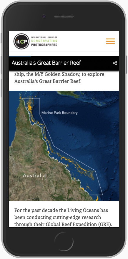
Don’t forget to account for an embedded Cascade in your website’s mobile-friendly view. Story maps are responsive, which means their layout changes depending on the screen size at which they are being viewed, but no web content looks good constrained to a small frame when shown on mobile device. At a minimum, have a link that opens the story in a new tab.
We like how the ILCP’s website works on small screens, too. It helps Cascade look its best on mobile devices since it allocates almost the full page for the story. With this design there’s no need to come up with a different strategy for showing the Cascade in the mobile-friendly view, it just works.
In Summary
It’s recommended that you test your story at a variety of screen resolutions and on a variety of devices to make sure it looks and behaves as expected. Always make sure you are showcasing your work in the best way possible!

Commenting is not enabled for this article.