By Charlie Frye, Esri Chief Cartographer

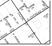
Notice in the first graphic below that the labels for “CAJON ST” and “CLIFTON CT” are placed over of major streets in a way that makes them difficult to read. This graphic is derived from my recent blog entry on the Maplex Street Placement option, and I was using the Street Placement option, but that left me with this problem. Well, this happened because I didn’t tell the Maplex Label Engine to treat the major streets differently.

I symbolized this map to show major streets more prominently, but just assigning a darker, wider symbol does not tell Maplex my intentions. I could change the color of my major streets to a medium gray so that you could still see the text on top of the intersections, but that isn’t ideal — I shouldn’t have to change my symbology just because Maplex did what I told it to rather than what I meant it to do.
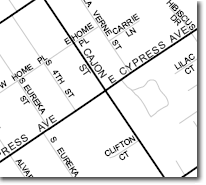
Instead I used another feature on the labeling toolbar (feature weight rankings) to give the Maplex Label Engine the information about what I wanted and it then produced the result in the next image.

In this example, notice not both labels that were problems in the above image are better placed relative to the nearby major streets. The way I did this was to assign weight rankings to my label classes, specifically to my major streets.
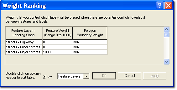
The streets layer I am working with has three different line symbols, one for surface streets, which are medium gray lines, one for major streets, which are heavier black lines, and one for highways, which aren’t visible in these examples. Each kind of street my layer has a label class that defines the specific symbol and labeling rules. When I click the Label Weight Ranking button on the labeling toolbar (shown at the top) the Weight Ranking dialog box is shown. Here is what it looks like for my simple map:

I changed the feature weight for my major streets to 1000. That way no labels would be placed on top of major streets. The Maplex Label Engine uses feature weights as guidance for whether or not to place labels on top of features. Here are a few things I’ve found useful to know about setting feature weights:
- Name your label classes in way that make it obvious which features they are. In my case I used the same labels as I used for my layer’s symbols. Short, versus long label class names are also better. Both will help make it easy for you to see exactly which label classes you are assigning rankings in the Weight Ranking dialog box.
- Some feature weight values have specific meaning:
- A feature weight of 0 (zero) means that the space on your map the symbolized features of this label class occupy is to be treated as available for labels to be placed:
- A feature weight of 1000 means that the space on your map the symbolized features of this label class occupy is absolultely not to have labels placed on it. Typically, you would assign a feature weight ranking of 1000 for point layers, which would ensure the complete point symbol is always visible, and unobscured by labels.
- All other feature weight values are interpretted relative to one another. That means if the Maplex engine must choose to place a label on a feature, it will place it on the feature with the lowest feature weight; it won’t matter if you use 300 and 301 versus 200 and 800; 300 is still lower than 301.
- When making a maps that have many label classes, I usually set my feature weights with intervals of 100, this makes it easy to see which are more important. This also leaves gaps between the values in case I have to add another layer with features that happen to be more important than some and less than others, letting me use, for example 250.
In general, you can use feature weight rankings to tell the Maplex Label Engine about which space on your map is available to place labels, which space is not available, and which features on your map are relatively important so labels won’t be placed on top of them.

Article Discussion: