By Charlie Frye, Esri Chief Cartographer

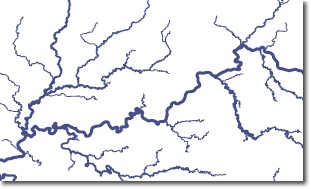
Last week we received an interesting question on Ask a Cartographer about how to create tapered stream or river line symbols. Tapered symbols are actually a bit more complicated than what is shown to the left; those lines are proportionally scaled symbols that are based on an attribute value. Notice that each stream is a single line width. Tapered symbols would actually change widths along the length of a given feature, giving a very smooth effect. Tapering is more useful for depicting flows that range widely in value or magnitude, whereas proportional symbols are usually an excellent solution for symbolizing rivers and streams.
Another aspect of tapering that is usually not appropriate for displaying rivers and streams is that the tapering is usually applied uniformly along the length of the line, suggesting, for instance, that the midpoint of the line is exactly half as wide as the widest portion. Such an approach doesn’t work well for river networks, for instance where the Ohio and Missouri Rivers each join with the Mississippi adds a large quantity of water that should be represented immediately rather than uniformly managed along the length of the Mississippi River.
To illustrate this point we’ve posted a dataset on Mapping Center’s resource page that contains hydro flowlines for the continental U.S. These flowlines were derived from the NHDPlus dataset created by Horizon Systems for the USGS and EPA. One of the valuable aspects of this dataset is that the hydro flowlines have attributes, including two for mean annual flow. In this particular example, I classified the flow attribute that was based on upstream drainage area into 25 flow classes. Then I dissolved the result on name and flow class. That is essentially what I used to create the image above which shows a portion of the Ohio River, the Wabash (on the upper left), and Kentucky (on the lower right) rivers.
The symbols are set up with proportional symbols with the smallest symbol at 0.1 (flowclass = 1) and the largest size (flowclass = 25) is automatically determined.
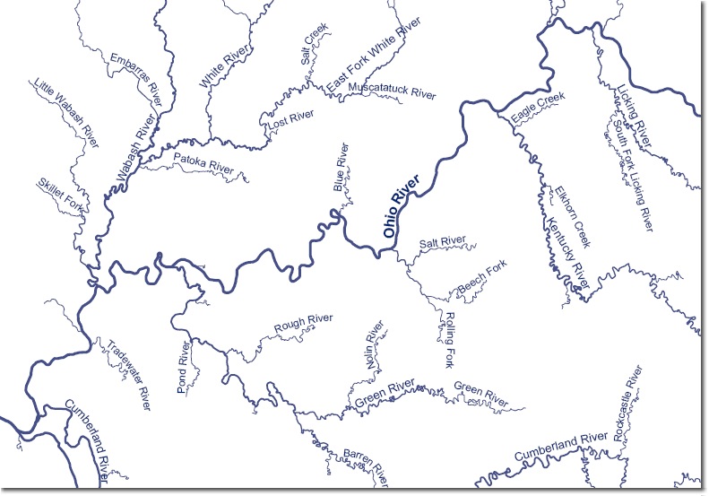
In order label these features, flow class can be used to set up labeling classes to label the rivers with text sizes that reflects the importance of the river. To do this I used the flow class attribute, but created fewer label classes. I included a second feature class with “_lab” on the end of its name. That feature class has a field with three classes (small = 0, medium = 1, and large = 2). This data is also simplified to a much greater extent, making it efficient to label.
Here is an example of how this symbology and labeling appear:

The labels are produced from the simplified data and in addition to being faster to produce (for not throwing as much geometry at Maplex) the simpler geometry doesn’t offer so many traps for Maplex’s labeling algorithms, resulting in generally better placed labels (or labels that are easier to edit if you convert them to annotation).

Article Discussion: