By Aileen Buckley, Mapping Center Lead
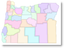
Have you wondered how you can get a graded boundary effect for your polygons layer, which is a nice way to add a subtle emphasis to boundaries? This effect uses what are called “tint bands”. We posted a blog entry on this a while back. If you are in a rush and want to get a similar effect, you can create what we call “quick tint bands”. It’s pretty easy, really – you just need two layers – one for the fill, one for the outline. In essence you will end up placing the fill layer over the boundaries using transparency. The boundaries will be symbolized using a Gradient Fill Symbol with a gray to white color ramp. Here’s how you do this: Fill layer:
- For the fill layer, use whatever you want to symbolize the polygons. In this example, I simply symbolized the counties in Oregon, each with a different color. (I did this using Unique values on the Names field using a default color scheme from the Esri style).
- Set the transparency to whatever you want (I used 40%).
Outline layer:
- For the outline, again use your polygon layer. This time set the symbology to be a Gradient Fill Symbol, set the Intervals high enough that you do not see the individual bands (I set it to 25), set the Percentage to however wide you want the edge to be (I set mine to about 17).
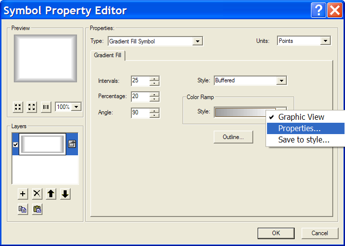
- Use a black to white color ramp (black on the left and white on the right). If you want to tone down the effect some, then change it to a gray to white color ramp. To do this:
- Right click the color ramp and select Properties – set Color 1 to be gray and Color 2 to be white.
- Once you click OK then you can also right click the color ramp again and select Save to Style – this will allow you to use it again. If you want to do this, then type in a name. This new color ramps will be in your personal style when you want to use it later.
- Click OK to get all the way out.
Fine tuning the effects: You will find that using the above method will result in tint bands that may vary greatly in width along the boundaries (depending on how much variation in size there is for your polygons) – the smaller polys will have thinner tint bands and the larger polys will have wider ones. You can fine tune the effects if you create separate layers for polygons of different sizes. For example, compare the width of the bands for Iowa (where the area for the counties varies from 397 sq mi to 978 sq mi, a 60% difference in size), 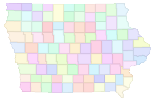 to those of Oregon (where the area for the counties varies from 481 sq mi to 10,246 sq mi, a 95% difference in size):
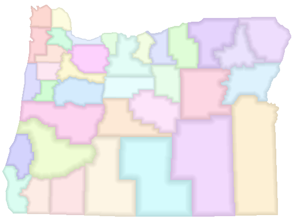 To mitigate this,
- I copied and pasted the symbolized outline layer (with the Gradient Fill Symbol) for the counties of Oregon 5 times. (I figured out which sizes to use by classifying the Area field using 5 Natural Breaks – then I just wrote down approximate numbers for the break values to refer to in the next step).
- I then used a Definition Query to define which size polygons would be shown in each layer.
- Then for each layer, I tweaked the Percentage in the Gradient Fill Symbol (I reduced the Percentage for the layers with larger polys and I upped it for the layers with smaller polys.)
Here is what I ended up with: 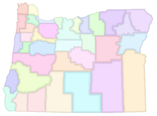

Article Discussion: