We live in an amazing time as far as cartography is concerned. Technology allows, and actively supports rapid, democratized mapping. Data, compiled and published in near real-time (if not actual real-time) encourages people to get their hands dirty to see what they can make. Media outlets all rush to provide their audience with fast, visible content. Social media drives sharing of these maps at a breathtaking pace. When you throw in a developing human health story the ingredients are ripe for maps to take centre stage, as they have become with the ongoing coronavirus outbreak. Let’s take a look at how maps can help shape the narrative and, as concern (fear?) grows, how to map the data responsibly.
Coronavirus (Covid-19) has, to date (February 25th 2020) infected over 77,000 Chinese citizens, mostly in Hubei Province, since it was first identified in December 2019. It has so far spread to more than 30 countries. It has claimed more than 2,600 lives and been declared a global emergency by the World Health Organisation (WHO).
We’ll focus just on data for China in the following series of maps. They are designed to look like small maps you might find on a news media web site. Relatively simple, and with just the basic facts. Many of the issues I’ll note are equally applicable whether you’re making a small static map or an interactive web map.
The first job when making any map is to determine what projection you’re going to use. The region is China, and the data is thematic. For ANY map of population data to work the map has to use an equal-area projection. A good choice for China is Albers equal area. Web Mercator does not support the map’s purpose because distortions lead to people over- or under-estimating size of areas relative to one another. And that has the effect of propagating people’s impressions of less and more because of the over- or under- exaggeration of parts of the map due simply to the projection. Projection Wizard is a great tool to help you work out a good projection for your data. And making maps in a suitable projection is easy in desktop GIS. It’s also very easy if you’re making a web map using ArcGIS as this previous blog explained. Here’s a comparison of how the map looks at a scale of 1:30 million for Albers equal area and Web Mercator. They’re quite different!
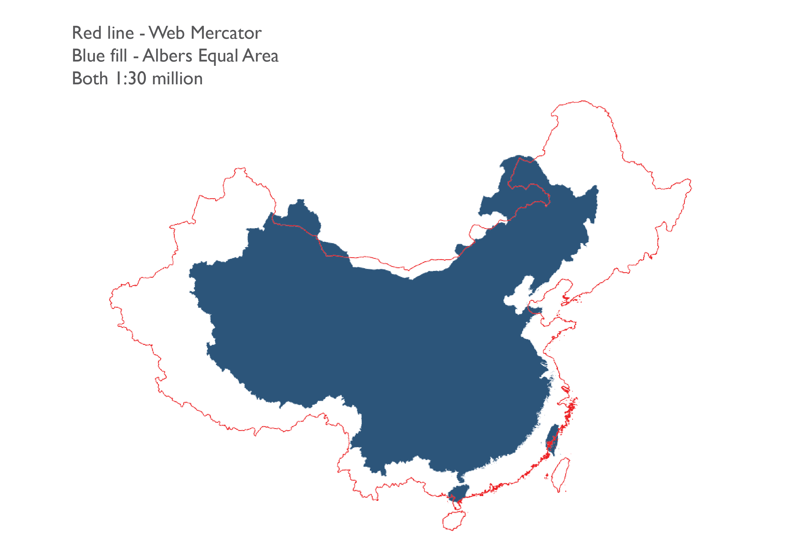
So we’ve identified an appropriate projection, all the maps now get mapped that way for consistency. This supports not only comparison within each map but between maps.
The default thematic mapping technique, the go-to technique, the technique most people are familiar with is the choropleth (graduated colour) map. It’s a great technique when used properly. But when used poorly it has the capability to really misguide people. Here’s a reasonable ‘looking’ choropleth map of the coronavirus data as of 24th February 2020. This is the date we’ll use for all of the maps. Spolier alert – this is how not to make the map.
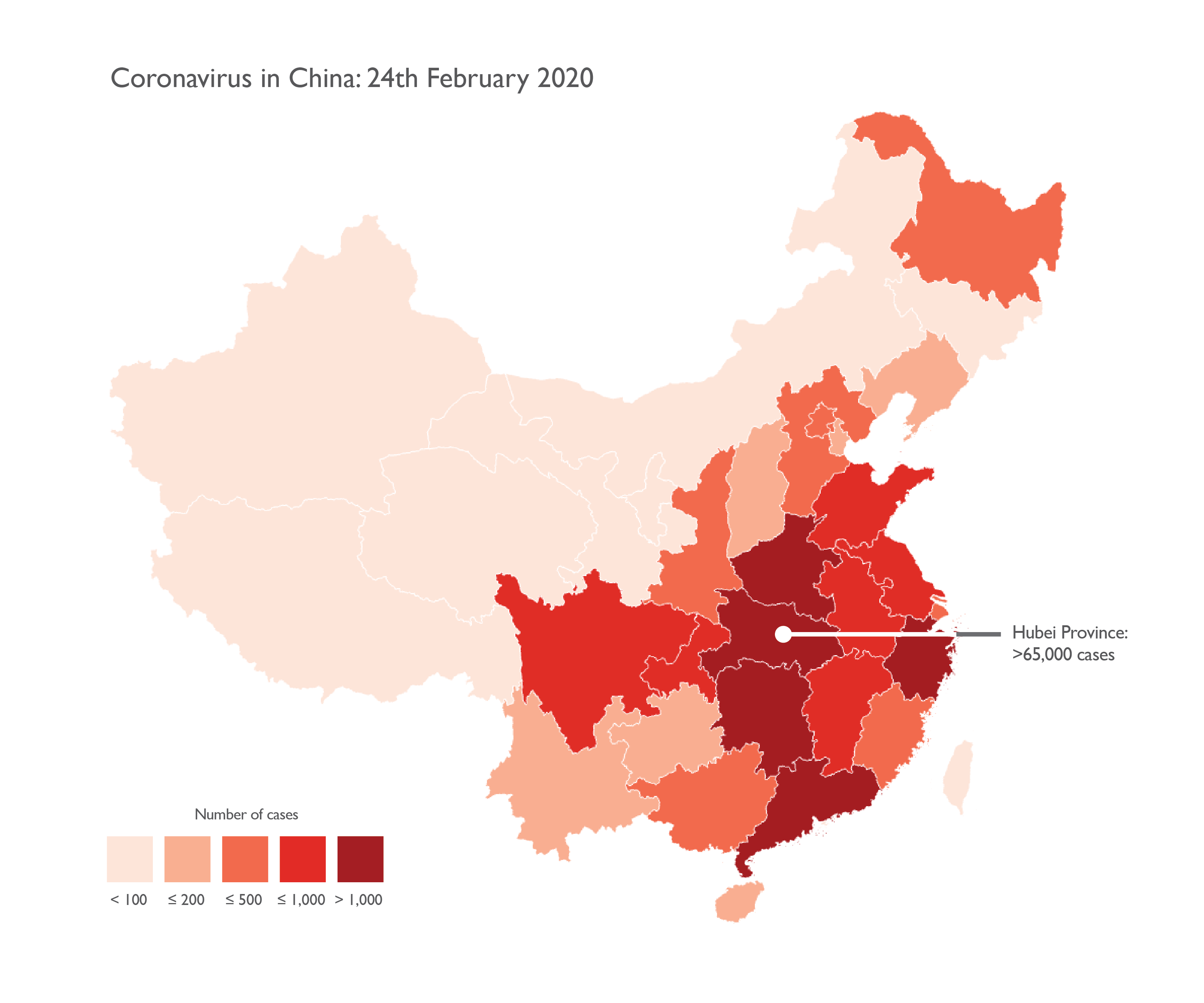
Looks can be deceptive. The fact that it looks okay is hiding a dark secret that, if you’re not aware of the fact, won’t even get noticed. The map is using totals (absolute values) as its raw data. There are very very few golden rules in cartography but this is one of them: you cannot map totals using a choropleth thematic mapping technique. The reason is simple. Each of the areas on the map is a different size, and has a different number of people in it. They are inherently unequal in character so we first have to deal with that before we can make sense of any other data. These innate characteristics of all thematic maps means you simply cannot compare like for like across a choropleth map.
The label tells us that Hubei region has over 65,000 cases of coronavirus. It sounds a lot. But does Hubei have 100,000 people, or possibly 100,000,000 people living there? And what of its neighbours? Do they have similar numbers of people living there? Or far more or less? Because we have no way of knowing, comparison of the map’s theme across the map is impossible. We simply don’t know where there is actually less or more because there’s no consistent baseline for the comparison. All we get is a total number, and we may as well use a table for that.
And what about the classification scheme used on the map? It seems 1,000 cases is being used as a key break point. There are 5 Provinces in the highest category so the assumption must be that they have similarly high numbers right? The only way to see what’s actually going on is to look at the data distribution. Here’s a bar chart of the number of cases by Chinese Province.
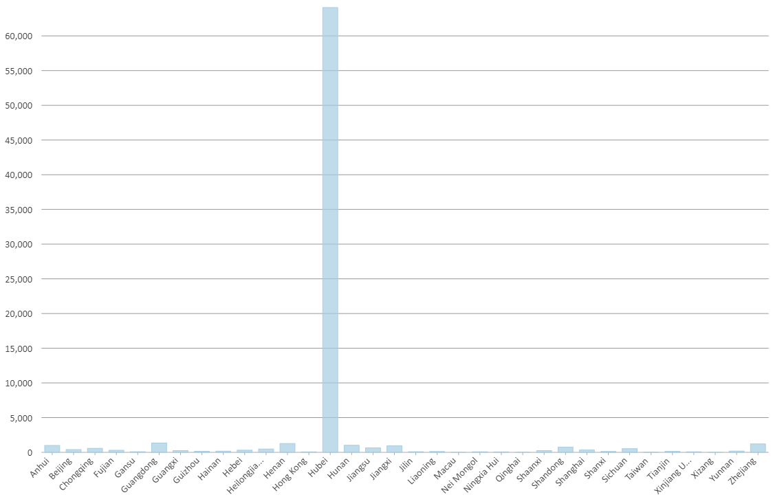
Hubei Province is a massive outlier, a really massive outlier that the map above doesn’t properly reflect. All other regions are way below that level so using a break point of 1,000 cases a poor choice as it conflates Hubei with its four nearest neighbours in terms of data values, despite them being nowhere near the same. One thing you might do at this point is actually consider using a bar chart rather than a map because it clearly shows the empirical and geographical dimensions without hiding them behind a map that needs careful interpretation. Either way, take this knowledge to the map. Here’s a much better version of exactly the same data.
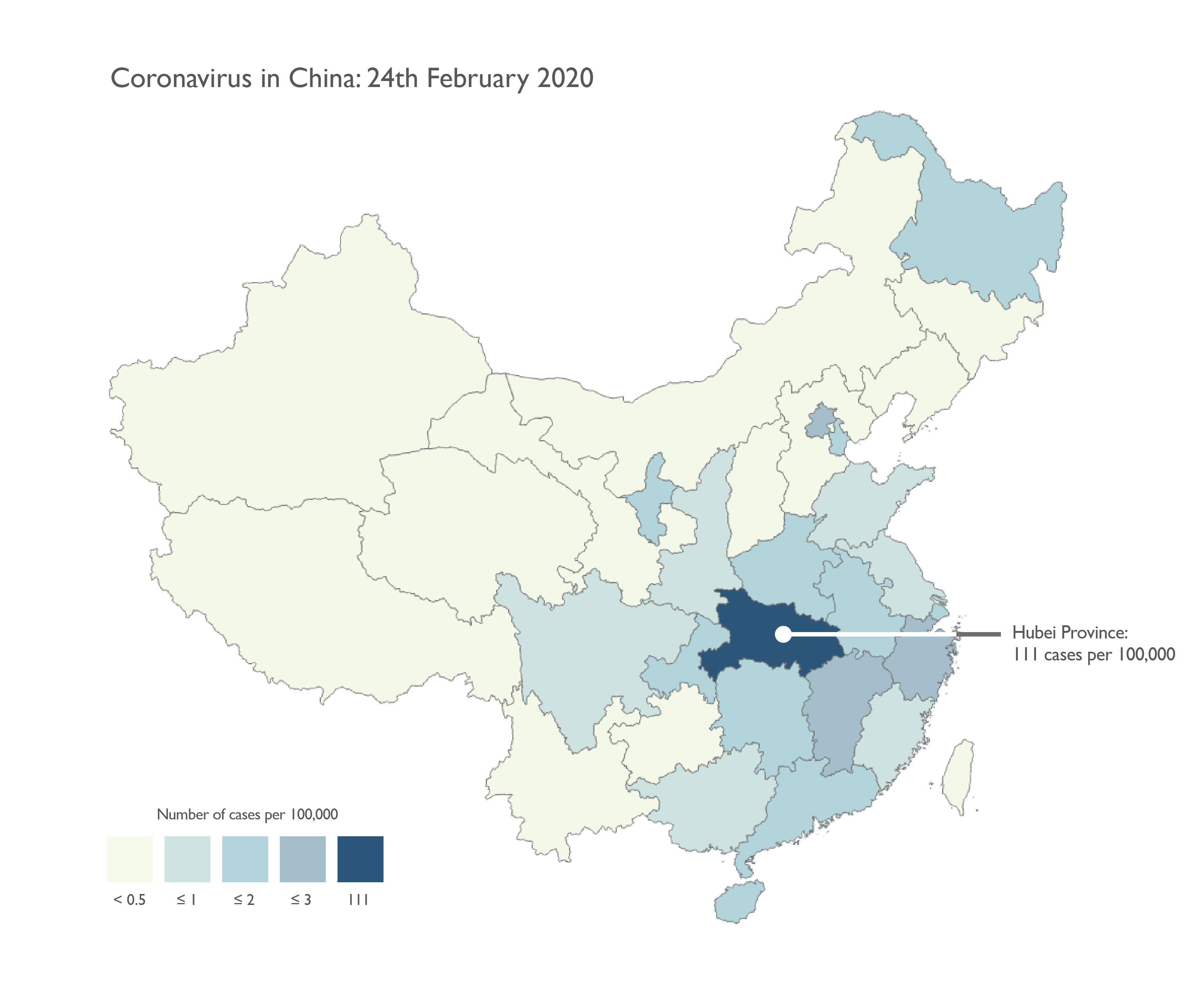
We’ve changed from a red colour scheme to a bluey-green colour scheme. Why? People like red maps. Well that may be true, and they’re certainly attention-grabbing but consider the dataset. We’re mapping a human health tragedy that may get way worse before it subsides. Do we really want the map to be screaming bright red? Red is a very emotive colour. It has meaning. It can easily connotate danger, and death, which is still statistically extremely rare for coronavirus. We can still make the map reveal the same message but without sensationalist colour choices. A simple light-dark colour scheme does the job so people can assess less to more.
The other big difference with the map is it’s corrected the use of totals to use rates instead. The map is now normalized to support accurate visual comparison because 10 cases in a city of 100,000 is a fundamentally different situation to 10 in a town of 100. Hubei has 111 cases per 100,000. Every other region has less than 3 cases per 100,000. Significantly fewer. The classification of the data, the map itself, and the supporting legend now reflects that very large disparity and because we’ve using rates we have a consistent baseline and we can compare what we see from one place to another across the map. The colours are muted for all classes except Hubei just to allow it to stand out a little more, and make it obvious it’s an outlier. The additional label supports the story, and helps lead the reader to the crucial aspect of the map.
The choropleth isn’t the only technique that’s useful, and while this blog isn’t the place for a full exposition of every possible alternative, what other simple choices might we make (or not) to show the data? First up, a dot density map.
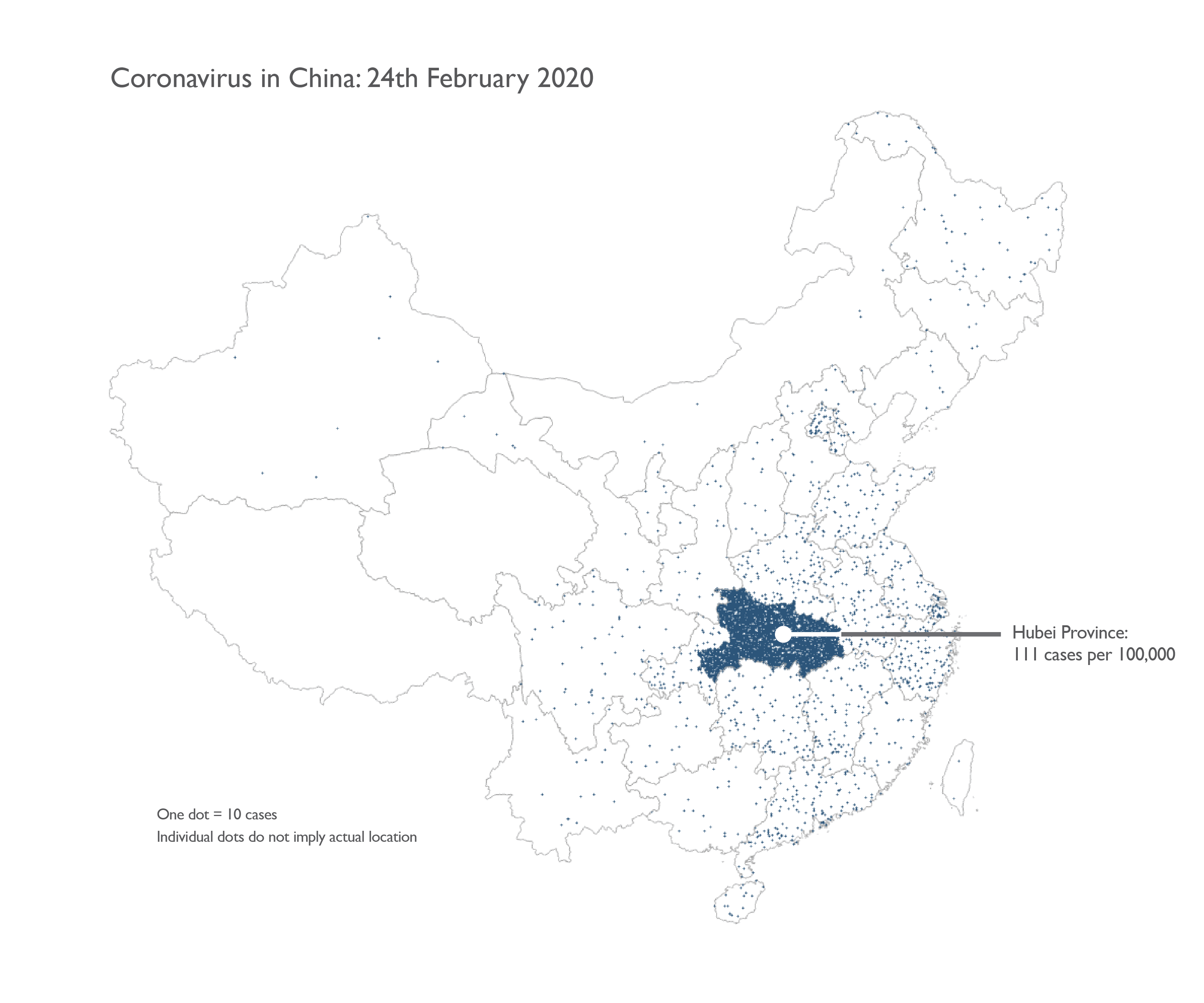
Here we can use totals rather than rates because the technique itself automatically renders the data as a visual density of dots of the same size that aids comparison. On this map, one dot is equal to 10 cases. Dots are positioned randomly and it emphasizes the large outlier in Hubei. The downside is some might infer a dot locates an individual case. It’s always useful to include a note to clarify any potential confusion in how to read the map symbols. Because of the large range in data it’s almost impossible to get the dot value to accommodate the low counts at the same time as the highest count. Hubei seems to be completely overwhelmed, but that may be what the map should be showing in comparison to surrounding areas.
Another really useful thematic map type is the proportional symbol map. Again, this map type can take totals as input data and it uses the data values to calculate the area of a symbol, here a circle, that are then proportional and comparable to one another.
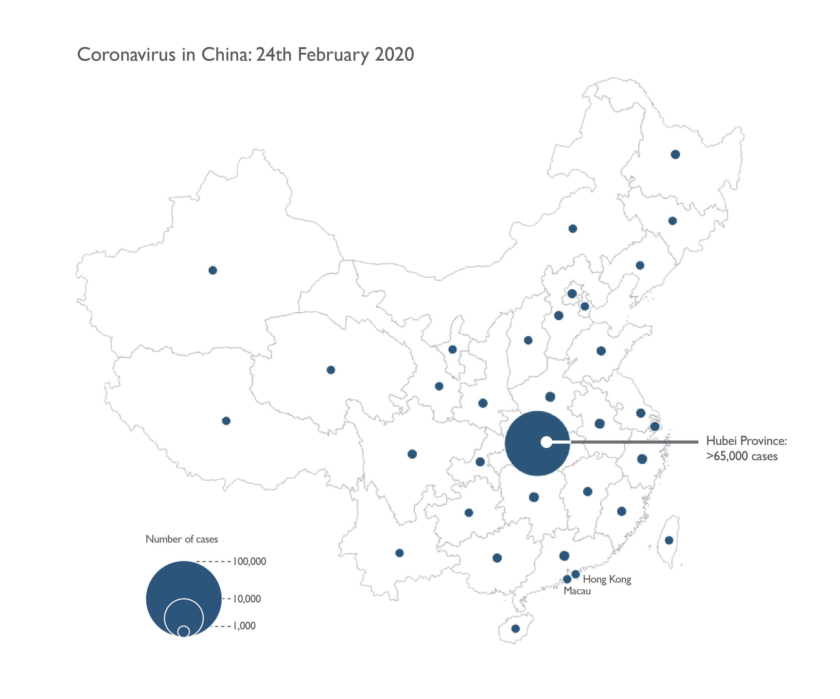
Had anyone noticed that on the choropleth and dot density maps it’s impossible to see Hong Kong or Macau? At a national scale, and for such a large country, it’s inevitable that small areas get overlooked. You could use an inset, or rely on the multiscale characteristics of a web map, but a proportional symbol map allows you to see smaller areas by virtue of the symbol itself. Except we have that large outlier so if we scale our symbols linearly all regions bar Hubei are the same small symbol size.
Alternatively, we might use graduated symbols where a range of values are snapped to a set of symbols of a specific size (graduated symbols). Or we could modify the way the proportional symbols are scaled such as using a logarithmic scale instead of a linear scale as in the map below.
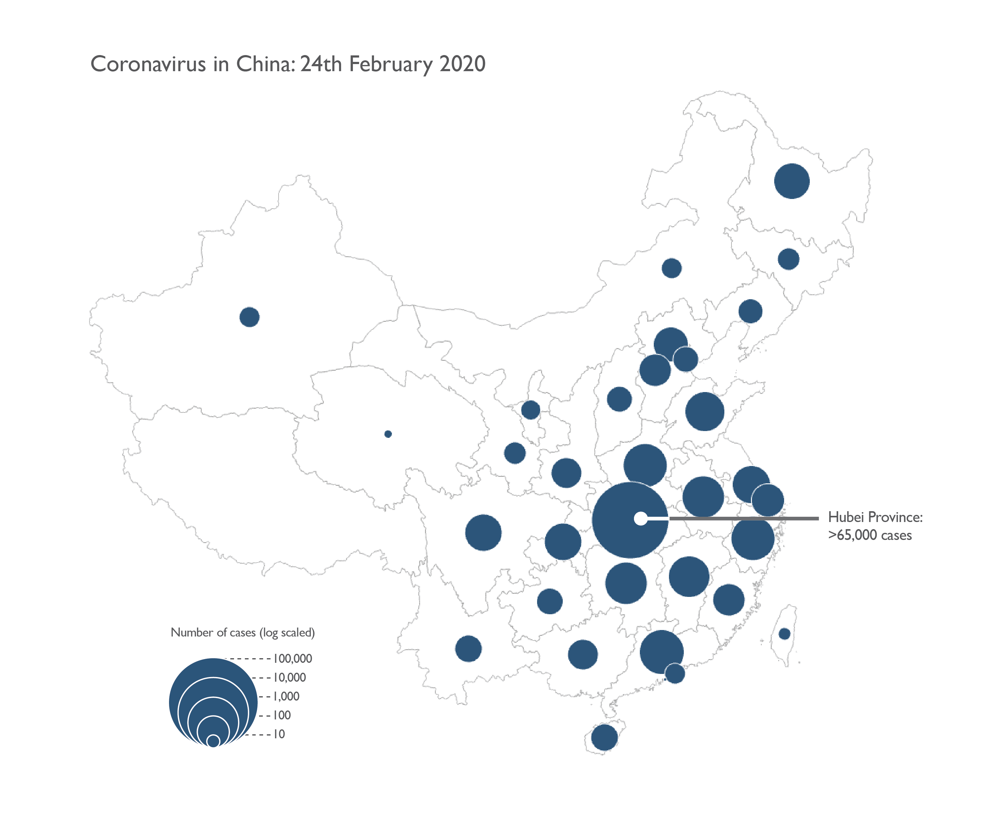
The legend is really important whenever you do something out of the ordinary in processing the data to accommodate some aspect of the data distribution. We certainly gain far more variation in symbol sizes across the map with this approach, though visually we run the risk of over-emphasizing small values in comparison to the large outlier. As with any proportional symbol map, avoiding overlapping symbols is vital. Repositioning them can help, as can a multiscale web map where symbols disaggregate or de-cluster as you zoom in. One other approach would be to make a hybrid map, perhaps using dot density for all areas except Hubei which gets a proportional symbol.
Let’s end with a couple of examples of maps that are easy to make, but just because you can doesn’t mean you should. Firstly, the so-called ‘heat map’.
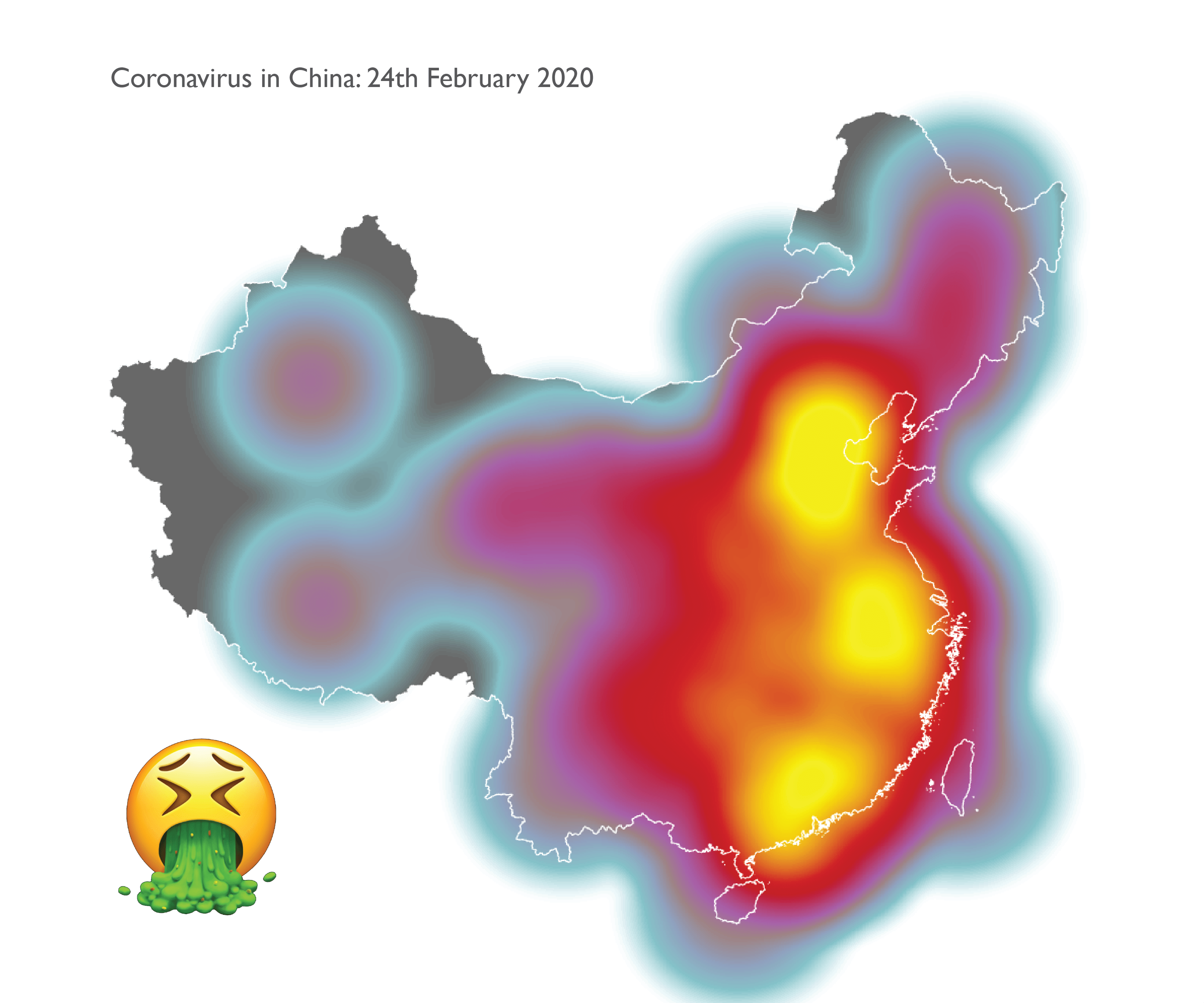
This sort of map is really just an interpolated surface using the data values at points that represent the areas on the map. There’s a few drawbacks. Chinese Provinces are quite large. The geometric centre isn’t necessarily the best place to pin the data value to. We could position the points using a population-weighted technique but even so, with the coronavirus data being very location specific, using an interpolator to assume some sort of gradual variation between adjacent data points that are far apart and represent highly generalised geography is not helpful. It presents a picture of the data distribution that neither the data nor the geography really support. On top of that, the map doesn’t actually show Hubei as the epicentre. It’s over-generalised. And the colours? A really poor choice that veers into sensationalist territory as China looks all-consumed by the ectoplasmic virus. That’s simply not the case so let’s not make maps like this.
Okay, but what about 3D? People love 3D.
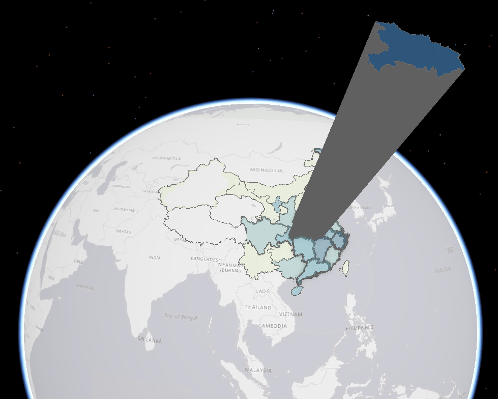
3D has a time and a place. It can be a really useful way to encode thematic data on the z-axis and make something useful. But extruding Hubei compared to the rest of the areas just doesn’t work for this data. It’s gratuitous and adds nothing. It’s really hard to make any sense of relative amounts and that’s before we even deal with foreshortening and occlusion. But talking briefly about 3D scenes does bring me back to the idea of interaction and back to the web map.
Web maps are fantastic ways to map and share rapidly. They are a vital component in the way in which people share data. They offer many useful capabilities over and above static maps such as pan, zoom, and click events that drive popups. All very useful but which do come with their own set of potential issues. For instance, a proportional symbol map with fixed sized symbols when zoomed out coalesces the symbols into a blob. When zoomed in too far it’s easy for people to assume the symbol in view represents a precise location rather than a geometric centre of the much larger area it abstractly represents. Zoom a choropleth map in too far and you’ll fill your screen with a single colour implying totality and removing it from the surrounding context. Zoom a dot density map in too far and you’ll end up with people thinking a single dot that happens to have been randomly positioned near a house is where someone actually lives. These are messages your map should not be suggesting.
It’s therefore really important to restrict your zoom levels to avoid the extreme situations at small or large scales if the data doesn’t support that granularity or you don’t have any different, more detailed data to switch to as you zoom in to larger scales. And if you’re using proportional symbols or dot density, have your symbols re-scale at different zoom levels to overcome the problems associated with fixed-scale symbology. Remember, data like the Province and country aggregations for coronavirus are an average for an entire region. It’s impossible to derive any insight into local circumstances, outbreaks and clusters. The data does not support that analysis so restrict the map from implying it through meaningful design choices, and don’t obfuscate the reality of the limits of the data.
It’s also critical to remain critical when you are reading these sorts of maps. Being smarter about what you see in the map helps identify when you’re seeing patterns that are as much, if not more, a product of the map mediating the message, as they are of the data itself. Caveat emptor applies just as much to reading a map as it does to buying a house. The map might look stunning and attractive but once you step inside you may find all manner of structural defects that limit its practical use. And you wouldn’t buy a house that’s suffering from a collapsed foundation and termite infested walls, despite the fresh lick of paint you can smell as you walk through. Being able to identify some of the flaws in what you’re seeing regardless of how authoritative or definitive you think, or you’re being told the map is will help you be a smarter consumer of information.
That’s a rapid run-through of a few ideas to help you map data such as this coronavirus outbreak responsibly, and also how to spot when the map is perhaps not being as responsible as it could be in communicating something to you as a map consumer. Often, the simplest techniques, done well, provide a sound cartographic approach. The key to informing is to work with the data and to not imbue it with misguided or sensationalist data processing or symbology, and to deal with some of the cartographic problems different techniques are known for. And what are the key points? As of 24th February:
- Hubei has 111 cases per 100,000 people (0.1% of the population);
- everywhere else in China is less than 2.5 cases per 100,000 people;
- for other countries reporting cases, the rate is even lower; and
- maps mediate the message to a greater or lesser extent, and some that appear well-intentioned are often unhelpful.
Maybe words are all that’s needed? But if you’re going to make a map, think about these key aspects, pick a technique that supports the telling of that story, process the data and choose symbols that are suitable, and avoid making a map that misguides, misinforms, or has the potential to go viral as an example of a #cartofail.
Which map would I make? For this data…proportional symbol, log scaled, with a light to dark colour scheme to accentuate the symbols. Alternatively, I might just put proportional labels on a map, or simply use a table or a graph instead of a map.

Article Discussion: