By Wes Jones, Esri Design Cartographer
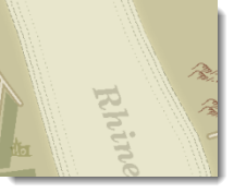
Recently, I was trying to replicate a historic map and I would like to share a couple of the techniques I used. This first blog will show you how you can symbolize waterways so that they appear as they do on some historic maps, and the second will show you how to create a torn and creased parchment paper look for your map.
We previously wrote a blog on symbolizing coastlines which showcased several different ways to make a coastline. I want to add a technique to this and show a way to symbolize larger scale inland waterways like the Rhine River in the map shown below. This technique mimics an old inking style that used dashed lines running parallel to the coast to delineate the shoreline. The following explains how to create those dashed lines.
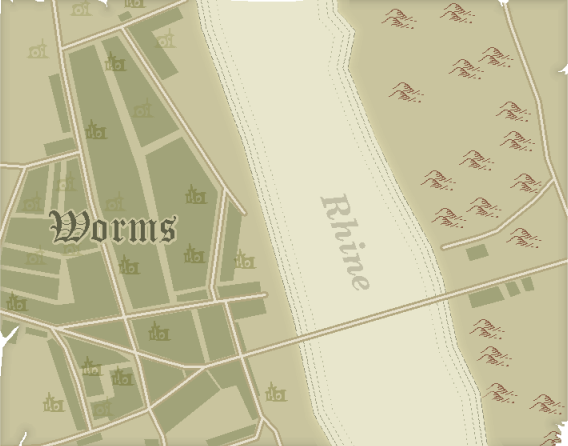
Figure 1: Historic map
Step one: Create the dashed lines
Double click the waterway polygon feature class symbol in the Table of Contents to open the Symbol Selector. Next click the Edit Symbol… button to open the Symbol Property Editor. Click the Outline… button (since we are editing the polygon outline) to open the Symbol Selector. Lastly click the Edit Symbol… button to access the Symbol Property Editor.
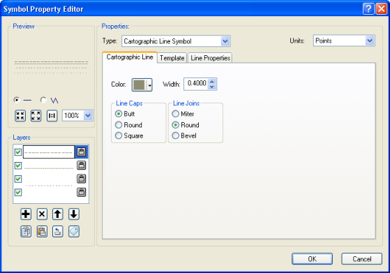
Figure 2: The Symbol Property Editor dialog
Now we will be making four dashed lines. From the Type drop down menu choose the Cartographic Line Symbol option — this will allow you to create dashed lines.
The first dashed line will be along the coast (no offset). Its pattern is 4 dash / 1 naught.

The second dashed line will be offset -4. Its pattern is 2 dash / 1 naught.

The third dashed line will be offset -9. Its pattern is 2 naught / 2 dash.

The last dashed line will be offset -16. Its pattern is 1 dash / 3 naught.

You can play with these values but these worked well for my map. In general, you want the dashes to become smaller as they are drawn further from the shore.
Step two: Convert to Representations
The dashed line symbol for the waterway looks best if it is then converted to representations, because representations will help avoid the troubles that offset lines can have around bends. To do this, right click the layer in the Table of Contents and click the Convert Symbology to Representations option. Note that this will require that your data are in geodatabase rather than shapefile format.
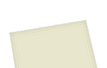
Figure 3: Shoreline before converting to representations
Once you convert to reps you can keep all the defaults and you will get the effect shown below. Notice how the corners (or bends) look a lot better.
Figure 4: Shoreline after converting to representations
Stay tuned for part two of this blog series which describes how you can give your map a torn and creased parchment paper look.
Thanks to Aileen Buckley, Mapping Center Lead, for her help with this blog entry.

Commenting is not enabled for this article.