By Dr. A Jon Kimerling, Professor Emeritus, Oregon State University
Question: What is the difference between filling a polygon with randomly placed dots and creating a dot density map for the polygon?
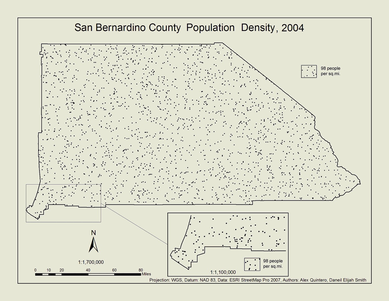
Filling a polygon with a certain number of randomly placed dots is a form of choropleth mapping where random dots are the area symbol for a quantity that is assumed to be of uniform density throughout the polygon. The choropleth map seen below of San Bernardino county population density uses random dots in this manner.

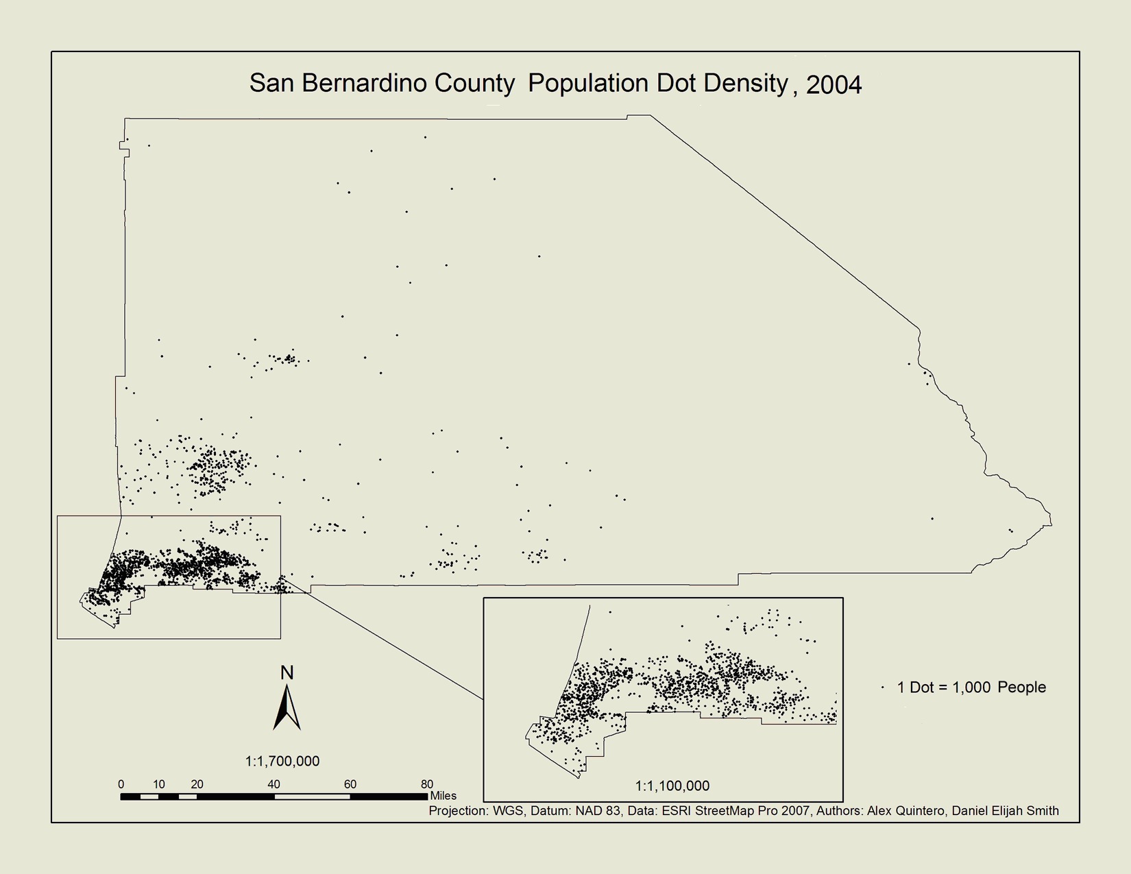
Dot density maps, on the other hand, show the geographic density distribution of a phenomenon by placing dots representing a certain quantity of the phenomenon where they are most likely to occur. The dot density map seen below of San Bernardino county population density is made by first allocating the county population by much smaller census block groups, then excluding areas within block groups where people are unlikely to reside, such as parks and military exercise areas. The dot map eliminates the obvious geographic inaccuracies apparent in the choropleth map where the county appears to have the same population density in desert and mountain areas as at the eastern edge of the Los Angeles metropolitan area where most people reside.

Good dot density mapping is a little more complicated to achieve because it requires the use of related ancillary data and an understanding of the geography of the area. However, they are more accurate. With ArcGIS software, it is possible to achieve well-designed dot density maps, as will be explained in forthcoming blog entries by the students who made the maps you see here.
Article Discussion: