By Aileen Buckley, Mapping Center Lead
Recently we were asked if there are any cartographic standards for inset maps. Here are a few guidelines:
Purpose
First, consider why the inset map is needed. Inset maps are sometimes used to show related themes of data at smaller scales, for example:
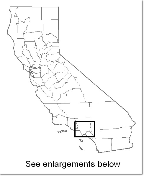
Most often inset maps are used to provide either an overview of the area or a close up of a section or sections of a map. Here are some examples:
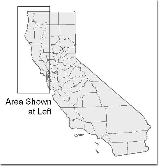
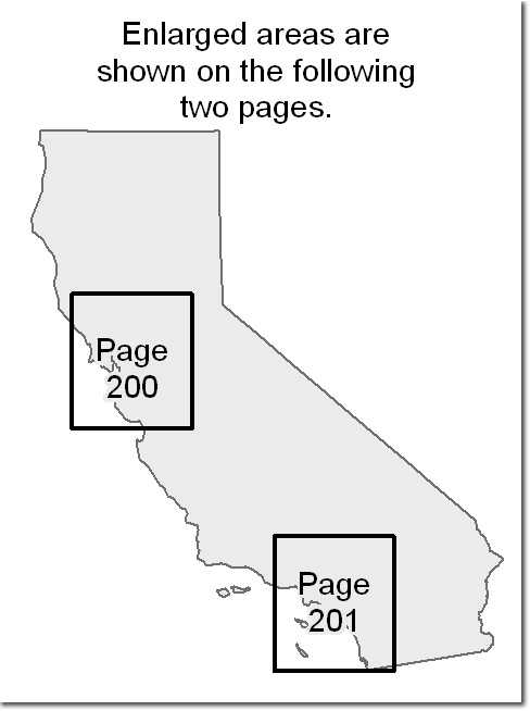
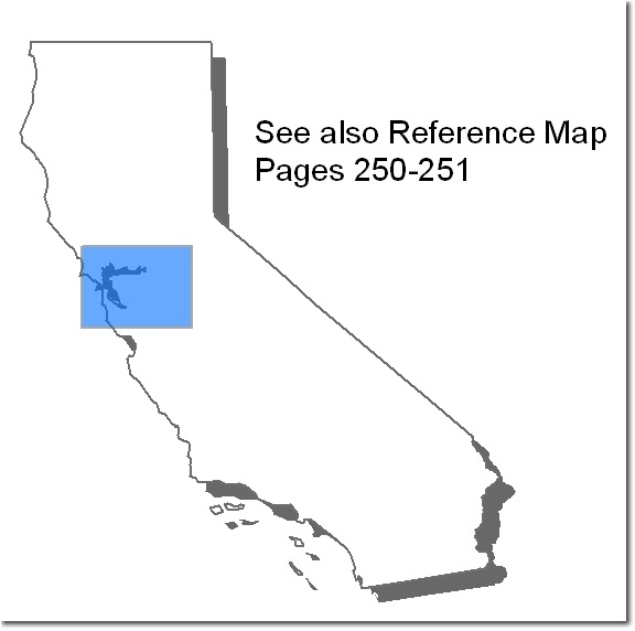
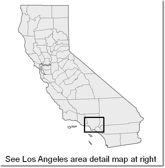
When designing inset maps to provide an overview, consider the map readers and determine what locational information they need in order to properly establish the location of your study area in their minds. For inset maps that are close ups, you can provide further detail for the areas that are rather congested on the main map.
Form
Inset maps will either be open or closed forms. A closed form inset uses an immediately recognizable outline (a state, a country, the world, etc.) An open form is a portion of any of these that is a little harder for the reader to locate without additional information, unless your audience is already familiar with how you have cropped the area shown in the inset.
If you are using a closed form, familiarity will allow you to get away with providing less basic locational information for the audience. If you are using an open form, you may need to give the audience more clues about the area mapped. Base data generally includes some or all of the following:
- Administrative Boundaries
- Hydrography
- Major Transportation
- Cultural Features (e.g., cities)
- Physiography (if it makes sense for the mapped area and theme)
Design
There are a few standards that you can follow. In general, the same design considerations that you apply to the main map should be applied to the inset map(s). Here are some tips:
- When you use an inset, be sure to make a clear distinction between the inset and the main map (a border, drop shadow, etc. can help). To provide the reader with clues as to the relationship between the inset and the main map, you can either use captions like “Area shown at left“, or “See detail of Portland area at right“. If you have multiple insets, you can label them 1, 2, 3, or A, B, C or you can label them with their location (“NE corner”, “Western half”, etc.) and use the same label as the title of the inset maps.
- It is not usually helpful to use “zoom lines” (lines that make the inset look like it is zooming out from the main map). Map readers are familiar enough with inset maps that this addition to the page is not really necessary, and the lines usually just add unnecessary clutter.
- Sometimes all that is required to show the area that you are mapping on an overview map is very simple base data with a few geographic details (e.g., a state with the county outlines). The area shown on the man map is then simply a polygon filled in with a solid color or an outline around the area shown on the main map. If you use a border for the main map, a clever trick is to use the same color (usually black) as the border for the polygon fill or outline on the overview map.
- If the scale of the overview map is global, you do not need to provide a scale indicator (i.e., graticule, representative fraction, scale bar, etc.) If you are showing any other scale, you would want to show the scale indicator.
- If you are showing any orientation other than “North is Up”, include an orientation indicator (i.e., north arrow or graticule) for the inset map.
- Make sure that the level of generalization is appropriate for the scale of the inset map – if you are showing an overview of your study area, the data in your inset should be more generalized. Simply use a less detailed data set if you have one. A number of geoprocessing tools in ArcGIS can also be used to accomplish much of this work. You might also want to take a look at MapShaper (this is an online tool that allows you to input shapefiles, generalize the linework, get it back out, and use it on your own maps).
- The substantive design (that is, the “look and feel”) of the insets should be the same as the “look and feel” of your main map – use similar colors, fonts (albeit usually smaller ones), etc.
- In your layout, use the inset map to balance the content on the page – often inset maps can be used as “anchoring” elements. This is because they have straight edges, so placing them along the bottom of the map can help to “anchor” the content to the bottom edge of the page making the page seem more grounded.
- Relate the content of the inset map to the theme of the page, not just the main map – usually inset maps are used to help tell a story or provide additional vantage points into the theme.
Carefully consider whether to add inset maps to your page layout. Inset maps can help readers view an area from multiple vantage points – use them when this would be helpful to your map readers. Avoid using inset maps to simply fill up white space; doing this can actually detract from your map’s message and provide more confusion than clarity.
When you design an inset map, you will need to consider the same cartographic decisions that you do for your main map since the same cartographic standards apply to these maps as well.
Additional Resources
You can find additional information about these and other map elements in:
- Brewer, Cynthia A. 2005. Designing Better Maps. Redlands, CA: Esri Press, 202 pages, ISBN-10: 1589480899, ISBN-13: 978-1589480896.
- Robinson, Arthur H., Joel L. Morrison, Phillip C. Muehrcke, A. Jon Kimerling and Stephen C. Guptill. 1995. Elements of Cartography, Fifth Edition. New York, NY: John Wiley & Sons, Inc., 674 pages, ISBN 0-471-55579-7.
- Slocum, Terry, Robert B. McMaster, Fritz C. Kessler, and Hugh H. Howard. 2005. Thematic Cartography and Geographic Visualization, Second Edition. Upper Saddle River, NJ: Pearson Prentice Hall, 518 pages, ISBN 0-13-035123-7.

Article Discussion: