By Aileen Buckley, Mapping Center Lead
We recently received this question on Ask a Cartographer:
“I am using a bar chart with 2 data fields to display data on my map. In the legend, I have my 2 data fields displayed, and there is a random number (not sure if it is a mean or median of one of my data columns) which is also displayed in the legend, and I cannot remove it. I’d like to remove this random number from the legend. Can anyone help?”
In this blog post, we’ll go into a little more detail about charts and their legends since this seems to be a question that has been raised before (http://forums.esri.com/Thread.asp?c=93&f=989&t=273493 and http://forums.esri.com/Thread.asp?c=93&f=1730&t=262441).
There is a bit of online help about the charts and their legends. In this blog, we’ll focus on bar charts and their legends. First, let’s see what it is composed of.
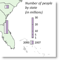
By default, when you insert a bar chart legend, you will get a title, a chart symbol and a number, as well as the legend patches and their labels. The titles and the legend patches/labels are commonly used in other ArcGIS legends so we won’t focus on them here. The chart symbol and number, however, are unique to chart legends, so let’s look at them in a bit more detail here.
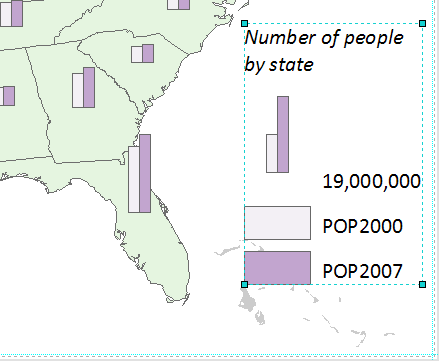
The chart symbol is composed of bars that represent each of your classes as well as a label. The number next to the chart symbol relates to the value that the longest bar in the chart represents. The shorter bar in the chart symbol represents half that value. The chart symbol is scaled to equal half the size of the largest value for the attribute that relates to the longest bar. For example, on my map, the highest value for a state’s 2007 population is 37,483,448 – half that is 18,741,724. The chart symbol is scaled to the nearest whole million (19,000,000).
The chart symbol and value in the legend also appear in the table of contents.
In the process of writing this blog, I learned that there are only a few things you can do to alter the look of a chart legend if you want to keep it “live-linked” (that is, it updates automatically when you make changes to your symbology). I’ll explain them here, and then towards the end of this blog entry, I’ll tell you have you can enhance the legend even more if you convert it to graphics and lose the live link.
If you do not want to display the number next to the chart symbol, you should probably also eliminate the chart symbol from your legend — otherwise people will wonder what it means, and it won’t have a label to describe it.
Here is how you can do modify the legend to delete the chart symbol and its label:
- After you have inserted the legend, right click it to see its properties.
- Then on the Items tab, in the Legend Items right pane at the top right, right click they legend item used to make this legend, click Properties and click the General tab.
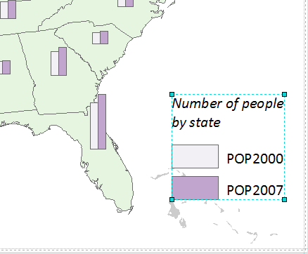
- At the bottom is a drop down arrow next to “Only show classes from this heading”. You will probably see three options: “All” and two “all other values”. The first “all other values” relates to the legend patches and their labels (population for the years 2000 and 2007, on my map), and the second “all other values” relates to the chart symbol and its label (19,000,000, on my map). Click the second “all other values” and click OK to accept all the changes.
You can follow similar steps to eliminate the patches and their labels from your legend – simply repeat all the steps above, but select the first “all other values” instead”.

Now, if you want to further modify the legend, you will have to convert it to graphics. When you do this, you lose the live link to your map data but you have much more control over the appearance of the legend. To convert to graphics, simply right click the legend and select “Convert to graphics”.
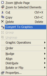
While it is selected, right click again and select Ungroup.
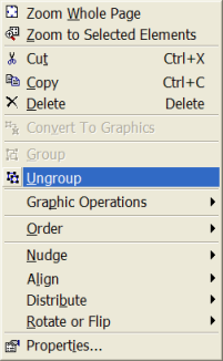
This ungroups the legend elements.
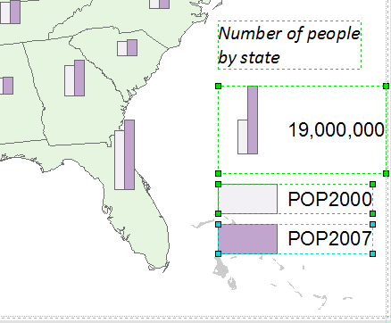
Notice that some of the elements are still grouped, like the legend patches and their labels. While the elements are still selected, right click again and select Ungroup one more time.
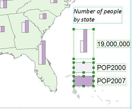
Now nearly all the legend elements are ungrouped. Notice, however, chart symbol is still grouped. If the legend symbol is not scaled to a number that you like – for example, I would rather that mine were scaled to 20,000,000 than 19,000,000 – then select that legend element and perform one last Ungroup.
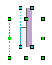
You will find that there is an un-symbolized background element that you can simple delete at this point – it is highlighted with the green box in the example above. When you select the remaining legend element – the part that contains the bars – you will notice that you can not ungroup it and you cannot do much to alter its appearance. However, you CAN use it as a template to make the kind of legend you want to make.
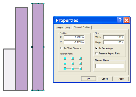
The first thing you might want to do is to resize it to a number that makes more sense. Once you do that, you can also add segments to the bar to indicate intermediate values. Here’s how you do that. First, draw a rectangle that is the same size as the largest bar and symbolize it the same way that the bar is symbolized (you can always review the settings you used in the layer properties – this is especially important if you changed the layer symbology after converting the legend to graphics.)
The next thing to do is to figure out how high you really want the bar to be – relative to a number that you want to show. For example, for my map, I would rather show what the bar looks like for a value of 20,0000,000 (and increments thereof), than for 19,000,000. So simply use this formula:
The ratio between the value you want the bar to show to the value currently shown by the bar, times 100. For example, (20,000,000 / 19,000,000) * 100 = 1.05.
Alternatively, maybe I want to show a value of 10,000,000, in which case the formula would be (10,000,000 / 19,000,000) * 100 = 52.63.
These are the percentage values you will input for the Height value to rescale the bar. In the example below, I used the formula above to scale the bar to 20,000,000.
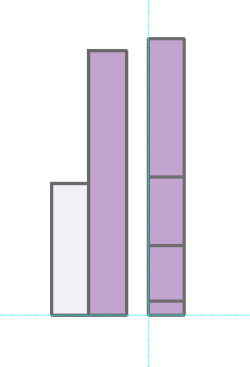
Now copy and paste the bar and use the Height value to divide that in half (input a value of 50) to get a bar that represents 10,000,000. If I place this on top of my 20,000,000 bar and use guides to make sure they align along the bottom and left, then I am assured that I have an exact increment of my bar. I can do this again to get values for 5,000,000 and even 1,000,000 (rescale a copy of the 5,000,000 bar to 20% of its height.)
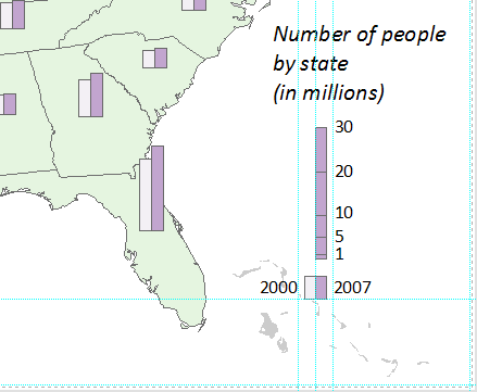
Now all you have to do is add the legend text. Note that a good rule of thumb is to avoid any extra ink on the page – you can do this in part by eliminating the many zeros in the numbers and adding “in millions” to the legend title. If you want to show the legend patches and their labels, you cans imply modify the legend elements that you ungrouped earlier. Note that you should ALWAYS show legend elements exactly as they appear on the map, so do not change the width of the bars in the chart symbol or their colors. For consistency, I used the same width for my legend patches below though you could also use the more standard landscape orientation.
Also note my extensive use of guides – I find these really help when I am working with graphic elements. You may find they help you work with more accuracy and speed as well.
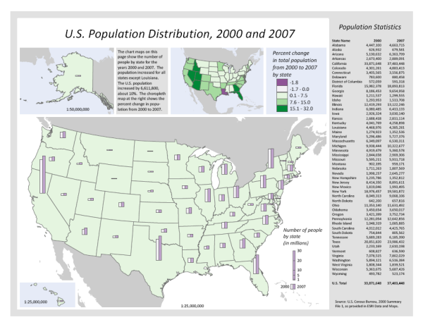
Here’s how the legend looked on my final map.
Thanks to David Barnes, ArcGIS Product Engineer (with a specialization in Page Layout), for his help with this blog entry!

Article Discussion: