By Rajinder Nagi, Esri Cartographic Product Engineer
In our last blog entry, Landsat Services Now Available on ArcGIS Online, we announced the release of the free and easy-to-use Landsat Image Services that you can access on ArcGIS Online. In this blog entry, we discuss how you can use these image services in your day-to-day mapping and GIS activities.
Landsat imagery can be used for creating land use/land cover maps, mapping urban change, detecting forestry change, and studying a variety of other environmental phenomena. In this blog entry, we discuss how you use the Landsat imagery in ArcMap to view the change the change in the landscape by adding composite image services to your ArcMap session and using the new time functionality that we introduced in ArcGIS 10.
To start, connect to the ArcGIS server that has the image services. To do this, in ArcCatalog open the GIS Servers folder and click Add GIS Server.
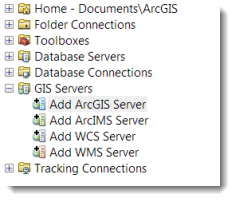
Opt to “Use GIS Services”, and then on the second page of the dialog, provide this Server URL: http://imagery.arcgisonline.com/arcgis/services. Click Finish.
When you expand the added server in ArcCatalog, you will see two new folders, LandsatGLS and LandsatGLSChange:
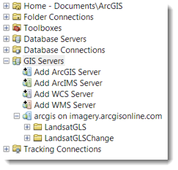
You can now open the folders to see the image services available to you. For now, we’ll focus on the LandsatGLS folder.
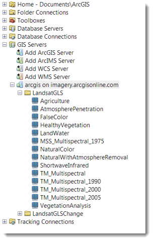
As you can see in above list, there are two categories of images services available:
- Agriculture, AtmosphericPeneteration, FalseColor etc…, and
- MSS_ or TM_ multispectral image services with the suffix “year” in the name (and where TM stands for Thematic Mapper and MSS stands for Multi-Spectral Scanner – two of the satellites that are used to collect these images).
The first set of image services are composites of different time periods, so if you use them they will have four different time periods in them, while the latter represent one particular “epoch” (i.e., period of time).
These image services relate those we mentioned in our last blog entry, though the names are slightly different – if you look at the services on ArcGIS Online, you will see spaces in the names, and the band combinations will be noted in the title. Here the names are shorter, and the band combinations are not noted.
To discuss some of the uses of these dates, we’ll demonstrate with an example featuring the TM_Multispectral_2000 image service that was compiled from the Landsat Global Land Survey (GLS) dataset.
Since you have connected to the GIS server, you can add this image service to your ArcMap session by dragging it to the Table of Contents. You can now create different views of it. You will see that the image is being displayed with the Red, Green, Blue band combinations of Band_1, Band_2, and Band_3, respectively. You can change these band combination and the RGB “channels” they are assigned to in order to highlight different properties of features in the image.
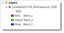
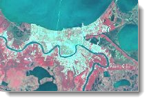
For example, let’s change this to bands 4, 3, and 2, which is what is called a “False Color Composite”. To change the display, right click the layer in the Table of Contents, click Propeties, and click the Symbology tab. Here click the down arrow next to the bands that are being displayed in the Red, Green and Blue channels so that they are 4, 3 , and 2. When you click OK, you will see a result that is similar to color-infrared (CIR) aerial photography. You may want to zoom in closer to see these results. In the example below, we’re looking at an area around New Orleans, LA.
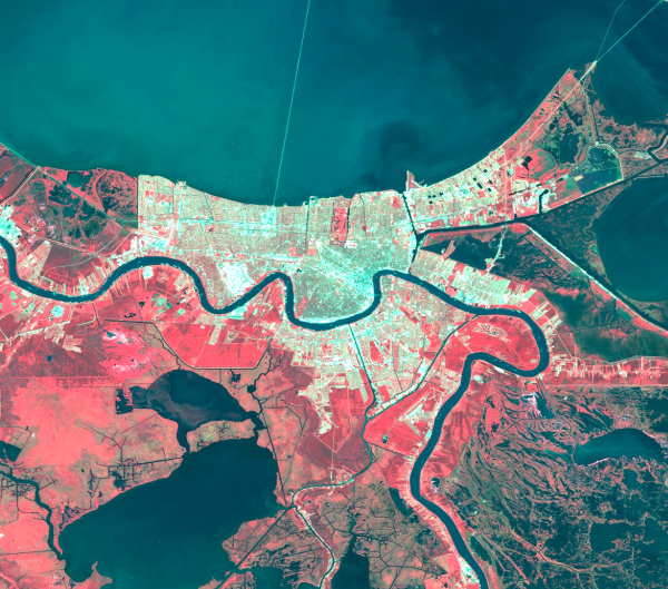
The 432 band combination produces a color infrared image of New Orleans, LA
CIR imagery is useful for vegetation studies, monitoring drainage, seeing soil patterns, and determining various stages of crop growth With this band combination, vegetation appears in shades of red, urban areas are cyan blue, and soils are shown in shades of browns (darker shades indicate higher moisture levels). Ice, snow, and clouds appear white or light cyan. Generally, dark reds indicate coniferous vegetation, bright reds indicate broadleaf vegetation and vigorously growing vegetation that is producing a lot of chlorophyll, while lighter reds signify grasslands or sparsely vegetated areas.
You can also experiment with other band combinations – the references at the end of this blog entry will help you learn more about them.
Now let’s take a look at the other type of image service in the LandsatGLS folder – those that include multiple time periods. To do this, we’ll use the FalseColor image service. Once you add this to your Table of Contents, right click it and open the Properties dialog. On the General tab, in the Description, you will see that “This image service was compiled from the following Global Land Survey (GLS) datasets: GLS 2000, GLS 1990, and GLS 1975.” This means you can use the time functionality introduced in ArcGIS 10 to view these different time periods in this single image service.
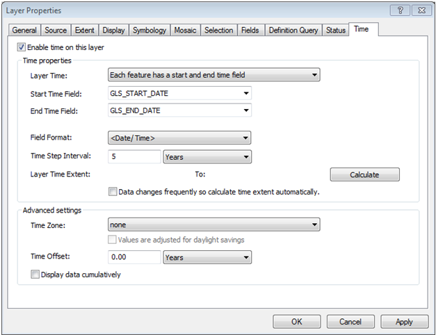
First you need to enable the time properties of the layer. To do this, just click the Time tab of the layer and click the option to “Enable time on this layer”. For Layer Time, choose the “Each feature has a start and end time field”. The Start Time Field and End Time Field will automatically be populated. Then change the Time Step Interval to 5 since there are five time periods in this image service. You can keep all the rest of the defaults and click OK.
TIP: DON’T click the Calculate button as that will cause ArcMap to try to calculate the time extent to for ALL the images that make up this service!!!
Then open the Time Slider Window toolbar using the new Open Time Slider Window button ![]() on the Tools toolbar. You can review the images for each of the epochs by simply using the left or right arrow buttons or pulling the slider to the left or right.
on the Tools toolbar. You can review the images for each of the epochs by simply using the left or right arrow buttons or pulling the slider to the left or right.
With the time slider toolbar you can see how areas have changed over time. Here are some examples…
The first example is Las Vegas, which had tremendous urban growth from 1975 to 2005 as you can see in the LandsatGLS images below.

LandsatGLS 1975 LandsatGLS 1990 LandsatGLS 2000 LandsatGLS 2005
Las Vegas, USA growth over last three decades (1975-2005)
This second example is from Beijing, China, which has seen tremendous growth from 1975 to 2005.

LandsatGLS 1975 LandsatGLS 1990 LandsatGLS 2000 LandsatGLS 2005
Beijing, China growth over last three decades (1975-2005)
The Landsat image services are worldwide, so you can use them for analysis/mapping for nearly any location. You can also use Find tool ![]() on the Tools toolbar to find and zoom to a place of interest.
on the Tools toolbar to find and zoom to a place of interest.
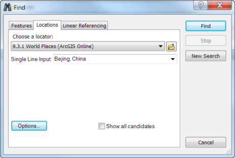
Different Locators can be used with the Find tool. To find Beijing, China, we used the World Places Locator
To help you use these services, we’ve enabled the time properties on all the Landsat image services so you can just open them up in ArcMap and start using them right from ArcGIS.com — here is the link. Click the Open button under the picture to open this in ArcMap.
Just a quick note about the MSS and TM images. The MSS images consist of 4 bands, and the TM images have 7 bands. Only one of the image services, FalseColor, will include images from both the MSS and TM images because the other images require the use of bands that were not in the original 4 used by the MSS sensor. SO…the only image service that will include 4 time periods is the FalseColor one, which includes 1975, 1990, 2000 and 2005. All others will only include the TM images for three epochs from 1990 to 2005. For consistency, you will see pixel values of zero for bands 1, 6, and 7. For most of you, this is probably not that important but some of you may want to know about this variation.
Stay tuned as in a future blog we will dive further into this subject and discuss how you can use these Image services for image classification to create a land use/land cover map.
In the meantime, want to know more? Here are a few references you can check out to learn more about how Landsat data can be used to study urban growth:
- http://pubs.usgs.gov/circ/2004/circ1252/
- http://duckwater.bu.edu/urban/local_part1.html
- http://www.nasa.gov/centers/goddard/news/topstory/2003/1212globalcities.html
- http://www.conferences.earsel.org/system/uploads/asset/file/70/earsel-symposium-2010_5-03.pdf
Thanks to Aileen Buckley, Mapping Center Lead, for her help with this blog entry.

Article Discussion: