(Originally published August 2022. Updated September 2024.)
Your brain on symbology
Did you know that 30-50% of your brain is dedicated to processing visual information? In fact, the evolution of written language all began with pictures and icons, or symbology. Eventually, as humans needed to express more and more complex ideas, symbology developed into formal written text.
However, when we want to communicate ideas with numbers, the reverse remains true. Communicating data demands that we tap into the part of our brain that can subconsciously (and quickly) process visual information, rather than overloading our eyes with a lot of text and numbers, even when using charts or maps.
Luckily, ArcGIS for Power BI is designed to help you do precisely that.
ArcGIS for Power BI provides many layer styles that help you communicate information quickly through customizable visual variables, such as size, shape, color, texture, and more! When you style your map layers, you take your reporting up a few notches, from simply presenting where your data is, to providing an enriched understanding of what it all means and, ultimately, what actions to take.
Let’s get styling!
Start modifying the symbology of a data layer by clicking the Symbology tab in the Layers pane and selecting a layer to style in the Active layer drop-down menu.
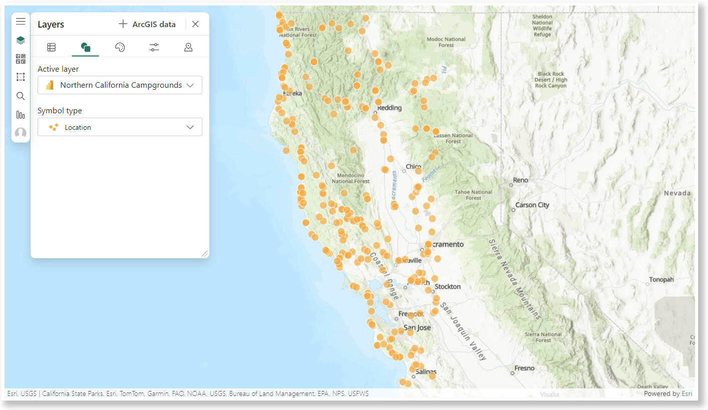
In the Symbol type drop-down menu, choose a style and start customizing!
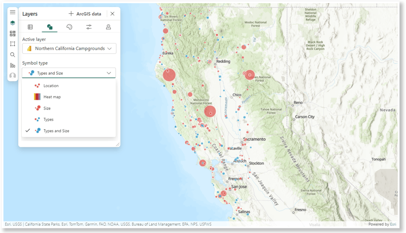
ArcGIS for Power BI uses smart mapping to suggest Symbol types that are appropriate for your data. The options shown in the below image might be different than those on your map.
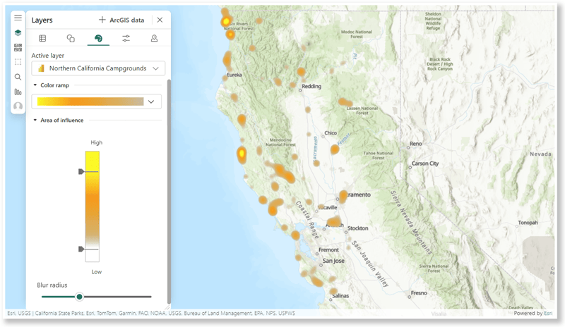
Heat Map
Here’s an example of custom symbology. Maybe you want a report consumer to easily understand where the highest and lowest concentration of features are located. A heat map is a good way to visualize the hot and cold spots on your map. Click the Style options tab and you can manually adjust the Color ramp and the Area of influence to best represent your data.
Size
Sometimes you might want to show your data proportionally by size. To activate this option, drag a numeric or ranking value into the Size field well. In the example below, you can see locations styled by their rating. Locations rated 5 stars are styled with larger stars, while locations rated 1 star are styled with smaller stars.
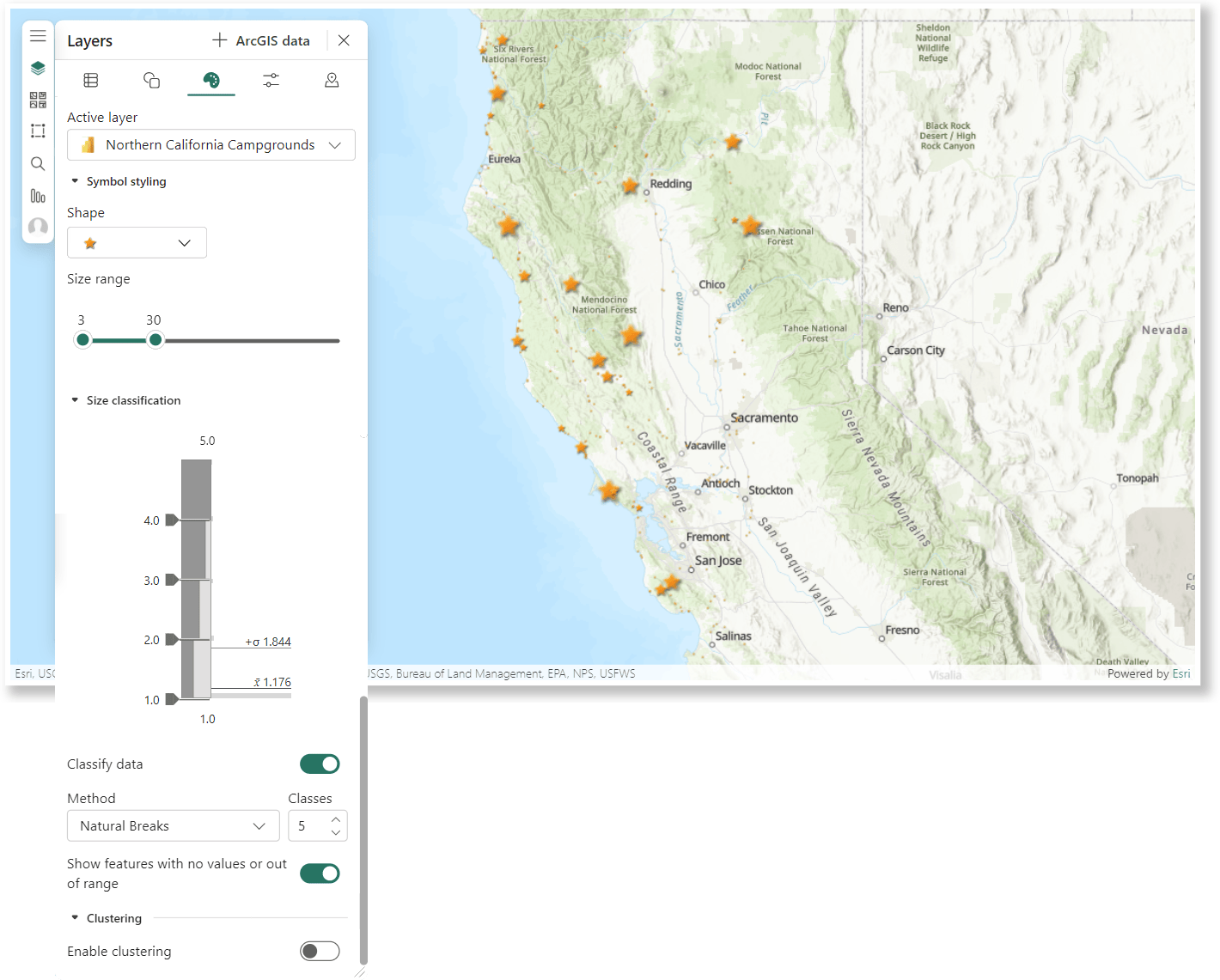
On the Style options tab, you will find the menu provides a variety of options for you to customize details like symbol styles and sizes, classification methods, and clustering options. Oh, and don’t forget to experiment with fun colors and shape!
Color
If changing object size isn’t your thing, why not try a more colorful experience? A Color Symbol type adds order to your data by modifying the colors of your map’s features, such as from more to less saturated.
To experiment with color saturation, drag a numeric value into the Color field well. Notice that you are presented with the same Symbol types as in the Size example, but with the new option, Color. When you select this option, you can play with the color settings on the Style options tab. Try selecting a sequential color scheme designed to highlight your ordered data and show ranges, highs, lows, etc.
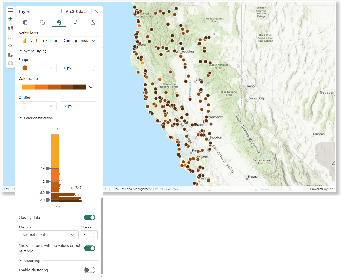
Color and Size
What if there was a way to combine both size and color visual variables? Try filling both the Size and Color field wells with numeric data. This adds a Symbol type called Color and Size that lets you compare two visual variables at once! Nested inside the Style options tab you’ll find options to modify for Color and the Size described previously.
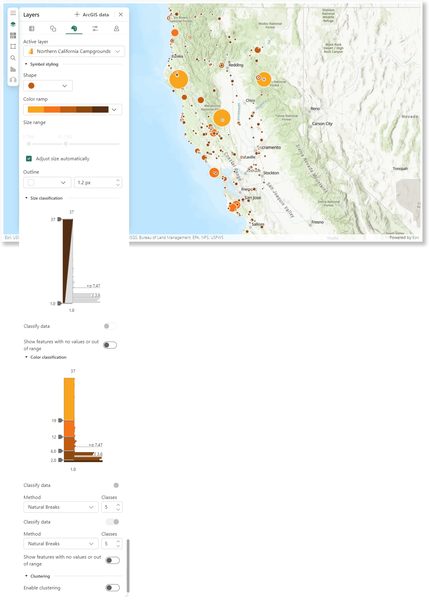
Types and Size
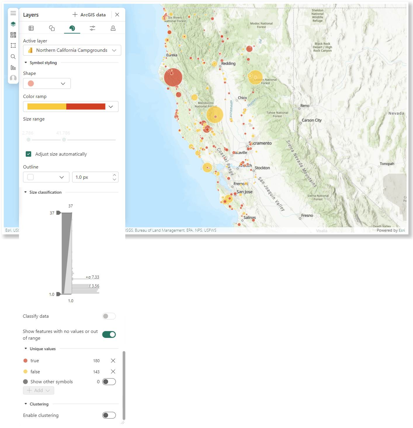
If you work with both numeric and categorical data, we’ve got you covered! Fill the Size field well with a numeric data value and the Color field well with a categorical data value to see the Types and Size Symbol type.
When you choose this option, you have access to the symbol (Types) and Size customizations on the Style options tab.
Types
If your data contains categorical fields, you can use unique symbols to show differences in feature categories! When you drag a categorical value into the Color field well, the Types option appears in the Symbol types menu. Select this option, and you can modify the symbol shape, color, size, and choose which values are shown on the map from the Style options tab.
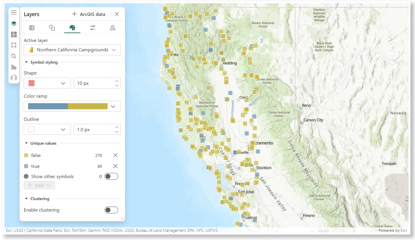
Location
Last but certainly not least, there is no reason for these fancy styles to always steal the show! You can give different colors and shapes a try using our basic (but trusty!) Location Symbol type.
And for extra credit, you could even change up your Basemap to add some visually pleasing geographic context to your map.
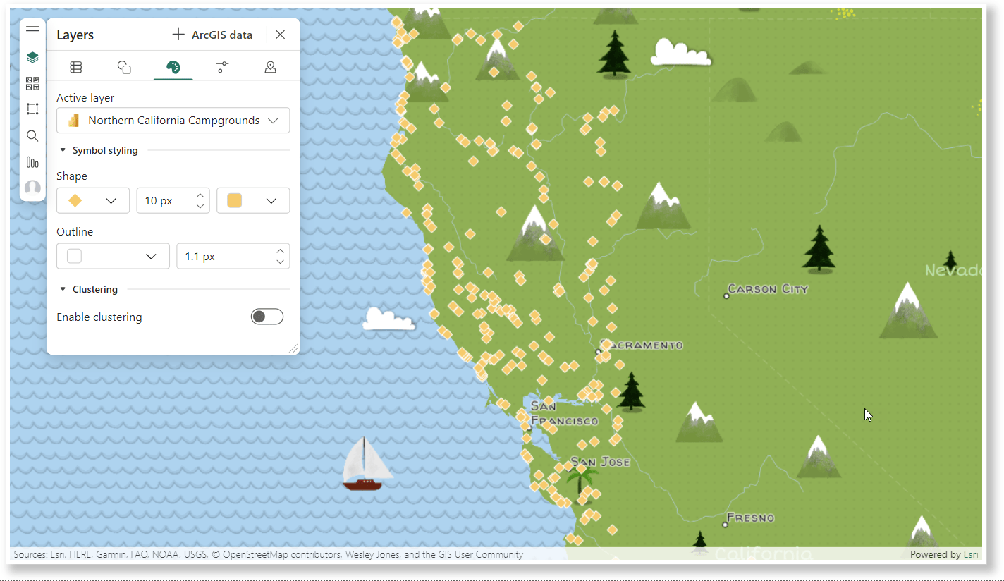
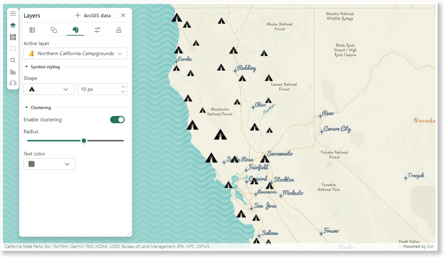
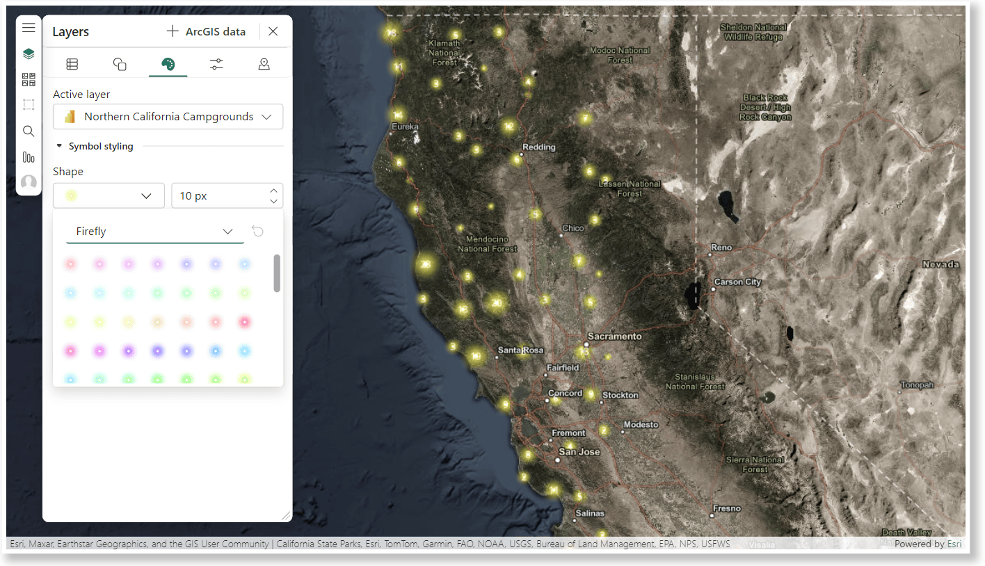
Start styling your data today!
The ArcGIS for Power BI visual is a great addition to your Power BI reports. We guarantee it will increase the effectiveness of your data communication, reporting, and overall style.
If you are looking for more information about getting started in ArcGIS for Power BI, you can find our documentation here. For even more detailed information about layer styling, see Style map layers in the ArcGIS for Miscrosoft 365 user guide.
We are always looking to improve the options and experience for you inside ArcGIS for Power BI. We would love to hear from you about ways you use map visualizations in your reports. Let us know what you are doing in our Esri community page here.

Article Discussion: