When you open ArcGIS Dashboards to create a new dashboard or edit your existing ones, you will notice something looks a little different. As part of the December 2021 release, the Dashboards team has introduced a new authoring experience for dashboard users. The new experience introduces a modern look and a common feel across ArcGIS Online.
You can now find your dashboard’s authoring tools, including dashboard settings, subscriber content, and save options, all on the side toolbar.
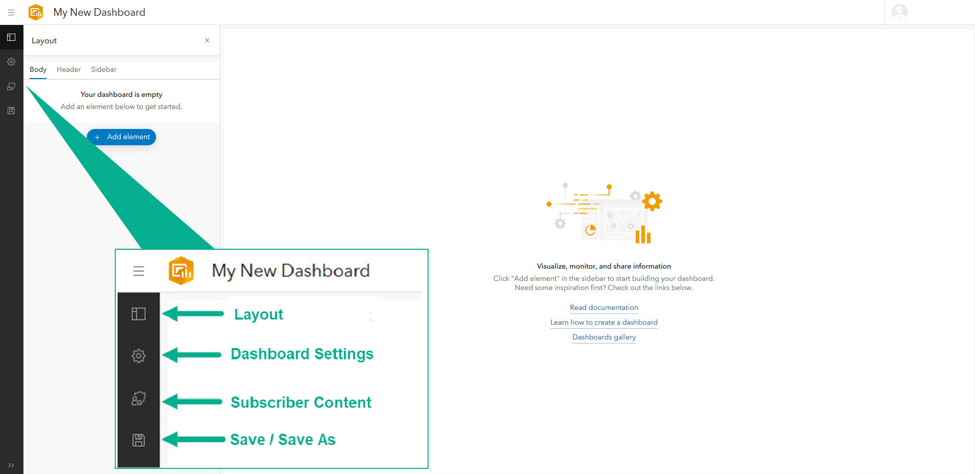
New layout panel
New to the toolbar is the Layout panel that allows you to view and manage your dashboard’s layout a lot easier. In the layout panel, you can see all your added elements and add new ones.
A dashboard has always been divided into three parts: body, header, and sidebar. In the new layout panel, you can quickly see and switch between these three sections to add the elements and selectors that go in each one.
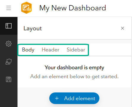
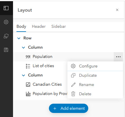
The Body section is the dashboard’s arrangeable layout. As you add elements to your dashboard, they appear in the panel in a layout tree (see more about the layout tree below). From the layout panel, you can quickly open an elements menu and do any of the following:
- Open the element’s configuration window
- Duplicate the element
- Rename the element – without needing to open the element’s configuration
- Delete the element
The Header section is where you can go to add a header to your dashboard and any selectors to it. In the Sidebar section, you can add a sidebar (formerly known as side panel) and any selectors to it afterward.
Worried about screen space? The layout panel can be closed so you can get a full view of your dashboard. Once closed, you can reopen it by clicking the Layout button in the side toolbar.
Layout tree
With all your elements organized in a layout tree, you can manage and arrange them more effectively. The layout tree outlines the rows and columns that make up your dashboard, and the elements contained in them.
A row describes elements that are docked side by side in the dashboard layout. A column describes elements that are docked above and below each other in the dashboard layout. As you rearrange the elements on your dashboard, you can see them move in your layout tree into their respective row or column. Additionally, as you hover over a row or column in the layout tree, the corresponding row or column is highlighted in the dashboard preview.
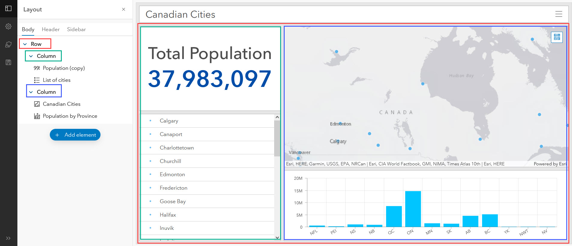
In addition to seeing your elements in their rows and columns, you can also manage how those rows and columns are displayed. For each row or column, you can choose to distribute the height (for columns) or width (for rows) of the contained elements evenly. You can also choose to group the elements in that row or column.
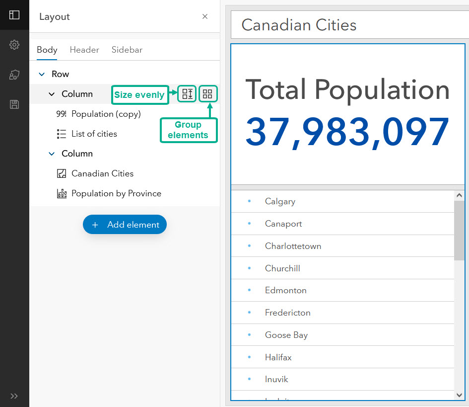
This new user experience is just the first step in making dashboards easier to author. The ability to easily see and rename all your elements, and quickly resize and group entire rows and columns helps make authoring workflows more efficient. Additionally, the layout panel also makes it easier for users to use their keyboards to navigate through the layout tree.
Create your first dashboard or open your existing dashboards and get to authoring!

Article Discussion: